HAND.
-
-
finnan, you stole my idea :( :)
OK then, I show something other. This is my last attempt :)
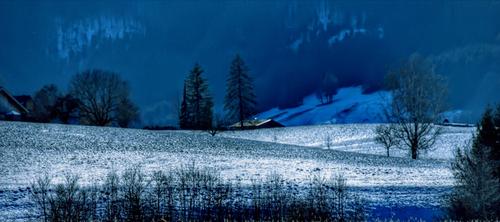
To access raw file I had to install NX Studio, fortunately it's free. From raw I could recover some more of shadow information and create different result, again with help of Corel PSP, using local tone mapping and fill light. No cropping this time.
-
-
-
No problem.
You or anyone else might be wondering why I deleted my entries.
In the weekly Wednesday C&C thread you choose to ignore my images there and have never commented on them. That is fine and I have no issue with that as they are not everyone's cup of tea. A few other members also choose to not comment on them and some do comment, both positively and negatively.
Since ArvoJ commented on all the entries in the previous thread here, I am not going to put you in the awkward position in this thread of maybe feeling obliged to comment on my images when you prefer not to.
If I remember, I'll put them back after you post your comments on the other entries.
-
I wouldn't read too much into the amount of noise in the raw/tif vs jpeg users because it really depends on the amount of noise reduction, if any, applied to any of the 3 formats.
Any reputable denoising app will do a good job of removing the noise in the jpeg.
Your jpeg is not of a low light scene where noise removal from a jpeg could be problematic.
-
-
-
-
-
😂 , I needed that...
-
Still time enough left to add any last entries and to add in your votes.
Good luck to you all ! -
The tension is unbearable! 😱
-
Congratulations to GreatBustard for winning this "Edit me an image-Number 2" thread, in this close finish contest. :-)
You can now choose one of your images and see what the community makes of it with this fun editing thread. Please make a new thread and copy/paste in Arvo's rules and pick a closing date.Many thanks to all for participating.
I'll post some comments to the images a bit later today. -
Thanks again for your entries.
I wanted to make one post now with all the images and a short comment on them.
Turns out that is quite difficult (for me) to do that on my phone while on holiday :-(
So, I'll make that comment post at the weekend when I return back home and sit in front of my PC again. Hope you don't mind the delay too much. -
Once again, Many thanks for your entries.
This could be the start of a long running fun thread to see what others can make of one of your images.As promised here are some comments from me about all the different edited versions here.
It has turned out to be a very long monster comment, so maybe future hosts could choose to make only a few comments on only a few selected images 😉These are, of course, just my opinions and you may have a different take 😊
The comments are in the same order as the entries were added.
The winning entry from GreatBustard is towards the end of this long post@in2lapland has written:Download: RAW
"Extreme" adjustments in LrC, Photo AISkaters as "rabbits" in landscape

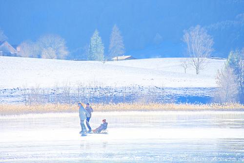
It was interesting to see the difference made by just flipping the image so that the family now move from left to right. This version seems to work intuitively better for me than my version which feels a bit cramped; as though in mine they are about to run up against a wall on the left edge.
The shadows have been brightened nicely, to show more details and there’s not a lot of noise visible. The colours have been pimped quite a lot compared to “reality”, giving it a sort of sunset type feel. At first I thought it was over the top , but began to like it more as time went by.
By starting with the RAW you managed to nicely recover the details of the highlights in the bright white ice sheet@in2lapland has written:Download: RAW
"Extreme" adjustments in LrC, Photo AISkaters as subject in landscape

The same comments about the tone curve adjustments apply to this one too but the crop now gives us more details of the family, while losing some of the surrounding scenery.
I guess it depends on what story you want to tell with the image. Both work well.@ArvoJ has written:This is very good image even without any PP :)
😊
Quoted message:As I have no software to process Nikon files, then I used just jpeg.
I cropped image to bring out skaters - losing interesting landscape, but hopefully shifting image context somewhat.
I attempted to remove CA - did not succeed fully, but some improvement was noticed.
Then I played with colours and image dynamics to make scene even more sunny and light, result is attached.This is cropping even more to “tell that story about the family”. The bright highlights in the ice sheet have been lost completely, but maybe that was intentional to give a more high key look to the result.
The shadows although brighter, don’t reveal quite so much details in the dark clothes and the faces, which is a pity since this is the crop about the “family story”. The colours look reasonably realistic .@Maoby has written:I can't use Z7 RAW with my old 2017 LR 6.12
I used TIFFFirst attempt
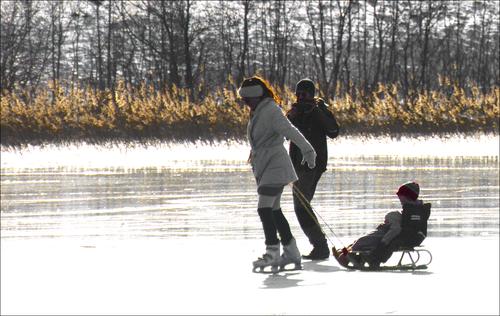
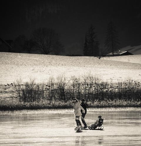
B&W often works well in shots with snow and ice 😊
Nice highlight details recovered here in that bright ice, the crop gives the family more space to move into. The shadows of the family are raised nicely to give lots of nice facial details.
Also looks as if a bit of film grain has been added for effect. Works really well
The contrast is well applied over the image to make the shot interesting with that darkened background but also retaining details like the bright line on the roof top which is picked out convincingly.@xpatUSA has written:RawTherapee: AmAze Raw > RGB> tif
tif > GIMP: Cropped, Resized, RETINEX mapped > jpgSkaters placed according to Golden Ratio (0.618) and space made in their direction of motion.
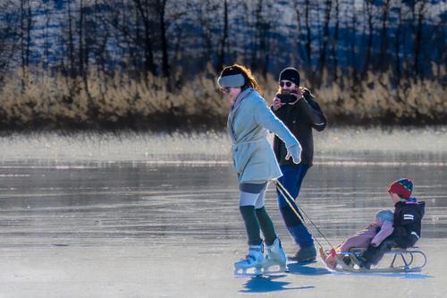
I wasn’t entirely convinced by this edit. The crop works to show “the family story” and the darker colour and the details of the ice work well , but the overall saturation of the reds and greens look over the top to me.
The lady’s white coat has been sort of unevenly brightened so that it looks a bit like it has a big dark stain at the front 😉
The bright red faces of the couple look a bit strange. The overall colour nosie is quite high if you start pixel peeping here.@AlanSh has written:Like some of the others, I wanted to isolate the skaters. So a fairly large crop. Then, moved the mid tones, changed the colour balance a bit and increased the saturation and stuff. A reduced size image because I'm on holiday with a fairly slow internet upload.
The crop does tell “the family story”, although I think they could be brightened a bit more, they are still almost silhouettes here. The more blue colour of the ice in the forground works well although some of the highlights that are in the RAW were not there to start with in the JPG. As in my original shot, I think ,also in this crop, they have a little too less space in front of them.
@Andrew546 has written:@Fireplace33 has written:Now to this weeks photo,...
The rest is up to you :-)
Many thanks!Don't need much, you've done the biggest bit already (from the jpeg)...
A pleasant result with a reasonably realistic view of what I saw on that day, The faces are clearly visible. Although ,perhaps the background could be a touch darker to highlight the family just a bit more
@TomAxford has written:A little brighter and more colourful....
Looks to me like a move to a more abstract take on the image. Certainly it's not a realistic view anymore and so now it becomes a matter of taste.
Not sure, why but Andy Warhol came to mind when I first saw this version 😊@ArvoJ has written:Something different this time.
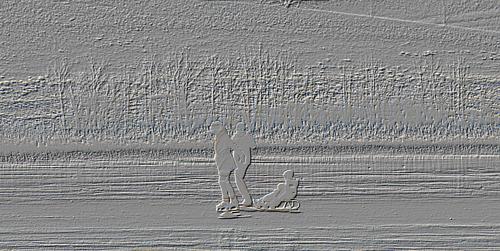
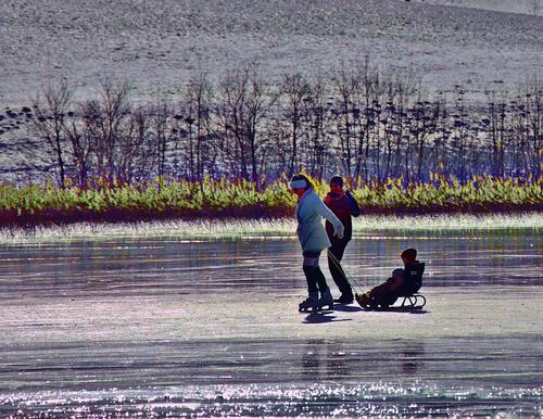
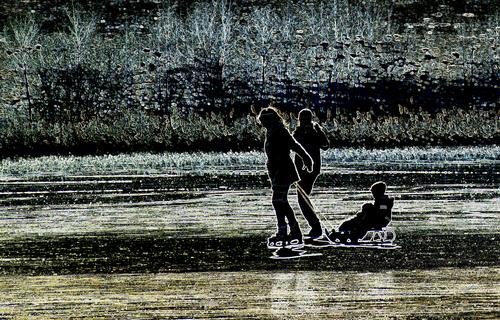
As it sometimes happens - if I have no clear idea, how to process an image, then I start playing with Corel Paintshop Pro effects. This time Glowing Edges seemed to work and give scene some meaning - like "There is nothing safer than the family in the busy and dynamic world".
Another abstract take on the image, the more you look at this, the more interesting it becomes. The crop works to give the family room to move and the processing is really quite “different”. Maybe it would fit in a series of abstracts, all using the same effect?
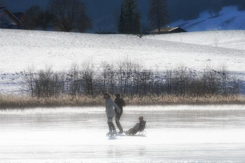
@Vahur has written:The colours remain realistic here and it has a sort of hazy, misty effect applied to it which deliberately takes away the details to create a softer image.
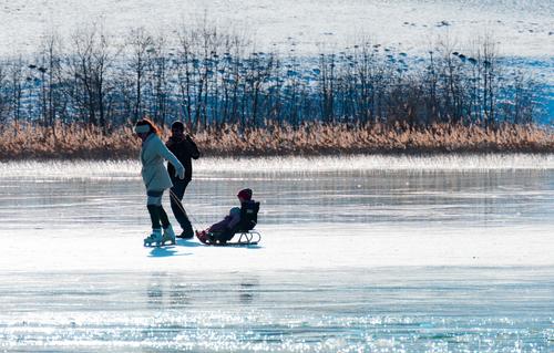
Not really my cup of tea, but it could definitely find a place in a set of “soft misty images”@Sagittarius has written:The family certainly pops and looks more "3D" here, nicely brightened and separated! And it retains details and low noise on the family
One odd thing though is that the facial details of the boy seem to have almost disappeared?@finnan has written:The dad (w/o skates, but w/ smartphone) likely has better images of skaters and sleds.
The scenery here in this area around lake Irrsee is beautiful, definitely worth a shot for that alone.
The blue tone, contrast and detail all work here. If I had had a zoom lens pointed on that scene, I would have focused on those trees directly and improved the details even more.@ArvoJ has written:finnan, you stole my idea :( :)
OK then, I show something other. This is my last attempt :)
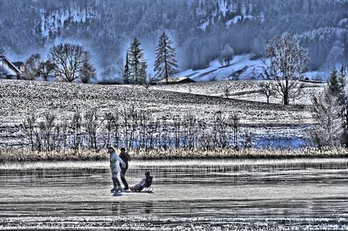
To access raw file I had to install NX Studio, fortunately it's free. From raw I could recover some more of shadow information and create different result, again with help of Corel PSP, using local tone mapping and fill light. No cropping this time.
Another abstract version, a bit more difficult to look at with the high local contrast and those halos around the trees, but it is interesting to look at such a fun and different edit too
@Sagittarius has written:Another abstract, amazing what the various options in our editing software programs can produce
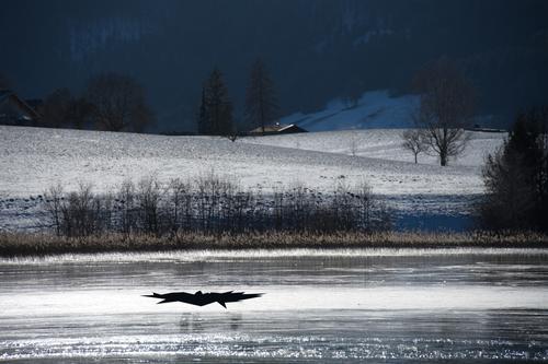
@Maoby has written:The storm approaches
Great title !
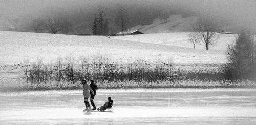
As mentioned about your first entry B&W works well for snowy scenes.
Looks like you’ve somehow turned up the grain effect so much that it really does look like a snow storm and they are trying to get home as quickly as possible.@GreatBustard has written:THE WINNER !!!!
Well done!!
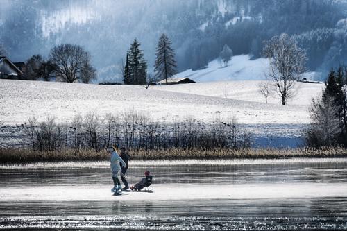
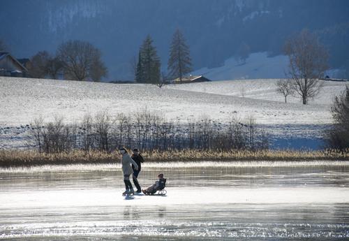
This is a very realistic view of the scene as I saw it. The colours look good, they are nice and gentle. The contrast is “just right” to show both the background scenery and the family without them competing too much with each other for attention. The background has been brightened and enhanced to show the forest and mountain details, and the ice shows the bright highlights and the darker parts in a convincing way
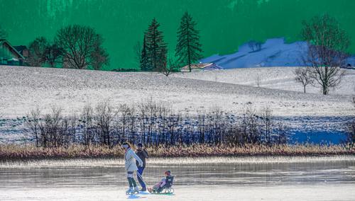
It was my favourite too 😊@Sagittarius has written:Another abstract with what looks like a “green sky“ this time.
Not really my cup of tea but interesting to see@minniev has written:I'm still playing with emulations of vintage stuff...
AND SECOND PLACE GOES TO MINNIEV
Well done , It was a close finish with a tie right up to the end.
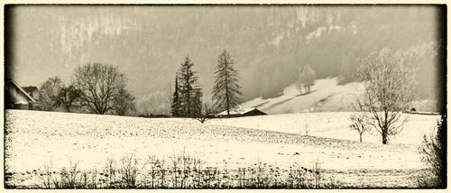
Taking a different view by selecting only the background scenery with a panorama framing and adding that vintage feeling with sepia toning and framing .
Nice result !!@Andrew546 has written:That spoilt the family fun
Oops, where did they go ?
A bit of comedy in the last entry.
I mentioned in my original post that I try to avoid walking on lake ice. You’ve shown us exactly the reason for that😊
Pulling two kids on a small sledge on lake ice also seemed a bit precarious to me, but it was thankfully very thick and strong on that day !That’s all folks !
Over to GreatBustard now -
Thank you very much for your analysis!
About the winner taking thread over - I have not heard of GreatBustard for some days, I hope he's well.
I think we will wait a few days more and if he does not appear, then we should give chance to minniev for second place - what do other users think? -
I agree
And congratulations to Fireplace33, for this colossal work. 👍🏻
Winning almost becomes a punishment, in my eyes. 😂 -
@Maoby has written:
I agree
And congratulations to Fireplace33, for this colossal work. 👍🏻
Winning almost becomes a punishment, in my eyes. 😂😂
Thanks Maoby, I did have some time to kill this morning, as it's raining continously outside at the moment !
so not so bad,...
But you're right though, comments at the end from the host should definitely be only optional.
I suggest the next winner just makes some comments for a few selected entries, or even just some general comments or even none at all :-)
... All under the moto of keep it simple and do whatever he/she likes :-) -
@Maoby has written:
I agree
And congratulations to Fireplace33, for this colossal work. 👍🏻
Winning almost becomes a punishment, in my eyes. 😂It is a "punishment" in a way because the op of the new thread is not allowed to post his/her suggested edits to the starter image and their techniques.
To me this is grossly opposed to the assumed intentions of these threads to share editing ideas and techniques.
In any thread the "winner" has the option to decline starting the next thread for whatever reason and pass it on to the runner(s) up.
Or you could set a rule saying you cannot start 2 threads in a row.
-
@Fireplace33 has written:
...... comments at the end from the host should definitely be only optional.
Of course. I haven't seen anything that suggests otherwise.
The op's comments are just one person's opinions.
Given the intention of these threads is to suggest edits and share techniques, all participants should be allowed to comment/ask questions at any time up to the closing time or at least afterwards, not just the op.
-
You are all overthinking this. It's just a bit of fun. Let the OP decide the "rules" - and if you don't agree with them, move on.
Alan
-
@AlanSh has written:
You are all overthinking this. It's just a bit of fun. Let the OP decide the "rules" - and if you don't agree with them, move on.
Alan
Yes, that's a great idea.
Having the op set the rules will allow more variety in the "challenges".
-
Looks like @GreatBustard doesn't want (or more likely just can't) to join us and start next round of the "Edit me an image". Thereby I ask our current round runner-up minniev to start the next, third round of competiton.
@minniev, you have the honour (or was it punishment?) :)
