• April 30, 2023, 9:32 p.m.

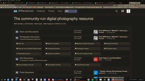
    I am not the creator of the forum s/w. I am the person who 'designed' (and I use that word very loosely, because all I did was move forums around) the 3 tier structure to try and get more information on one page.

    When I first saw it, it was just one loooong list (have a look on a mobile phone and you will see what I mean). On a decent screen, it wasted so much space.

    But the principles behind it all were designed by whoever wrote the Misago software - and that wasn't me.

    Alan
  • Members 284 posts
    April 30, 2023, 9:57 p.m.

    I dont think this has to be a DPR clone as if that place was perfect.

    Yes, there will be a dark mode...
    Yes, there will be a thread view...
    Yes, there will be a 🔔 alerts...

    And yes, I agree, maybe the having the same post in 2 forums is not necessary.

    Alan’s work and efforts in this project (which is like a month old) are huge and we should be more grateful to him. It must be a pain in the neck reading negative comments about it.

  • Members 535 posts
    April 30, 2023, 10:47 p.m.

    Nothing better than design by committee.

    No thanks. I’ll live with whatever is presented.

  • May 1, 2023, 12:22 a.m.

    We currently have to work within the confines of the features of the forum software and what it provides. It isn’t quite as easy as as just deciding to have a new design and it magically appears. Some customisations come from the team here, but others are dependent on the original developer (the forum is based on an open source project, Misago) making the changes.

    Right now, the forum is the primary feature of the site and serves as the landing page, but as I understand the team have wider ambitions for editorials and reviews, that will be a catalyst for more design, a custom homepage etc.

  • Members 118 posts
    May 1, 2023, 1:53 a.m.

    I like this form design MUCH better. The hierarchy of sub-forums let’s one read across integrations of various discussion trees (eg, all of nikon, not just Z; or indeed the whole site). The structure & function naturally supports taking a broader view of community discussions, while simultaneously supporting quick access to specific sub-forums when desired. IMHO the forum design at dpreview (while having great features like threaded view) lead one to more silo-ed views & reading.

  • Removed user
    May 1, 2023, 2:50 a.m.

    Yep, I greatly preferred DPReview on my machine, not a forum link in sight !! LOL

    lol.jpg

    Hmm ... too late now to buy an 8K monitor and some 5-diopter reading glasses ...
    ...
    ... or one could stay here and get used to it (big smiley), eh?

    lol.jpg

    JPG, 486.8 KB, uploaded by xpatUSA on May 1, 2023.

  • Members 6 posts
    May 1, 2023, 4:25 a.m.

    I think you've done a great job Alan. My response was aimed at those who are being critical just for the sake of having an opinion, like ArvoJ.

  • Members 509 posts
    May 1, 2023, 7:17 a.m.

    I can't work out what it is that some people are objecting to. Is it the graphic design they don't like or the organisation/structuring of forums or something else?

    Personally, I find the visual design a bit ugly and the colour schemes on offer (good that the options are there) don't help - too crude. I prefer to use the browser plugin Dark Reader for producing a colour scheme I find easier on the eye (everyone will have their own taste, providing a custom option that can be tweaked might be a good idea).

    Here's mine produced by adjusting Dark Reader's sliders. Scheme chosen for its readability and lack of glare, not aesthetics. I find it gentler on the eye.

    Screenshot from 2023-05-01 08-08-22.png

    What would improve the usability of the layout would be a way to distinguish the different levels - make the hierarchy more obvious.

    For example, the "News and Discussions" top level section has the lower levels "News and Photography" and "Site Discussions". There is no visual distinction between the top level and the two secondary levels. A visual style that makes it clear that the top level is the top level and the secondary levels are secondary levels would help, I feel. I'm no designer but maybe making the top level have a larger font and perhaps a slightly different background colour (darker, using my custom colour scheme) would help make the hierarchy clearer or even just indenting the secondary levels 10px.

    I'd also be inclined to reduce the visual prominence of the "Featured/latest post" - it visually dominates too much IMO, and the larger Avatar images make it even more dominant. Make the avatars 1/4 the area so they are more like picture bullet points. I'd also suppress the duplication of the "latest post" - make it appear in the secondary level only. You could probably do this by hiding it with CSS rather than having to rewrite the code.

    I had quick play with the CSS using the Inspector tool and it wasn't easy to find a way to target the top level category separately from the secondary categories. Might be worth looking for a way to do this reliably.

    Screenshot from 2023-05-01 08-08-22.png

    PNG, 479.8 KB, uploaded by DavidMillier on May 1, 2023.

  • Members 105 posts
    May 1, 2023, 8:41 a.m.

    Patience may be a dicipline one needs

    Structuring is more important than speed of identification. While a good search function is essential for firnding past info buried in a flurry of posts-

    In this case of me looking to find info ad the development of the site I found the heading of this category not ovwerwhelmingly precise.

    p.

  • Members 746 posts
    May 1, 2023, 10:28 a.m.

    Who exactly are you talking to?

  • May 1, 2023, 10:31 a.m.

    I agree - and we will do something about that.

    Alan

  • Members 509 posts
    May 1, 2023, 10:41 a.m.

    Thanks Alan, good job so far but I bet that todo list is dispiritingly long by now.... 😕

  • May 1, 2023, 11:22 a.m.

    You'd be surprised.

    I am going to chat with Bob & Martin about publishing it. I would just do it, but it may open up alll sorts of discussions about which to do first, why that one is more important. who sets priorities and "who put that one in". So, for now, you get the summary below.

    I've got 29 'new features' requests (and some of those are interlinked) and 11 bug requests in the list.

    Alan

  • Members 3983 posts
    May 1, 2023, 11:47 a.m.

    Is enabling CSS styling for BBcode in the feature request list? I don't need to know where on the list, even #29 would be ok.

  • May 1, 2023, 12:06 p.m.

    No it isn't. Can you outline the benefits of having it?

    Cheers

    Alan

  • Members 16 posts
    May 1, 2023, 12:15 p.m.

    My opinion that I don't have any idea of how to fix is that I find it almost impossible for me to sort out who is responding to who when reading through the responses and even where to put a response I might have. And when reading through the responses, the same response from the same poster will show up repeated over and over as I scroll down through the comments. If poster A makes a comment, why can't all responses to that comment follow it without repeating it and subsequently posted responses each time?
    Overall very hard for me to follow.

  • May 1, 2023, 12:18 p.m.

    'we' means community here.
    If I recall correctly then one of the leading ideas behind dprevived was 'community driven' - thereby I think using 'we' should not imply that I have to be related to forum team or creators.