• March 28, 2023, 6:13 p.m.

    For people used to DPReview, this site is a little different (or as @Rafal, who was responsible for the development of the misago package we used says, 'good core but its rough around the edges') - we chose it for the 'good core' because we want this to be more than just a forum in time, and we'll be smoothing out the edges. In the meantime, here's a quick explainer for people new to it. Other people who find neat ways of doing things, feel free to add your own to the thread.

    1. Posting Images
    The most asked question. Who'd have thunk it, in a photography site? So, here's how to do it.
    In the top bar menu is the 'upload' icon, select that:

    Screen Shot 2023-03-28 at 17.35.55.png

    This will insert a load dialogue at the bottom of the frame, select the 'embed' icon:

    Screen Shot 2023-03-28 at 17.42.00.png

    This will embed the image where the cursor was, use the 'Preview' button to see it there.
    Now you've loaded your image.

    2. Navigation
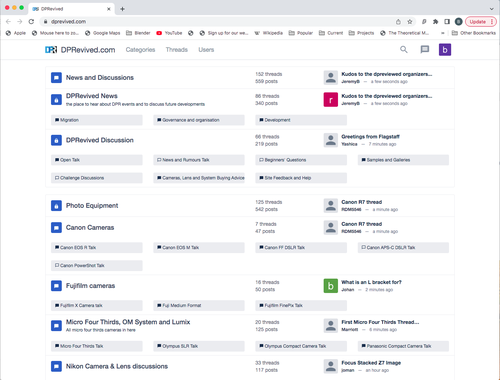
    This is very different from DPReview, but powerful when you work it out. When you access DPRevived.com you will go into the Category view:

    Screen Shot 2023-03-28 at 17.51.16.png

    Categories are what were called 'forums' in DPReview. They same categories/forums are mostly here, with some changes that members have asked for. The layout is quite different. It's not ideal, but we've done our best to get in as much of the DPR list in a single screen. There are some choices in navigation.

    Screen Shot 2023-03-28 at 17.55.34.png

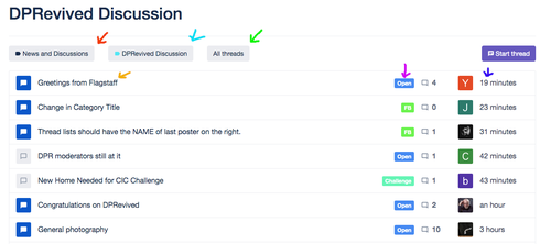
    Mostly these are under holder categories, in this case 'DPRevived Discussion'. The post notification -green arrow - is the most recent thread in the whole group of categories. Press that, it takes you straight there. Select a sub-category - blue arrow - and you go there. If you select the category itself - red arrow - , you will get a list of the latest threads in all of the the lower categories.

    Screen Shot 2023-03-28 at 18.03.18.png

    There are lots of arrows here because you can navigate lots of places in one click. It's a bit like a Nikon, lots of buttons which at first sight look a bit daunting, but gives you one button for each function.

    If you choose the top level category name (News and Discussions - red arrow) you'll get a drop-down list of all the sub categories and you can go straight to one of those. If you choose the holder category name (DPRevived Discussion - blue arrow) you'll get a list of just the categories in there. If you choose 'All threads' - green arrow - you get this drop down list:

    Screen Shot 2023-03-28 at 18.12.51.png

    The names are self explanatory, each lets you filter the list of threads to the selected criterion.
    If you go to the thread name - orange arrow - you go straight to the first post of the thread. Choose the forum breadcrumb - magenta arrow - and you'll go to that specific forum, and if you select the latest post - violet arrow - you'll go to the last post in the thread.

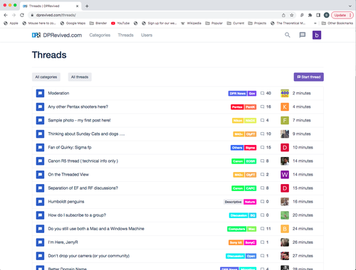
    That's the Category view, you can also select the Threads tab in the top bar to get the threaded view, or go there directly with DPRevived/threads/

    Screen Shot 2023-03-28 at 18.54.11.png

    The last thing on the screen is the 'Start thread' button (purple - top right). Press this and you get a drop-down list of all the threads in the scope of this screen. You can start a thread there without having to navigate to it.

    So whilst it's not as neat and intuitive as the DPReview screen, when you know how to use it you can navigate very quickly.

    3. Private Threads

    The quote box next to your user identifier:

    Screen Shot 2023-03-28 at 19.02.43.png

    takes you to your private threads. These are just threads, but shared between selected people, so you can use for a one-to-one like a DPReview private message, or for a group of people and people can be invited to the conversation or leave as it continues - so good for group discussions that you don't want on the public forums.

    Screen Shot 2023-03-28 at 19.02.43.png

    PNG, 10.7 KB, uploaded by bobn2 on March 28, 2023.

    Screen Shot 2023-03-28 at 18.54.11.png

    PNG, 257.3 KB, uploaded by bobn2 on March 28, 2023.

    Screen Shot 2023-03-28 at 18.12.51.png

    PNG, 22.6 KB, uploaded by bobn2 on March 28, 2023.

    Screen Shot 2023-03-28 at 18.03.18.png

    PNG, 99.1 KB, uploaded by bobn2 on March 28, 2023.

    Screen Shot 2023-03-28 at 17.55.34.png

    PNG, 37.6 KB, uploaded by bobn2 on March 28, 2023.

    Screen Shot 2023-03-28 at 17.51.16.png

    PNG, 279.9 KB, uploaded by bobn2 on March 28, 2023.

    Screen Shot 2023-03-28 at 17.42.00.png

    PNG, 15.2 KB, uploaded by bobn2 on March 28, 2023.

    Screen Shot 2023-03-28 at 17.35.55.png

    PNG, 10.4 KB, uploaded by bobn2 on March 28, 2023.

  • bookmark_border

    Thread has been pinned locally.

  • edit

    Thread title has been changed from How to....

  • March 29, 2023, 1:59 p.m.

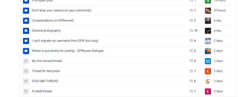
    Once you are in Thread mode, you should see this sort of thing:
    threads.jpg

    On the left, a thread is either Blue, which means you have unread messages within the thread, or Grey, which means you don't have any unread messages in there.

    if you click on the thread name, it takes you to the first message in that thread. However, it you click on the time (2 days, 19 hours etc.) on the right, it takes you to the first unread message in the thread.

    if you click on the avatar, you will see all the messages that that person has posted.

    I hope this helps.

    Alan

    threads.jpg

    JPG, 78.3 KB, uploaded by AlanSh on March 29, 2023.

  • Members 6 posts
    March 29, 2023, 11:33 p.m.

    Hi Folks.

    Would it be possible to create some parallels to how this may be used on a mobile device? Android/IoS.

    I'm thinking a lot of users may not be using a PC.

    I'm impressed how fast it's growing and if the first week or so is anything to go by it looks like it's going to be a great success.

  • Members 3 posts
    March 29, 2023, 11:51 p.m.

    Brand new user here, Bob.

    Is there a way to change the viewing mode for the whole site -- i.e. a Dark mode -- or are we stuck with the bright white background?

    Thanks,
    Vitée

  • Members 15 posts
    March 30, 2023, 12:13 a.m.

    Didn’t need an EXPLAINER to navigate DPR, E B FORUM etc. This is great but really notmeasy

  • March 30, 2023, 6:57 a.m.

    For the moment, there are some browser tricks you can do, there are some threads here. However, we'll be starting on the styling soon ,and should be able to add a dark modes soon - I don't think it requires any basic SW changes.

  • March 30, 2023, 7 a.m.

    I went to pick up my son from the airport yesterday. My wife drove the return journey and they were in the front chatting, so I was in the back browsing on my mobile. It works really well on a mobile, actually better that DPReview. I suspect that may be why the UI on a computer doesn't seem so good, it's been optimised for mobile.

  • March 30, 2023, 7:01 a.m.

    DPReview was the gold standard - and this one has been developed from a different perspective - it will take time, but I hope not too much.

  • Members 1620 posts
    March 30, 2023, 7:09 a.m.

    I made a trail run post with a picture heavy thread. When I upload a picture from my computer and insert it in the thread, it shows up as code.

    It is planned to have a picture show up rather than the code, as this makes it a bit cumbersome to make image heavy threads?

    BTW The Forum is looking good. Thanks to the movers and shakers behind this project.

  • March 30, 2023, 7:11 a.m.

    Yes, the post editor needs some work. Fortunately it looks like this might be much easier than first thought.

  • Members 3 posts
    March 30, 2023, 7:13 a.m.

    Good to hear. Thanks.

  • Members 5 posts
    March 30, 2023, 8:44 a.m.

    Hi,

    Is there any way to see the EXIF of the uploaded photos?
    Also, it would ne nice to have a theraded view option, but I guess that's asking a bit much...🙂

    quatpat

  • March 30, 2023, 7:26 p.m.

    We want both to happen. EXIF is probably reasonably easy, threaded view option isn't. So it's not asking a bit much, it's just timeframe expectations.

  • Members 510 posts
    March 30, 2023, 7:32 p.m.

    Bob, a thing that would be nice to have is a link back to the original post when it is quoted. In flat view, I mean. I guess flat view will be an option in the new version. In case you lack ideas for the rewrite, I mean. 😉

  • Members 86 posts
    March 30, 2023, 7:36 p.m.

    Thank you very much to all those working on this forum! Immensely appreciated!

    Threaded view a wish here as well, whenever it is possible.

  • Members 689 posts
    March 30, 2023, 10:42 p.m.

    Is it possible to have a navigation string which is right above the thread name at the bottom of the thread. It will eliminate necessity to scroll up to move around.

  • Members 510 posts
    March 30, 2023, 10:45 p.m.

    Or just click the Home button on your keyboard. Or do you use a phone?

  • Members 689 posts
    March 30, 2023, 11:21 p.m.

    Thanks