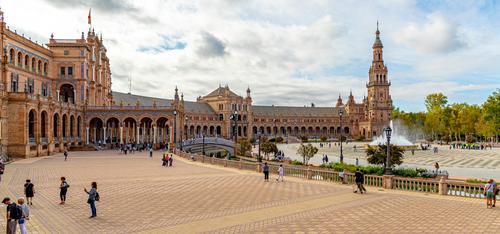
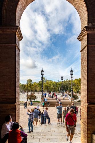
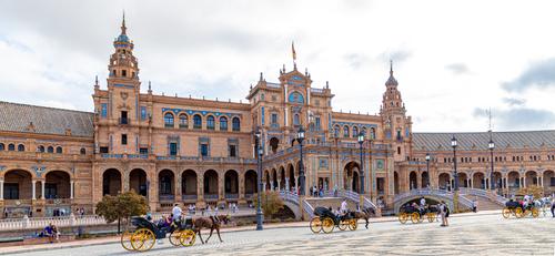
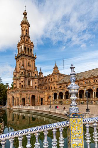
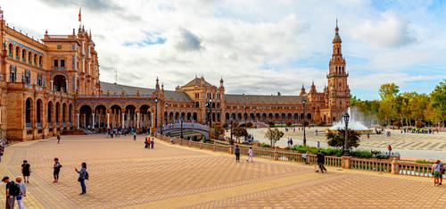
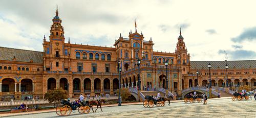
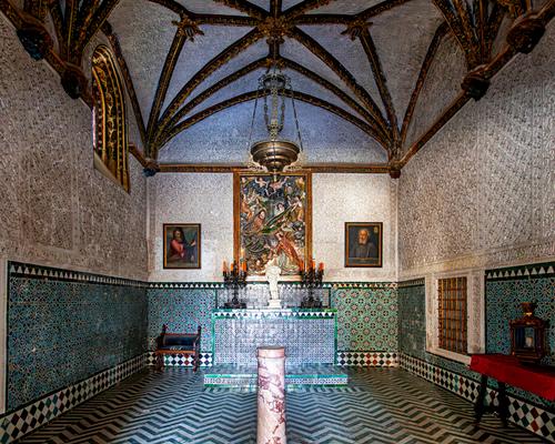
Because roel inspired me to revisit editing these images. I thi9nk I shot them at the wrong settings and they needed so time in lightroom. Please C&C, I'm learning.
-
-
Nice set, I like this one most, esp composition!
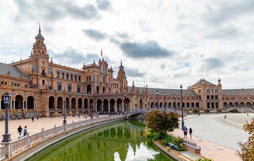
C&C: on some images (3, 5, 6) sky is unfortunately overexposed (having not seen the raw data, I can't say, would that be correctable in post or not).
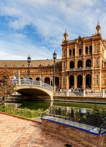
Then I would substantially crop image 4 - cut away entire upper part, see attachment (I won't embed it here - it needs dark background to convey point of it). -
Joe,
I like all these photos as you show them; but I havent seen the versions that Roel commented on (where?). Did you actually delete the EXIF data?
I actually prefer to see the full arch in No.4. Setting the sky so it isnt overexposed is a nice thing to do; but, in my experience, it is often the case that the rest of the photo then needs a lot of careful work to lift it out of gloom, including noise reduction. Because of this, I am sometimes resigned to allow a little over exposure in the clouds.
I dont think you need to upload such large files for us! Around 2000 px for the longer side is my usual size. 😀
David
-
From the few photos I have seen, I never realised the beauty of the Placa De Espana.
Your shots show a much broader perspective with a camera that captures an incredible amount of detail (FF, MF?)I am still a relative beginner in the world of pp. My camera, set on auto WB, takes similar looking shots especially under cloud or lower light.
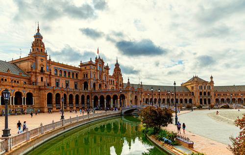
I have learnt a boost in contrast and saturation is often enough to bring back some pop and then a reduction in highlights may allow colours to stand out a bit more. Although the blue tiles are a feature, there did seem to be a blue cast in some of your shots so I reduced blue somewhat in those.
Those with more knowledge / experience in pp would probably do better - and for my learning too, I would like to see what others would do, because I feel these are perfect examples to see what can be achieved.
Just a note on keystoning. If you hold your camera level, the effect is lessened. You would then need to zoom out with feet or lens to get everything in and then maybe crop. Your detail level seems high enough so I assume you wouldn't lose much.Because I am fascinated in your subject, and I knew I could get a few improvements, I want to show, as a start, what can be done. The over exposed sky is perhaps not retrievable, but if they were mine, I can ignore that and just see the rest of the scene.
I hope they inspire you to see what is possible. -
I find this version of Joe‘s photos over-saturated. Or do the original buildings really look that?
David
-
@ArvoJ I hadn't thought of removing the arch, but I like how it brings focus to the middle of the image not the lower third. It moves the eye better.
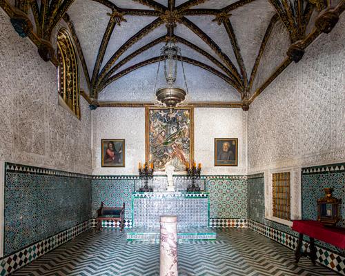
Most of these images are HDR 5 image composites, at the time I took the images I was aware the dynamic range was significantly greater than my sensor's capability. So, in post I determined if I prefered the HDR or normal exposure version. There was a low thin fog layer for most of my time there. It was very bright but didn't have directional light. You can see this with the lack of shadows created by the people and lamp posts. The interior of the small chapel is a single exposure that has been AI denoised in lightroom.
With greater skill for post editing, I believe either better compositing or editing could show better skies.@davidwien I didn't mean to remove the EXIF data. I looked in lightroom and it was set to strip metadata. This might be from something I did previously. I shot these with a Canon 6Dii with a 24-105 shot at 24mm except for the image in a room, it was shot with a 17-40 at 17mm. I also didn't check their size on export, I will watch that in the future.
The buildings represent Spain's history and have a "strong Moorish" influence and were built for an "Iberio-American Exposition World's Fair" (I'm quoting wiki). The brick has a strong orange hue, with tile motifs that are blue, green and yellow. The Orange drowns out the colorful tile in most of the images I've seen, but the tile work really make this place interesting, so many patterns and colors! I tried to bring out the color in the tile by pushing the vibrance and pulling the saturation to keep it as normal as I could.@Bryan I messed up the keystone on all these images terribly when I was there. In my defense, it was 9am when we got there after an hour bus ride and the first stop on a whirlwind tour day (I was half asleep and under-caffeinated). I wasn't careful, I pointed the lens up and shot the widest end of the lens. The originals are very distorted. I had to manipulate the image quite a bit to make them near what I remember seeing. If you look at the spires you can see the stretching from being manipulated in lightroom.
The skies got easier as the fog burned off. There is only one image with some of the remaining fog layer. I reduced contrast on that image because it brought the sky back from completely blown out. I need to learn to use selective filters. Maybe a better HDR composite, or I can try a manipulation of a single exposure for the sky. I know JPG can be harder to manipulate than the RAWs.Thanks for the replies! The tips are very helpful!

