• Members 1604 posts
    Nov. 7, 2023, 7:07 p.m.

    The Picture Of The week, however it is chosen, should change out every week and should not dominate the entire page. There can be other picture slots added for other photos as other content is developed. For instance if some member did an article on photographing architecture, a photo could be slotted with the title and first paragraph of the article. Or when the Zoom is done, a composite of the admins could be posted with a wrap-up. Or when you link to other articles, a photo or graphic from somewhere else could be shown. Content can even be borrowed from posts on our own forums if it's interesting.

    The point is to have a lively mix of original and linked content with a healthy dose of visuals, updated regularly.

  • Nov. 7, 2023, 8:18 p.m.

    Quick memory test - what exactly do you remember of the dpreview home page? (Don't switch tabs to look!)

  • Members 691 posts
    Nov. 7, 2023, 8:59 p.m.

    I never go to the front page, just straight to the forum from the links in my drop down menu. But I do not think they have full screen displayed picture and change it every week. Also they are so well known that they do not need anything else to be remembered and/or identified.

  • Nov. 7, 2023, 9:01 p.m.

    In short - you have no idea. Why should people memorise dprevived homepage then? :)

  • Members 691 posts
    Nov. 7, 2023, 9:12 p.m.

    Why should dprevived to have one then?

  • Nov. 7, 2023, 9:25 p.m.

    You and some others seem to suggest standard portal- or newspaper-like appearance - why? You have used to such layout? You have problems with seeing only one thing at a time? You need informational overload to function properly? :)

    Currently we have last threads page, what I'm sure this is the only page what most of us are visiting.
    Then we have index (=landing) page with list of all forums - this actually looks quite distinctive, but it is rarely used [by forum members] and makes not ideal first impression [for random visitors] and certainly does not visually indicate that this is photography related forum/site.

    Now Alan proposes to create new landing page to make first impression memorable (=keep random guest interested for more than three seconds).
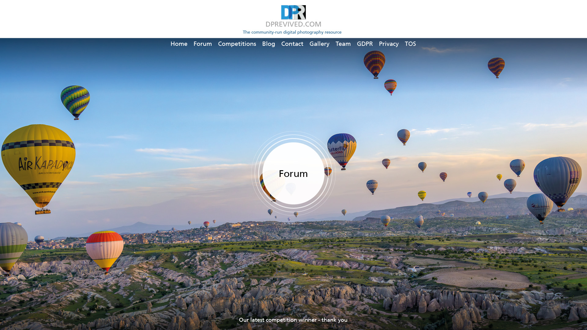
    In my opinion such a page has to be somewhat different from mainstream portal-like pages and needs to have only minimal informational content, but it should be visually attractive. Again in my opinion single full-size image (covering maybe entire page) is pretty good for this task; also the fact that it will be changed every week poses no problem - guests likely will remember that "this was the site with big wonderful image", not what kind of image it was exactly. If it is different next time, then it is for better.

    Alternative proposal would be redesign our current index page to include some images (the same weekly winners and more) and so on - but I think Alans idea is better. Sure those ideas can be combined.

  • Nov. 7, 2023, 9:49 p.m.

    I did try and embed the forum within one of the landing pages, but the forum s/w won't embed (security risk). I'll play some more tomorrow and present other ideas.

    Alan

  • Members 1452 posts
    Nov. 8, 2023, 3:28 a.m.

    A landing page is for those new to a site. It needs to spell out what the site is about and engage so that those discovering it want to look further. We need new members. An appropriate name and landing site are not the complete answer but they are important steps on the way.

  • Nov. 8, 2023, 3:01 p.m.
  • Members 643 posts
    Nov. 8, 2023, 4:58 p.m.

    Looks great Alan.

  • Nov. 9, 2023, 4:25 p.m.
  • Members 96 posts
    Nov. 10, 2023, 11:55 a.m.

    Sorry being a bit slow to reply, it's been a bit hectic! Actually most of the work that's about to start is pipe renovation for the whole apartment building and it'll be largely off-limits for the occupants due to safety concerns during the project. We plan to do some renovation of our own once the pipe work is done (wallpapers, replacing wardrobe cabinets, stuf flike that), so maybe that'll be a good opportunity for some progress photos.

  • Members 4 posts
    Nov. 11, 2023, 7:45 a.m.

    Dear all,

    First of all, I'm not a frequent contributor, here or on dpreview, but still following and hoping to have more time for photography in the future. I almost deserted this site, despite liking very much the initiative and community spirit displayed by Bob, Alan and others, and the main reason was that the image related sections (such as the landscape one) never really took off. Posts were very limited in number from the start, and comments even more and often just saying "nice". The one series of threads that kept my attention was one about constructive comments and criticism, that is both active and interesting, but somewhat difficult to follow if you can't come and read every day.

    To compare, the "landscape and travel" facebook group has a lot more pictures posted. (But also lacks constructive comments very much. And it's on Facebook...)

    So I fully agree with some of you here stating that the most important now is to clarify the purpose of this place, and then how to promote it and make it attractive.

    Regarding the home page :
    - to the one who asked about the dpreview home page : yes I remember it, and the logo, quite well. And the gear reviews that keep coming often were the reason I came to the site at the beginning, then I became active in the forums for a while before I eventually had less time for photo. Yes, a front page is good to have, and it must be clean and attractive enough. It won't make people stay here, but it can make people leave...
    - the front page on dprenewed looks like we are still in the 90's. Sorry Alan, but that's not exciting to me. Simplejoy's examples look better but do not show what make this place different and better.
    - it's hard to design a front page when the type of content has not been chosen.

    Other technicals :
    - Great technical ideas in the first post, but make sure that they do not require overly powerful servers to work, and make sure the site remains comfortable to browse with poor Internet connections.
    - DPRevived was a brilliant name in its time, but, dpreview being continued, it seems important to find a new one, in line with the purpose of this place.

    Thanks all for your efforts !
  • Nov. 11, 2023, 9:10 a.m.

    Thanks for your comments and support. With ref to the above quote - my front page IS one of SJ's examples. So I am unclear what you mean.

    Alan

  • Nov. 11, 2023, 9:15 a.m.

    I wasnt trying to put pressure on you! „Progress photos“ would be interesting.

    All the best for the work, which I am sure will be well worth the effort in the end.

    David

  • Members 4 posts
    Nov. 13, 2023, 8:42 p.m.

    Hi Alan,

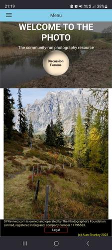
    Sorry that was not clear maybe. A picture is worth a thousand words as they say, so the dprenewed front page looks like this on my phone :
    Screenshot_20231113_211923_Firefox.jpg

    I see lots of sections (blue header with the menu, one picture with overlaid title, another picture touching it, a black footer), aggressive colors, a word-art style "forums" button...

    The designs by simplejoy I was referring to are, for example:
    dprevived.com/media/attachments/e6/15/fV6rifpSkiCOok7LMNsLTJLvZWRLC41kLG1wtZtf8pi9HVbxUPqef9nLxrB2lrB7/dprevived-landin.jpg

    This is much simpler and cleaner, the logo is plainly visible but not overcrowding, the menu is better integrated in the picture, the button style is more modern, and most of all I feel like the picture is more prominent. But, as said before, this is just another photography website.

    And again, what I feel was the most attractive to me at dpreview, was some users (I remember one going by the name of Sabrina, sorry for forgetting the others), providing some of the best, most constructive comments I have seen about others' pictures. Something very hard to find in a local photo club for example. Having and featuring some users like that is extremely valuable, probably even more than editorial content (although I also love good lectures given by good photographers) or award winning photographers only using the site as a display/advertising place.

    Best,
    Benoit

    Screenshot_20231113_211923_Firefox.jpg

    JPG, 1.9 MB, uploaded by s1ptome on Nov. 13, 2023.

  • Nov. 13, 2023, 9:45 p.m.

    Benoit, you are comparing a phone picture to a desktop picture. They will be different. I will be looking at the phone side of things in the next few days.

    Alan

  • Nov. 14, 2023, 12:12 p.m.

    I've played with the different views (phone & desktop). Have a look now.

    I've removed the big "forum" button - it was just getting in the way and played with sizing - also got rid of the footer from most of the pages. I like the 'comic sans' font for the menu. In SJ's picture, the menu background colour integrates nicely with the photo. But when you change the picture or look at opther pages, it then clashes or is hidden. So, for now, it's staying as white text on a blue background.

    Alan