Like lots of dramatic geologic features, Badlands can be great in both color and black and white. I have quite a few shots that I've done both versions of. Generally I found the sunrises and sunsets and those with animals or very colorful landforms in them were better in color, and those with contrasty lighting or particularly stark forms were better in monochrome. Some, especially with those big puffy white clouds and blue skies, were fun in both.
Feb. 14, 2025
53
-
-

Plenty in Europe too - Tabernas, Spain, Mylos, Greece, plus Cappadocia in Turkey all spring to mind, and lots of others. You often find villages names such as Malpas or Malpais, which is often a clue.
-

Nice to see the exposed bones of the earth ;-)
In the first, the red colour and texture are good with the deep shadows adding a touch of mystery.The last one has a lot of depth and a 3D feeling to it. we can't see the actual scale but I'm assuming the pillars are huge. If I fantasize a bit, I can imagine a scene from "The Lord of the Rings" taking place here, with the pillars swaying back and forth while our heros try to pass through ;-)
-
The water's surface must have been completely still to get that upside-down shot.
The only real give-away is the tin can floating strangly amongst the branches ;-)
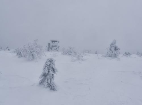
It has the typical appearence of that time of the year when winter is over, but spring hasn't really started yet; quite still, drab and just waiting for the wild flowers to burst into lifeIn the resovoir shot, the leading diagonal line to the tower is good. And the negative space, made by the still lake and mist, gives lots of breathing room for the tower.
In the last, maybe the stream has been called a "river of blood" at some time before?
-
Thanks, just ordered a "used - like new" copy of the David Ward book. I'll take a look and add it to my collection :-)
-

Thank you for kind words. I have an albom dedicated to Cappadoccia on Flickr. Here is a link if interested
flic.kr/s/aHBqjAJ8B1 -

Yes, color is indeed in deed in the eyes of the beholder. It is not that I don't like color photography. In fact in the late '70's to early 80's when I was teaching some classes at a local art institute, I taught both color and B&W. However, the staff would draw straws to determine who got "stuck" with the beginning color courses. Sometimes I lost. 🤣 Don't get me wrong, I like the color work of other people. I have seen some beautiful color landscapes. The work of Elliot Porter is exquisite.
However, me shooting color does nothing for me. I have always seem to "see" in B&W and find that color distracts from the underlying meaning and story or emotion in an image. I was never drawn to color for my own work. While during the 80's I did hang work in galleries in Baltimore and Denver, I did photography out of love for myself. I didn't have to do it to feed myself. If someone liked it and bought it fine, if not no big deal. When my real career became more demanding - photography became nothing more than a serious hobby. I did it for myself - not others and what I liked for myself is the abstractions that were attainable by stripping away the color. Or as Elliott Erwitt said, “Color is descriptive. Black and White is interpretive.”
Of course today production of a high quality color print is much less time consuming than it was in 1985. White balancing a print is nothing more than a slider on a screen. Color grading - a few droppers and sliders. Sometimes I have played around with some of my Z8 images to see how they look in color. However, I end up calling up Silver Efex and converting them to match what grabbed me about the scene in the first place. If a 28mm lens is the appropriate tool for a scene - I use my Q2M.
It difficult to change the habits of an old dog. So I will continue to enjoy the color work of others while I pursue the abstraction of B&W for myself.
-
Sounds like a good position to take :-)
For me, I like B&W shots, there are some scenes where B&W is the natural choice and the results just simply look better when “reduced” to monochrome.
There are of course many scenes that need colour to work at all and others where the colour itself is celebrated in the image.
One of the goals in photography is to emphasize different layers and/or make a subject stand out from an often “busy” background. There are several “tricks” we can use to make this happen and one of them is using colour. I’m a big fan of colour but I also like B&W shots. For me, I’ll use whatever works best. I like to say that I try to reproduce the reality that I saw out in the wild, and I’m happen to emphasize that experienced reality while post processing the images. Using B&W is one tool that can do that , but for me colour is usually part of that “reality” and more often used. -

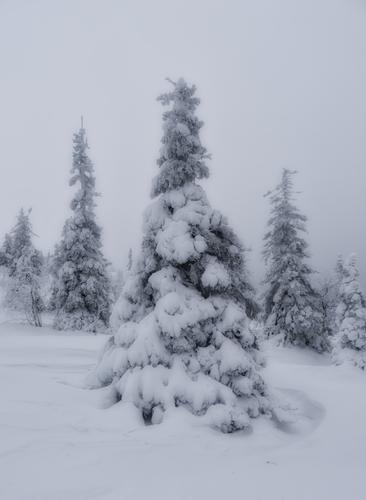
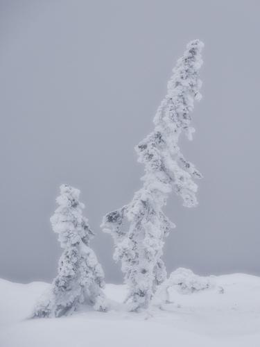
Back from my Lapland trip, shot tons of photos, it's landscape nightmare, wherever you turn there is photo opportunity, my moving tempo was 500 meters in 30 minutes :D Fortunately our group was all photographers so we had more or less enough time to take for shooting.
Here are first shots I've managed to process from first day climb to mountain, it was cloudy but still fun. Used DXO plugins to tune mood little bit. -
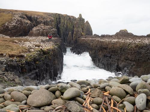
Bit hard to get overview or scale of this formation, but seems like for better shot drone is needed. Or Superman.
-
Sea and clouds, 2 constant changes. I like how rocks lead eye to center of image, under clouds.
-
I find it fascinating to try to understand how people see and how they visualise a scene, whether for photography or otherwise. Colour is often what draws me to a scene, though I don't go for 'colourful' in the usual sense. It's the subtle muted variations, particularly in colour triads, that attract me. I once came across the phenomenon of tetrachromacy, where people (usually women, it's linked to the X chromasome) have extra colour cones in their retina and hence have enhanced colour sensitivity. What does this 'look' like? On the other hand, my husband is red-green colour blind, and I struggle to imagine how he sees the world.
I enjoy other people's B&W photographs, and have been known to use it occasionally, but since it's often colour that draws me to a particular subject, that's usually what works for me.
+ for Elliot Porter 😊 -
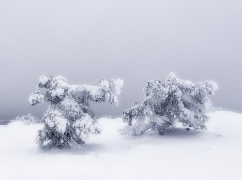
You've definitely captured some kind of interaction here! An animated conversation between aliens perhaps? The light is more interesting in this one than the others too.
-
The pillars are quite big. They're columnar jointed basalt on the northernmost tip of Skye. Here's a scale shot. Our hero didn't attempt to pass 😁
-
I love the work of Elliot Porter. He started out in large format black and while working with the New Mexico group, Weston, Adams, etc. His photo book, Elliot Porter's Southwest is a wonderful collection of traditional Black and White photography. www.amazon.com/Eliot-Porters-Southwest-Porter/dp/0030060133
Then of course as color film advanced he moved on to concentrate on color. I find Porter's color work exquisite. However, while I enjoy looking at his work I have no interest in doing it. I see B&W as an abstraction interoperation of what is in front of you which is what interest me. Color more or less is a documentation of the scene as is.Interesting point about color vision. Yes women are much more green sensitive. In fact many can pick out patterns of very subtile green on green that men will see as a single shade. A friend of mine and a retired Army Colonel told me one time that woman make better pilots because of this. There vision from the cockpit is much keener. That is especially true for helicopter pilots. Often times women pilots will detect threats and fly around when men would fly right over and probably end up being shot down.
Horses can see only blue and yellow. The natural state of a horse is like your husband, red-green color blind. Supposedly they evolved with keen vision in blue and yellow for survival as they evolved as a prey animal in the plains. Horses have very keen vision compared to people and much better vision for detecting motion. However, they can't see all colors.
The way I explain my personal obsession for B&W photography to my sister-in-law and some photography friends is to point out that I have a Picasso lithograph hanging on my wall and I would love to have a Dali hanging on my wall but given the size of his work, I just go down to the Salvador Dali Museum and tour from time to time. In my house not now or any time in the future will you find an Albert Bierstadt. If someone wants a color photograph I just point them to my wife - she does some beautiful work. That's her thing.
-
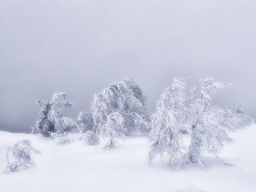
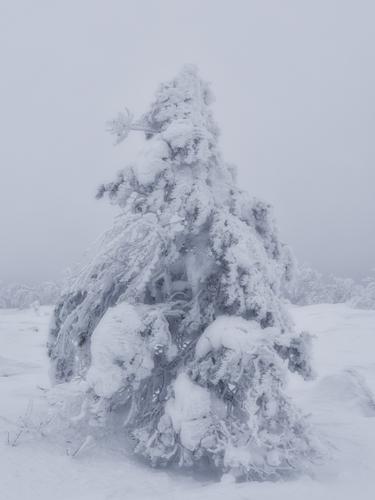
Looks like shots of some interesting "characters" wearing their heavy winter coats.
Must be a good place to visit!
The brightness of the 2nd one is so that the snow looks quite nice and white and the contrast in the shot looks good too.
Maybe it was your intention to make the others darker and more moody ? -
When I looked at these sculptures carved out from snow covered trees I think I understand from where these nordic myths came from, all these tales of Asgard, Niflheim, gods, trolls, dwarfs and giants. It's quite magic.
-
Well, these were my first processed images from this trip and I realized after posting that they don't work together due to different lightness, so once I have done initial processing I'll probably review results and maybe create 1-3 sets of landscape images and then process them to have similar appearance and can be seen as story.