Green is a tough color. It is the middle of the visible spectrum it can dominate and over power a scene. Green is not can impact color it can impact B&W, which requires different color filters often to contain it. I would agree the color version - the green is somewhat over powering. In the B&W its impact has been nullified a bit. In the color the eyes are drawn to the green in the middle. In the B&W the white flowers grab the eye and lead it naturally back to the pond, sand hills and then the light fluffy clouds in the sky.
Feb. 21, 2025
45
-

-

Lots of detail in the many leaves and plants when seen large. The edge lighting on the trunks picks them out and rounds the forms.
Quite beautiful. -
It took me a moment. At first I thought I was looking out through a cave entrance.
The unusual angle and framing gets interest and the cloud detail and storm colours complete the impact. Nice positioning of the weed/grass heads within the white cloud reflections. They give a focal point to the shot. -
For a relatively small membership list, I'm always pleasantly surprised at the number of Australians who hang out here. G'day Ron.
What are we looking at in your avatar? I'm guessing it's a submersible that can deal with deep pressures.Wonthaggi.
It's the structure I find I want to look at here. Textures, colours, angles and a possible story gor speculation. All the foreground doesn't feel as though it adds much, to me. The shot feels a bit underexposed, even allowing for the overcast sky. However, when we get closer to the building, the dark sky becomes an asset with an ominous edge appropriate for the wreckage. ie., I feel that the exposure would be fine if the image was cropped in close to the building -
I'm curious about the processing and would have thought this is a photo of a paper print. That seems unlikely as usually today, film images are scanned directly.
Is it a digital scan of a negative or a digital photo of a print?
There's the balance of dark, hard rock and contrasting fluidity that makes waterfall images a pleasure.
The foreground rock. The placement is good with the point slotting into the gap in the splash pools. I feel the rock is a little too bright however. Shape, size, position feel good in the mix with the splash pools but the brightness of the rock draws too much attention.
Edit addition. Just saw the comment from Fireplace with his similar thought about the foreground rock. -
The B&W version looks better to me. This could be because I'm not familiar with the landscape. In the colour version, the colours don't look right. There seems to be a yellow cast across everything. In B&W I don't have the problem and the composition emerges.
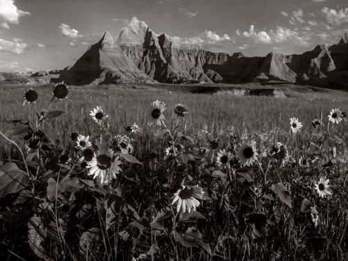
The sharp luxuriant details of the foreground flowers and foliage are set against the barren hills. The puffs of white clouds repeat some of the forms of the (now) white flowers. I prefer the clouds with the dak backgound to the clouds with the blue background. -

A lot has been said about this image already. I'm not sure i can contribute much of value, that is as always a matter of taste. In short, I like the B&W version better for very much the same reasons already mentioned. The black and white version improves the experience. Then I started to wonder about the balance between the back- and foreground. There is a lot of details in the foreground while the mountains in the background are a bit bland in comparison.
So, I gave the image a try in Photoshop. I was hoping increased contrast and details in the background should do for a more balanced and interesting view. Maybe the idea wasn't worthwhile, or I overdone it, you judge.!
-
This was taken in 1979 if memory serves me right on the old Kodak PanX on my Mamiya RB67 and developed in Rodinal 1:100. This was on a backpacking trip. Yes the RB is a heavy load on a three day backpack - especially since we climbed out of the Senica Creek valley up on to Spruce Knob and out along the ridge line. Spruce Knob is the highest point in West Virginia. In was fairly dark in the canyon. The light was coming in from over my right shoulder illumining the top of the falls, some of the face and the front rock. So although while the scene was on the dark side, the contract was pretty high - the reason for the Rodinal 1:100, long development and agitation for 10 seconds every two minutes. This version was scanned from film. Starting in the early 200's Epson came out with a highly capable flat bed film scanner that worked really well for medium format and larger format film. So I spent some time scanning a lot of my medium format and 4x5 negatives.
The exposure was several seconds. The beauty of highly dilute Rodinal is its ability to hold highlights. On the print, the rock required quite a bit of attention during in as did the top of the falls in the upper right corner. There wasn't a lot of room to take this shot. I'm backed up to the canyon wall knee deep in the creek taking this and it was a bit cold. 🥶 I had the camera angle low to get the rock in. I had other versions from a higher camera angle where I eliminated the rock. I liked the rock to give the image. I found that burning it in too much would make the whole scene "too heavy." The rock was light in color to start with and in the direct sun. So I decided to burn it in to show the delicate details which means it ended up at about Zone VI to VII.
During my time living in the Maryland/VA/DC area, we backpacked this area often. This was the only time, fate lined up with the brightness of the day, the angle of the sun when we were there and the water level all fell into line.
Truman
-
Thanks Truman. The detail you give here about adjusting developers and agitation because you understood the requirements of the image and exposure, were a trip down memory lane. I fondly remember the principles and charts but I couldn't have given the precise times.
I took a guess that you might have done a digital photo of a print rather than a scan on this occasion because when I lokked at the image up large there are small marks on it that look more like those I'd expect on a print not a negative. You probably still have bottles of Spotone and Marshal's on your shelves somewhere, -
Some where and when I looked at the image again on my monitor, I spotted a piece of lint that must have been on the negative that I need to "heal out." The one process I don't mess from the darkroom and prints is "Spotone." Capture one heal and clone brushes are much easier and a lot less messy.