Nature eventually reclaims what we build without constant maintenance. I wonder what the Earth would look like if humans disappeared from the face of it after thousands of years.
-
-
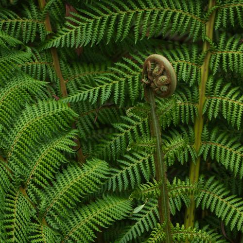
I love ferns ! My pick is the first capture.
-
I browse Rightmove nowadays, it saddens me seeing once upon a time beautiful gardens of many houses. We have such a short span of life, it is so cruel !
-
-
We are selling my childhood home at the moment. It has a huge garden that my mother cultivated right up until the end. We always had fresh vegetables for dinner, and in the summer, strawberries and other fruit out of the garden. I cannon imagine our new buyers will have the time and patience to take advantage of the garden.
-
@Daneland has written:
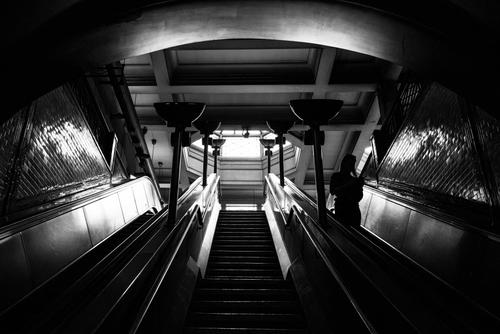
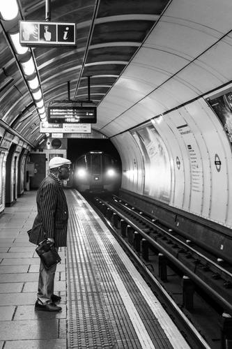
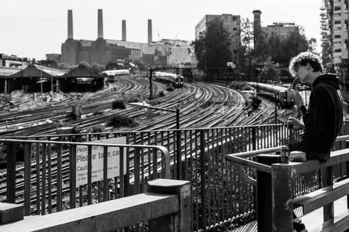
A few station shots. Nothing extraordinary. I collected many station shots, I am planning to publish a photobook. Has anyone tried it here before?
This is a nice cohesive set.
Regarding photo books. I often make Blurb books, when I finish a project, or just want a memory of a holiday. They are quite easy to make, and it it is an interesting exercise in making a large scale coherent picture story. Making a book is a really good way of improving your photography, as putting a large set of pictures together, that flow well and hang together is quite challenging. You will find you will probably have to specifically make some new shots to make the book work.
But they are quite expensive, and even if you are not interested in making a profit, I think selling them will be quite difficult in a hyper overcrowded market.
I make Ebooks using Book Creator. I use the free version, that allows 40 books. It is made for the teaching industry, but they have not twigged yet that I am an intruder.
-
@Daneland has written:
Like this one. Great curvy lines and verticals. Ah... the 21st century diet 😏
-
@SteveMonks has written:
On The Fells Above Mardale Head
When I visited Small Water Tarn last week, I was weighing up the feasibility of going further with the walk and continuing up the Nan Bield pass to reach the fell tops above. I felt this was still within my abilities, so while I've been off this week to celebrate that I've survived another orbit around the sun I decided to revisit Mardale Head and take another crack at it.
My plan was to follow a circular route, initially heading up to Small Water Tarn before continuing around the tarn and up to the top of the pass. From there, if I felt up to continuing, I'd head for the summit of Mardale Ill Bell and then on to High Street before finally descending via the ridge above Riggindale Crag which would take me past Blea Water, my 2nd tarn of the day.
I wanted to keep things light and the forecast indicated it would be dry all day, so I was going to take the X-T50 and my bag of primes. However, upon weighing the complete package of the X-T50 + 18mm, 23mm, 35mm and 56mm primes, I found it was actually heavier than my Z8 + 24-70 f/2.8S and even adding the 14-30 f/4.0S to the mix still gave me a comparable weight with the big Nikon kit. I do have the Sigma 18-50 f/2.8 for the Fuji which would have resulted in a much lighter kit, but I find the quality of that lens to be somewhat disappointing, so in the end, the Nikon kit was the camera of choice.
All images taken handheld and processed from single raw files in Capture One Pro 23. I think everything was taken with a CPL adjusted for reduced reflections and more saturated looking foliage.
An enjoyable read as usual. This landscape reminds me a lot of the Apennines.
Camera weight can be deceptive. Sometimes a FF setup can weigh less than a smaller format. I was surprised when I compared the weight of my Z7 +28-200 with an EM1 + 12-100. There are just a few grams between them. Have you sold the Z7, I would maybe prefer thai camera over a Z8 for hiking.
-
@NCV has written:@SteveMonks has written:
On The Fells Above Mardale Head
When I visited Small Water Tarn last week, I was weighing up the feasibility of going further with the walk and continuing up the Nan Bield pass to reach the fell tops above. I felt this was still within my abilities, so while I've been off this week to celebrate that I've survived another orbit around the sun I decided to revisit Mardale Head and take another crack at it.
My plan was to follow a circular route, initially heading up to Small Water Tarn before continuing around the tarn and up to the top of the pass. From there, if I felt up to continuing, I'd head for the summit of Mardale Ill Bell and then on to High Street before finally descending via the ridge above Riggindale Crag which would take me past Blea Water, my 2nd tarn of the day.
I wanted to keep things light and the forecast indicated it would be dry all day, so I was going to take the X-T50 and my bag of primes. However, upon weighing the complete package of the X-T50 + 18mm, 23mm, 35mm and 56mm primes, I found it was actually heavier than my Z8 + 24-70 f/2.8S and even adding the 14-30 f/4.0S to the mix still gave me a comparable weight with the big Nikon kit. I do have the Sigma 18-50 f/2.8 for the Fuji which would have resulted in a much lighter kit, but I find the quality of that lens to be somewhat disappointing, so in the end, the Nikon kit was the camera of choice.
All images taken handheld and processed from single raw files in Capture One Pro 23. I think everything was taken with a CPL adjusted for reduced reflections and more saturated looking foliage.
An enjoyable read as usual. This landscape reminds me a lot of the Apennines.
Camera weight can be deceptive. Sometimes a FF setup can weigh less than a smaller format. I was surprised when I compared the weight of my Z7 +28-200 with an EM1 + 12-100. There are just a few grams between them. Have you sold the Z7, I would maybe prefer thai camera over a Z8 for hiking.
No, trade in prices for the Z7 MKI are pitiful, so I decided to keep it as a back up in case anything ever happened to the Z8.
There's less than 200g between both bodies (including their respective L-brackets which I keep permanently attached), so I figure it's worth accepting that little bit of extra weight for the usability improvements the Z8 brings to the party such as improved responsiveness, a better user interface, better viewfinder, improved screen articulation and the real decider for me, the ability to display a horizon level and histogram at the same time.
To save a bit more weight I could have swapped out the 24-70 f/2.8S for the 24-70 f/4.0S, which is significantly lighter, but does hit the IQ a little bit.
The X-T50 is certainly a lot lighter on its own, but the X series lenses (particularly the faster ones) are surprisingly large and heavy, although I was still surprised that my collection of primes was more than heavy enough to outweigh the Nikon 24-70 f/2.8S which is quite a heavy lump on its own. It's a pity I was so underwhelmed with the X fit Sigma 28-70 f/2.8 for it as that combination is significantly lighter, but the IQ of those together is a clear step down (at least with the copies I have) in my opinion.
Of course, if I could manage the weight, I'd be lugging the GFX, its humungous lenses and a tripod around on these bigger walks, but I'm clearly no longer up to that sort of challenge these days, so it's a matter of being practical and finding an IQ to weight compromise that works for me and I was very pleased with the results from the Nikon combo on this trip and didn't find myself struggling too much with the weight.
-
@Wormsmeat has written:
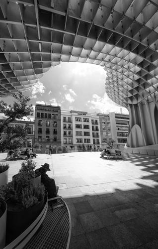
In the Plaza de la Encarnación is Metropol Parasol, affectionately known by the locals as 'The Setas de Sevilla' or 'The Mushrooms of Seville' are a structure and a tourist attraction and is the largest wooden construction in the world.
Some interesting shapes there, combined with wonderful tones.
-
@Woodsider79 has written:
Frond
New Zealand tree ferns at Logan Botanic Garden, Galloway.
I find plant photography really difficult, ferns in particular can look great in real life, but lose something when you photograph them. This one jumps out to me as the best composition, although it could have benefited from better light. It looks nice and sharp to me, although the serrated effect of the fern leaves gives them a fuzzy appearance when viewed as a whole. I get a similar effect to this when photographing pine forests, it can look like a blurry mess looking at the entire image, but it's perfectly sharp when you zoom in.
-
@Vahur has written:
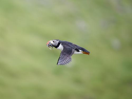
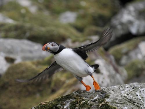
Nolsoy
Photos from/of Nolsoy island, situating near Tórshavn and easily accessible by ferry, taking 25 minutes ride.
Terrific puffin shots, particularly these two, the timing on the second one is excellent.
-
@NCV has written:
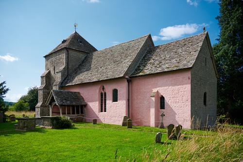
The one that got away
It is to hot and humid here, in my part of Italy right now to even think about going out and about. So here are some more from my holiday in the UK
I often use Google Maps to pre explore area where we are staying. I was clicking on a few likely monuments of interest, when I came across, this church, St Mary’s Church, Kempley, far from any village hidden, away down a country lane. What is remarkable about this Norman church is the fact that it is one of the very few churches in Britain, where you can see frescoed walls. They like many others were covered by whitewash during the Protestant Reformation, but the were rediscovered and uncovered in 1872.
Everything was shot hand held. My 24 shift lens works quite nicely with the Z7
Nicely done, particularly going hand held with a (tilt?)shift lens. This is a nice image of a fine looking church, although the pink paint job seems a bit gaudy and unnecessary. I can't imagine the Norman's painting the external stonework like that.
-
@Daneland has written:
A few station shots. Nothing extraordinary. I collected many station shots, I am planning to publish a photobook. Has anyone tried it here before?
On first viewing, this image struck me the most. I like the symmetrical framing here and the tonal range in use, leaving the highlights bright and resisting the urge to pull the shadows up, leaving them dark and forbidding.
@Daneland has written:I dismissed this one at first glance, but fortunately clicked through to see it full screen, I think it may be the best of the bunch.
-
-
@Daneland has written:
A few station shots. Nothing extraordinary.
I dunno, I think this has real merit.
-
@SteveMonks has written:
On The Fells Above Mardale Head
When I visited Small Water Tarn last week, I was weighing up the feasibility of going further with the walk and continuing up the Nan Bield pass to reach the fell tops above. I felt this was still within my abilities, so while I've been off this week to celebrate that I've survived another orbit around the sun I decided to revisit Mardale Head and take another crack at it.
I like the sheep shot, the 'thumbnail' really doesn't do it justice.
