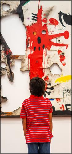
That's excellent! I love the effective use of the format which further elevates the face in the artwork and makes it seem even more menacing. The highlight is of course the continuation of the red color, absolutely fantastic! It's a perfect depiction of fear and how it affects us, while we're also eternally fascinated with it and can't look away... Really well spotted and captured.
-
-
Welcome to our weekly critique thread. We are thrilled to finally have a proper home for critique, something missing on the old DPR. Sounds like we have lots in common - we all value the activity of sharing photos and getting/giving feedback on them. It's how I learned photography in the first place, on this thread with its august 15 year history, and other similar sections on other photography forums, so I have a special appreciation for such. We are trying to make our activity work here in a different format, but without losing the qualities we value. It may look messy now while we learn the available tools, but we hope we will figure out a method to bring more order as we learn.
The single post with cascade of response method works well here in this new section. It's a perfectly valid approach to get/give critique. I participate in those threads too, and have thrown in my thoughts on some of your images there. But shared threads are also valid mechanisms. Bear with us while we try and tame the flat format. Thanks for sharing your response to one of the images in the thread, and we invite you to consider submitting one of your own. See for yourself what's different about it and what's the same. There's more than one way to skin a cat, as they say.
-
Sorry to all for being somewhat absent this week.
I have many concerns to take care of in real life.
But I am seeing that the thread is doing what it is supposed to do, i.e. to be a gathering to share images and thoughts, in which every peer's voice is equally valid.
Which means that there is no need for any single person to respond to every single image. That is as it should be.
And I am glad. -
Deleted
-
Thanks,
Rich
-
@camperjimk has written:
[quote="@Rich42"]
Boardwalk
Well-weathered and well-worn oak timbers in the Oceanside, CA pier in late afternoon sun. Texture and detail galore.
You should definitely revisit this are and take advantage of the length of this feature.
Thanks. I will.
Rich
-
-
@minniev has written:
Welcome to our weekly critique thread.
Thanks for sharing your response to one of the images in the thread, and we invite you to consider submitting one of your own. See for yourself what's different about it and what's the same. There's more than one way to skin a cat, as they say.
Thanks but I am not impressed with the jumbled format and I see no advantages.
-
SAD
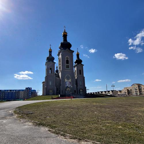
Cathedral of the Transfiguration is an imposing structure build almost 40 yrs ago by Steven Roman, local mining magnate . Mr. Roman, who arrived in Canada in 1937 from his native Slovakia, donated the land for the Cathedral, which he built as a beacon of religious freedom for his fellow Slavs then living under the repressive dominance of the former Soviet Union, without religious freedom. Construction of the cathedral began in early 1984, and the cornerstone and altar stone were blessed by Pope John Paul II during his visit to Canada in September 1984, marking the first time that a Roman Pontiff consecrated a church in North America. Václav Havel, the first president of a democratic Czechoslovakia, following the fall of the Communist regime, visited the Cathedral in 1990.
No expense was spared – It’s built with granite and marble, real gold gilded towers, it contains the world's largest peal of three bells, cast in bronze at the foundry of Paccard S.A. in the French town of Annecy. Real Casavant concert organ. Casavant Frères is a world-renowned Quebec company that has produced more than 3,000 organs since its founding in 1879. Floor Mosaics were installed by Travisanutto Mosaics of northern Italy. Etc, etc, etc.
But…it sits almost abandoned due to dispute between the Slovak Greek Church Foundation and the Eparchy for Catholic Slovaks of the Byzantine Rite in Canada led to the closure of the building in 2006. An application for public occupancy was filed with the City of Markham.
Once a public occupancy permit is granted, the Cathedral will be able to permanently open its doors to any Catholic congregation wishing to worship there. It will also be able to host concerts and other public events. -
@RoelHendrickx has written:
My entry for this week is (again) an older animal portrait: "Let Me Carry You There"
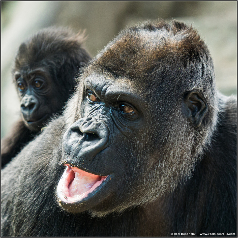
A gorgeous family portrait. An alternate title possibility: "Shut up kid, and pay attention!" I really like the lighting. There is just enough fill light coming from right rear to perfectly highlight ear and chin. If I had a nit, it might be slightly stronger with just a little more breathing room on the left side. But that's a very minor point, so if you want to keep the square format, then it's fine as is.
-
@RoelHendrickx has written:
The BREAD BIT portrait
@simplejoy has written:I got a kind of portrait as well (not really, but I love having a bit fun with my titles...) It's called: Bread Bit portrait

Bread Bit portrait by simple.joy, on FlickrIt is a focus-stacked shot made with a lens that was used in a film-scanner originally. It's processed of course but there is no Photoshop involved in the hovering effect. The bread square was probably around 1x1 cm in size. While the stacking is far from perfect, I'd still encourage you to look at the full resolution image on flickr, if you're interested to get a good look at the texture, which is often a main driver for me to get a closer and more detailed look).
Like you invited, I took a closer look by zooming in on the image.
But let me first tell you my general impression: it is one of admiration for the creativity to take a simple cube of stale bread and make it into a compelling, tight and suspenseful macro composition, by making it balance/hover on one tip and showing us an angle not afforded by nature.
It feels like a Houdini or Copperfield act in bread.
Zooming in closer, we get drawn into the minuscule openings and crevices.
And then micro quickly becomes macro: it feels like the surface of an asteroid, with holes that must be explored by our space ship.
I like it a lot.What Roel said!
I studied this quite a bit zoomed it. At first, I was just a bit confused by which bits were in focus and which weren't. Then after a while I concluded that for me the focus wasn't the point. It was the overall feeling of the tiny scene, held together by perfect lighting, that kept my interest. Nicely done! This shot makes me want to get more into macro work. Might even have made me hungry for some good bread!
-
@minniev has written:
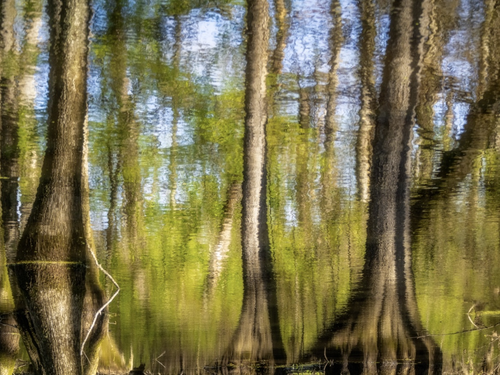
As Roel has mentioned, sometimes in these shared threads, a theme creates itself. This week seems to be heavy on creative capture strategies and abstract content. Though most of my photos are pretty straightforward, I sometimes dabble in oddities and one of them involves capturing reflections and turning them upside down. Some of you will recognize my swamp or what's left of it,
I'm getting a real Monet vibe here. The lighting is gorgeous and you captured the reflection very well. One small suggestion, you might consider a small reduction in the brightness of that stick in the lower left. It seems just bright enough to trap my eye. I'd suggest making it just slightly darker than it's reflection. That way it would blend into the scene, and help direct my eye unconsciously toward that brighter region in the lower center.
-
@simplejoy has written:
Bread Bit portrait

Bread Bit portrait by simple.joy, on FlickrIt is a beautiful piece really, cant take anything away from it, lovely composition, good lighting with excellent sharpness and details.
-
@RoelHendrickx has written:
My entry for this week is (again) an older animal portrait: "Let Me Carry You There"

I like it a lot but I do wonder how the shot would have been when processed somewhat differently, with a little bit less contrast and less highlighting.
Would have loved to play with the RAW but here goes
-
@MainlyMe has written:
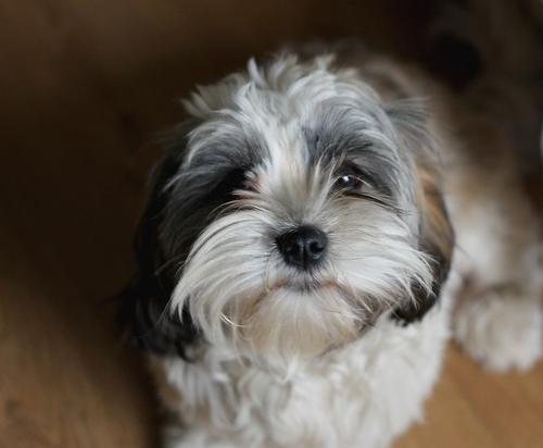
"Lady"
This picture goes back to 2007 when visiting a friend at the time.Cute little guy. Her nose and left eye seem sharp and the side lighting is nice. There are a couple of suggestions I might make. If this was a RAW original, you might have the leeway to lighten up the right side of her face (her right, that is) at least enough that we can see some detail in that right eye. Also, I'd suggest cropping out the white cloth on our right side. It commands way too much attention and distracts the viewer from what is important. Something like this, perhaps.
-
@MikeFewster has written:
The young viewer here is caught being an extension of the art he is viewing, as he and the abstracted creature on display participate in a face-off. His posture and the repeated colors tie him irrevocably to the art. Very well caught.
There is a connection in theme to Tinternaut's street scene.
-
@MainlyMe has written:
"Lady"
This picture goes back to 2007 when visiting a friend at the time.
Welcome to the Wednesday thread!
I was about to start commenting on this adorable pup when I saw Mike PDX's response and realized he was saying what I was thinking to say and he was actually showing it. Good capture and an edit that improved it nicely.
-
@MikePDX has written:@MainlyMe has written:
"Lady"
This picture goes back to 2007 when visiting a friend at the time.Cute little guy. Her nose and left eye seem sharp and the side lighting is nice. There are a couple of suggestions I might make. If this was a RAW original, you might have the leeway to lighten up the right side of her face (her right, that is) at least enough that we can see some detail in that right eye. Also, I'd suggest cropping out the white cloth on our right side. It commands way too much attention and distracts the viewer from what is important. Something like this, perhaps.
1) Unfortunately there isnt any RAW available as I shot it jpeg only, considering the few pictures taken that day to be mere candids. There wasnt much dynamic range to work with as the right eye is totally underexposed. To me personally it doesnt seem to take away much of the image but perhaps I'm not objective enough about it...
2) I thought about the bright area just before posting after which I decided to choose composition over the distracting element, even considered cloning it away but decided against it somehow, perhaps I'd should have.
Thanks for taking the time and trouble to provide me with these things to consider.


