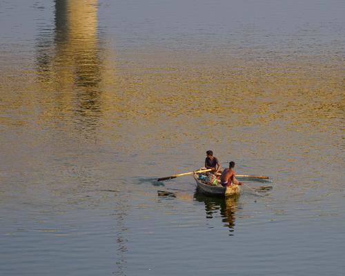
I like the scene, but I wish the man were doing something more visually interesting.
-
-
I like it. Both photography and fine art. All elements in proportion and nice use of negative space.
-
-
You mean, like this? 😉
[
]
-
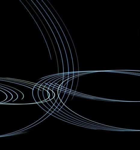
Looks very interesting and nicely balanced for a camera motion shot. I love the shapes and am both wondering what their source is, as well as how you got the motion so smooth. Excellent work!
-
Not what I had in mind, but you made me laugh our loud.
-
@simplejoy has written:
Looks very interesting and nicely balanced for a camera motion shot. I love the shapes and am both wondering what their source is, as well as how you got the motion so smooth. Excellent work!
Source is lights on a building. Motion is smooth because shutter speed was high and camera and lens inertia dominated the motion. Handheld. Shaken, not stirred,
-
@simplejoy has written:
I got a kind of portrait as well (not really, but I love having a bit fun with my titles...) It's called: Bread Bit portrait

Bread Bit portrait by simple.joy, on FlickrAah! This is a fine pin-up for Spongbob Squarepants ! :-)
Actually it earns lots of points for being such a creative subject, and immediately catches the eye. The lighting is well controlled and the choice of background is good too. I think standing the bread on a corner is an excellent choice, as it would be very static stood on a side, and its shadow would be much larger and create a dark base similar to the top, leaving the paler brown as a rather strange stripe in the middle. The out of focus or non-focus-stacked lower corners look a bit odd at first, but since they are relatively small and in unimportant parts of the subject, they dont really detract. In fact they actually blend into the background, which is an interesting side-effect.
You are right, it is worth zooming in and taking the spaceship ride that Roel referred to. Strangely enough the more you zoom in, the more the bread seems to turn to ice!
Pete
-
@simplejoy has written:
Great thread and 15 years is quite an impressive history - thanks for carrying that over and sharing your experience. I remember reading about a thread which started in a brand- or format-specific part of the forum but got opened to everyone over the years... if that's the history of this one, thumbs up for being open minded - I always appreciate that!
@RoelHendrickx has written:My entry for this week is (again) an older animal portrait: "Let Me Carry You There"
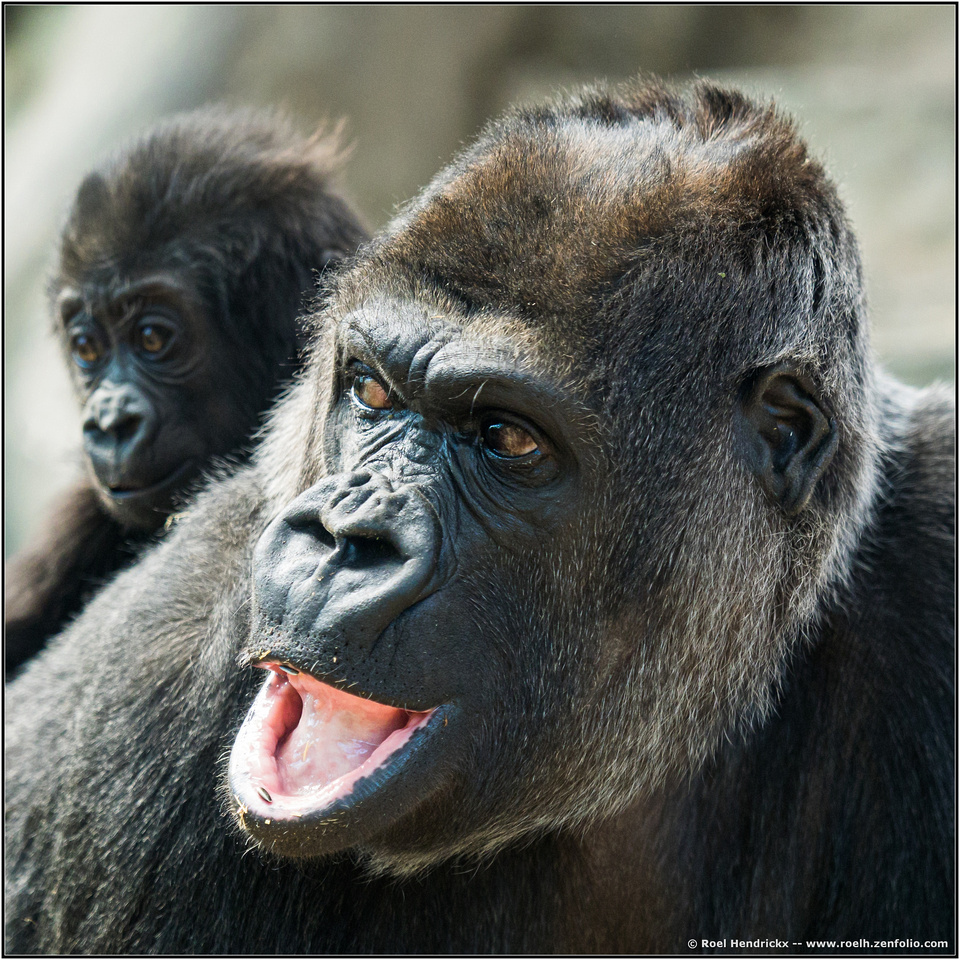
I have to mention that I don't know anything about animal-portraits, but I like the image - I feel like it works well in the square format (was it shot that way?), has nice diagonal lines and shows an interesting expression on the face.It reminds me of countless situations with one of my children on my back or arms, when I'm trying to make them aware of something potentially dangerous (like a busy crossing etc.) but get the feeling they feel safe enough to not pay any real attention to what I'm trying to tell them. 😂
I got a kind of portrait as well (not really, but I love having a bit fun with my titles...) It's called: Bread Bit portrait

Bread Bit portrait by simple.joy, on FlickrIt is a focus-stacked shot made with a lens that was used in a film-scanner originally. It's processed of course but there is no Photoshop involved in the hovering effect. The bread square was probably around 1x1 cm in size. While the stacking is far from perfect, I'd still encourage you to look at the full resolution image on flickr, if you're interested to get a good look at the texture, which is often a main driver for me to get a closer and more detailed look).
I like any "macro" image that isn't an insect. (So many macro images on these fora are those of bugs, ugh!) So I like this image.
But I do like it for its own qualities. As is almost always the case in macro-photography, a whole unseen world of texture and detail is revealed. The texture here, indeed is crystalline. Unexpected and fascinating.
How did you balance the bread cube on its corner?
Rich
-
@WhyNot has written:
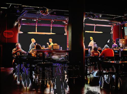
Lunch
Something a bit different …...
@WhyNot has written:… but let me know if you think this interpretation has a future ….
This treatment was definitely worth doing and has made something very attractive out of what was probably a very ordinary scene originally. The processing has brought out the chair legs etc in the bottom part of the frame, and they draw us into the picture towards the people in the background, who are almost on a stage against the windows
Pete
-
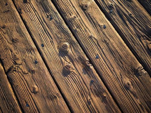
Boardwalk
Well-weathered and well-worn oak timbers in the Oceanside, CA pier in late afternoon sun. Texture and detail galore.
Rich
(Edit: I cannot figure out why the thumbnails and small display images of my uploads show with such a color shift and desaturation. If you click on the thumbnail or small display, the large image appears correct)
(Edit: Solved. Images must be in sRGB space only. This site has problems with Adobe RGB 1998 and ProPhoto RGB)
-
@tinternaut has written:
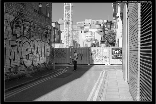
Spear Street.
This is good, but I have to agree with Jim, that it would be improved if the man was doing something more interesting. SimpleJoy's solution was pure joy, but I have another suggestion - remove the man completely. The human interest would still be there by way of the face on the wall, which would actually become more significant without the man. I like the way she stares down the street towards the viewer and I like the irony that the animate object in a rather sterile man-made surrounding, is actually man-made herself.
I like the (leading) lines - on the road, on the right hand wall, on the pavement, on the fencing, the crane, the buildings ... I also like the contrast between the two sides of the road - the neat, tidy slats on the sunny side of the street, and then the organic, chaotic grafitti on the shadowy side of the street.
Pete
-
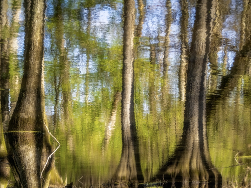
As Roel has mentioned, sometimes in these shared threads, a theme creates itself. This week seems to be heavy on creative capture strategies and abstract content. Though most of my photos are pretty straightforward, I sometimes dabble in oddities and one of them involves capturing reflections and turning them upside down. Some of you will recognize my swamp or what's left of it,
-
@simplejoy has written:

Bread Bit portrait by simple.joy, on FlickrIt is a focus-stacked shot made with a lens that was used in a film-scanner originally. It's processed of course but there is no Photoshop involved in the hovering effect. The bread square was probably around 1x1 cm in size. While the stacking is far from perfect, I'd still encourage you to look at the full resolution image on flickr, if you're interested to get a good look at the texture, which is often a main driver for me to get a closer and more detailed look).
What an intriguing and non traditional shot! The detail of the front edges is quite clear with every particle visible for a rich texture effect. There is softening in the back of the stack that seems more than a normal fall off in focus, a feature I've run into myself and don't ever know what to do with. It doesn't detract because it seems more artistic photography than graphic representation, particularly with the almost levitating posture your bread- bit has taken. Nice color and background. Thanks for sharing something that makes us look again! And welcome to this long standing tradition that's veered off on a new path and adventure.
-
@Kumsal has written:
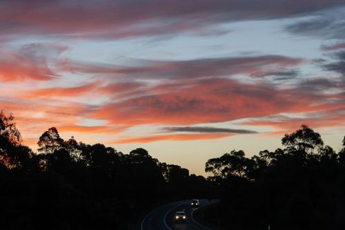
Sunset - Photographed from the passenger seat
Glad to see you found us here!
It's a very pretty sunset and I've many times had the feeling you must have had: a yearning for a beautiful pull-off with mountains or lake or even a field full of cows to set beneath it. But usually we just have to settle and you made the most of it, with the silhouetted trees and the road bending toward the viewer with a couple of autos full of people who are missing the entire show. The trees give a good contrast and the triangular space right above the disappearing road gives a nice platform for the most dramatic part of the sky. The colors are beautiful. I am not sure if there may be a slight motion blur in the trees on the right side, or if that is an artifact of the small viewable size, but it doesn't really hurt the image. I would clone out the tiny light stick like object lower right.
Quite nice. And peaceful.
-
@PeteS has written:
I have another suggestion - remove the man completely.
I'd go for that. Content aware fill to the rescue.
-
@WhyNot has written:
Lunch
Something a bit different …...
Noting some movement away from reality in recent posts to C&C I offer this idea … I ran across this in my files while looking for something else and it had been shown in a different Thread on DPR last year. ..
The picture is not an accident!!.. This is Version 6 according to the title I have but I am not sure I have many of the other versions ...Since this has been moved to a backup file I no longer have the PP layer files that would tell me how I did it (but I think I could give reasonable try.) …. This was just an idea that I thought I would like for certain interiors and night pictures but I didn't see much future for it during the COVID pandemic so it went no further … but let me know if you think this interpretation has a future ….
WhyNot
BTW .. A little confused by this new sub forum .. I think you're still encouraging using this thread for displaying this week's entries. But it appears some posters are creating singles entries.... Do the rules here apply to those entries???? Or are they treated like DPR entries that included C&C in the title??? The “Weekly ....” has moved to a sub-forum which is treated as the original Thread it seems to work a bit more awkwardly than DPR but so far so good .. That community seems to be gathering there ... You're a bit more ambitions and I am interested in how it all turns out .. then again maybe the threaded view will show up!!!
Yes, we have had some really creative captures and presentations here. I jumped into that theme this week too.
I like it. There's an almost cartoon-ized look to it but not quite. It's pretty graphical with dramatic simplification of the people and the scene to shapes and exaggerated colors that imply what we're looking at but we have to imagine the detail. The scene might have been less interesting with the detail provided for us. I can't begin to figure out how you got here, but I'm curious, especially about the light globes that turn up in unexpected places. The one on the leftmost patron renders him kinda scary but so be it.
We are still learning how to wrangle our project into flat view. We took the step of moving it into a properly designated section but we are not ready to give up on the shared thread concept. Still hoping for threaded view. But it is a work in progress, and we welcome suggestions. The rules of our thread are still just that: rules for the thread, at the top of each week's launch post. Alan used some of our language when setting up the rules for the section as a whole, so they are similar but not exact; they are locked at the top of the section. Individual entries outside the thread are fine, and there are several. They draw their own participants and have a longer shelf life than the weekly thread which starts, runs and ends in a set time frame. Try them both and see what you think?
-
@JimKasson has written:
A little fun with camera motion.
It is a bit of fun. It has elegance and rhythm like a piece of music transcribed to light. A fine abstract piece of art regardless of how it was done. It's one of those things that would be fitting to matt and frame in one of those all white-and-chrome rooms you see in ads. I like that all the "strings" exit the frame, some on each side. I think that gives balance. The confluence is situated in the general vicinity of the thirds intersection which helps with visual perception. Lovely.
I am curious as to what the light source was and how you controlled its path.
