• Members 1589 posts
    April 13, 2023, 8:28 p.m.

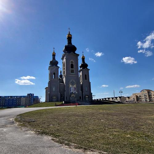
    A beautiful historic structure with a fascinating history. Hope they can eventually get it accessible. The first image (though it is not showing up in thumbnail display the larger version is beautifully rendered). It's taken from an appealing architectural angle, with clarity of detail and color. The second, a wide angle distance shot, gives us the full view of the same building from afar so that together they tell the full story. The second image looks to be underexposed considering the extreme brightness of the sky. It might hold up to some shadow brightening that would reveal more of the shadowed front of the structure. If I was at home with my computer I'd download it and see what I might do with it, but I'm away and using a phone so I'm sure I'd make a terrible mess of it.

    I'm curious what went awry with the upload of the first image? Do you have a theory why one showed up and the other was "broken" in the thumbnail display?

  • Members 1662 posts
    April 13, 2023, 8:44 p.m.

    I fully agree with that take! Love the painterly, dream-like vibes and I feel like the framing is excellent - well done!

  • Members 252 posts
    April 13, 2023, 8:46 p.m.

    Thanks both.

  • Members 711 posts
    April 13, 2023, 9:10 p.m.

    I looked at this image for a minute or so, never noticing or being distracted by the white cloth. We capture most images that have nothing to do with any compositional "rules." They just exist as they are and are wonderful for that.

    I don't think the image needs to be cropped at all. There's nothing distracting in it. It's quite pleasing, even beautiful. Suggestions to crop away the "distracting" elements are "camera clubby" type advice, adherence to some strange rules that such organizations promote. And get amplified on the Internet.

    You obviously liked it or you wouldn't have posted it. I like it, too. Don't mean to offend anybody, I like it just as it is.

    Rich

  • Members 1266 posts
    April 13, 2023, 9:47 p.m.

    Thanks for comment.
    I have reported the case to Bob in admin, apparently if you are NOT logged in and just viewing you can NOT see the first pic, for some unknown reason (system issue?). However, if you are logged in you can see both pics with NO issues. Technology/software/other!?

  • Members 1589 posts
    April 13, 2023, 9:48 p.m.

    "Things To Consider" is a perfect response! Always know that anything any of us say here is suggestion based on individual experience and opinion. We all give each other the best feedback and advice we have with the best intentions, but the final choices are up to the photographer. Since there are no photography classes or camera clubs or where I live, I learned much of what I know photographically from forums and the people I've met there, by taking in all ideas, distilling them through my own intentions and revising when I get an idea that I want to incorporate, or sticking to my original when I want. Mostly, giving and getting feedback just prods me to think my way through an image.

  • Members 54 posts
    April 13, 2023, 9:49 p.m.

    No offense taken, by me at least. There is clearly more than one way for a viewer to approach a photo. The fact that we can express differing points of view is one of the strong aspects of this ongoing thread. I would say that my comment about the white cloth being a distraction is based on my coming to realize that my eye usually goes to the brightest spot of the photo, which is I suspect not what the maker intended. Your eye may be different.

  • Members 1589 posts
    April 13, 2023, 9:59 p.m.

    I am logged in ( I have run into that problem before), even tried logging off/back in, can see photo #2 but #1 is the infamous broken paper clip. Both show up as attachment icons that when clicked, enlarge properly, so the photos are "in" the forum system. I understand the not-logged-in error but this is puzzling to have one photo that shows and the other not. Are they about the same size? Glad you reported it, I'm sure they will sort it out.

  • Members 1737 posts
    April 13, 2023, 10:31 p.m.

    I'm logged in and can't see the first image.

  • Members 1416 posts
    April 13, 2023, 10:45 p.m.

    I don't mind camera club advice and general rules. They develop for a reason that is generally sound. However, and it is where discussions like those we have here can be really valuable, some of the most interesting photos are those where the "rules" get broken and the surprise of that gives life to the shot. In this shot, the cloth to the right doesn't bother me, but it does change the way I respond to the image. With the cloth in, we feel the domestic setting. Without the cloth, the emphasis is all on the cute face and the dog could be anywhere. It isn't only brightness that controls our eye movement. Sharpness does it as well. Here, the relative sharpness of the fur ensures that we don't give too much attention to the cloth. More detail in the dog's right eye would have further helped the balancing away from the cloth. But I'd keep the cloth as I like the domesticity it adds. It isn't that one view is correct, merely that they change the interpretation the viewer brings. Only the photographer knows which interpretation they were trying to give. The viewer can simply say how they see it and why.

  • Members 1416 posts
    April 13, 2023, 10:59 p.m.

    One of the things I enjoy in photography is that it makes me look and notice rather than looking and not really seeing. Macro photos in particular do this and we see the magic in the mundane. Your bread shot is a perfect example. It provoked me to go and look at the cut loaf in my cupboard. Stacked images are perfect for this. I looked and looked again. You succeeded.

  • Members 1416 posts
    April 13, 2023, 11:02 p.m.

    Thank you Simplejoy. You opened my eyes to my own photo. I hadn't seen the face as "fear" but of course it is.

  • Members 1266 posts
  • Members 1266 posts
    April 13, 2023, 11:31 p.m.

    I rest my case. Let admin resolve it. Tx

  • Members 54 posts
    April 14, 2023, 3 a.m.

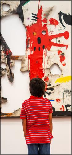
    I'm usually not much of a fan of tall/narrow vertical framing. But in this case, it works perfectly. I can't imagine this shot with any other crop. you have perfectly aligned the boy with the art until they have become one. If you were going for a menacing look, I wonder if it might look even more menacing were you to tone down the whites and highlights. Just a thought...

  • Members 1416 posts
    April 14, 2023, 4:22 a.m.

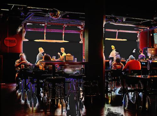
    I certainly think the technique is worth exploring but I don't feel that we are seeing its potential with this image. I can't see what the technique is adding to the particular subject matter of the shot. Lunchtime in a bar with the image split into two. The one interpretive direction I can find is linking "Maker's Mark" with a statement about lunchtimes. This feels too tenous. I can imagine the technique adding movement and impact to something like a high energy dancefloor however.

  • Members 1416 posts
    April 14, 2023, 4:33 a.m.

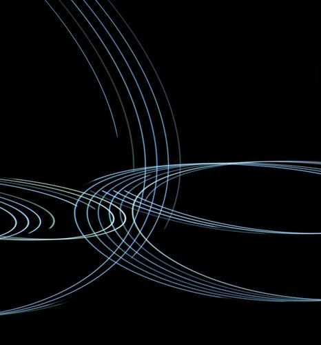
    Jim, you sure enjoy playing with a camera. Another shot that has me asking "how" as much as "what."
    Let's stay with the "what."
    To me, the image visualizes music. Notation lines swirl. They get louder and they diminish. They cross and create harmonies.
    This would make a great album cover for a string quartet.

  • Members 252 posts
    April 14, 2023, 5:50 a.m.

    I do like it just as it is yes, exactly how it is. After contemplating the suggestion and seeing the cropped version again I feel like that would have ruined the image for me. I'm glad you see it the same way as I do as I consider myself to be kinda prejudiced about it, the image my own and having more affinity with it because of the memory.

    Thanks for your input, appreciate it!