I get a distinct feeling of infinity here.
It looks like a setting for an action set piece in a sci-fi movie about a dystopian future society.
-
-
@OpenCube has written:
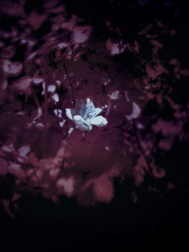
Trying a few different ideas rolled into one here. Would appreciate any thoughts.
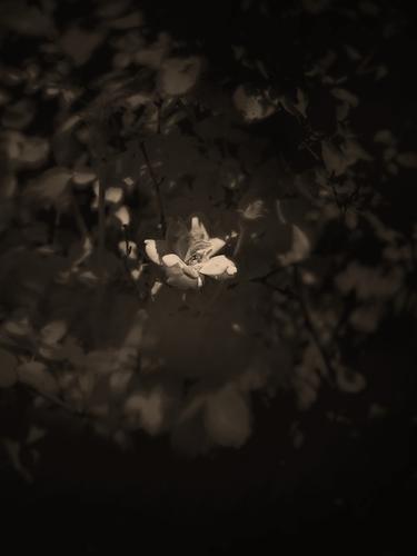
I will confess that I'm finding it hard to like this one once I get past the pretty white flower. The color of the blurred parts is a put off for me, but I have a dislike for purple and magenta so I may not be a fair reviewer on this one. This may be a matter of personal taste, but I found the image more pleasing when I desaturated it and applied a LUT. Then I find I like it quite well and can appreciate the symmetrical blur that becomes part of the composition, leading the eye in a circular pattern around the well defined flower.
-
@OpenCube has written:
Trying a few different ideas rolled into one here. Would appreciate any thoughts.
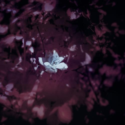
I very much like the idea and the limited colors! Cropping to a square gives me more of a feeling of being fully enveloped by the soft foliage.
-
@minniev has written:@OpenCube has written:
Trying a few different ideas rolled into one here. Would appreciate any thoughts.
I will confess that I'm finding it hard to like this one once I get past the pretty white flower. The color of the blurred parts is a put off for me, but I have a dislike for purple and magenta so I may not be a fair reviewer on this one. This may be a matter of personal taste, but I found the image more pleasing when I desaturated it and applied a LUT. Then I find I like it quite well and can appreciate the symmetrical blur that becomes part of the composition, leading the eye in a circular pattern around the well defined flower.
I don't think the desaturation is an improvement.
The purple hues do not bother me. They create a mournful atmosphere. The flower comes to represent a slice of hope in the midst of grief or mourning.
It is not an upbeat image and the colour treatment is odd (like the church previously), but it forces me to think.
It tells me that realism is not the alpha and omega of photography.
I still would not buy any of the two images to hang on my wall (or accept them as a screensaver on my computer). But they are at least interesting. -
@simplejoy has written:
Another macro image, titled "How'd you get into the bottle, cap?"

How'd you get into the bottle, cap? by simple.joy, on FlickrIt was shot with a Steinheil Optronic lens (no focal length mentioned, but it might be around 50-60 mm and it has a maximum aperture of f/2.8). This simple triplet lens was used in a so-called Oscillophot, which was a camera meant to capture images of an oscilloscope. Doesn't make any sense? Well, wait until you hear about some of my stranger lenses. 😂
Why would you adapt this thing, you ask? Here's another image, but just meant to show some of the bokeh-qualities (or probably lack thereof in many people's eyes 😉) of this peculiar piece of glass:

Wide open by simple.joy, on FlickrSo please don't go and criticise the lighting in this one... 😱 of course there had to be some compromises.
Both have a strange, surreal, dreamlike quality.
The second creates the impression of the bottle cap being hurled into the air by a stream of bubbles.
The first reminded me a lot of M.C. Escher, the dutch graphic artist, with his impossible constructions.
The cap seems inside the bottleneck, but simultaneously outside of it.
So Escher or maybe also Möbius.Both present an odd view and a photograph that is quite different from the kind of realistic documentary photography that I usually prefer.
But like Jim Kasson's guitar, I am intrigued and forced to reconsider my preferences and that is good. -
@Bryan has written:
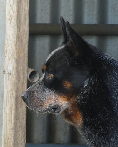
Australian Cattle Dog (Blue / Red Heeler)
I would have preferred a different background, but then again these dogs are often found on farms. Cropped to remove an over exposed light coloured wall to the right.
How many different emotions can you see in his eyes?Yup, the background does you no favours.
I don't mind the actual background, but I am bothered by the round shape of the pipe pointing in our direction, but it is such an attention magnet that I don't even see the dog's eyes anymore. Your description had me look at them, but I had to forcibly concentrate to see past the pipe. -
@WhyNot has written:
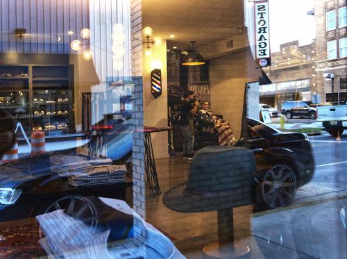
Ambiguity
or maybe a shave and a haircut ....
WhyNot
I do like images that are like puzzles.
Images that combine planes of glass, mirrors, reflections, shadows, ghosts of other sideways reflections etc.
When done well (i.e. when the components work harmoniously together) they create a feeling of 1+1=3.
I can't say that this one will enter into the pantheon of my all time favourites, but it is not bad.
Maybe not 1+1=3 but 1+1=2.50.
And that should be good enough. -
@Rich42 has written:
(Also posted in Medium Format forum)
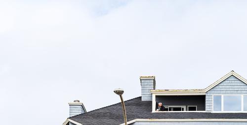
The odd proportions of house and sky must certainly be a conscious choice, but I am not really on board here.
And I was wondering why that was.
I can't come up with any other explanation than the fact that I subconscously know where the man's feet are, respective to his upper body.
And then it may sound odd, but I feel like his (invisible) feet are really too close to the bottom edge.
And no, that is a DIFFERENT thing than just saying that I wanted to see more of the house.
It's the shape and size of the person that throws the balance off, for me. -
@minniev has written:
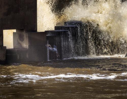
Aiming for the Portal
A few dam birds are back, but it's not crowded so there isn't as much confrontation going on, sort of like a new photography forum, except that confrontation is not much fun on a forum and dam birds squabbling over perches is pretty cool. Trying out the new controls in LR that came out yesterday.
So glad to see the dam birds return, and not just to the dam, or to your photo-taking, but to our weekly gathering.
Your poetic compositions of light, water, spray, fragile birds and brutalistic concrete have always been a true highlight of our gatherings over on the previous site.
I am glad that the dam birds have found a new home and haven.
I look forward to seeing many many more.
The individual image?
A moment of magic frozen in time.
That sounds like a lot (and it is) but for Minniev that is just another day at the office. -
@MikePDX has written:
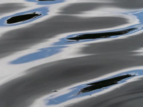
Abstract - Untitled
Another from my recent experiments with abstracts. This one is so abstract that I wasn't able to come up with a suitable title.
Well, from the photo data it is clear that you DID consider a title : "Pool of Uncertainty".
I think that does not speak much. It feels a bit like forcing meaning onto the viewer.
Untitled is better: let the viewer make up his/her mind.
For me, the image lacks a real handle, a clear point of focus or interest.
And oddly, the reflections make the water look hugely pixellated.
And I mean that in a mega way, not on the pixel level.
The way the colours get refracted really feels like the natural equivalent of pixelation. -
@LindaS has written:@Rich42 has written:@LindaS has written:
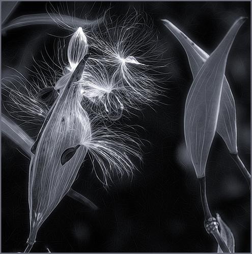
Great lighting. Interesting detail and texture.
Rich
Thanks very much. I've always been drawn to backlighting (or side light).
Hello Linda, and welcome.
Nice to have you.I am a bit late with my welcome, but life and work got in the way the past few days.
I am catching up, but thankfully Minniev has been the most loyal keeper of the fort (as she always is).We hope to see much more from you, because this first showing is utterly promising.
It is an IR-type conversion (interesting) of a plant macro.
Now, you must know that plants are usually not my main interest (cats are even worse).
But this one triggers so many associations.
I see strands of DNA revolving and trying to create life.
I see amoebes carving our their territory.
I see alien life forms getting ready to invade.
(This must be a reference to the "Alien" prequel "Prometheus" that is popping up in my mind, wherein the spores of alien parasites are inhaled and then wreak havoc on the host. Enough to create a lifelong phobia of pollen...)
Associations and references are good.
It means that the image gets my head spinning and my cultural juices flowing.
More of that, please. -
@Kumsal has written:
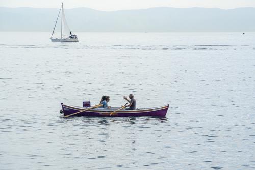
In the Sea of Marmara
A peaceful scene. Two boats passing (with the sailboat maybe a bit too close to the top edge?)
And the highlight and focal point of the image, is a human hand: an expression of expressiveness. -
@RoelHendrickx has written:
I still would not buy any of the two images to hang on my wall (or accept them as a screensaver on my computer). But they are at least interesting.
I wouldn't buy them either. :) These are "I need to see what happens when I try something" shots. Everything about the setup is wrong and not ideal, but it's what I've currently got to work with. The colors just sorta happen. It started ooc as a blinding red (so that part of the idea failed), then I tried some blue, did some b&w, weird blending techniques, and it just doesn't feel right no matter what. It became a matter of something bad is better than nothing good.
What do you think would have made it more upbeat? I had not even considered any emotional tone with the color, but your assessment feels very true, and because of personal reasons, perhaps I am subconsciously projecting something unintentionally.
-
@RoelHendrickx has written:
Hello Linda, and welcome.
Nice to have you.I am a bit late with my welcome, but life and work got in the way the past few days.
I am catching up, but thankfully Minniev has been the most loyal keeper of the fort (as she always is).We hope to see much more from you, because this first showing is utterly promising.
It is an IR-type conversion (interesting) of a plant macro.
Now, you must know that plants are usually not my main interest (cats are even worse).
But this one triggers so many associations.
I see strands of DNA revolving and trying to create life.
I see amoebes carving our their territory.
I see alien life forms getting ready to invade.
(This must be a reference to the "Alien" prequel "Prometheus" that is popping up in my mind, wherein the spores of alien parasites are inhaled and then wreak havoc on the host. Enough to create a lifelong phobia of pollen...)
Associations and references are good.
It means that the image gets my head spinning and my cultural juices flowing.
More of that, please.Wow, Roel, what a marvelous welcome! I had just finished reading your poetic response to MinnieV's dam bird (I've known her online since before her award and exhibit, so I've enjoyed the dam birds for many years). I'm delighted by your reaction to my seed pods! Looking forward to spending quality time with all you folks.
-
@ChrisOly has written:
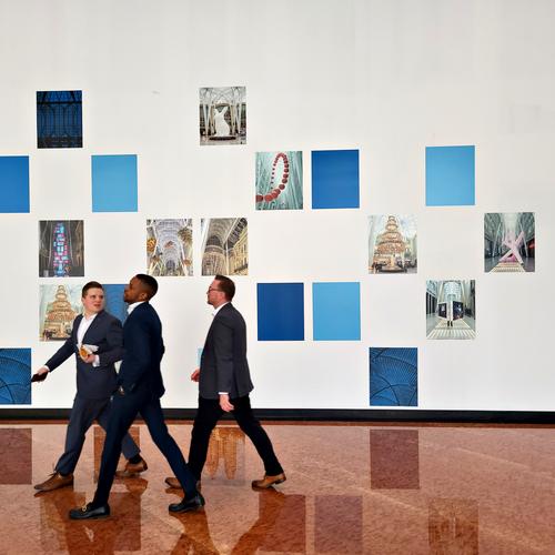
Lunch Hour
Great photo. The young men walking demonstrates energy, confidence and purpose. Although they are striding out of the image - the front fellow looking back into the image which draws your eye back into the image to the clean lines of the white wall and blue artwork that looks to be floating across the image.
-
Love those!
-
[quote="@RoelHendrickx"]
[quote="@Rich42"]
Condo ManRoel and Mike,
Thank you very much for looking at the image and the thoughtful critiques.
I should not have named the image "Condo Man." I realized that shortly after I posted. The title draws too much attention to the male figure. He appeared just as I was taking the picture, and brought some additional interest, but, in my mind the image is about the building. "Blue Condo" would have served better.
I saw the image as a collection of angles flowing from right to left. I kept the (visible part of) the building low in the frame to try for a minimalist look, tied in with the patch of blue sky at the very top, picking up the predominately blue hues in the shingles. Unfortunately, that tie in is much weaker (non-existent?) the way the image shows here. It is much stronger in Photoshop on my monitor. It's an issue of the original being in ProPhotoRGB color space and the forum effectively forcing use of an sRGB profile, which it then ignores and lets everyone's browser display the image as a presumed sRGB image.
It prints very well on matte stock with dye inks.
Again, much thanks for the feedback.
I like these threads!
Rich
-
@LindaS has written:@RoelHendrickx has written:
Hello Linda, and welcome.
Nice to have you.Wow, Roel, what a marvelous welcome! I had just finished reading your poetic response to MinnieV's dam bird (I've known her online since before her award and exhibit, so I've enjoyed the dam birds for many years). I'm delighted by your reaction to my seed pods! Looking forward to spending quality time with all you folks.
Hi Linda, I’ve also known Minniev for many years and I know ALL about her dam birds, their evolution, the award and exhibit.
In fact that is one of the most rewarding stories I have seen emerge from our 15 year long C&C history and it makes me proud with her. I love that woman although we never met in person.
A word of caution: regular participation in this thread can cause real (and not just internet) friendship. Just ask Mike Fewster.
I can say this now because he is defenseless, on his way by plane from Adelaide to Rome to go harvest south-Italian images.
