• Members 861 posts
    April 27, 2023, 9:10 a.m.

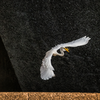
    My standards/feelings and others will never be the same, as such, just because I think a photo doesn't meet whatever lofty goal it had in mind, doesn't mean others think or feel that way. To me, that's kinda the fun of it all. It's always interesting to see others look at your work without all your biases attached. Maybe it helps you see or think differently. Maybe they can help you find something you can't, or inspire something to make the next one like this better. Maybe they can help you see a beauty your bias won't let you. I was just watching some video, and the guy told a story about doing portfolio reviews and he thought the one submitter was pulling his leg because "This has to be a professional messing with me. These are too good to not be professional work." Allegedly, nope, just someone thinking their work wasn't very good, when in fact, the guy was pushing him towards agents telling him he's ready now for bigger and better things. You're always your own worst critic.

    The image fails to me, in all the theories of composition and prep. Everything about this image could be better....but all I have is what I could get and of the 40 or so images that were taken, this is the one that was "best" by my lofty standards. Better to turn in a C grade paper and see what can be done better next time than no paper at all.

  • Members 1028 posts
    April 27, 2023, 10:59 a.m.

    The thing about your pic is that it makes me want to experience that view for real - I would feel at home there. I was thinking the surreal and the city as a title but the light and the trees mid distance blend with the hills and even the poles, wires and blacktop don't seem out of place. The soft border also adds to the effect.

  • Members 1464 posts
    April 27, 2023, 11:19 a.m.

    I'm curious exactly why you don't like it. Meanwhile I'll share what I do and don't like about it. I like the deadly sharp bird that is obviously the subject. I like the concept of the bird appearing only in the keyhole-like spacing between what appears to be the boards of a fence. I like the blurred background. I like the colors in the sky and foliage.

    I do not like the blurred fence and I am particularly distracted by the very blurred object between the boards, whether it is a leaf or a wad of paper, matters not at all. That I am blocked by it, and can't even tell what it is, makes this image inaccessible to me, so I mentally just move on rather than continue to try to decipher it.

    Blur can serve various purposes in an image, but when it blocks visual appreciation it can become a hindrance. It is very hard to make foreground blur work, especially when it claims so much real estate.

  • Members 861 posts
    April 27, 2023, 11:36 a.m.

    Because it fails in most aspects of design and composition. The idea of having this small area of interest be worth looking at that draws the viewer in is right....but everything else is bad. Position of subject is unbalanced. Background is rather boring and distracts more than adds. The extreme vignette is done to both draw the eye in, but also to cover up the giant jumbled mess of unsightly cords in the front of the image. The blurring is a natural occurrence of the lens, but I made it even more blurred to again draw the eye away from the mess and toward the bird. The critical focus was not hit - it is in other shots, but the bird's position was worse. This shot was the overall happy medium of its position between the post and overall sharpness. My positioning to shoot the shot was terrible. This was a shot of opportunity, so simply getting any shoot was a win unto itself, but it's still very far from well executed. And if you know anything about the Lensbaby Spark, then you understand how complicated of an opportunity this shot was. Very thankful I've set the G9 to fire like a machine gun.

    So yeah, we're kinda on the same lines of thinking.

  • Members 523 posts
    April 27, 2023, 11:43 a.m.

    Thanks Paula! The mishmash was what attracted me in that particular instance because I was looking for photos for a forum's theme of the week: Traffic Lights." :) I thought the warm toning gave a bit more of a welcoming feel to the empty street, as well as feeling more vintage - a time and place where cables and wires have not all been hidden underground.

  • Members 523 posts
    April 27, 2023, 11:47 a.m.

    I love what you've done! I'm always most inspired when I can identify with a scene as something I might see on my outings (as opposed to a shot from the top of a mountain, for example), and I question whether my creative eye (such as it is) would have made the wonderful leap that yours did.

  • Members 523 posts
    April 27, 2023, 11:49 a.m.

    Many thanks! I discovered that early Sunday mornings I usually have the "downtown" area to myself.

  • Members 523 posts
    April 27, 2023, 11:52 a.m.

    Thanks so much; I hadn't thought about the importance of the single vehicle, so I appreciate your mentioning. Shot early on a Sunday morning, October 2022. I have always been a morning person :)

  • Members 523 posts
    April 27, 2023, 11:58 a.m.

    Your expressive, detailed response leaves me speechless, Mike :) You've made observations I hadn't consciously considered, but that I hope I was thinking deep down inside. Either way, I'm very grateful for your comments.

  • Members 523 posts
    April 27, 2023, 12:05 p.m.

    Thanks Bryan. I have recently watched a few YouTube videos on Expressive Photography, with Scottish photographer Alister Benn. He makes a point to work with the weather conditions, which can be a fun challenge in itself. One example: too windy? Use slow shutter speed or in-camera-motion to emphasize that. Thanks for the conversation!

  • Members 523 posts
    April 27, 2023, 12:06 p.m.

    Thanks very much for your time and feedback!

  • Members 677 posts
    April 27, 2023, 12:10 p.m.

    Thank you.

    Rich

  • Members 1464 posts
    April 27, 2023, 1:21 p.m.

    Both of these, for me, are fairytale forests. The first is the dark domain of trolls and goblins, a dizzying and confusing maze of trees that might grab and hold you while passing through to grandmother's house, and keep you forever or turn you into a troll too. The second is the domain of more benign and jovial elves and fairies, creatures of light, with airy wings and gauzy garb. I like them both. The second is quite beautiful and would make a lovely canvas print. I have some reservation about leaving the distant middle trunk in the composition, and would not mind removing it in the interest of art since it is more in the artistic category than the documentary.

  • Members 1464 posts
    April 27, 2023, 1:27 p.m.

    You have made a Mondrian of a cluttered garage door. That is quite an artistic achievement. I don't think I would ever have found this treasure. What a good photographic eye you have! You've reduced the scene to the rectangular frame, isolating in good proportions the various forms: rectangles, vertical/horizontal/diagonal lines, ovals, and enriching the color/contrast/texture to help us see. Marvelous work.

  • Members 1662 posts
    April 27, 2023, 2:05 p.m.
  • Members 1464 posts
    April 27, 2023, 2:22 p.m.

    This is a nice architectural abstract, well composed so that my eye moves from the lower third left side entry, down to the middle lower border, then up to make the roller coaster loops before exiting the ride to notice the blurred background. The nice range of tonalities and their placement within the most interesting features of the image make it well suited to monochrome presentation.

    I think this is your first image here, and if so, welcome to the Wednesday thread. We hope you'll come back, share more images, and offer your comments on the wide variety of photos that pass through here every week.

  • Members 1464 posts
    April 27, 2023, 2:38 p.m.

    Having never been to Rome, I can't guess whether this is a classic view or not. I would recognize certain ruins and structures but I don't know the trees or road signs, so perhaps I'm the wrong reviewer for this one. I do have an appreciation for the image in terms of design, so that is where I'll approach the image from. There are three primary colors involved: green, red and blue, and the image is composed of a set of lollipop shapes, either green or red, of varying heights, set against a pleasing blue sky. The lollipop jungle forms a rough triangular composition because of the wide angle lens which forces the verticals to bend towards a central apex which the eye is bound to follow. The white lines on the red signs are punctuation in the story. It is a visually pleasing image with considerable clarity of form and color.

  • Members 621 posts
    April 27, 2023, 2:44 p.m.

    Thanks so much!