• Members 523 posts
    April 29, 2023, 5:02 p.m.

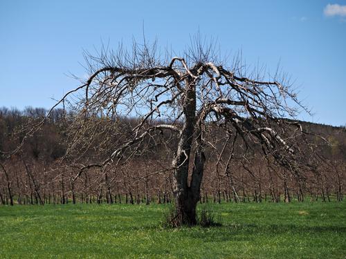
    A great example of how an image can speak to one person in a very different way as to someone else. In my case, I feel right at home with this one because I live in central-eastern Washington with its abundance of commercial fruit orchards. I believe what I'm seeing behind your giant are rows of trellis-style commercial orchards, which enable the most fruit per acre and the most efficent way of picking. The giant looks like it was pruned not long ago, so I wonder if it is still producing fruit.

    Happening upon a relic of "our grandparents' apple trees" (I'm originally from Maine) as I drive around the area, I'm always a bit saddened by the then and now. Thanks for this photo!
  • Members 1416 posts
    April 29, 2023, 5:12 p.m.

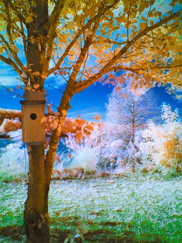
    Of the various shots you have posted OpenCube, I easily like this one the best. Even so, frosty conditions are conditions I don't understand. So, I think I am looking at frost on a glorious day. Perhaps I'm not? Blue sky, golden leaves, an animal (bird/squirrel/possom?) home, the greenest of grasses and all tipped with sharp white. The image is shouting with life. The critter box is located along the trunk/branch diversion line so it naturally becomes the object of our attention and this again makes a statement about this location and this moment as a place of life.
    An image that is satisfying to look at.

  • Members 1416 posts
    April 29, 2023, 5:27 p.m.

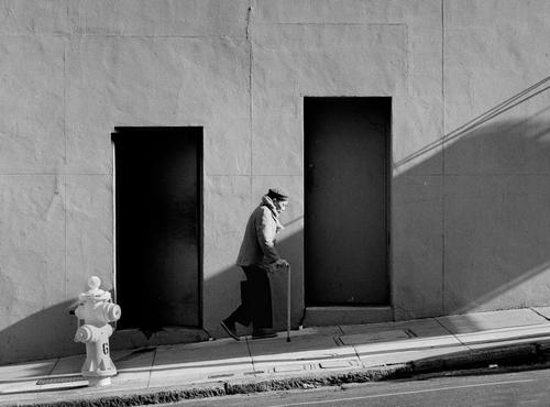
    I wouldn't have thought of the interpretation simplejoy has reached but I see what he means. It's an utterly valid interpretation of a memorable photo. I'm with Jim though on the fire hydrant. Great job in removing it but on balance I prefer it in. In it's own right, it becomes a balancing shape/figure however it is a little too bright and so it does distract from the man. Just cut down the highlight a little perhaps?
    In Spain in 1974 I did a photo of women waiting for a bride to pass. They were standing in front of large dark rectangular window shapes. Jim's image immediately reminded me of my shot.

  • Members 1266 posts
    April 29, 2023, 5:50 p.m.

    Thank you kindly for your comments.

  • Members 1416 posts
    April 29, 2023, 6:05 p.m.
  • Members 621 posts
    April 29, 2023, 6:51 p.m.

    I lightened the shadows a tad. Not sure if I think it’s better…maybe just different. I sometimes like crushed blacks…but I know some prefer otherwise, thanks for commenting.

    28FF6D69-4EDB-4C75-B207-9845D040E3AD.jpeg

    28FF6D69-4EDB-4C75-B207-9845D040E3AD.jpeg

    JPG, 146.4 KB, uploaded by TheDavinator on April 29, 2023.

  • Members 1093 posts
    April 29, 2023, 10:54 p.m.

    Your comment just reminded me of some desert shots I have seen over the years where the sky has a much deeper / darker blue than other places. Perhaps from the lack of moisture in the air?

  • Members 1737 posts
    April 29, 2023, 10:58 p.m.

    Revised edit, thanks to comments received in this thread.

    CA Street 1982.jpg

    CA Street 1982.jpg

    JPG, 332.4 KB, uploaded by JimKasson on April 29, 2023.

  • Members 861 posts
    April 30, 2023, midnight

    Lol. Balmly beautiful summer day photographed here. This is all the R72 filter and ACR/Photoshop pushing to get something more from my image. The "frosty" look is just slow shutter speeds since I'm working with an unmodified body.

    After I found a person with a space suit, I am desperate to use this setup to make some "exploring alien worlds" photoshoots.

  • Members 3983 posts
    April 30, 2023, 1:35 a.m.

    Thank you Chris. I'm glad you like it.

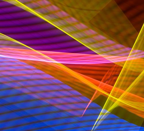
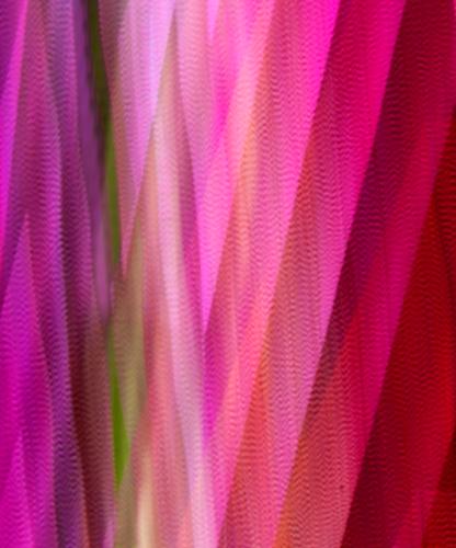
    For anyone interested, a few years ago someone in a forum mentioned the technique of twirling to create abstracts from a starter image. Some starter images work better than others.

  • Members 1416 posts
    April 30, 2023, 5:42 a.m.

    LOL indeed. I suspected that it wasn't frost but on the small screen I'm currently using, I couldn't check this closely. It doesn't matter. The image is still striking for the same reasons.**

  • Members 1416 posts
    April 30, 2023, 6:46 a.m.

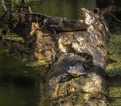
    The problem with the original image is that it is successful. This opens a Pandora's Box of discussion about what a good image is. It perfectly demonstrates why discussion of an image, the purpose of this forum, is so valuable when looking at photos.
    What do we mean by "success" here? I'd suggest that minniev has caught the camouflage of the alligators. That's "success" if the aim is to show this aspect of a natural environment image. Generally in an image we look for the photographer's skills in using differential focus, leading lines, variation in colour and tone to ensure we see a chosen subject. From a classic photography point of view, the image is not a success so we set about trying to adjust various aspects of the image to create success in photographic terms.
    I note this is part of a series minniev is doing documenting wildlife. In that context I'd leave the image exactly as is, possibly with a title referencing camouflage.

  • Members 1585 posts
    April 30, 2023, 11:06 a.m.

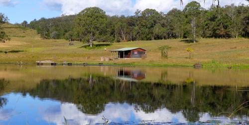
    It's a pleasant scene with nice colors and a lovely sky. There is some distraction top and bottom from intrusion of weeds or leaves hanging into the frame. The photo would be better without these distractions, whether shot to exclude them or whether "repaired" in post processing. They would not be hard to remove with PS or similar but cleanup in a parametric editor like LR would be tiresome. Any editor might offer some simple adjustments to contrast, light and color that might give you more zip in the photo without overdoing it. It would make a nice jigsaw puzzle!

  • Members 1585 posts
    April 30, 2023, 11:14 a.m.

    This is a visually pleasing and interesting image that forces the viewer to think a bit about what's you've done and why you've done it. It does appear to be a journey through the seasons, regardless of how you did it. There's the green grass of spring and summer, the brilliant blue sky, the fall foliage gently receding into the frosty looking trees in the background. Here is what is different about this one and some of your other recent posts: accessibility. There is nothing blocking the viewer's access to the various parts of the image: no jarring color, no object, no foreground blur. The path is clear. We enter state left to walk past the tree and there is full access to the rest of the image. When there is too much blockage and not enough enticement to get past it, we give up as viewers and move on, perhaps never noticing the one thing the photographer wanted us to engage with. With this one, you've created an open path with interesting things to consider as we move about. Nice work.

  • Members 523 posts
    April 30, 2023, 11:22 a.m.

    How delightful to learn that this was primarily created with an IR filter! I've seen an occasional fanciful result, but never one quite so engaging. Mike's and Minnie's observations helped further define how I felt and what I said to you originally. What a great group this is!!

  • Members 1585 posts
    April 30, 2023, 11:22 a.m.

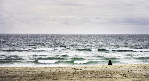
    This is a simply constructed but pleasing image with a Gursky-ish feel to it. The colors, contrasts and details are concentrated in the ocean layer which calls attention to them as the most important of the 3 layers. The human figure is well located within the frame. I wish more of him were visible, but it looks like that would have been impossible given the slope of the beach. You could get more out of the sky but then you'd lose the emphasis on the water, so I think you are correct in keeping the sky a supporting player as you did. Nice shot.

  • Members 1585 posts
    April 30, 2023, 11:30 a.m.

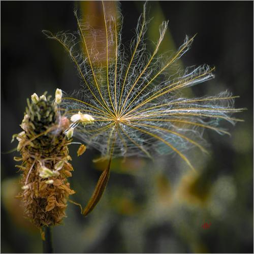
    What wonderful detail you have in the upper level of the fan-like structure! The color palette is subtle but effective and has a film-like feel to it. When I first looked at it, I thought perhaps it might benefit from a crop on the lower 1/3 but then I noticed the role that the supporting structure for the seed plays compositionally and I do think your choice is the better one, giving the seed adequate space and a good location at the natural entry point for the frame. I wonder how focus stacking would work for this? I'm not good at it but have seen enough of the work of more skilled photographers to imagine what it might look like. Regardless, a nice image.

  • Members 1585 posts
    April 30, 2023, 11:47 a.m.

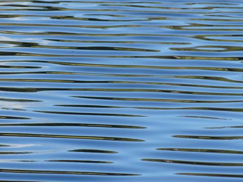
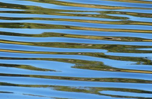
    I will leave the science of it to others more capable in that area, but will say I find these quite pleasing as abstracts just as they are. The colors are lovely, it is obvious that there is a reflection involving foliage and moving water, there is a sense of movement and yes, liquidity. MikePDX is a good one to advise you since he's been studying this kind of work and practicing it.

    I'd encourage you to experiment with different shutter speeds and focus approaches to try and get what you are wanting, but when on shutter speeds too slow for handheld, bring out the tripod and then go even slower. On sunny days you may need an ND filter to help with this, but you'll begin to learn what different settings do under certain lighting and wind conditions, on certain kinds of water. (My settings for a big nearby lake and for my swamp that has no flow are very different). I usually keep my camera on auto focus+manual adjustment in such situations as this, because auto focus alone may or may not do what I want. If the water is very still auto focus may do better than if the water is moving, and it behaves differently if there's clear reflections. Experimentation is your friend. But you're off to a good start with a couple of pretty abstracts.