All monitors are different too. Things look quite different on my ipad than they do on my desktop monitor, though both are Apple products.
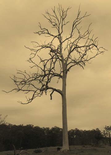
Of them all I like the newly minted lighter sepia toned version best. I know I am likely in minority because sepia is considered by many to be outdated now. I guess I'm probably outdated too so it suits me.
A combination of things that come together. I'm guessing that the framing of these shots comes from stitching a number of very wa images together and then not doing the usual thing which is to crop the combined images to give a straight edged rectangle? Your framing becomes part of each image. I feel that it works, especially in shots 1 and 3. In these two the radiating shadows stretch out into the curves of the lower edge of the frame and directly towards the viewer. The viewer is drawn immediately into the scene.
In the three, B&W does its usual magic with fine lines and there are plenty here. Positioning the bare branches against the clear background makes the most of them.
Number two is a little different. This time we don't have the strong lines reaching to the viewer. Instead your framing has created a stronger arch form that gives emphasis to the canopy of the trees. That's fine, it is simply calmer without the drama of one and two.
Normally, infra red doesn't appeal to me, it feels gimmicky without a purpose apart from looking "different." Not so with these shots. The IR has been used for contrast in images that are all about line.
I spent a long time writing a response to this and then lost the lot when my wi fi connection failed. Oh well....
A totally different subject but I am immediately reminded of a shot I posted here a couple of weeks ago of pylons and a dismantled pier. The lines of verticals work in a similar way.
A carefully selected position. A little to the left or right and the poles would not have created the pleasing patterns you caught here.
I don't think it is important for the viewer to know what is being looked at. The pattern with the receding lines is what counts. Repeating narrow, vertical lines convey dignity and solemnity. That's fitting for a crop whose work is done.
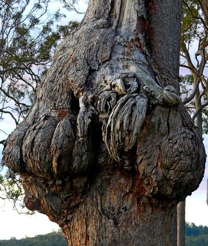
Oh my! A fascinating find, for sure. Do you have any interest in shooting this at different times of day and light? All sorts of creatures might emerge 😁
Fittingly, my wi fi keeps getting lost as I try to respond 😀 I added your P.S. to your first comments in quote here. I love your reference to solemnity being fitting for a crop whose work is done, as well as your additional comment. Many thanks for the feedback!
Agreed. It has to be viewed large to get the effect. I don't know how this was done- I imagine that some form of Van Gogh analysis/texture has been applied to at least one other image. This is where prior knowledge messes with how we see something. I can't put myself in a state of innocence and look at the image without a lightbulb going off in my head "Van Gogh.' I can look at a VG and enjoy it but when I look at this I see clever processing but I don't get much pleasure from the final image itself. How I would react if I had never seen a Van Gogh is an interesting philosophical and psychological question.
Wow, this one will require some study. My first impression is of a sculpted architectural frieze on a baroque period structure, like a civic building or cathedral. Looks like the paw of a giant cat, with some kind of prey in its grip: a skeleton hand? a dead swan? a tiny imp?
Perhaps you've given me a hint why I persist in liking sepia long after its popularity has faded: newspapers. I grew up in a newspaper family and spent many hours digging through the bound copies of the little county press, going back to the early 1800s.
I like your bare sepia tree. That lower limb could host a swing, or on the grimmer side, a hanging.
Very nice indeed. An unconventional portrait composition and it works. The diagonal corner line including the shoulder/arm moves from face to face and is the movement is assisted by the staircase. All look directly at the camera. The overlap unifies them and I for one, immediately took them to be siblings.
The fish in the plastic bag is very SE Asia. A pet going home. It adds personality and fun to the young faces.
Exactly as Minniev has said. Everyone needs to see this as a quality print. The centre tones may very well be perfect. Again, as Minniev has said, tonal subtlety like this can't be made out on screens and certainly not on the small traveling laptop I'm looking at now.
A further bouquet for the stem angling to the lower right. Perfect. A smudge of light to suggest no more than the line. The soft focus means we are aware of it whereas hard focus would have drawn our attention away.
*I prefer the interpretation by Rich. The smaller number of horizontal lines and especially the continuation of the lines as they bend around curves and make their way back, creates more interesting forms than the straight lines truncated at each end in the second shot. I'm glad that the second shot was posted, it made it easier to explain what I was liking in the first shot.
You need a good eye to see the possibilities for a photo in a mundane subject. I enjoy shots that make me look at the everyday and open my eyes.
Sometimes photos need words to give context. With this image Rich I feel that your text is superfluous. If it can be done, maybe let the viewer enjoy making the associations for themselves. *
I must have seen too many BBC costume dramas. With no hesitation I saw a rear view of a woman in a bustle. No correspondence about my mental state will be entered in to. Photography as fun and another shot where we acknowledge the photographer's sharp eye.
Jim says it just right. It is what I was saying less concisely about what I liked about his use of the framing technique in his posts from this week.
Applying it to Mike's shots here we can see the borders contribution to the various elements.
Example. Shot 2, the help break the image into two parts expressing totally different pleasures at the same beach.
Shot 3. The soloist gains stature of his own courtesy of the bends in the framing.
And so on.