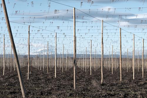
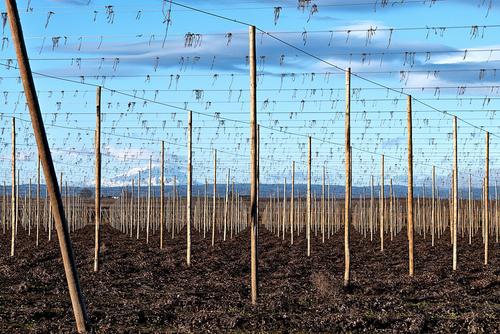
I meant to add in my previous comment this thought: I once had the privileged to have one of my photos critiqued by Vincent Versace. His comment was "Patterns are interesting. Patterns interrupted are even more interesting." I think that applies here. The leaning pole is the pattern interrupted. It makes me concentrate even more on the precision of the vertical poles and your carefully chosen camera position.
-
-
@RoelHendrickx has written:@JimKasson has written:@JimKasson has written:
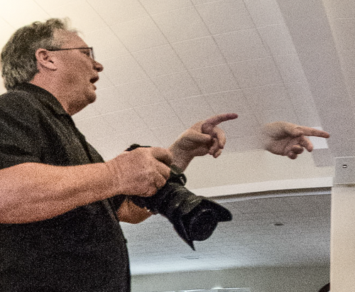
Also, conventional wisdom is that stitched panos don't work for moving subjects. As you can see, I don't buy that.
I like people who go against conventional wisdom, break the rules and make me look and think twice.
👏 YES and YES and YES! Thank you very much. I like that as well. I'm not saying that everyone has to do that, but when I see something which is out of the norm in a creative way, it can be very inspiring.
@JimKasson I love the floating hand in that picture. It's wonderful.
-
@MikePDX has written:@LindaS has written:
"Patterns are interesting. Patterns interrupted are even more interesting." I think that applies here. The leaning pole is the pattern interrupted. It makes me concentrate even more on the precision of the vertical poles and your carefully chosen camera position.
Totally agree with that - it's a great image and the leaning pole makes it even more interesting and impressive! Very well done.
Only thing I'd consider personally:
-
@simplejoy has written:
@JimKasson I love the floating hand in that picture. It's wonderful.
Thanks. When I do those fast handheld panos, I sometimes let some stitching errors remain.
-
@LindaS has written:@Bryan has written:
Around the corner
Oh my! A fascinating find, for sure. Do you have any interest in shooting this at different times of day and light? All sorts of creatures might emerge 😁
I read that as day and night. Answer for night is only if someone comes along with a big floodlight...
Then I saw day and light and thought typo. But now I am thinking that was your intent. Answer is yes. I have already revisited and got some sharper pics in a bit more light - also afternoon. But I have been struggling to get the highlight / shadow balance to my satisfaction (compared to the one above) on the latter ones. I am not masking, just full pic, as is my level of experience.
I often find myself shooting later afternoon in lower light (not by design - although I know it is one the golden hours). It was a problem at first but now I am playing with pp, I am finding some very pleasing tones. -
@LindaS has written:
AFTER THE HARVEST
Shot in 2017, re-edited a few times since. Feedback has often been about the diagonal pole. Your thoughts? Also, do you know what the scene is, and does knowing or not knowing add or detract from any possible interest? Thanks much!
The diagonal pole breaks what might otherwise have been a monotonous pic. The 45 degree view captures an evenly laid out structure as poles in successive rows are pretty much hidden - good job by the farmer and well spotted by you. I remembered the scene from my childhood as they are grown not too far from where I grew up, with the same high poles and wires.
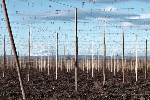
Seeing what SJ had done, I thought I might try and see what I could do with my newly acquired but minimal pp skills.
I boosted contrast and saturation and achieved about the same as SJ, but then took out a chunk of highlight and added a dash of shadow. If I may say I think it adds some depth to the view and brings the hills and mountain into relief a bit. -
@simplejoy has written:
...Totally agree with that - it's a great image and the leaning pole makes it even more interesting and impressive! Very well done.
Only thing I'd consider personally:
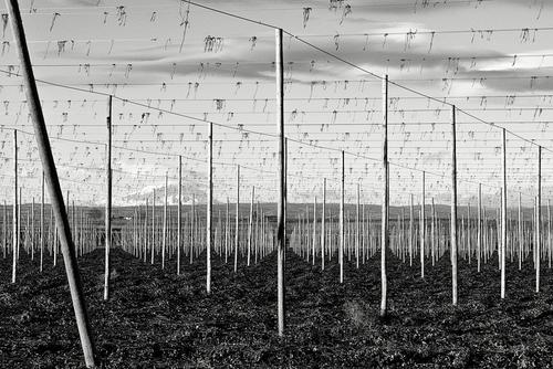
Thanks so much. With your color edit, you've added just enough pop to enhance, but not overwhelm. For me, the b&w would work a little better if there were no clouds or mountain - just the more graphical lines and ground. I very much appreciate your time and interest!
-
@Bryan has written:@LindaS has written:@Bryan has written:
Around the corner
Oh my! A fascinating find, for sure. Do you have any interest in shooting this at different times of day and light? All sorts of creatures might emerge 😁
I read that as day and night. Answer for night is only if someone comes along with a big floodlight...
Then I saw day and light and thought typo. But now I am thinking that was your intent. Answer is yes. I have already revisited and got some sharper pics in a bit more light - also afternoon. But I have been struggling to get the highlight / shadow balance to my satisfaction (compared to the one above) on the latter ones. I am not masking, just full pic, as is my level of experience.
I often find myself shooting later afternoon in lower light (not by design - although I know it is one the golden hours). It was a problem at first but now I am playing with pp, I am finding some very pleasing tones.Yes, thanks; you figured out my not-so-clear comment 😁 Different light...which for me would mean using the angle of sun - such as lower from the side - to help bring out textures or using shadows to define the shapes. This might not be possible with the location, time of year or other factors - including your own interests and goals. From your reply, it sounds like you've been able to achieve the details and tones you were looking for. Very gratifying!
-
@Bryan has written:
The diagonal pole breaks what might otherwise have been a monotonous pic. The 45 degree view captures an evenly laid out structure as poles in successive rows are pretty much hidden - good job by the farmer and well spotted by you. I remembered the scene from my childhood as they are grown not too far from where I grew up, with the same high poles and wires.
Seeing what SJ had done, I thought I might try and see what I could do with my newly acquired but minimal pp skills.
I boosted contrast and saturation and achieved about the same as SJ, but then took out a chunk of highlight and added a dash of shadow. If I may say I think it adds some depth to the view and brings the hills and mountain into relief a bit.Thanks so much, Bryan. Your edit makes the poles stand out sharply, even with the more detailed background. Sometimes I have a difficult time deciding on a "final" look, then I realize there's no need to choose. Print 'em all 😁
-
@simplejoy has written:@MikePDX has written:@LindaS has written:
"Patterns are interesting. Patterns interrupted are even more interesting." I think that applies here. The leaning pole is the pattern interrupted. It makes me concentrate even more on the precision of the vertical poles and your carefully chosen camera position.
Totally agree with that - it's a great image and the leaning pole makes it even more interesting and impressive! Very well done.
Only thing I'd consider personally:
Love the B&W suggestion.
-
@MikeFewster has written:
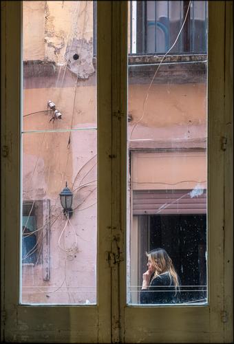
The verticals on this are terrific! The focus on the woman in the bottom right leads the eye in, and then the window frames draw the eye around the rest of the frame.
-
@minniev has written:
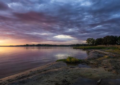
Sunrise Over An Ugly Shore
No iconic landscapes where I live, so I make do with what I find.
Looks like you make your own iconic landscapes, Minnie! The colors, the sweep of the land, the light-to-dark shading from left to right. I can’t see anything to improve.
-
-
@JimKasson has written:@simplejoy has written:
@JimKasson I love the floating hand in that picture. It's wonderful.
Thanks. When I do those fast handheld panos, I sometimes let some stitching errors remain.
I hadn't thought about this, but your note is interesting. "Hand held" is the key. Normally when stitching panoramas together a tripod is used and this results in close to rectangular stitching of overlapping frames and therefore the original exposures/composition are made with this intention. If the shots are taken handheld and without too much attempt to try to hold the camera as though it is on a tripod, there will naturally be a tendency to take each according to the composition seen in the individual exposure. When stitched, the black framing is likely to therefore support the dominating lines of each image, as it does in the IR images you posted.
I'm going to have to play with this. -
Another attempt at a B&W edit. I think it's another image where it might be beneficial to view it big. because the best thing about this lens is its biggest flaw: It is damaged to a degree, where it's sharp in the center exclusively, while the degrading image quality outside of it adds a lot of blur, far beyond the point a f/4.5 repro-lens would usually be able to. (I also suspect that it's actually faster than the claimed f/4.5 in the first place).
The image was created for the flickr group "Macro Mondays" where the weekly theme was "Swag".... not something I have a lot of, I suppose. 😐

Real swag, no cap by simple.joy, on FlickrShot with a Steinheil Repro-Objektiv 80 mm f/4.5 (love that creative lens name... 🤣).
-
@simplejoy has written:
Another attempt at a B&W edit. I think it's another image where it might be beneficial to view it big. because the best thing about this lens is its biggest flaw: It is damaged to a degree, where it's sharp in the center exclusively, while the degrading image quality outside of it adds a lot of blur, far beyond the point a f/4.5 repro-lens would usually be able to. (I also suspect that it's actually faster than the claimed f/4.5 in the first place).
The image was created for the flickr group "Macro Mondays" where the weekly theme was "Swag".... not something I have a lot of, I suppose. 😐

Real swag, no cap by simple.joy, on FlickrShot with a Steinheil Repro-Objektiv 80 mm f/4.5 (love that creative lens name... 🤣).
How delightful to realize what I'm actually seeing, after initially just assuming 😀
The ultra-sharp teeth-like row seems ideally suited to black and white. I can imagine hours of creative discovery with flawed lenses!
A sort-of related idea is a YouTube video I happened to watch just yesterday: www.youtube.com/watch?v=das4jtIAJeU
"How to Make Your Photography Imperfect (but beautiful)" -
@LindaS has written:
AFTER THE HARVEST
Love that shot. Simplicity always wins.
-
@minniev has written:
Sunrise
Excellent shot. Very atmospheric.
![[Group 2]-_D416891__D416901-11 images_0000-Edit.jpg](/a/thumb/32zGotPGtM4CouokfW9o7CowfsvV7bMQkMmzOmYzROsI6Mx5a9be2rPF2VJCmq7P/7728/?shva=1)
