This is a clever shot. The sporty cyclist in the foreground immediately catches attention, and his dynamism is highlighted by the contrast with the leisurely cyclist in the background. They both have their own cycling lanes and the different textures in the wall even gives each their own background. This helps separate the two cyclists and their styles.
The image shows two very different, but equally valid, ways to enjoy a bicycle.
Our eyes are usually attracted from cool colours towards warm colours, but in this case the red object attracts attention straight away anyway, that it doesn’t really need to attract it away from the small blue corner, but it is a nice touch anyway. Also the corkscrew line leads in the same direction, so the direction of “travel” is well set and it is a positive upward trajectory. The colours of red, orange and yellow are very dynamic, and since they are the colour of fire, there is a sense of danger too. I have seen other comments about a spaceship, so that has probably influenced how I interpret it, but in any case I enjoy its warmth and positivity.
@LindaS @minniev @ChrisOly @MikeFewster @Bryan @PeteS
You have seen things that I have never seen before, now it is as if the photo has taken on a life of its own, it is amazing.
I am flattered by your comments, thank you very much.
That is a fascinating image. I don't know what you were going for when you took/processed this image, and in someways it doesn't matter to me. I guess that true art is something that speaks to the viewer in some way, whether that is what was intended by the artist or not. What I see is a statement on the fragmentation/fracturing of society. We are perilously close to coming apart at the seams. The choice of a long pano here enhances that feeling.
[As an aside, I'm finding it quite difficult to follow all the responses to any particular image in this non-threaded world we are living in. I really hope the promised threaded view comes sooner rather than later!]
My reaction to this one is mixed - thanks for the interesting image. I'd be curious to see the original and have an idea how much you processed it.
It has an odd color balance, almost like old or overheated film or maybe some cross processing (which I'm not really that conversant with, so I'm not sure if you really can get exactly this result like that). There are a few things that could be changed, or could certainly be artistic choice, so a lot depends on what you are going for.
It's pretty noisy/grainy - but that adds to the "old picture" feel. I think it's also a bit too purplish for me, and the extra purple seems to be stronger in the center of the frame, so you get something of a color-vignette effect. I'm guessing these were deliberate choices?
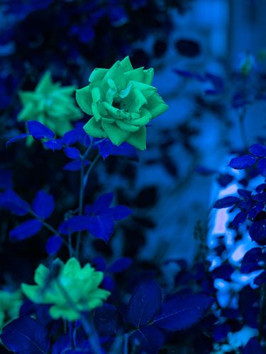
This shot has something of the qualities that I like in stained glass windows. It glows. Black edging breaks up the colours while the same blacks enhances the glow.
Again like stained glass, the composition is relatively simple with the tree centrally placed - that's fine it's the colours and textures that are doing the work.
The golden burst near the centre gets the initial attention and it is positioned to show the fork of the tree. The fork is important as it immediately establishes that a tree is the subject. The reds and golds are the colours of Autumn.
A very enjoyable image.
I really like this one. For some reason it reminds me of Salvador Dali. I think it is the lighting, which sculpts the objects, but is not too bright, and also the arms, by being disconnected and seen from an unusual angle become shapes and almost unrecognisable as arms, in fact they are recognised more by the context, by being near hands and a torso, than by their shape. The glasses containing teaspoons and sugar packets have no obvious connection to the mannequin and add to the surreal atmosphere. And then there is the hand, with one fluorescent varnished nail to draw attention, seems to be alive and crawling out from underneath the arm like a spider. Very cool!
The processing has turned this into a night scene, and with the dominant purple colour, it has the vibes of a nightmare. With this in mind, I think Minnie’s idea of creating headlights on the locomotive coming towards us would be a great addition.
In any case it is worth continuing the experiment with different processing techniques to see how they can enhance an image.
The processing is interesting, but I don’t think it works particularly well with the subject. It attracts attention, because it is different, but it doesn’t really hold attention. Sorry.
If you have to ask, the answer is a lot. lol. This was all done in ACR if I recall rightly. I really disliked this picture. This is kinda just an endpoint. Wasn't going for anything, just trying to make intriguing images and capture beautiful things. Noise is deliberate, center burn is lens hot spot from the 720 filter and I guess it wasn't hidden well enough.
Nothing to be sorry about. I don't like it either. Just throwing it out there to see how others view it cause maybe your artistic instincts are wrong sometimes.
Imagine this as a straightforward version. The panorama format would be attractive for the long, thin subject, but it would have nowhere near the impact of this compelling image.
The idea of assembling the image by connecting individual photos, rather like creating a train from individual carriages, is amusing, but it also opens the door for adding layers of interest. The photos fit together … almost. The lines are not quite straight, and the colours and lighting do not quite match. The same passengers and other details appear multiple times. But these are not imperfections, they are part of the concept and make the constructed image far more interesting and also give the train a texture, which would not usually be there.
A beautifully conceived and executed image.
Concentrating on the statue itself was probably a wise decision, especially as it is such a masterpiece. As it is you avoided the temptation to just show the complete Bernini statue, and imposed your own creative stamp on it in the form of your crop. We only see the female legs and buttocks and the male hands and beard, leaving the viewer to guess the rest, although that is not hard, it is satisfying. The legs, arms hands, torso and clothing combine in a good flowing composition within your crop, and lead to the important central area where the powerful marble hands squeeze into the soft marble flesh of the thigh and abdomen, which is the point where the true genius of Bernini is highlighted.
To understand Bernini I looked it up again and it is clear that Bernini has incorporated this attitude into his sculptures and yet when you photograph you have to look to see it and you did.
Beautiful how he depicts the body of the woman in all its fascinations and ethical admirations and I do not see that this would be banned in the States, after all all communication is erotic and without that element life would lack its main motivation, also is it's incredibly fantastic how Bernini has incorporated this sublimation into his statues, watching, thinking, performing and capturing. Well done.
For what it's worth, I thought the photo of the Bernini statue was stolen at first because I swear I've seen that same crop in a book before. In cases like Bernini, some horses get beaten worse than death. Nothing really left to be said about them, especially something that has probably been getting photographed, since photography was a thing.
Re Bernini, I agree. As I said with the original post, I know it has been photographed endlessly. It is beyond argument that similar/the same crops have been used by and many times at that. As I also said, no claims for originality with that shot. Never the less, it is a wonderful thing to photograph. The shapes,textures and play of light are irresistible. I considered other details and angles, including trying to get just the faces. I thought about even closer detail of the impression of fingers and flesh v the line including the leg. Having found the way I wanted to see it, I then concentrated on the exposure I wanted for the shot. I'm happy with what I got and I enjoyed the experience of considering how I'd take it, but no, definitely no claims for originality.
I myself HAVE done some street photography, and that enhances my appreciation of this image.
It is a compositional marvel, with the subtle but very clear vertical division that runs like an unsurmountable frontier between the figures.
And then there are poses, glances, looks. Depth indeed.
Stories.
That is it, basically: good street photography invites the viewer to imagine the story.
Tthis one has that quality in spades.
I agree with Pete that it is a wise decision to show not the whole statue, but just the significant parts that allow us to imagine the rest.
After all: sculpture is sculpture and photography is photography.
One art form just objectively showing the other, would be a documentary, but not photographic art.
The other possible approach to avoid just registering what is there in terms of the sculpture, might be to show not LESS, but MORE.
A bit like I tried here, by using a fisheye lens in the room of the Villa Borghese where Bernini's statue is displayed, incorporating most of statue but also the ceiling where a similar #MeToo scene is depicted (the photo is from 2015, long before #MeToo became a thing):