Old tools are favourite subjects of mine too and this shot would have been irresistible for me as well. The problem for a photographer is how to deal with something like this. We love the subject but the display and lighting is bland, from a photographic perspective. The photographer can't do anything about the display and lighting but wants to record it.
A strategy might be to use this shot as the first of a series. Maybe add some more of close ups of some of the implements. Then you can start to be selective and use individual shapes, texture, colours that seem to the photographer to be of particular interest.
Another strategy could be to hover around and wait, hopefully, to get subjects of visual interest studying the display.
There are some nice pieces on that board.
-
-
-
Are we in a hop farm again? Whatever, the site gave you plenty to work with and you have done just that.
It is an absolute storm of repeating straight lines. Because they run in three different sets they aren't confusing to the eye. It is very busy but very organized. The almost monochrome colour range supports the impression of planning. Our human is beautifully positioned to span the three horizontal colour bands of the image. The image is cropped to do something like the suggestion I had for Bryant's photo last week. All the verticals and the horizontal movement are strengthened by the crop here to panoramic proportions. The foreground poles' tilt parallels the ladder and get's us to the human. The red jacket is small but it can't be missed.
It's a witty title as well and together with the composition of the image, we think of the nature of the work in this extraordinary environment.
The image stands on its own but I think along with your earlier shot of the hop farm, you have a great series in the making. -
Beautiful capture - love the colors!
-
Many thanks!
@MikeFewster has written:Are we in a hop farm again? Whatever, the site gave you plenty to work with and you have done just that.
It is an absolute storm of repeating straight lines. Because they run in three different sets they aren't confusing to the eye. It is very busy but very organized. The almost monochrome colour range supports the impression of planning. Our human is beautifully positioned to span the three horizontal colour bands of the image. The image is cropped to do something like the suggestion I had for Bryant's photo last week. All the verticals and the horizontal movement are strengthened by the crop here to panoramic proportions. The foreground poles' tilt parallels the ladder and get's us to the human. The red jacket is small but it can't be missed.
It's a witty title as well and together with the composition of the image, we think of the nature of the work in this extraordinary environment.
The image stands on its own but I think along with your earlier shot of the hop farm, you have a great series in the making.No, this is a commercial apple orchard. There are different setups, but these follow the trellis-style way of growing hard fruit. Once in place, as the little trees grow, their branches are trained to follow the horizontal wires for more sunlight, yield, and ease of harvesting.
As I recall, there are actually two styles in two separate blocks here. The telephoto lens helped a lot with impact, I think.
This photo is the oldest I've shared so far. Taken in 2015, I've not encountered a photo op quite like this one since. To your suggestion about hops series, I do sort of have that, though not with any organized intent. I'm kind of scattered in my interests and abilities.
Many thanks for your detailed feedback!
-
@MikeFewster has written:@WhyNot has written:
Forgot the QUOTE!!!! This is in response to MIKE's Post -- SWEET DREAMS
I like the idea ... and the picture ... That everything is leaning makes me want to lean back with them!!!!
WhyNot
Now that's funny. I have a habit of slightly tilting a camera when I'm composing a shot. No idea why, however I am aware of it and usually remember to straighten things before exposing. Much too often I need to do it PP and because of that I tend to frame with a bit of extra room knowing I'll need to correct.
On this occasion I didn't. It was from my phone and I posted it here without my usual check. The whole tilt was quite unintended.Serendipity, or unconscious knowledge that the tilt would add a great deal of interest? Our win!
-
@OpenCube has written:
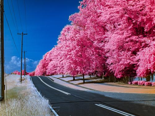
A world of cotton candy dreams, where the road goes on and on. Love it.
-
@Rich42 has written:
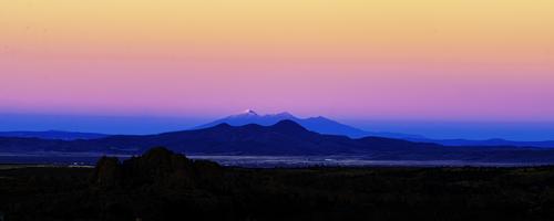
San Francisco Peaks, Flagstaff, AZ
Rich
The layers of colors are marvelous. I particularly like that they start at black, then a blue hour feel, then the colors produced by a rising sun. I use a 13" laptop and the impact when I filled my screen was breathtaking. I can imagine this simple, yet compelling and joyful image printed very large. Wow!
-
-
@PeteS has written:
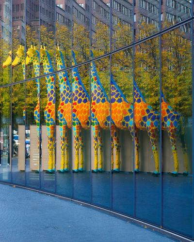
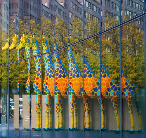
Building a Giraffe
Berlin is always good for a surprise.
Love it. Crop up from the bottom to make it a bit more mysterious?
-
@PeteS has written:
Building a Giraffe
Berlin is always good for a surprise.
Absolutely lovely
-
To Simplejoy and LindaS,
Thank you!
Rich
-
@OpenCube has written:
Fantasy world!
Rich
-
@OpenCube has written:
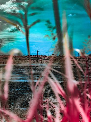
This is a disturbing image, especially when viewed large. It's post-apocalyptic. The landscape has become a wasteland complete with watchtowers and electronics. Nature is out of wack. Clouds are threatening and full of non natural stuff we would rather wasn't going to drop on us. The large, out of focus foreground suggests that the viewer is hiding and peering through plants that are either dead or fundamentally altered. The cloud , upper right, is all too reminiscent of an eye looking for us. I don't want it to find me.
Open Cube, I'd be interested to know what you were after when you made this image. random button pushing or searching for a particular effect?
I can see this image being used on a science fiction novel dust jacket. -
@simplejoy has written:@WhyNot has written:
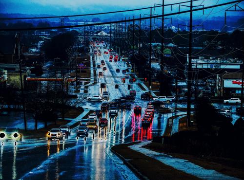
City Lights
WhyNot
Looks good - not something I would go for in terms of processing with a shot like that, but indeed - whynot? Looks unusual and interesting - I like it.
It also helps that I like the composition. I would get rid of the two cables at the top though!
*This isn't a place I want to be. It's the same world as "Fuel City" from last week. It's dark. It's a world of machines that don't need oxygen or green spaces, just power. For that reason I like the two thick power lines across the top. They balance up with the verticals on the right in framing the street.
Importantly, we are being drawn into (invited into?) this bleak mess. The lines extending from the bottom corners rapidly converge. Subjectively, this pulls the viewer in.
A strong image to be respected for its message.* -
@simplejoy has written:
When the first flowers bloomed this year, I tried to capture a few different versions of the liverleaf. Here's a slightly more experimental one:

Second hand halo by simple.joy, on FlickrThis shot puzzles me. I like the flower, the details and the electric purple against the black. It jumps off the screen. The halo at the top? It doesn't matter that I don't know what it is, it simply doesn't trigger a response from me, apart from feeling puzzled. As such, I'd have preferred the flower without it.
-
@OpenCube has written:
* It is interesting to compare this image to the image from Why Not this week.
Both use a road coming in from the lower corners to invite us down the road. Both use lightpoles and roads as major elements. Both are unabashedly manipulated. The outcomes couldn't be more different.
Open Cube has us on the fantasy yellow brick road of the land of Oz. It's all apple pie and happy endings. * -
@Rich42 has written:
San Francisco Peaks, Flagstaff, AZ
Looking north east at sunset from my living room windows in Prescott, AZ, Nov, 2005 to Flagstaff and the San Francisco Peaks, 100 miles away.
Great "Alpen Glow."
Granite Dells in the foreground, then Prescott Valley, Mingus Mountain about 30 miles away, then the San Francisco Peaks with Mt. Humphries at 12,600 ft and Mt. Agassiz at 12,300 ft. catching the last rays of the sun. Cottonwood and Sedona are between Mingus and Flagstaff.
Prescott is at 5000 ft, Flagstaff at 7000ft. The 100 mile sight line to the Flagstaff peaks was one of the most beautiful vistas I have ever seen. I photographed it hundreds of times in all kinds of weather conditions.
Rich
That is quite a view to have from a living room window. It certainly warrants the panorama treatment with multiple horizontal lines. The different skylines are easily distinguished giving the layers. The blues/pinks/oranges are dramatic but also calm.
The Earth shadow colors you have here are quite different to those I am familiar with. It might be different atmospheric conditions or perhaps you boosted the saturation?
Apart from curiosity, it doesn't matter. It's a fine image.
