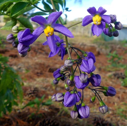
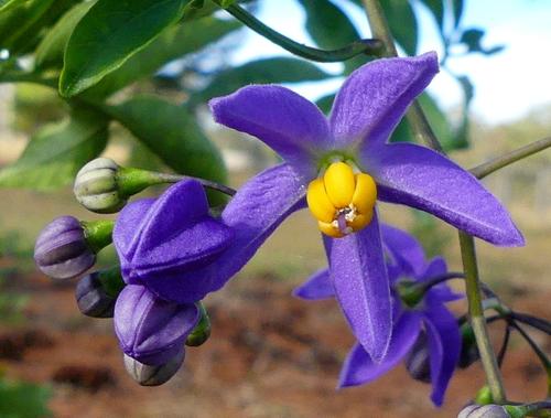
Your image is another I looked ahead through the thread to see if you explained why you added the light painted halo, and I found it was in response to a prompt for a project. Then I found your other submission of the flower photographed alone. The second submission, the flower alone, is so much more appealing to me. The halo is a worrisome extra that doesn't make sense to me in terms of function or symbol or design, but maybe I just don't understand the image properly. So I try to focus on the flower. The alternate image allows me to do just that. The angle and points of focus are more pleasing, the colors and light are beautiful, and the detail is lovely.
-
-
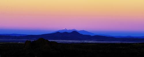
The scene is simply beautiful in the truest sense of the phrase. The layers of color are rich and lovely, but there is also exquisite detail in those mountains, with that snow covered peak as the centerpiece of the composition. We see a suggestion of civilization in the valley between the rocky foreground and the towering distant mountains, but the scale of the landscape reminds us that nature rules here.
I have never seen an alpenglow with colors that intense but I'm willing to believe that if such a thing can exist, it would be in Arizona! A narrower panorama crop that removes some of the orange area is a nice alternate framing for this one, and gives it a different less fierce/more peaceful look that I actually prefer. .
-
Wonderful celebration of your special creative eye that sees what others cannot see and captures it to show it to them with titles that gently explain it for those of us who love words as much as pictures.
The mirrored sequence of the colorful critter are indeed constructed into a whole before our eyes. It has the feel of a kaliedoscoped image flattened and rolled out. I like J Kasson's crop too but I think I prefer the original with the embedded lines which serve to lead us through the construction timeline.
I really like this.
-
I just don't know what to do with this photo. If I mess with highlights and shadows it changes the petal colours. So far just a small boost to contrast and saturation... I started to completely remove the background with a view to making it just one colour but that was going to take ages which I don't have...
[edit] Macro: these little flowers are maybe 25mm petal tip to opposite petal tipTwo crops
-
Welcome to the Wednesday Thread! Visit often, share your thoughts and your images. It's a good place for sharing experiments with black and white. And yes this little cafe or coffee shop does look best in monochrome. The color version has very little range of color but quite wide range of tonality, a clue that monochrome will work well. The monochrome processing even hides some flaws like lack of detail in lights at the same time it increases interest in all the little details like the handwritten labels on the containers. And of course the young attendant adds interest in that version.
Nicely worked.
-
This looks like an upside downer, something I'm very partial to, especially with a bit of ground foliage hanging from the top of the frame. Rich but realistic colors, natural blues and greens. My favorite of all the shots you've posted thus far.
-
Welcome to image sharing on the Wednesday Thread! Glad to have you join in. I am glad I'm not the only one inspired by garlic plants. I think we could name this Garlic Week on the thread. Those plants do take on the most convoluted and interesting forms. The shapes do persuade me to use monochrome on some of them, though the purple blooms or good sunset light can persuade me otherwise. Yours looks like it's just a couple of days from popping open.
-
You made a good choice in choosing to separate the smaller section of flowers, which are truly beautiful, In the other portion of the scene the background is a little scruffy and the foreground a little blurry, and takes something away from the flowers themselves. I am always reluctant to bring up color adjustments because everyone's monitor is different, not to mention color perception, but if you have editing controls for individual colors, you might try lowering cyan saturation or moving blue hue away from cyan to limit the cyan in the top third of the frame. But that is a minor quibble in a nice image.
-
Minniev,
Thank you.
Rich
-
-
The image is rotated 180 degrees and probably a polarizing filter was used. All of it is a reflection except the top and the bottom, which are the riverbanks.
I also see a float from a fishing line.
Is that it? 😀 -
Only after seeing it on a 24" monitor could I appreciate the picture. I like it, but that pink stripe disturbs me a bit. Was any filter used in the capture? or was it just your recreation with editing software?
You had dust on the sensor (upper left corner)😀 -
It's all been said. It's a great shot.
-
Fanciful, ultra-charming! I particularly love that it took me a few seconds to see the upside down world at the top 😁
-
Many thanks, Pete!
@minniev has written:Another hops farm image I think. Like many of them, it's dominated by dizzying displays of geometry in action: squares, verticals, horizontals, diagonals with all going left to right except that one white ladder that, wonderfully, is topped by a guy with a red shirt. The contrast and the disruption of the pattern gives the illusion that the ladder has stepped out of its actual dimension, in much the same way that the features in your poles image made the poles appear to have moved themselves into floating positions. Something about the geometry in these is very deceiving to the rational eye. And very intriguing.
Thank you Minnie! Please see my reply to Mike; this was a trellis-style apple orchard with finishing touches added before the trees were planted. In fact, I think it's two separate "styles" of apparatus. I took the photo in 2015 and have not encountered a similar photo op since 🙂
-
@tinternaut has written:
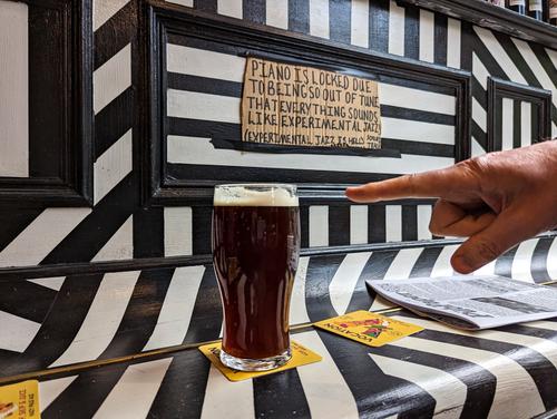
Hold my beer; I have a migraine.
Welcome home tinternaut, glad to have you join us again! A smile worthy image. The migraine may be from the experimental jazz or the paint design on the piano which makes me dizzy enough before you add the beer. The paint job provides the same kind of intense contrasts Roel offers in his wonderful circus image and that I remember from the last image you posted here. Intense contrasting tones create memorable photos whether the intensity is created by lighting or by paint. Here it's the paint that did it, and the photographer that saw it and figured out how to arrange it in a capture (longest line emerging from lower left corner, intersecting with other lines about 1/3 of the way into the scene. The human hand makes the subject clear, and along with the yellow coasters give us the color bump needed to sort it out from monochrome). Nicely caught.
-
@Manuel has written:@Rich42 has written:
San Francisco Peaks, Flagstaff, AZ
Looking north east at sunset from my living room windows in Prescott, AZ, Nov, 2005 to Flagstaff and the San Francisco Peaks, 100 miles away.
Great "Alpen Glow."
Granite Dells in the foreground, then Prescott Valley, Mingus Mountain about 30 miles away, then the San Francisco Peaks with Mt. Humphries at 12,600 ft and Mt. Agassiz at 12,300 ft. catching the last rays of the sun. Cottonwood and Sedona are between Mingus and Flagstaff.
Prescott is at 5000 ft, Flagstaff at 7000ft. The 100 mile sight line to the Flagstaff peaks was one of the most beautiful vistas I have ever seen. I photographed it hundreds of times in all kinds of weather conditions.
Rich
Only after seeing it on a 24" monitor could I appreciate the picture. I like it, but that pink stripe disturbs me a bit. Was any filter used in the capture? or was it just your recreation with editing software?
You had dust on the sensor (upper left corner)😀Manuel,
Thanks for looking. No filters were used in the making of this image. The colors really were there. In the finest traditions of photography, though, I dodged and burned away some distracting foreground detail and "improved" the contrast and saturation "slightly." AA would approve.
You didn't catch the 3 dozen really noticeable dust bunnies I "cleaned up!" 😉
The fantastic atmospherics and colors in the American Desert Southwest sky sometimes are astonishing. It doesn't happen with every sunset or sunrise, but when it's good it can be jaw-dropping. I remember a 10 day span in Tucson when every sunset was like this or better. No two are alike and the intensity and saturation of the colors can be beyond belief. When you look at art, especially painted pottery from people indigenous to the area, it becomes very clear where the inspiration arose for the designs and color palette of their work.
Rich
-
I deleted it because I duplicated the reply


