I envy you for living in this place and being able to watch this show of nature. You are a lucky man. 🙂
May 31, 2023
146
-

-

Your feedback is helpful for me in understanding what to look for in a B&W photo. Thanks.
-
Keep an eye on the thread, you'll likely get other ideas. Also, if you look at the other monochrome images in the thread and their comments, that may help too. Jim Kasson's two photos in this thread and the comments are good examples.
-
Thank you very much for your response and explanation - I really appreciate it, while at the same time (once more) asking myself, if I'm actually really THAT bad at getting my point across... It certainly sometimes seems that way.
(of course I've made an image for that...)

Getting my point across? by simple.joy, on Flickr -
It's the visual that didn't work for me, and a visual will always trump a concept or point. The halo didn't have the appearance of lighting the flower, it looked like an extra element floating untethered above. I find I often feel that way about light painting. (I feel the same way about star trails). But viewers' reactions will differ so what bothers one may appeal to another. Don't ever be disheartened because a few people don't respond to an image if the majority do. That's very normal even with a really good image. But if 60-70% have a weak response, it may mean you should rethink it and figure out why. I have used this metric to let forums "help" me choose images for competitions and gallery displays, and it has served me well so far.
Your "point" image is super! I love it!
-

Wow!
Great concept and execution.
Rich
-

G'Day Tinternaut.
This is a striking image with four different but clearly established elements. The finger pointing at the beer emphatically insists that either a point is being made or that we should interpret something from the image. Here goes.
The painted piano has bold stripes of different lengths running in different directions. any energy. The sign offers an explanation. The sign and hand are associated through similar colours. so the pointing finger can be seen as offering an explanation or additional information to the sign. the finger suggests that beer is the answer.
A photo with a lighthearted message.
Visually the card, hand and beeremerge together from the background . They form a stable triangle that lock together against the chaos of the background. The hand looks a little artificial. It may have been added in PP. It doesn't matter. The image isn't about realism. -
Enchanted forest
-

-

Thanks for stopping by and the critique both you and PeteS...
Much appreciated ….. It was a series and not sure if it will continue .. All four were based on a single PP four layer group that I modified slightly between the four … All four used the same compositional device – the leading line down the middle and out to not much of interest … This is what I've tried unsuccessfully to engage a conversation about in the past – piers that leave me jumping off into the water as no Jenifer standing at the end and tree lines leaving me lost in the forest …..... With these four there was no Jenifer, hopefully the other elements of the picture were seen and of interest along the path as you follow the line and maybe stopped at a train or store …. Maybe even generated a story but then ….
WhyNot
BTW I wasn't convinced about those blacked out headlights either and version 1 did not include them ..... and there may be others I haven't specifically replied to and I'm sorry and hope not to miss you in the future ...
-
Here is something important I want to share.
Your image in itself makes us look and think twice.
Green trees presented as pink candyfloss.
This is a way of processing an image that distorts reality and makes it sur-real.
I like being challenged and provoked, so that image of yours ticks a few boxes for me.But most of all, it brought back an incredibly haunting memory.
A few years ago (2014) , the Antwerp Photo Museum hosted an installation by photographer and visual artist Richard Mosse, under the title "INFRA".
This exhibition consisted of two parts :
On the one hand : large photo prints.
On the other: a visual installation in a darkened space, with multiple screens on which fragments of video were projected, sometimes in harmony, sometimes extending the image over more than one screen, sometimes different points-of-view of the same scene, sometimes brutal juxtapositions.All of that imagery was shot with a large medium format camera and a specific kind of film emulsion that turns greens into pinks.
I think it was called Aerochrome.
The specific kind of film originated in war times and had been used for military purposes, i.e. to spot humans and equipment through camouflage.Richard Mosse bought a stock of that film and used it to photography and film a conflict zone in Central Africa, with images of troop movements, checkpoints, soldiers posing, but also a huge refugee camp. I think he must have used techniques to mimic the same effect also in his video footage.
To see all of that in bright candy-colours was totally disorienting and ... yes, haunting.
Here is an image I made there (not in the video installation; that was too intense):!

I was quite simply blown away. I have never forgotten that experience.
Your image brought it back to me.
On this page you can find explanation and also a video about that artwork:
www.collater.al/en/infra-reportage-richard-mosse/More recently, he has made new work about environmental catastrophe in the amazon region, using similar techniques, including infrared and thermal imagery.
His philosophy is that climate change is a "hidden catastrophe" because it is something that the camera cannot see (in real time)What the camera cannot see is a short enough video about his work in different chapters, including images of the installation "INFRA"
(it really is a MUST see): -
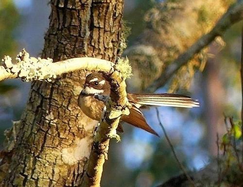
It is enchanted and you must visit it often. What I like: the almost hidden bird peeking at us from her well-disguised position. And the gorgeous blue bokeh in the background. And the gentle forest colors in the background and around the edges. What I struggle with: the seemingly blown out vine as it curls towards us. It just draws my eye away and dominates the otherwise subtle and lovely image.
If this is a raw file you might be able to find some extra detail to work with. If not, there is a dilemma of what else you might do which would range from removal/replacement to transplanting detail from the less exposed portion, to transforming the whole thing to a more fantasy type image. This is where some really advanced editing might come to the rescue. It's something I might try to do just for the challenge of it. I'm trying to master such things, but still on the journey.
-
Thanks, folks, for your comments. Your thoughts give me some reassurance that what I tried to do worked the way I intended due to the plan I had in mind. I'm in a phase of subtlety right now, without glorious scenery to inspire me, so I'm looking for guidance in whether I'm on track.
-
It's a nice array of tools, and on a documentary level it works.
But I feel like it could have surplus value with some abstraction.
Meaning: concentrating on the tools as such, and getting rid of the context (walls, bench below, slated roof, licence plates).
Basically: the center of the image and almost nothing else. -
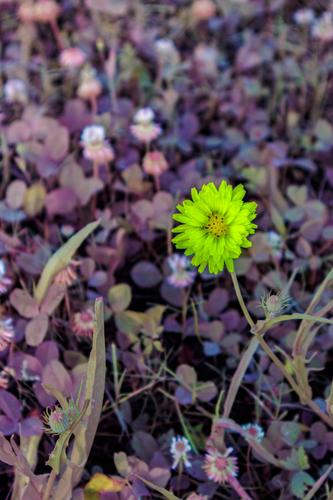
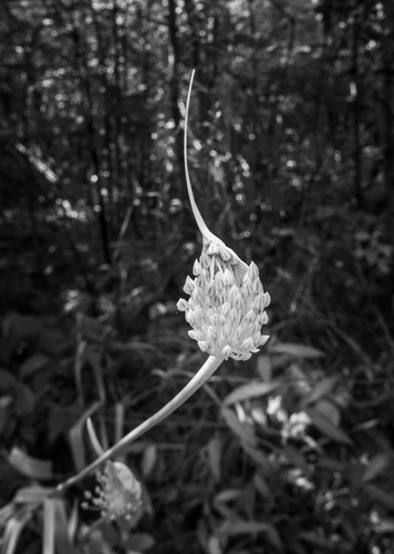
I had not yet gotten around to commenting, and now there is already this reply, so what can I add.
Maybe just that I also liked how the garlic flower pops out from the background.
Shallow DOF is responsible (put to good use here), but also that leading line from the bottom left corner that seems to propel the flower towards the front. -
Like with last week's parakeet (or whatever that bird was), I would be tempted to crop in close on this one. The background is OK (with the contrasting blue colour) but not essential. The crooked branch under which the bird comes looking out, is a bit overexposed (on my monitor). Bringing that down could result in a better overall effect (not the brightness or exposure of the whole image, just of that branch).
Zooming in on your image, it seems like the bird's face lacks a bit of sharpness (the parakeet was VERY sharp), but that may be a result of us viewing that face in a zoomed in version of a larger image, embedded here. Maybe there is more sharpness to work with if we would start from the original.In any case: this is a very welcome addition to our thread and I do hope that you will come back next weeks.
-
This is the kind of street photography that I enjoy.
There is not much more than the portrait of a relaxing dude and some street paraphernalia, but the combination of the guy with his background creates a winner.
The title is, in that respect, maybe a bit too much on the nose.
The viewer will automatically associate the closed eyes with daydreaming, and the pin up girl is an obvious subject of dreams.
The candy colours complete the "sweet" connection.
One detail that I should mention: the image has a very obvious lean: the verticals all bend over backwards towards the left.
That's a defect (in photo-technical theory) but an asset (in artistic reality): the photographer (and the viewer) are being infected by the lean of the daydreamer in his chair. -
I am very curious about other people's responses to this, and I will check them out later.
But I want to share my own thoughts without influences.
This is an image that I wanted to see really really big.
It is exactly the kind of image that I hope to make on my best days.
Because it is documentary, and shows us the raw reality of a human activity.
But at the same time your choice of lens, angle and composition elevate the image to much higher levels, i.e. the level of abstract art.
The intricate webbing of these supports (I assume that this is what they are: supports for vines or beanstalks or hops) creates a spiderweb of verticals and horizontals, and that is in harmony with the strong diagonals of the supports (and of the ladder, of course : that ladder is the cornerstone of the composition).
Your image sparks my interest into what exactly is going on here, while at the same time satisfying my craving for beautiful geometry and composition.
That is what good documentary photography should do.