-
-
@LindaS has written:
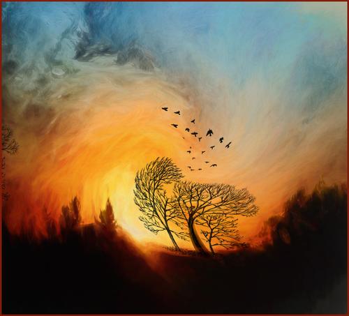
WIND
In the past few years, as I've traveled less and have fewer photo ops, I've become addicted to colors and playful editing.Love this one. It is full of motion and vibrant colors. That it is a fantasy image is no bother to me, because I can admire how the fantasy dream world is knitted into the humdrum of daily life. The circular form gives the eye something to chase down, and there we find the wonderful unbirds. How you put together such a wondrous combination of elements (light, color, texture, and brushes to create this is brilliant. Beautiful and whimsical simultaneously.
-
@LouHolland has written:@PeteS has written:
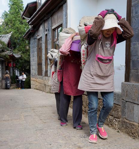
Women at Work
The choice of jobs for women in China seems greater than in the West, but that doesn't mean that western women would clamour for a chance at some of those jobs.
This Western woman does not clamor for that job. It makes me a little tired and sad to see them because it looks so hard, and they look so burdened. All in a row, heads down, with grim expression, they march onward beneath their loads. It's a thought provoking image, well composed, but not a happy one.
Pete
Wonderful Pete and at the same time terrible to see the difference of the people at the beginning of the street.
Lou -
@MikeFewster has written:@MikeFewster has written:@LouHolland has written:
Before discussing the photo Lou, lots of thanks for the suggestion on how to view it. This is one of a number of things I still don't get about our new forum. Your technique makes viewing each photo much better. In future, I'll do it for all photos here.
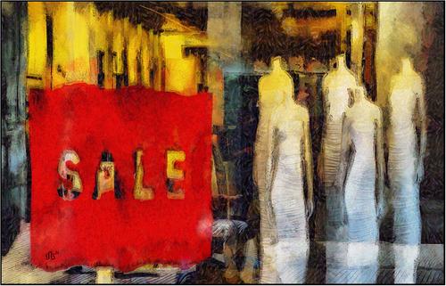
Your image has a lot of impact. The "Sale" message dominates as a result of its size, position and colour. Something is being disposed of for less than its value. We see figures that are unmistakably women. Slim, elegant, without heads. Because the image has been processed so it is no longer photo realistic, the figures are more easily seen as symbolic. Women in general; idealized women; women as slaves to a world that doesn't value their heads? We could go on.
I showed it to my wife, without comment, and she loved it.
Too often post processing can be a hit and miss affair that seems to be done without any aim in mind. This image and Linda's this week are great examples of PP done with purpose.Changed my mind. That last sentence in my earlier post isn't quite what I meant to say. Messing about with PP IMNHO is fun and can lead to exciting things. Besides, its the best way to get a handle on some of the endless possibilities within PP. What I was clumisly trying today was that when such experimentation becomes a keeper, I prefer the image to feel as though it has something to say.
Mike, I'm glad You and Your wife loved it. Lou
-
@LindaS has written:
WIND
In the past few years, as I've traveled less and have fewer photo ops, I've become addicted to colors and playful editing.It's very creative and well done! I love the spiral shape and the wonderful combination of colors. It really draws you in in a very nice way. The only thing I'm not completely sure about is the border... I think it might look better to me without it, or with a more neutral one. I think I'd also crop it as a square, because it's quite close to that already.
Excellent work - an image with lots of different possible interpretations and very effective!
-
@RoelHendrickx has written:
Copperfield
This is another image from that "up-close-and-personal" candid documentary series in a small family circus that I mentioned last week :
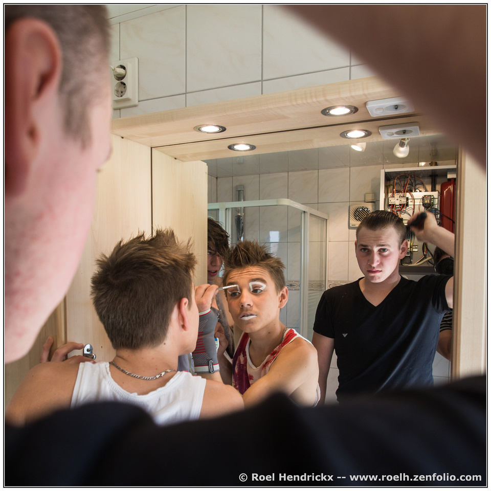
This is in the private trailer of one of the two sons of the circus director who are the two clowns.
When I first started this project, the director had told me that I could shoot in the general circus area but that I had to respect the privacy of the artists and crew members, which of course I agreed to. So the idea was to not enter their private spaces. After a few days, though, a lot of mutual trust was established (and it also helped that I had brought them each a few home-made prints of the results of the first day of shooting) and so a number of the artists actively invited me in their trailer to document also that aspect of their life.
It's one of the best aspects of photography for me, these encounters with ordinary people in extraordinary circumstances.
This is a great demonstration of framing.
The bent arm and head form a frame, they are dark and/or out of focus, so they don’t distract, and it draw us in.
The pale wood around the mirror frame the three men. The mirror itself frames two of them, and in doing so, exposes them as reflections. The shower unit frames the most important character and the image revolves around his eyes, and he is applying a frame of white make-up to draw attention to those. All very cool.
David Copperfield has mysteriously hidden the photographer. Almost. We can just get a hint of how he achieved that trick.
As viewers, we have the privilege of witnessing this scene of intimacy. It shows us a scene which would be hidden from us, but also reveals the closeness of the brothers and their trust in the photographer.Pete
-
@simplejoy has written:
This image was created for the theme "single use items" and shot with an old scanner lens.

Toothpicks are handy... quite literally! by simple.joy, on FlickrI like the transition between the darkness at bottom right and the bright, coloured bokeh balls top left, all out of focus, but with points of sharpness in the middle.
Could I recognise the subject as toothpicks immediately? No. But my subconscious immediately kicked in to assist. If in doubt, it checks for human features and saw a hand. It then did its next job, friend or foe? Very small, maybe a a child. Outstretched, so possibly looking for attention, or help even. So probably friendly, with just an outside chance of it being something small and nasty, reaching for my jugular.
That was a bit tongue in cheek, but it shows the interaction and fun we have trying to interpret an image. It doesn’t matter that it is probably the text, and nothing visual, which gives us the most valuable clue to identifying the subject. It is an enjoyable composition and colour, so I don’t feel cheated if I spend time looking and failing, because the process is enjoyable. Had it been a pile of well lit, perfectly sharp and instantly recognisable toothpicks, I suspect my enjoyment would have been slightly above zero.Pete
-
@JimKasson has written:
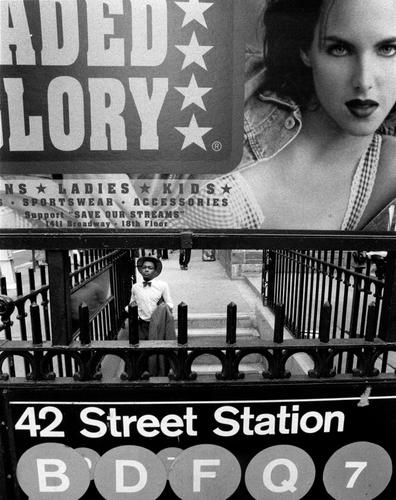
Nikon F4, 15mm f/5.6 Nikkor
I am immediately drawn to the inviting stare of the woman in the top right corner. This is despite the man being in one of the strongest part of the composition, near the centre and in a frame. This creates a tension as we try to work out which is the more important subject. There are two legs just above and behind the man, but there is not enough information to see if there is any connection. This also adds a degree of tension. Are the legs a sign of danger for the man? He is wearing a bow-tie, which is very formal today, and not what I would expect him to wear entering the underground. Strange. Or maybe it is from a time, when bow-ties were more fashionable. It is a B&W photo after all. He is black and since she is white, hinting at a predominantly white area, is this a cause of danger. It shouldn’t be, but the thought raises the tension again. There are lots of clues to location, but they are lost on me, but maybe they are significant.
All in all it is a beautifully balanced photo, but creates an uneasy feeling. A delicious cocktail.Pete
-
@RoelHendrickx has written:@LindaS has written:@minniev has written:
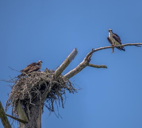
.... Apparently snags of broken limbs are attractive to osprey.What a great find! Having chased ospreys and eagles for many years, I know how difficult it is to get two good poses in the same image, let alone to be there for mealtime! While your osprey enjoy dead trees, my area has man-made platforms (and the river) to attract the mating pairs. Your photo captures the massive nest size, along with the perfect moment. Love it!
I also love the catch, but am unsure about the square crop.
I am sure that MInnie didn't shoot this in a native 1:1 ratio, so it must have been a deliberate crop from an image in another ratio.
And while I love (LOVE; L-O-V-E) square crops, this one does not work for me.
The branch on which the rightmost osprey sits, could have been a diagonal, but not in this square crop.
And I also don't like the stray thick branch on the far left: it leads my eye out of the image.
Since the right side branch is already touching the image's edge, there is no reason to keep the image this big (a branch that did NOT touch the image's edge would have been different.
I think I would crop this to 4:3 or even 3:2 (heck, maybe even 16:9) to concentrate on the main items on our menu.
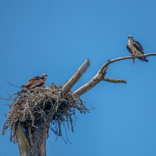
We don't need all that blue.This would be roughly what I mean (but I did not use a classic ratio: I just pulled the edges closer at a whim)
Please note that my crop is of microscopic size; I did not download a full resolution image but just the forum embedded version - after the crop it becomes even smaller - it's just to show you what I mean with cropping):This is a good capture as well as being an unusual find. I liked the original version, but then preferred Roel’s crop without knowing why, until I realised that I was being distracted by that triangle of branches in the bottom left corner.
It is nice to know that devastating winds bring ospreys , and not just destruction.Pete
-
@LindaS has written:
WIND
In the past few years, as I've traveled less and have fewer photo ops, I've become addicted to colors and playful editing.This is fantastic, in all meanings of the word. It is a very creative use of photography. It is one for the wall, and I would see it differently every day, depending on my mood. The colours are strong and cheerful, and the spiral shape shows energy and the silhouettes are delicate. But the reds and yellows can feel warm and soothing or hot and dangerous, and the swirls can be caresses or whirlwinds. Today it could be a glorious sunset, with the birds coming home to roost in the trees. Tomorrow it could be a forest fire, with the birds flying away from a tsunami of flame. The day after it could be….
Pete
-
@minniev has written:
I usually don't post such a straightforward documentary image as this but I have never run into an osprey couple sharing lunch on their nest before. Ospreys don't typically live where I live, so finding one is an oddity in itself. This couple is returning for a second year to the little swamp that's the subject of one of my ongoing projects, and some version of this or one of the others I shot of them a few days ago may end up in a gallery display at the state science museum. There are many dead trees since the tornado ripped through the swamp 2 years ago sawing off the tops of some of the older tupelos and cypress. Apparently snags of broken limbs are attractive to osprey.
Great capture with an interesting composition and dynamic! At first I thought the square crop is something I would change, but then realized what bothered me, is that it's actually not exactly square... So I tried making it square, get rid of the wood at the lower left corner and changed the colors slightly. Of course that will decrease its documentary value somewhat, but it kinda captures what I'd try to go for:
-
@JimKasson has written:
Nikon F4, 15mm f/5.6 Nikkor
There's so much going on... it really is a very busy image, and yet it somehow works. I think the most fascinating aspect about it, is the high number of attention-seeking things in this image (the woman on the poster, all the words, letters and numbers, the different symbols, the shapes etc.) which make it a bit of a challenge to focus on the tiny person with the white shirt. And yet you managed to recognize him and take the shot... not only that the extremely busy composition + the B&W edit even allow the viewer to succeed in realizing that it's actually about this man.
And so all the information becomes related to him as well, giving lots of opportunities for questions:
- is he perhaps someone really interesting of famous, which makes the women in front desperate to capture our attention/or his?
- do the words ("faded glory" ?) mean, that he was once famous, or could have been, but rather decided to go 'underground'?
- are the layers of icons in the front suggesting that he doesn't quite know where to go next?
- is the metal fence a symbol of him feeling like he's in a cage? Perhaps a cage of constant travel and consumation?
etc.
Very interesting and multi-layered image - well done!
-
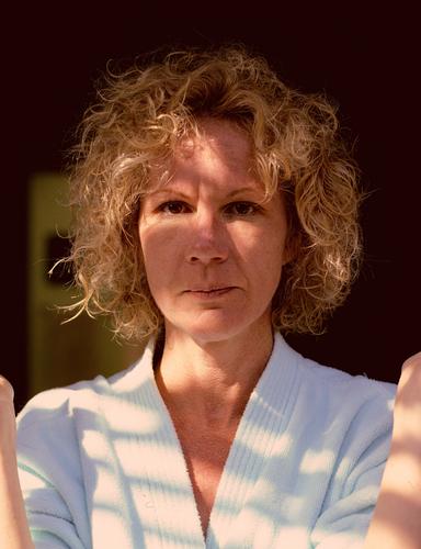
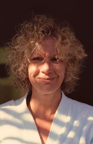
Gayle's one and only fling with a self-permanent. She's doing her best not to break out laughing. But couldn't keep a straight face.
Some time in the mid-80s. Kodachrome 64, Daylight. Olympus OM2n, Zuiko 50mm/1.4, ~ f/5.6, drum scan.
This was a difficult scan. Kodachrome always required extra compensation, scanning slightly blue-ish. The late afternoon light which was mostly skylight was very blue, despite the few rays of sunlight coming through some tree branches. The 'chrome looks quite blue, optically.
I thought she looked great in curls.
Rich
-
-
I have been trying to get a half decent shot of some lilies in this dam ever since I bought my camera. What with poor focus, user blur, wind damaged petals, bug eaten green parts, old dead lily pads and other weed, I never succeeded. The other day I noticed a suggested WB tweak I had missed and that has improved natural colors no end. Today my enemy was bright light so a lot of playing with EC and still struggling with sharp focus. Here is one where I have brought up shadows somewhat but not sure what else I should do.
.
-
@OpenCube has written:
The colours are very attention getting. When I first see it I immediately want to look closer. But then? I can't find anything else in the subject matter or composition that would bring me back to look at the image a second time.
-
@minniev has written:@JimKasson has written:
Nikon F4, 15mm f/5.6 Nikkor
Excellent image. Two faces - a sultry looking white female model advertising designer jeans floats above a young black man dressed in a formal style of an earlier period, enclosed in cage like bars. Both looking us in the eye. I love the image for what it allows us imagine both good or bad. The image is Manhattan but I'm from Mississippi and I grew up 10 miles from where Emmett Till was murdered, so my mind, sadly, goes there. And Mississippi is not the only place where such things happen.
Jim & Minnie,
I had looked at Jim's image and was thinking about a response.
Many elements were in my mind: * the challenging but satisfying composition, with many large panels occupying big parts of the image and leaving open an almost letterboxed view on reality, through which we gaze at a young black male who seems very confident about his dress style; * the subway signs that provide a clear geography * the truncated lettering of the advertisement that still allows us to read "faded glory", which ties in nicely with the timelessness of the man's dress * the juxtaposition of a provocative white female making eyecontact, and the young black male literally below her gaze * the fact that this juxtaposition of black and white is also reflected in the image's B&W processing choice.
All of those considerations were stylistic.
I read Mike's response and agreed, but wanted to put more emphasis on the many clever choices made by Jim, to enhance the value of this split-second capture.
But then I read Minnie's comment and it felt like a gut punch. A gut punch of recognition, because yes, of course, that is the subtext of this image.
It's an image that could grace the cover of two very different books: a coffee table album on street photography, but also a sociological study about race in the USA. -
@Rich42 has written:
Gayle's one and only fling with a self-permanent. She's doing her best not to break out laughing. But couldn't keep a straight face.
Some time in the mid-80s. Kodachrome 64, Daylight. Olympus OM2n, Zuiko 50mm/1.4, ~ f/5.6, drum scan.
This was a difficult scan. Kodachrome always required extra compensation, scanning slightly blue-ish. The late afternoon light which was mostly skylight was very blue, despite the few rays of sunlight coming through some tree branches. The 'chrome looks quite blue, optically.
I thought she looked great in curls.
Rich
Rich, I think so too.
The curls result in a level of frivolity and playfulness that each and every one of us would probably want to see in his favourite woman.
Photographically, this set of two images could be use as classroom material on the impact of a smile.
Cherish this moment from the mid-80s.
Forty years later, it still packs a punch.
