Full marks for catching the "disappearing act" reference.
Glad you liked the image.
As Minnie also already suggested, the point of using this kind of up-close framing, is to create a sense of immersion for the viewer.
In documentary images revolving around people (and their environments), I am a strong believer in the words of Robert Capa: "If your picture is not good, you were not close enough". Hence my love for extreme wide angle lenses: they just create a sense of actually being there.
Wide angle does however often bring the challenge of hiding the photographer himself (unless adding a shadow selfie is part of the idea).
I can't count the occasions where I have positioned myself sideways in front of a tree (and then held my breath and pulled in my gut) to hide my shadow in the shadow of that tree... Mirrors are even more challenging. I don't usually mind if my reflection is "discovered" upon close scrutiny, but I don't ever want it to dominate the image.
-
-
@PeteS has written:
Women at Work
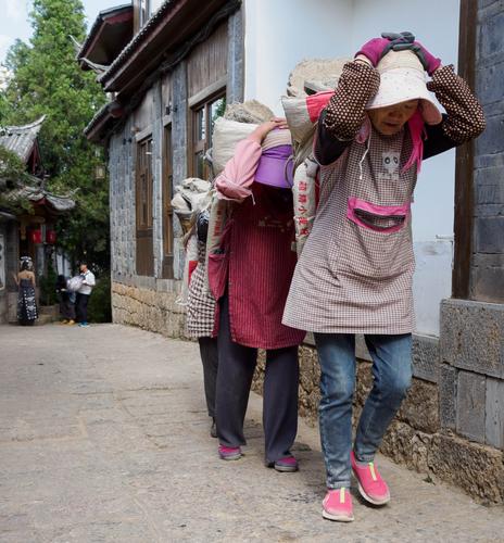
The choice of jobs for women in China seems greater than in the West, but that doesn't mean that western women would clamour for a chance at some of those jobs.
Pete
When we visited China (and also India and Vietnam), one of the things that we immediately remarked, was the fact that in many professions that would be "a man's job" in the west, the workforce was a strong mix of men and women. We've seen women in house construction, in salt mining, in brick-making and baking, and in so many other physically very demanding jobs.
(I haven't yet finished processing my images from China - shame on me - but here is a gallery of images from India that show people in "WORK" situations:
roelh.zenfolio.com/p1054729575
This is one of three galleries, apart from a fourth gallery with the travel sights, that I created from that trip: "Work", "Play" and "Pray".
But enough of that shameless self-promotion; back to your image.)These women you caught seem to be hauling debris from a demolition job.
Tough work.
What we see of their faces, shows the strain.The job at hand, is juxtaposed to great effect, with the colourful and very feminine dress and shoes and gloves.
I don't see many steel-tipped safety shoes here.The image works in itself, and is also food for thought on global economics and society.
-
@Bryan has written:
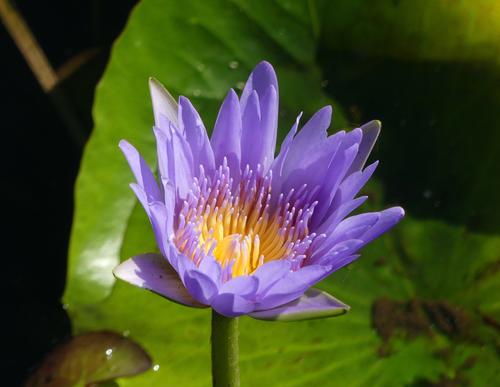
I have been trying to get a half decent shot of some lilies in this dam ever since I bought my camera. What with poor focus, user blur, wind damaged petals, bug eaten green parts, old dead lily pads and other weed, I never succeeded. The other day I noticed a suggested WB tweak I had missed and that has improved natural colors no end. Today my enemy was bright light so a lot of playing with EC and still struggling with sharp focus. Here is one where I have brought up shadows somewhat but not sure what else I should do.
To answer your question first. I don't know what your WB tweak was but the colours here are looking good. Accurate as well as I recall those flowers. No sharpness problems either. The golden centre is a little soft but this is giving a bit of depth to the flower so I don't think it is a problem. If you wanted the centre details to be razor edged you would probably get it by stopping down a little. What F stop were you using here? It looks like the focus point is the closest tip of the nearest petals.
One thing you might do in post processing is bring up the micro contrast a little. Whether or not you can do this depends on the PP software you have. In Lightroom I might have nudged up the Clarity and Texture sliders. It can probably be done in other software as well but I'm not familiar with what those controls might be called elsewhere.
Back to the image. The gold/purple/green combination is accurate and pleasing. The gold centre works perfectly in taking the viewer's eye right to the centre of the subject. I like the off centre stem that also angles to the same point. As does the soft focus leaf behind that continues the same line through the image. Being soft focus it doesn't take our eye out of the image. Much the same for the other greens. They give detail, background and balance shapes while enhancing the main subject.
Very well done. -
-
@MikeFewster has written:
To answer your question first. I don't know what your WB tweak was but the colours here are looking good. Accurate as well as I recall those flowers. No sharpness problems either. The golden centre is a little soft but this is giving a bit of depth to the flower so I don't think it is a problem. If you wanted the centre details to be razor edged you would probably get it by stopping down a little. What F stop were you using here? It looks like the focus point is the closest tip of the nearest petals.
One thing you might do in post processing is bring up the micro contrast a little. Whether or not you can do this depends on the PP software you have. In Lightroom I might have nudged up the Clarity and Texture sliders. It can probably be done in other software as well but I'm not familiar with what those controls might be called elsewhere.
Back to the image. The gold/purple/green combination is accurate and pleasing. The gold centre works perfectly in taking the viewer's eye right to the centre of the subject. I like the off centre stem that also angles to the same point. As does the soft focus leaf behind that continues the same line through the image. Being soft focus it doesn't take our eye out of the image. Much the same for the other greens. They give detail, background and balance shapes while enhancing the main subject.
Very well done.Thank you Mike. The tweak was 2 steps towards amber, which to me easily explains the improvement in yellows. The first was f/5. Yes I tend to try and get focus on the leading petal edges (closest point).
-
@RoelHendrickx has written:@Rich42 has written:
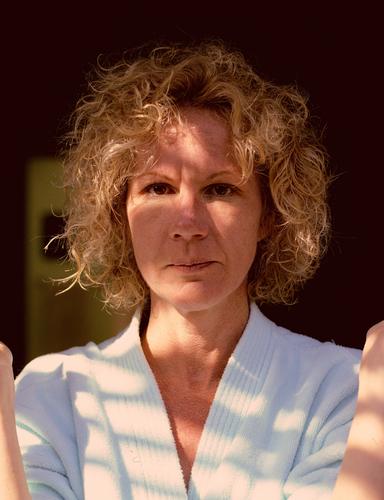
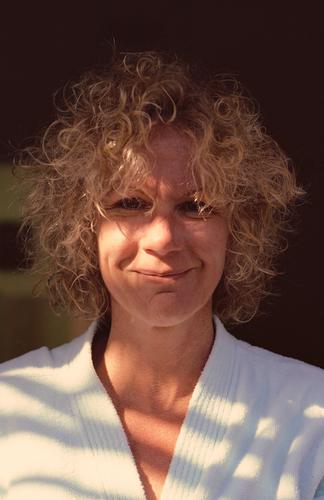
Gayle's one and only fling with a self-permanent. She's doing her best not to break out laughing. But couldn't keep a straight face.
Some time in the mid-80s. Kodachrome 64, Daylight. Olympus OM2n, Zuiko 50mm/1.4, ~ f/5.6, drum scan.
This was a difficult scan. Kodachrome always required extra compensation, scanning slightly blue-ish. The late afternoon light which was mostly skylight was very blue, despite the few rays of sunlight coming through some tree branches. The 'chrome looks quite blue, optically.
I thought she looked great in curls.
Rich
Rich, I think so too.
The curls result in a level of frivolity and playfulness that each and every one of us would probably want to see in his favourite woman.
Photographically, this set of two images could be use as classroom material on the impact of a smile.
Cherish this moment from the mid-80s.
Forty years later, it still packs a punch.All of what Roel has said. And another thought.
Generally, the kind of lighting here is a no-no. In portraits the norm is to seek even lighting or lighting that gives shadows that can be used to model face contours. Those conventions are broken here but the results work. The sunlit patches emphasize an eye and mouth respectively. It works because it injects a feeling of light hearted fun. A peep into character! You can't ask more of a portrait than that. -
@LindaS has written:
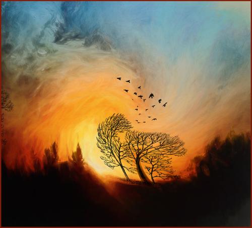
WIND
In the past few years, as I've traveled less and have fewer photo ops, I've become addicted to colors and playful editing.Coming from Australia it says bush fire to me. Birds frantically escaping. Other trees bending to the strong winds drawn into the fire. Dark ominous smoke and clouds above. Strong effect.
-
@Bryan has written:@LindaS has written:
WIND
In the past few years, as I've traveled less and have fewer photo ops, I've become addicted to colors and playful editing.Coming from Australia it says bush fire to me. Birds frantically escaping. Other trees bending to the strong winds drawn into the fire. Dark ominous smoke and clouds above. Strong effect.
That was my impression to.
And then there is the curled effect of the processing, which creates an impression of a vortex.
It really feels like the air (oxygen) and almost even the clouds are being sucked into a whirlwind of fire.
That makes the naked tree silhouettes even more dramatic.
And it makes the birds' escape even more narrow : they are fighting against the whirlwind that wants to suck them to fiery oblivion.
There is a case to be made for this image as an illustration of climate change and the disasters it brings, with all of us being sucked into the void. -
@MikeFewster has written:
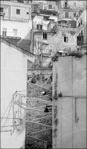
Sciacca.
You have a choice in this cliffside Town in Sicily. You can be going Up. You can be going down.There are some nice patterns in the step wall coping. Is that a person with a rather large bundle on a bike or something moving up? I think of the effort required to get all the materials up there for the buildings...
-
@Bryan has written:
A sharper one...
Yes, it's sharper but I prefer your first shot because of the composition in one.
-
@Bryan has written:@MikeFewster has written:
Sciacca.
You have a choice in this cliffside Town in Sicily. You can be going Up. You can be going down.I'm glad someone picked this up. That's probably a heavy bundle and was part of the reason I took the shot. I can't be certain of this but I think he is one of the refugee Africans in Italy. Many make a living from "pop-up" shops. The goods are inside a large cloth that serves as a background to display the items. If the owner needs to move in a hurry, often due to some form of harassment, the corners of the cloth are picked up and the lot is slung over the shoulder.
There are some nice patterns in the step wall coping. Is that a person with a rather large bundle on a bike or something moving up? I think of the effort required to get all the materials up there for the buildings...
-
@RoelHendrickx has written:@PeteS has written:
Women at Work
The choice of jobs for women in China seems greater than in the West, but that doesn't mean that western women would clamour for a chance at some of those jobs.
Pete
When we visited China (and also India and Vietnam), one of the things that we immediately remarked, was the fact that in many professions that would be "a man's job" in the west, the workforce was a strong mix of men and women. We've seen women in house construction, in salt mining, in brick-making and baking, and in so many other physically very demanding jobs.
(I haven't yet finished processing my images from China - shame on me - but here is a gallery of images from India that show people in "WORK" situations:
roelh.zenfolio.com/p1054729575
This is one of three galleries, apart from a fourth gallery with the travel sights, that I created from that trip: "Work", "Play" and "Pray".
But enough of that shameless self-promotion; back to your image.)These women you caught seem to be hauling debris from a demolition job.
Tough work.
What we see of their faces, shows the strain.The job at hand, is juxtaposed to great effect, with the colourful and very feminine dress and shoes and gloves.
I don't see many steel-tipped safety shoes here.The image works in itself, and is also food for thought on global economics and society.
Mike Fewster was so kind to send me a quick personal message to urge me to look closer.
And now I am hitting myself on the forehead for not enlarging your image, Pete.
As I obviously should have from the beginning.
That will teach me!(I usually go for quick and immediate initial impressions.
I tend to base my judgement on what an image tells me, when looked at as I would look at it in a newspaper.
In general I still think that this is a good approach.
I am of the school that thinks that images should make an immediate impression.
But sometimes, it pays to study closer.
If an image is muddled and badly composed, chances are slim that I would look closer.
But if an image is a winner already upon first impression, then maybe I should learn to take more time.
Enlarge and see if there is not even MORE value when looking closer.
As clearly is the case in this image.)WOW!
W-O-W!!If I thought that your line of hard working construction ladies (who vaguely resemble the blind leading the blind in Bruegel's painting) was already a lesson in economic and societal status, then what can I say now, after I have looked better and have found these ladies juxtaposed by another set of women in the background.
There, vanity is at work. A young lady in fancy dress and with a tattoo on her shoulder (identifying her as young, hip and westernized) is being her photos taken by a team of a photographer and a lady holding a reflector dish.
Could be EVER find an image that tells us more about modern day China in a single image?
-
@MikeFewster has written:@Bryan has written:@MikeFewster has written:
Sciacca.
You have a choice in this cliffside Town in Sicily. You can be going Up. You can be going down.There are some nice patterns in the step wall coping. Is that a person with a rather large bundle on a bike or something moving up? I think of the effort required to get all the materials up there for the buildings...
I'm glad someone picked this up. That's probably a heavy bundle and was part of the reason I took the shot. I can't be certain of this but I think he is one of the refugee Africans in Italy. Many make a living from "pop-up" shops. The goods are inside a large cloth that serves as a background to display the items. If the owner needs to move in a hurry, often due to some form of harassment, the corners of the cloth are picked up and the lot is slung over the shoulder.
The shot works well for several reasons: * B&W reduces everything to the essence (geometry and a few details); * you chose a good vantage spot for a head-on view of those steps; * not concentrating on the stairs alone (a narrow strip on which could be zoomed in further) provides context, with the ubiquitous random electricity and communication wires against whitewashed walls that make this very southern (mediterranean or further south; or east); * the human figure who seems almost smaller than the lamp in the foreground.
Another high quality street image in this week's thread. Our bounty is plentiful.
About that human figure and your speculation: he may indeed be a refugee making ends meet.
But we've been visiting Italy for decades now, and they have always been there, on squares and on beaches.They are (more or less) affectionately called the "vu cumpras"
I found this online about that nickname:
Italians refer to the beach vendors as "vu cumprà," which means: "You want to buy?"
It is a rather insidious appellation, one which highlights the power relations
between those whose survival depends on soliciting business
and those who can determine their fate with a "no."They are the mostly big muscular black men (most often very black, as from certain african regions and not others), selling watches, bathing towels, leather(?)wares and other luxury items (also very many real African artifacts that may or may not have had other origins than the mother continent; a lot of those African small fertility statues etc get actually shipped in by container from the far east).
Those guys (and girls too, more and more often) are really part of the couleur locale in any Italian beach town and always have been.
They are joined by legions of other unfortunate humans (both foreign and domestic).Read this (the title "uphill battle" is strangely in sync with your image):
www.spiegel.de/international/tomorrow/racism-and-corona-an-uphill-battle-for-italy-s-beach-vendors-a-f67f904d-566c-4924-9edf-97d2da219507
The article dates from Corona Virus times, but the issue is more universal.Some governments try to discourage these activities through scare tactics against the shoppers (which I can more or les understand for counterfeit wares, but not for innocent merchandise for which both seller and buyer know what the true value is - the true value can include a smile for the knowledge that there will be food on some table) :
www.independent.co.uk/travel/news-and-advice/italy-beach-holidays-vendors-fines-tourists-migrants-matteo-salvini-league-party-a8420936.html -
-
@RoelHendrickx has written:
Copperfield
Very intimate shot. I like the way you framed the capture.
-
@simplejoy has written:
 [url=flic.kr/p/2oboZiL]
Very imaginative shot. Well done.
-
@JimKasson has written:
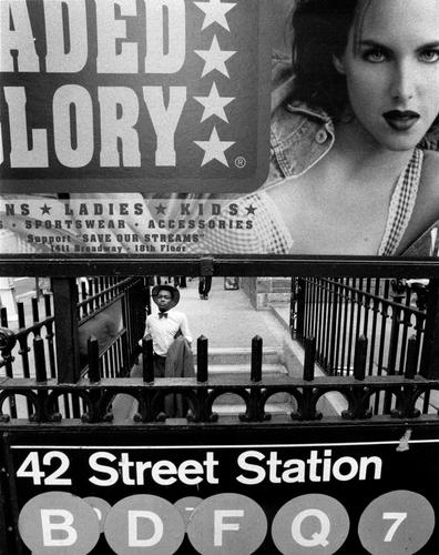
Nikon F4, 15mm f/5.6 Nikkor
Like that through the opening shot.
-
@minniev has written:
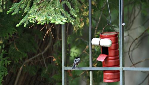
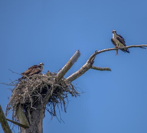
Excellent capture. I like the natural positioning of the birds. Ideal!
