That's a song I didn't know.
Glad to have heard it at least once.
But I vastly prefer the song by The Verve.
Did you listen to that song?
The Verve is one of the underrated British rock bands, with a few hits but not that many as, say, Oasis.
I like much of their music. Like Kula Shaker, another of those bands with a few instant classics that sound really timeless.
-
-
@RoelHendrickx has written:@MikeFewster has written:@MikeFewster has written:@Rich42 has written:@RoelHendrickx has written:
Those moments of just serendipitous luck are often the best and those we remember most vividly.
Lucky man:
[song by The Verve (one I play often, just to remind myself)]
(youtu.be/MH6TJU0qWoY)Roel,
Good song. Didn't know it before. Added to my library.
Rich
Time moves along.
I was puzzled to see "Lucky Man" here. I remember a "LuckyMan" as a song that was big for Emerson Lake and Palmer a bit over 50 years ago. It had a different message. I can't find the original on You tube, the version I found is nothing like the original. This gives some info. It was often listed in 'greatest songs" lists.
thegreatestsongs.com/lucky-man-emerson-lake-palmer/Found the original
www.youtube.com/watch?v=9ZUyB5dRwg0That's a song I didn't know.
Glad to have heard it at least once.
But I vastly prefer the song by The Verve.
Did you listen to that song?
The Verve is one of the underrated British rock bands, with a few hits but not that many as, say, Oasis.
I like much of their music. Like Kula Shaker, another of those bands with a few instant classics that sound really timeless.Here's a topic for a rainy day. "instant classics that sound really timeless."
A theory. It's an age and circumstance-related concept. ELP were huge, especially the first album on which was their "Lucky Man." I can't hear or remember it without many associations to Vietnam war events. That makes it timeless to me and I suspect many others of my generation. Perhaps "timeless" can only be judged after a few generations? -
@WhyNot has written:
Turn About ....
WhyNot
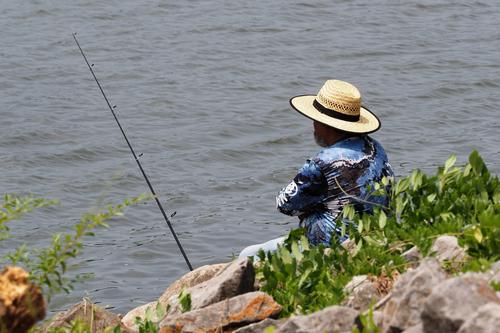
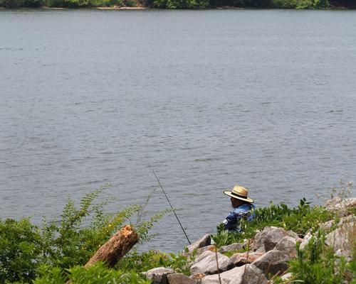
The sequence here gives a smile from understanding the story line and therefore I'll treat it as a story rather than image critique.
I feel it needs another frame or two that imply a considerable, unsuccessful passing of time before the arrival of the boat. Pulling back for your second image goes some way to doing this. Possibly add a couple more, each drawing further back before the punchline last image?
Or I might be misunderstanding your intention here? -
@simplejoy has written:
Okay... it's nothing of artistic value, I guess. But it's a little bit autobiographic. Because while I don't mind as much nowadays, I would have loved to stick out less when I was a child. 😪
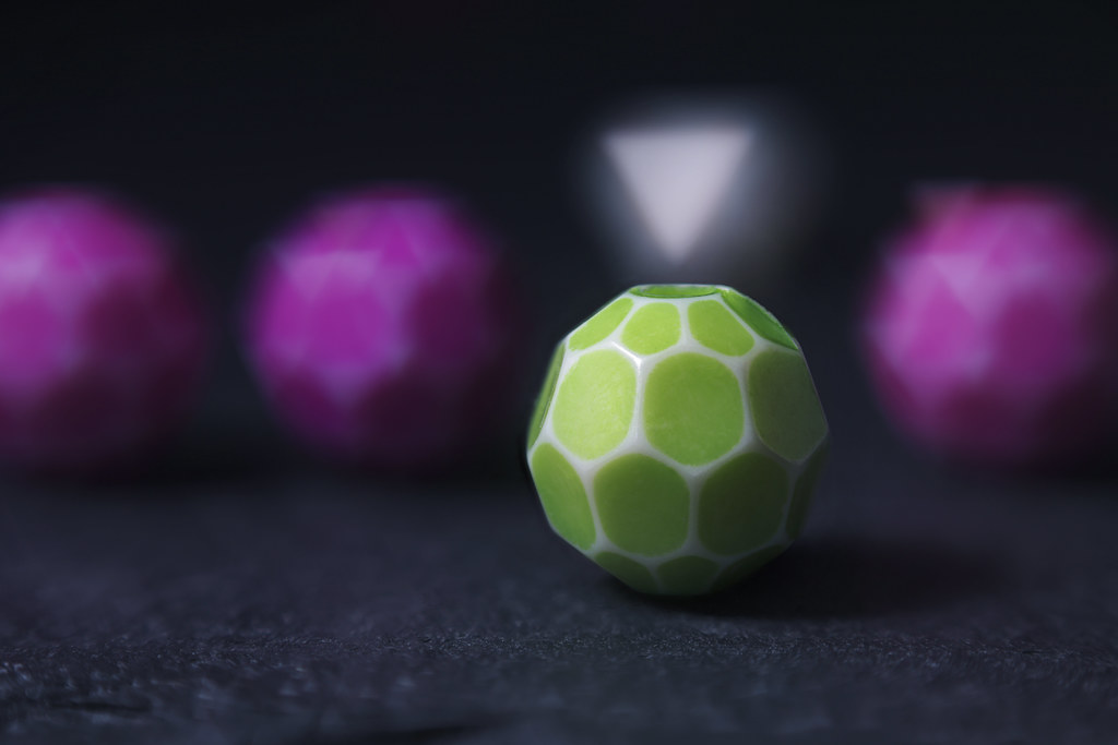
You think I'll stick out there, Mom? by simple.joy, on FlickrI'll probably add this as another example for triangular bokeh (because everyone is raving about that nowadays 😉) to my thread about unusual bokeh shapes. Drop by, if you have something similar or more spectacular! 👍
BTW. this shot was created for a flickr group theme called "beads".
Yeah, Greenie sticks out, not only because he is not purple, but because he has a triangular marker pointing right at him.
You make lots of interesting images of detailed closeups using household objects most of us would never think of trying to take photos of. Kudos on your creativity.
-
@WhyNot has written:
Turn About ....
WhyNot
You've shared a photo story! Well-taken. We don't get nearly as many of those as we did in the old forum, probably since flat view makes it harder to deal with. This shot could easily have been taken at one of my local haunts, the bend in the Pearl River. It looks like a southern US river, with its usual mix of straw-hatted shore fishermen, flowing water, verdant greenery, treacherous rip-rap, and intrusive boating enthusiasts who annoy the shore fishermen by getting too close in. I think I may drive down to the Bend this afternoon and see what it has to offer...
-
@OpenCube has written:
8MB's of crap. Lol.
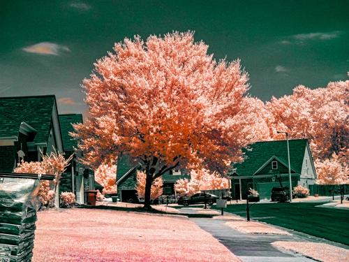
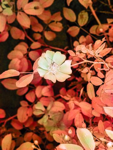
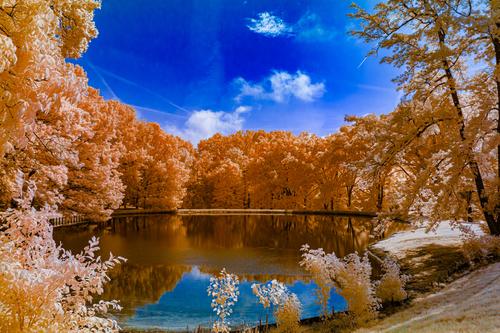
The second works better than the first, because the subject matter (lone flower with interesting insect) works reasonably well with the odd colors. The first is not a particularly interesting scene and outside the frothy peach colored trees there isn't much to look at. Maybe that is the point - the dullness of subdivision life.
-
@minniev has written:@simplejoy has written:
Okay... it's nothing of artistic value, I guess. But it's a little bit autobiographic. Because while I don't mind as much nowadays, I would have loved to stick out less when I was a child. 😪

You think I'll stick out there, Mom? by simple.joy, on FlickrI'll probably add this as another example for triangular bokeh (because everyone is raving about that nowadays 😉) to my thread about unusual bokeh shapes. Drop by, if you have something similar or more spectacular! 👍
BTW. this shot was created for a flickr group theme called "beads".
Yeah, Greenie sticks out, not only because he is not purple, but because he has a triangular marker pointing right at him.
You make lots of interesting images of detailed closeups using household objects most of us would never think of trying to take photos of. Kudos on your creativity.
Minniev is right. I'd never have dreamed of trying something like this for a shot. Yet another example about the two way nature of art. When I look at it, the unusual and colours mean I think Wimbledon nd I go looking for meaning in the unorthodox balls.
-
@MikeFewster has written:@WhyNot has written:
.......
The sequence here gives a smile from understanding the story line and therefore I'll treat it as a story rather than image critique.
I feel it needs another frame or two that imply a considerable, unsuccessful passing of time before the arrival of the boat. Pulling back for your second image goes some way to doing this. Possibly add a couple more, each drawing further back before the punchline last image?
Or I might be misunderstanding your intention here?@minniev has written:........
You've shared a photo story! Well-taken. We don't get nearly as many of those as we did in the old forum, probably since flat view makes it harder to deal with. This shot could easily have been taken at one of my local haunts, the bend in the Pearl River. It looks like a southern US river, with its usual mix of straw-hatted shore fishermen, flowing water, verdant greenery, treacherous rip-rap, and intrusive boating enthusiasts who annoy the shore fishermen by getting too close in. I think I may drive down to the Bend this afternoon and see what it has to offer...
Thank you for your critiques and interesting interpretations of this series .. normally I don't usually and don't like to give my interpretation of my posts here but today …... I was walking along the Tennessee River at our local marina the other day when I saw this fisherman with an interesting hat .. and it also reminded me of a recent critique I made about a similar situation shared by Minniev and these picture matched some of my critique and give her a chance to respond in kind …. Sorry about that … and I really had nothing else to share this week if I hadn't taken that walk … so …...
WhyNot
-
@minniev has written:
I appreciate everyone's help. When I'm working on a project I depend on forum members to give me feedback to help me shape what I'm expecting to display. To me, that is better feedback than I could get from an art critic - you guys come from a wide variety of backgrounds and have a wide variety of interests and styles and experience, but you share a common trait: a well developed visual intelligence. Thank you for sharing it.
An image I would be happy to have captured Paula. Personally, I would crop a bit from the top (I am having second thoughts about that though) and clean up the lower left of the image a bit. The crop, having done it but also having cleaned up the bottom after cropping, I think is unnecessay. I do think cleaning up the bottom left removes some distraction but that is entirely personal.
I have included that clean up below for your consideration. The sky part needs some more work but for this purpose it is good enough.
On a different note, I don't participate much here because I find the non threaded nature of threads like this off putting and just require more work than I want to put in.
Andrew
-
@MikeFewster has written:
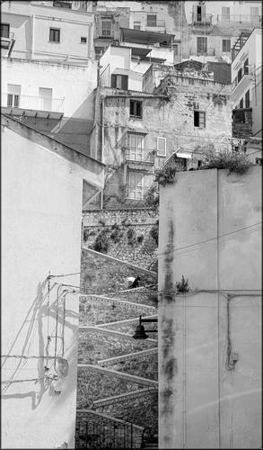
Sciacca.
You have a choice in this cliffside Town in Sicily. You can be going Up. You can be going down.A vertical village definitely demands a tall vertical frame. Imagine this shot as a panorama - it just wouldn't work as well.
The two almost featureless buildings in the lower half create a chimney of interest between them, through which the zig zag path rises. This narrowed focus of interest emphasises the vertical direction, and the zig zag climb does the rest. The figure towards the top of the climb adds a focus point, and a "reward" for the visual journey so far. The scene continues upwards and broadens, but my eyes have already been trained by the lower part to recognise the story of the vertical climb, and are mesmerised by the houses built almost on top of each other.
The harsh shadows imply strong sunlight and suggest heat, and the thought of climbing up through the village is exhausting. I hope there is a nice shady watering hole at the top.Pete
-
@LindaS has written:@ChrisOly has written:
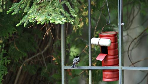
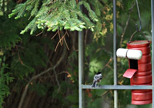
Tit
I know this is not avian forum, but i just happened to capture an elusive chickadee...
Well, no, you haven't captured it yet 😅
The trap is set and obviously the chickadee is intrigued. Will it enter the dark maw in search of its favorite treats or will it sense danger and move on? Stay tuned; all will be revealed in our next episode!
I enjoyed the humorous side of your text and Linda's reply. I also think Linda's crop is good, as I find the shadows on the grey wall distract from the main theme of the photo, however, I would not crop off quite as much. The bars on the right are reminiscent of a prison and add to the story, in my opinion, and cropping right up to the vertical bar means it is not so obvious. If the crop is further to the right, perhaps at the edge of the grey wall, then that sliver of green makes that final bar more obvious and the idea of prison bars more accessible.
The red house/trap attracts attention and draws my eye in much the same way the bird is drawn in, and it seems to feel the same incertainty as to whether it is a welcoming haven or something altogether more sinister!In any case it is well seen.
Pete
-
@LouHolland has written:
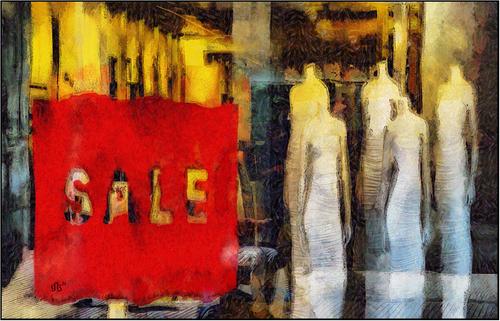
This image immediately attracts attention, and not just because of the large red square! It is not obviously a photograph, but the PP work truly enhances it and adds a layer of mystery.
My eyes are initially drawn to the red square, but quickly move on to the wrapped headless women, then take in the mysterious surroundings of the shop and the knees of the seller or the buyer. But what is being sold here? Women? Misogynistic women, headless and without thoughts of their own? Egyptian mummies? Evening dresses? The showroom mannequins themselves?
The textures are excellent, painterly and very well chosen. The strong reds and yellows and dark blue greens reminds me of one of your countrymen, whose first name was Vincent.Thanks, I enjoyed this image very much.
Pete
-
@Rich42 has written:
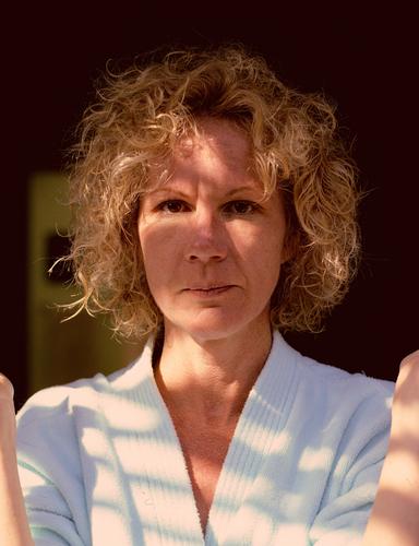
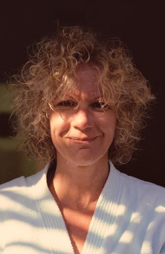
Gayle's one and only fling with a self-permanent. She's doing her best not to break out laughing. But couldn't keep a straight face.
Some time in the mid-80s. Kodachrome 64, Daylight. Olympus OM2n, Zuiko 50mm/1.4, ~ f/5.6, drum scan.
This was a difficult scan. Kodachrome always required extra compensation, scanning slightly blue-ish. The late afternoon light which was mostly skylight was very blue, despite the few rays of sunlight coming through some tree branches. The 'chrome looks quite blue, optically.
I thought she looked great in curls.
Rich
You mentioned in another post, that these were quick, off the cuff portraits. They are my favourite type, as they usually reveal more about the people involved, and these are great examples.The first appears to have caught her pretty much off guard, before she can put on her preferred expression and has a charm of its own.
For the second, she has had a moment to compose herself and her expression, but it is such a warm, natural and affectionate smile, without a trace of of being posed, that it is a real winner.
The lighting is harsh and contrasty, but it doesn't matter, and is part of the package of not being posed. In the first it highlights the eyes, which may seem the better choice, but in the second it illuminates that winning smile, and although the eyes are in shadew, we still see the smiles there too.
In both photos we see the delightful fresshly washed curls, which are contrasted nicely against the dark background.
These are endearing portraits and must mean even more to you and her.Pete
-
@OpenCube has written:@OpenCube has written:
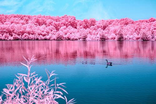
I much prefer the second photo you posted this week. The first attracts attention through the unnatural pink colours, but other than that the image quickly wears thin. There is a row of trees and their reflection, a cute family of geese and a rather obtrusive plant in the foreground.
Now the second is different. The colours still command attention, but they are a much more attractive orange and deep blue, but that is just the start.
The trees themselves are far more interesting, with more patterns and individual trees to look at, whereas the trees in the first were just a homogenous band without much visual interest.
The water, with its reflection, is almost eye-shaped, and the tall trees frame the sky into a similar shape, effectively mirroring the water, which is very cool.
The small trees in the foreground do not intrude rudely, but give an extra layer of depth to the scene and add greatly to the appeal.
I think these two illustrate the importance of having a good, well-composed subject, which is then changed with a fairly extreme PP, rather than an image relying to a great extent, or solely, on heavy PP.Pete
-
@Bryan has written:@minniev has written:@Bryan has written:
.
Well, consider this one a success. The flower is as near perfect as a wild water lily can be, your capture is about as good as possible under the lighting conditions. You have a few extras in that the lily has unusually nice coloring, you have those adorable little bugs crawling on the leaf tips, and you have a nice angle that allows a view of the center of the flower. Focus is pretty good. The very middle is a trifle softer than the petal tips but can be sharpened further in post. Lowering the brightness in the just center will also give the appearance of sharpness in that area (plus some local sharpening and clarity). If you have tools for spot editing without changing the entire image, those will help you here. If your editing tools don't allow for this, you may want to track down another option that will let you edit different areas of the image differently. You could also raise the brightness in the water to show a little more blue. These are very small/minor edits that might make you better satisfied with a very nice capture.
(PS - the one you added later, the side view, is nice too, but I like this one best).
Thx Paula,
Turns out there is a simple selection tool enabling selected edits so I took Linda's crop and vignette and came up with this...
p.s. don't look too close - there is no blending on the edges of the highlight removal....
Between you, you have made changes, which have definitely improved the image, even though it wasn't bad to start with.
Well done.Pete
-
@simplejoy has written:
Okay... it's nothing of artistic value, I guess. But it's a little bit autobiographic. Because while I don't mind as much nowadays, I would have loved to stick out less when I was a child. 😪

You think I'll stick out there, Mom? by simple.joy, on FlickrI'll probably add this as another example for triangular bokeh (because everyone is raving about that nowadays 😉) to my thread about unusual bokeh shapes. Drop by, if you have something similar or more spectacular! 👍
BTW. this shot was created for a flickr group theme called "beads".
If this is autobiographical, then I think it is important to realise that it is being pointed at (by a white triangle) that is the main problem, and not because you are green. 😉 Maybe this is another case of trauma being a catalyst of creativity, because you have certainly made a very attractive photo out of very little, and the shallow plane of focus and the very attractive bokeh have been used extremely well. As for the triangular bokeh ball ..... Triangular??!!! I had no idea there was such a thing!
Pete
-
@WhyNot has written:
Turn About ....
WhyNot
This is a neat little story showing the angler alone and at peace, gradually sinking into his surroundings, only to be disturbed by a motor boat. I wonder what annoyed him most, disturbing the peace, scaring the fish away, or possibly even snagging his line?
Pete
-
@PeteS has written:
Women at Work
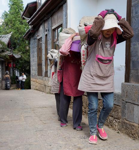
The choice of jobs for women in China seems greater than in the West, but that doesn't mean that western women would clamour for a chance at some of those jobs.
Pete
Thanks for the comments.
When I posted this, I was interested to know whether the woman modelling and the photographers in the background were obvious enough, as they show an important juxtaposition between women's jobs, and, judging by the comments, I think the answer is "not really".Maybe I can rectify that with a bit of judicious PP. Maybe brighten the red lanterns and change contrast, brightness and maybe even the colours of the background figures to help them stand out a bit more.
Actually I have had to make the best of a poor job with this image, as I came around the corner of the alley and was confronted with the scene, which delighted me. However, my lens was wide open, giving me less depth of field than I thought I had, and also the AF focus area had been knocked to the bottom, and was focused on the pavement just in front of the women, which has actually been cropped off here. I wanted the model shoot to be very slightly out of focus to be a secondary, but recognisable, sub-scene, but not attract too much away from the hard-working main subjects, but it was far more blurred than I had planned, and had to be rescued a bit in post.
My first attempt was to take them whilst still much nearer the model shoot, but this did not work because the angle meant that the second and third women were hidden behind the first, and anyway, I later discovered my mangled AF point meant that nothing much was in focus. I then decided to shoot wide angle as they went past to accentuate the leading lines toward the model shoot. I didn't want to stand there, camera to eye, as they walked past, as a clown with a camera pointed at them as they toiled past with their load may have hurt their feelings, so I just dangled the camera from my hand and trusted to instinct, as this also gave the low angle I needed. So the clown still fired (silent) shots as they walked past, but I am sure they were unaware and didn't feel any anguish, which I think is most important, even if the result is the same.
Human failure on my part meant that the result was technically sub-optimal, and you can't make a silk purse from a sow's ear, but sometimes the purse you do get is still useful, especially if the subject and story is strong enough.
Pete
