That's a song I have liked since the 1960s. I was certain that Pete Seeger wrote it. I checked. I was wrong.
The image has been constructed from one or more photos so I looked for a reason for the treatment. The association with "Little Boxes" is perfect.'Each house looks to be of superior quality. They are repeated. They overlap. They don't look as though they are about comfortable living. In Australia we have a derogatory term for housing like this. "MacMansions." These are houses where the owner/builder tries to get every bit of houses they can onto the block with the absolute minimum of green space left. These are compared, with nostalgia, to Australian housing until around 1970. In those days most houses were built on a 1/4 acre block and had backyards big enough for cricket and football games. Linda's photo would be interpreted with plenty of political clout in this country and I see it in those terms.
June 21, 2023
104
-

-

I enjoy studying this collage of houses and find it an inventive concept. Using the negative images makes it more surreal and seems to make it look more like an ink drawing.
I am not sure about the mirror image. On the one hand it fits well with the idea of everything being the same, as mentioned in the song, but somehow the relative chaos on one side, then a relatively quiet patch in the middle, then the mirror image, breaks it up a bit. What it does do is allow the subconscious to find multiple faces, which rely heavily on symmetry to be identified as such. It is best seen in the thumbnail, and looking at different sized thumbnails reveals a number of different animal cartoons looking out at us.Pete
-
The multiple images have given the graffiti a three dimensional and tactile feel, which I really like and is a good example of an image being created by the processing rather than simply improved or modified.
However, I do like the suggestion of masking out a portion, or portions, of one or some of the layers in the image, leaving the edges as they are. This would give a focus on part(s) of the image.Pete
-
I like Andrew’s panoramic version with the increased brightness and detail in the water.
In any case the rather delicate and amusing stance of the birds emphasises their fragility against the dark chunk of concrete (which balances the birds visually quite nicely) and the raging water.
The Dam Birds provide a very fulfilling project, and I am glad to hear you enjoy it for its own sake, and not just for its potential to provide a good photo. It is so important, because if a good photo is the sole purpose of time spent, then photography can quickly become a very annoying hobby.Pete
-
These two photos of birds and their offspring could hardly be more different.
The first is really about the beautiful plumage of the goose, which is impressive. The fact that a gosling is also in the frame is almost irrelevant, as the photo shows no obvious maternal connection between the two. The lighting is bright, but harsh, the pose stiff and upright and the sharpness includes both birds and lots of grass, resulting in a very factual image, but lacking in emotion.Now, the second, wow! It is B&W as the first obvious difference, but the curves and sweeps of the composition suggest caresses and the cygnet snuggles against the mother’s body. These visual clues mean the viewer feels the maternal bond, even though the swan is actually preoccupied with herself and is ignoring the cygnet at the moment the photo was taken. The choice of a high key finish and the beautifully sharp centre fading to a white vignette adds to that feeling. It is an excellent image.
Pete
-
I'm so glad the photo spoke to you, Mike! Fascinating to read about your country's use of "McMansion" because I first remember the term in the US in the late 1980's with new housing developments near Washington, DC. A google search just now pulled up this from 2022:
A McMansion is a pejorative term for a certain type of ubiquitous supersized suburban American home that people love to hate. A symbol of American excess, these homes reinforce the unsustainable notion that bigger is always better and can be found cluttering neighborhoods across the U.S. from sea to shining sea and beyond.
Thanks!
-
Thanks so much for your intriguing and educational response!
-
Time travel to the beginnings of the American interstate system and family vacations in wood-bodied station wagons, with Mom holding the map and us kids counting cows from the back seat while whining "Are we there yet?"
😁
-
Agree. However, I don't think it works as well as last week's from Jim. This is an image where opinions will be personal. There is much to explore here and the fun comes from digging in to find the details. The overall colours and complexity appeals (the colour combination pushes the same buttons as does SimpleJoys photo this week). I preferred last week's from Jim where I found an overall composition and a point of focus.
-
I'm rethink this a bit. Looking more, I become aware that Jim has used a different technique with finer detail around the borders and this takes the eye into the central area which has larger shapes as well as a little more white. I still prefer the previous week's shot because I found more I could identify with as a subject.
-
Minniev, this isn't fair. I run out of adjectives with regard to your Dam Birds. Over and over I find myself saying much the same thing.
Just ditto my previous remarks and add a note for the extraordinary legs in this shot. So long, fine and sharp and with an apparent fragility that mocks the waves. So perfectly places against a background that shows those qualities off. -
Somewhere I have read that Australia has one of, possibly the most, diverse bird populations on the planet. It is to be hoped that we will do much better in the future in looking after them.
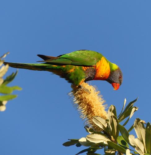
Even by lorikeet standards, I think the colors of the bird as well as the sky are oversaturated here. I'm in two minds about the formatting. It might depend on where the image is shown. As seen here, I think the landscape shape is a bit too extended. Besides, the banksia is very photogenic in its own right and the colours work well with the lorikeet. The angle of the banksia is balanced by the tail so I think you could change the height a little to include more of the banksia.
More Australia birds please. -
Is this a photo of an empty garage? No, of course not, because although that maybe true objectively, it is really about the colour and the graphical composition, and they are good enough to make this an enjoyable photo. Simple, minimalistic and good.
Pete
-
A well-spotted juxtaposition between the tangled hair of the visitor and Venus. There is a strong diagonal link between the visitor’s head and , through Venus’s body, to her head, which ensures we get the connection. It looks as if the two are comparing notes. How boring this photo could have been, if it had just been a photo of Botticelli’s Venus, fantastic though the painting is.
Pete
-
This is a fine shot of a beautifully coloured bird, with all the colours of the rainbow except blue, which is in abundance behind it. Other comments mention over-saturation. Maybe, but it doesn’t worry me. It is such an exuberant plumage, that saturation may even be appropriate.
What does worry me a bit is the composition. I get what you were trying to achieve, with the panorama format matching the pose of the bird, but, although I like the idea, I feel it doesn’t quite work, and that is due to the chopped feeling of the banksia and particularly the leaves. I have tried a crop as a suggestion, based on the other version you had as a thumbnail in your original post, which I assume is the out of camera version. Obviously the leaves on the left still need to be cloned out, but to me the composition has a better balance and the flower and leaves seem part of the composition instead of being decapitated.Pete
-
I feel much the same about both shots. In one, it gets a bit muddled as to the distinction between mother and offspring. The newly hatched looks sort of like a protuberance on the side of the mother. Wonderful feather details. A subject worth trying again from a different angle.
Co-incidentally, I'm in Italy and in recent weeks I have seen far too many "Leda and the Swan" pictures. Consequently at the moment, I don't impress easily with swan shots. But Lou's second shot is a different story. The PP has built on the circular shapes of the image, the neck, wing , breast, edge of the nest. Outstanding use of high key vignetting to remove extraneous shapes and capitalize on the curves. The feathering of the vignette adds softness that is perfect for the subject as well as being consistent with the whiteness of the swan. The strong lines and the textures here make B&W an excellent choice.
Quite wonderful Lou. -
I like the seemingly endless view into the distance, which is enhanced by being an IR shot.
I also like and empathise with Linda’s comments.Pete
-

Thank you, Pete!
Rich