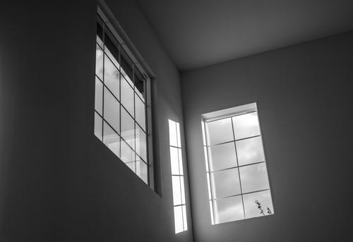
While at first look, this image seems too busy and full of conflicting things, fighting for attention, taking some time and then re-visiting it made me realize that this very aspect is actually the appeal of it. It raises a lot of questions and provides endless inspiration for stories about what's happening, what happened in the past, and what will happen in the future. It's one of those images a skilled band or musician could write an entire concept album around and I like it a lot for that! 👍
-
-
Wow - unfortunately I've not much to say in terms of interpretation or any real suggestion... It's just great as it is. Love the format, the lines and composition. Despite being a very high rectangle, it just seems incredibly well-rounded. 😁 Excellent work!
-
-
-
-
@Rich42 has written:
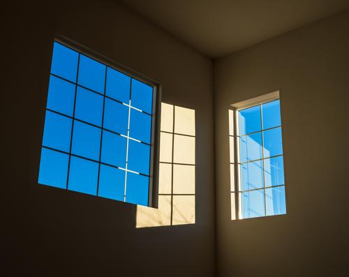
The sun had just cleared the horizon.
High windows in my living room.
Rich
I love this. I'm a big fan on disorientating images, like a lot of Michael Kenna's. This has a strong graphic element going for it and also at first glance, it's not obvious how to parse what you're seeing.
👍👍
-
This week I’m experimenting with responding after using the Reply button and the names of those replies I have read. I’m trying to find a way to keep links together rather than have to go through the pages over and over.
Roel and Chris.
As Chis said.
A WA lens at close quarters and the low angle have made the people look big. There are two consequences. The viewer shares a feeling of claustrophobia and the viewer feels small. Together give tension. Add the limited lighting and the dark spaces. Usually having more than one bright area in an image gets takes the viewer away from the subject. Here it's a virtue. We explore the surroundings. Exactly right for the subject. Still plenty of dark spaces that things might be hiding in. Maybe snakes Roel? -
This week I’m experimenting with responding after using the Reply button and the names of those replies I have read. I’m trying to find a way to keep links together rather than have to go through the pages over and over. I'll start with the name of those I'm responding to in the posts.
Lou.
The isosceles triangle with the apex at the top is an effective way to direct the viewer.. Here it takes us to the face and Lou's substitution of a mask gives a face that can't be missed. The face is human but dehumanized and it is not happy. I'd take that as a comment on plastic in oceans in general. Plastics can be recycled into jackets but it is a mere drop in the ocean in the scale of the problem.
The background is sombre with hints of the city in the reflections. The ocean is overwhelmed.
A message to be digested. -
This week I’m experimenting with responding after using the Reply button and the names of those replies I have read. I’m trying to find a way to keep links together rather than have to go through the pages over and over. I'll start with the name of those I'm responding to in the posts.
ChrisOly and Linda.Interesting note from Linda on the hazy background and the use of dehaze filter. The hazy background works well here because it helps isolate the foreground figures that are the subject. Where I am at the moment I'm shooting landscapes where I want more of the landscape detail and I'm battling quite a bit of haze. Whether to use a haze filter, when and how much is a topic on my mind.
I very much like the island position of the subjects when it is added to the hazy background. Our fishermen are isolated in time and space. fishing does that to your head.Doesn't matter whether they are biting or not.
I like the big rocks at the front. They help set the subjects in their fishing apart from the many cares of the world at large. -
This week I’m experimenting with responding after using the Reply button and the names of those replies I have read. I’m trying to find a way to keep links together rather than have to go through the pages over and over. I'll start with the name of those I'm responding to in the posts.
Linda.
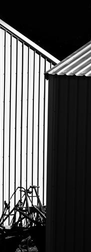
Love it on many levels. I really admire abstractions where the subject has been reduced to absolute basics and the artist has shows us the skeleton of the lines and tones at work. Applause for the formatting. I never see any reason whatsoever to be bound by the conventions of frames.
Would you consider simplifying this even further? Perhaps eliminating the details in the black area below the bikes? Maybe getting rid of the bikes as well. All the frames below the handlebars become a bit of a tangle that is at odds with the purity of the upper 3/4. Maybe, for something really daring, just the handlebars at the bottom? -
@minniev has written:@simplejoy has written:
You still remember the (short lived) era of the minilab? The "one-hour photo machines"? I actually don't myself, as it was already on a downward slope when I was born. 😅 But the lens I shot this with was used in such a device. So after enlarging thousands of photos in some machine, day in and day out, it finally got a (hopefully) more creative purpose here.

Pinch watching by simple.joy, on FlickrIt is always fun to follow my first impressions when I see your images - organic UFOs in formation with jet streams following, then carrot cake with buttercream icing on the tines of a fork. Not sure what happened to the first crumb on the left though, it seems to have imploded and only left its ghost behind.
Nice colors, interesting detail and blur, a nice rhythmic composition.
I was also thinking inmediately of some kind of aircraft, flying in perfect formation and leaving con trails behind them. Calling them alien craft is an inspired insight.
Coming back down to earth this does not remind me as much of carrot cake with icing, but rather of a sampling of assorted spices like you would find in a Bazaar in the middle east or India. Marco Polo would be proud.
Maybe this could be called “Spice Trails”Roel
-
@minniev has written:@MikeFewster has written:
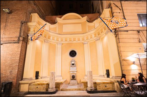
The New Crop of Unicorns.
This is the first of a number I'll be posting on Siena and especially the Palio. If you don't know much about the Palio, here's some background.
www.thegeographicalcure.com/post/guide-to-the-palio-of-siena
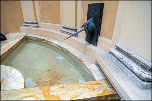
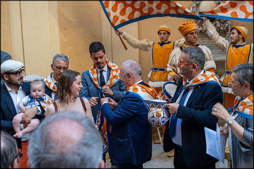
The Contrade we saw most of was the Unicorns. Each Contrade has a ceremonial fountain. The first event we saw was an annual baptism of newly born infants into the Contrade. Each was welcomed with a certificate, drum rolls, flag salutes and head sprinkled with water from the mystic fountain.
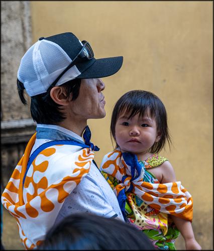
Great storytelling thread. I had never heard of the Palio until Roel's visit several years ago. You've shown us a different side of the frenzied celebration, illustrating the family traditions within the Contrade. Humans around the world have always organized themselves into smaller groups, established group rituals, displayed their symbols, made alliances with some other groups, competed with other groups, fought against others as well. The tradition seems both ancient and modern, and you've shown us various ritualized parts. The babies will be expected to carry the tradition forward. Love the last photo that makes all that real.
What makes that last image particularly noteworthy, is the fact that father and daughter are clearly not of “native Italian” descent. These are people with an Asian heritage who have arrived in Siena (or whose ancestors have arrived in Siena) maybe recently (maybe a long time ago).
But they will be members of the Unicorn Contrada just as much as Sienese who can trace their bloodlines back to the Middle Ages. It is an image of tradition but also of inclusiveness, tolerance and common humanity, through the assimilation of values and traditions.
Mike was in Siena in the week leading up to the first (July) Palio of the summer. I am sure he has many more images to share of the preparatory stages, like the total transformation of the Campo into a race course.
When I got there 7 years ago, with permission to be “embedded” for a week in the Contrada della Giraffa, the Campo had already been transformed and the stage of the horses’ presentation and selection, the lottery draw of horses between the competing contrade and the succession of trial runs was just aboit o begin.
It was one of the most memorable weeks of my life, certainly photographically, with not much sleep and an overdose of excitement. And it yielded the docu series that I am still most proud of. I am sure that Mike’s experience was similar. Although the Palio has become exploited touristically just a little bit, the core remains the same and it truly is a unique event.
-
@Bryan has written:
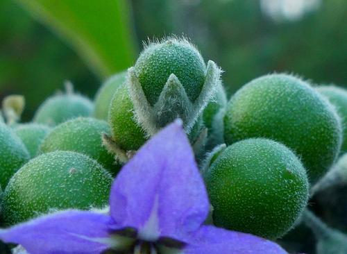
Another Nightshade flower - I think it is what we call bush tobacco
.
You've given us an unusual composition here. The focus is on the central bud that rises out of a triangular configuration of buds, but the flower itself in the foreground is only partially revealed and is somewhat unfocused. It does have the same triangular configuration as the buds, which is interesting. It is a nice play on focus sharpness, shapes, and color contrast (purple and green are pretty much opposites on the color wheel), and the detail in those buds is great. I'm pretty sure, though, that I'd prefer a more traditional composition with a full sharp view of the flower and the buds nearest to it, or perhaps the reverse angle with the sharp buds against the blurred purple background of the flower. But heck, I'm old and fairly traditional in my tastes, so take that into consideration. Thanks for sharing a creative and different approach to such a subject.
-
@Rich42 has written:
The sun had just cleared the horizon.
High windows in my living room.
Rich
What a clever image! I love the funhouse confusion of figuring out this visual puzzle created by the various overlapping reflections and light patterns. The warm/cool contrast is effective, as is the color contrast of blue and gold. This is a master class on making impactful images out of our own everyday surroundings. This would be quite nice in a high contrast monochrome conversation as well.
-
@simplejoy has written:@LindaS has written:
Forms
Wow - unfortunately I've not much to say in terms of interpretation or any real suggestion... It's just great as it is. Love the format, the lines and composition. Despite being a very high rectangle, it just seems incredibly well-rounded. 😁 Excellent work!
Many thanks! Love your pun too.
-
@minniev has written:@Rich42 has written:
What a clever image! I love the funhouse confusion of figuring out this visual puzzle created by the various overlapping reflections and light patterns. The warm/cool contrast is effective, as is the color contrast of blue and gold. This is a master class on making impactful images out of our own everyday surroundings. This would be quite nice in a high contrast monochrome conversation as well.
What appeals to me most is something MinnieV touched on: finding interest in everyday surroundings. For me, there is great satisfaction in seeing a familiar object in a different way. Often the light at the moment plays a part. Love this photo!
-
@MikeFewster has written:
This week I’m experimenting with responding after using the Reply button and the names of those replies I have read. I’m trying to find a way to keep links together rather than have to go through the pages over and over. I'll start with the name of those I'm responding to in the posts.
Linda.
Love it on many levels. I really admire abstractions where the subject has been reduced to absolute basics and the artist has shows us the skeleton of the lines and tones at work. Applause for the formatting. I never see any reason whatsoever to be bound by the conventions of frames.
Would you consider simplifying this even further? Perhaps eliminating the details in the black area below the bikes? Maybe getting rid of the bikes as well. All the frames below the handlebars become a bit of a tangle that is at odds with the purity of the upper 3/4. Maybe, for something really daring, just the handlebars at the bottom?I'm open to all ideas and suggestions, especially given that my original vision was not at all cropped this severely. What I loved and photo'd in the moment were the shadows and light. Over the years I've changed from giving a great deal of thought at the moment of capture to exploring different stories after I open the raw file in my editor. Something about left brain/right brain, along with physical limitations and other. I appreciate your time and interest!
-
@Rich42 has written:
Jim, Minniev, LindaS,
Thank you all very much for the comments.
I've photographed these windows many times since we moved in to this house in 2012. The image changes wonderfully with the time of year and time of day.
The scene can look extremely confusing and disorienting in 2-D, especially when I don't process it light enough to show the lines of the intersecting walls in the shadow area at the top. I like the color version, but it does work very well in monochrome, in which case, the spatial disorientation effect is greater.
Rich
