I am quite partial to direct pictures of the sun, and this is a fine one. The reds/oranges/yellows are rich and warm, and that fiery ball looks like it might drop right down into the the space between the piers. The patterns in the water form a lovely space to set the main features upon, and they match, in pattern, the lines of the clouds. A nicely put together image.
July 26, 2023
203
-
-

It would be hard to get a shot that feels more relaxed. Visually, I think this is being created by the mass of little repeating clump shapes plus the horizontal lines. Check the clumps. Patches of grass, the closer trees, the hills, the clouds, the cows, the white faces and the clouds. Similar sizes and shapes everywhere. They are all sort of rounded off and complete. It creates a static feeling. The one major vertical is the young lady. She is too far away to be the subject but she is obviously taking in the scene so this also feels static.
The cow looking back over its shoulder appears to looking at the looker. Its aware of her presence but not bothered by the proximity. This cow's head turn lifts the shot and we smile. It is helped by the contrast of the white face against the brown hides.
Gentle humour in a gentle and lush setting.
The way everything ought to be. -
This is a colour combination I enjoy. It associates night and moon events. There are hints here of eclipses and metal. It triggers the kind of wonder I feel about space and space exploration.
That's more than sufficient reason for liking the image. -
A fiery sunset and a calm, reflecting sea. It's competently recorded. What makes the shot though is the criss cross grating and silhouettes of the pier. The bracing especially smacks of humans and engineering against the natural shapes and colours. The top of the structure is carefully located along the horizon leaving the three slender poles with their triangular tops to link the horizon to the sky. I very much like the positioning of the pier with the sun and its reflections coming straight at us through the gap. Similarly, I like the empty sky and ocean on the left that stands as a contrast to the structure filled right.
It would trigger my early memories as well. -

I like the shadow-play, lighting and geometries in the second shot.
Rich
-
Very creative. Very pleasing image. Good eye!
Rich
-
Pete,
This is a remarkable series. I'd be satisfied with one decent image under the circumstances. But every one of your interpretations of the building are compelling and arresting.
Rich
-
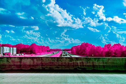
Nice well balanced image. They say 2 objects is the magic number and it works here, though the objects are different. The setting for the 3 objects is 3 nicely divided layers. 2 of the 3 objects break the plane of the layer above them, which adds interest. The little splash of almost red offers color contrast to the blue/taupe theme that occupies the rest of the frame. It has a Gursky-ish feel to it, quite a nice image.
-
It is hard for me to reconcile these two versions as being the same building - they are so different in so many ways. That makes the pairing interesting but somewhat jarring. The first seems like an etching on metal of this exquisite building with all its little details. The second is a dizzying display of geometry - the complex arches and domes, but also the sharply defined shadows, both leading in different directions. The complexity of these is actually the trait that makes they interesting.
-
What an awesome portrait of the two of you! The two sided framing is great, the slightly muted/limited color palette is so well suited to the creative treatment you've given it. The lighting is perfect. You and your camera make for an in-character portrait. But the show-stealer is Stella, peeping around the corner in the warmest part of the light, with an expression of absolute boredom suitable for a haughty queen.
-

I fully agree - the empty space between the constructions inviting the sun in - is excellent. Great work on the composition and very nice tones of course!
-

-
Great shots, Pete:I like them all, but this one best.
I am amazed at the technical quality of the photos achieved by such a small device. Am I wasting my energy carrying my EOS R6 around?
David
-
Very effective self-portrait with great experimental processing - the colors are very effective this way as well. One of the weekly themed Flickr groups I participate in has a theme of processed portraits this week. Yours would work perfectly for that. Mine's going to be a bit boring, I'm afraid... 😅
-
Foreground and background are pulled together by the almost identical blue and white tones of both. Different eras but even so there's an olde worlde kinship between the iron work and the car. Those inside the old Cadillac are relaxed, check the girl in the back seat and the arm on the window edge. So are those on the street. Car, street, people, they look right together.
I'm not sure what reprocessing you might have done to the image but I like it as it is here. Check a section like the far end of the street enlarged. The grain and charcoalish touches work well. It's impressionistic and that is fine. A highly polished, fine detailed image could feel out of place with the life on these streets. -
IMNHO. these two images shouldn't be presented together. Same place but such totally different treatments that they sort of clash.
On their own, I prefer two for the same reasons as Rich.
Arches, vaulting, brickwork construction awe me. As do questions as to how forces are transferred by these means. The design, calculation and construction skills are humbling. It's all on display in this photo. The shadows of the columns and fence are a bonus. If this had been a different time of day it wouldn't have worked as well....the shadows might have cut at right angles across the view down the length. Now, the angles take us down and accentuate the length. In its turn, this impresses us further with the scale of the ceiling. -
What a magnificent spot! Granted, I'm in Australia but over the years we tend to see lots of pictures of stand out places from the USA. This one is new to me.
You have a good angle. It picks up the slight outward overhang of the rockface and adds a little tension. The inner edge curve of the close vertical rock face corresponds with the curve of the bridge and both frame the waterfall. The tourists at the top give scale. They are small but getting them against the cloud helps them stand out so that we are aware of them. This was tricky to expose. You needed detail in the waterfall and the pool but you didn't want to burn out the clouds.
Well done.
Have you more to share with us next week? -

This photo burns its way in and warms the heart. Sunsets are so popular that they have become clichéd, and are quickly dismissed, but good ones, like this, are still good to see.
I think that rare deep orange sky has a lot to do with the attraction, but also the geometry of the silhouetted pier and the catch lights on the water. The triangular signs break the horizon and quite literally point to the sky, which links the land to the sky.
I wondered whether so much pure black shadows were needed and whether perhaps some should be cropped out, but decided it is fine as it is. The expanse of deep blacks acts as a an opposite to the bright sky and sea, which not only balances the image, but also emphasises the brightness of the bright areas.
And if it brings back childhood memories, that is a huge bonus.Pete