I'm always drawn to reflection images, and this one has superb detail. The coat of arms in the roof tiles is something I've not noticed before.
-
-
Interesting macro mystery that Simple Joy solved immediately and I would never have thought of. Love the prismatic effect, especially in the trails your attack-drops are leaving behind. You guys are very creative with your chose up photography.
-
What you're looking at is a leaf, sitting on the edge of a composite board that hosts a shed. To the left is the shed's edge, and to the right is the composite board's edge and the grass on the ground below.
-
Now I see it. Puzzles are fun.
-
I struggled a little bit creating a fitting image for the theme "stone"... When I tried a closer shot of a couple of very tiny (2 mm in diameter) crystals, I was reminded of one of my favorite songs by the band "Thrice" called "The weight" (www.youtube.com/watch?v=iktAVY4dcPU ). A song about love and commitment.

Double points for seeing this through! by simple.joy, on Flickr -
@AlanSh has written:
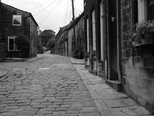
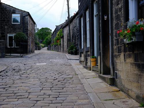
I produced these two photos - I quite like the B&W one - but for me, the colour one works better. Which do you prefer?
I really like B&W but here I prefer the colour version. Both versions need to be seen large.
B&W generally needs strong lines and tone subtlety to be at its best. The cobblestones and kerb and the top of the roofs go some way to giving the lines but they aren't taking us to a subject, they just sort of peter out. The lamp post and wires are a problem in both but especially in the B&W where are really aware of lines. cutting off the tops of the wires again gives us lines that take the eye but don't deliver. Further, they distract from the main lines of the kerb. If you really want this shot, perhaps consider removing the wires and the top off the pole.
The colour version immediately had depth. The red flowers and green leaves give interest to the foreground. The same colours reappear on a window box well down the street. The repetition in the second box may be small but it adds pattern and creates more interest as the eye moves down the buildings. The B&W version misses this completely. Something similar happens with the warm yellowish colours on the lower section of the wall at the front and the yellow pot plant on the doorstep.
The colours in 2 are muted. They don't overpower the scene and we still feel the old dark stone of the street. The touches of colour that are there seem to have important functions to me.
G'day Alan, nice to meet you here. -
@minniev has written:@Bryan has written:
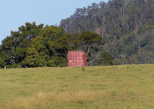
Long shot across a small valley
.
This one is a bit of a puzzle Bryan. I admit to being a novice when it comes to shipping containers (none of those here in central Mississippi) so I'm not able to surmise why one is set off far from port in what looks like farmland. Color contrast (red/green/blue) of primary colors works. What's kind of mysterious (besides the container itself) is the blotches in the right half of the phot that aren't present in the left half. There's a blur on top of the container and another to the right, then a bunch strewed in the trees of the right side. If it's not already a crop, I think I would crop it in from the right to get rid of as much of the blurry area as possible and get the container off center.
Containers may be more common in Australian countryside. Used ones are cheap, secure storage and get placed all over the place. I see them as blots on the landscape. I took it that Bryan felt the same but that might be my prejudices influencing my response..
-
@PeteS has written:@Fireplace33 has written:
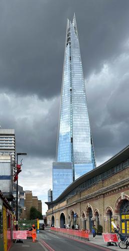
In No. 2 the glass building is capturing the light nicely and shines out bright against that dark foreboding sky.
I feel that it would also work as a long tall crop, with all of the red crane and the bright yellow wall chopped off from the left hand side, giving full attention to the magnificent Shard tower.Please let me know if it allowed to edit with sugestions and post back shots like this ?
In No. 5 the building is well framed with those interesting dark shapes
Yes, it is quite alright to edit and repost, in fact it is in the rules of the thread in the first post.
I like your crop, which simplifies the image and that is rarely a bad thing. I cropped the way I did for a few reasons. The first reason is valid. I wanted to contrast the sleak tower in the top right with the jumble at the bottom, with the tower rising above that for better or worse. The other two are not good reasons. The crop is more or less as I saw it, and I found it hard to abandon bits. The other was I did not want to get rid of those giant red ants crawling over the bottom left, as they made the the jumble slightly surreal and gave the tower an even greater contrast. However, nobody commented on the ants, so either they were not noticed, or nobody felt them worthy of comment, so it was probably not worth leaving them in, except to satisfy myself! In any case that probably means that your crop is more appropriate than mine.
Glad you liked it :-)
also good to see that editing and reposting is allowed.
It used to be allowed on DPR, until it was more or less banned. There was, among others, a very talented user called Sabrina81. I really enjoyed seeing what a bit of her editing could bring to a photo. I learned a lot from her
But unfortunately she was driven off by a few others that complained bitterly. They couldn't imagine that their original posted version wasn't already the only and the best possible way to present it.
I stopped posting in that forum after that :-( -
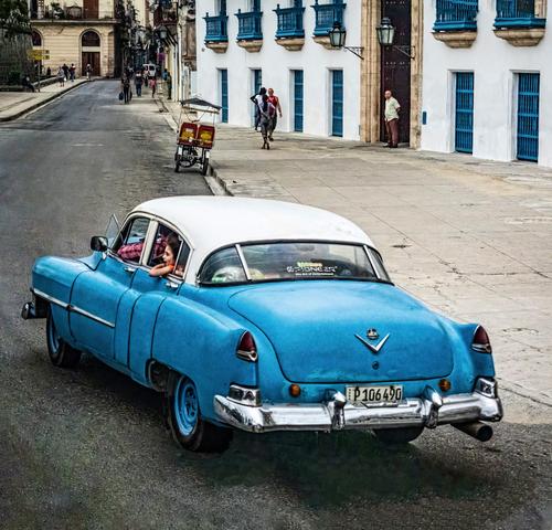
Thanks to those who commented! I always appreciate your giving my images some of your time and your thoughts. To say a little more about the image and its processing: I loved the old cars in Havana, and I spotted this one and noted the little girl's expression as the car veered around a corner in a fairly deserted part of old Havana. The result was dismal. My first issue was to reduce the excessive noise/grain from high ISO and dirty bus windows, which I did with the new LR tool. Second issue was the extreme tilt caused by the bus veering around the same corner while I was taking it. I used the new PS beta tools to try to fill in the edges that straightening obliterated, and it did OK some places but not so much to replace the rear tire on the car. I had to do that by hand the old way. Then I had to pull it all together so it made a coherent whole. I wanted to restore some grit and some detail so I used an antique Topaz Adjust filter, masked out then painted back in the degree and places I wanted it. I fiddled with the color toning a bit back in LR to get the color palette I'd anticipated. So it's a mix of on site impulse, with some instant previsualization, then experimentation in post to get it someplace I'd imagined.
@minniev has written:@ChrisOly has written:Oh I like your blue on blue interpretation. Blue '50's car against blue window frames works really well indeed. A rickshaw on a side of the street also adds interest.
Thank you, those blues struck me in the moment.
@MikeFewster has written:Foreground and background are pulled together by the almost identical blue and white tones of both. Different eras but even so there's an olde worlde kinship between the iron work and the car. Those inside the old Cadillac are relaxed, check the girl in the back seat and the arm on the window edge. So are those on the street. Car, street, people, they look right together.
I'm not sure what reprocessing you might have done to the image but I like it as it is here. Check a section like the far end of the street enlarged. The grain and charcoalish touches work well. It's impressionistic and that is fine. A highly polished, fine detailed image could feel out of place with the life on these streets.Thanks Mike, you are right that it is an interpretive rather than documentary image. There's nothing removed or added (except the back tire and distant corners. The original was badly tilted and the noise was the ugly speckled-color kind, so I had to remove it and add it back to bring it under control.
@PeteS has written:Your processing has given the photo a painterly look and an air of being hand-made or crafted in a most attractive way. The blue and white theme also works very well and embeds the car in its surroundings, which is very appropriate, given that Cuba is famous for its beautiful old cars and old buildings. These aspects combine to produce a very retro and nostalgic feel, where even the street scene itself plays a role and, apart from the car, the street is dominated by leg power and only one other motorised vehicle hiding in the background.
Given the high angle of view, I suspect this was taken from a bus, but the photo has so much more than a thoughtless drive-by record shot.
PeteYou are right about the bus. And you are right about exactly what my ambition was with this thing. It was one of my favorites of my Cuba photos but never shown because I had never finished it till last week. I'm looking at others. A few are so bad that all I can do is paint them. Of all my trips, this was the most challenging photographically because of the limitations on how I moved around outside certain areas.
@LindaS has written:All together now: Sense. Of. Place.
Marvelous Minnie does it again! 😍
Now Linda, we both know there's not much marvelous about Minnie. She's a tired old lady with a missing muse and a lot of pictures on an external disk. But when I took this one, it did scream Havana, because it is classic. The little girl made it special.
@WhyNot has written:This is one of those pictures where I like the idea but would really like a lower angle against and more of the building behind it .. I think .. But like all critiques of this nature --- I wasn't there!!! .... and such was probably never an option!! .... I think the picture as is a nice view of Cuba and may give us some insight into that country as I look about and think of that old Cadillac on a mostly empty street ...
..... and like all pictures here this needs to be seen inthe gallery view .....
WhyNot
It is from a bus with dirty windows (a rather tall one at that) careening around corners and racing down bumpy streets. The horse and donkey carts had better viewpoints but rougher roads. It was an interesting challenge. You can't really escape chaperonage in Cuba either. I've always been able to give the tour guides the slip on other trips but in Cuba one is best served by being compliant. If I ever manage to get back I'll have a better look since I have a cousin who has moved there.
-
-
@OpenCube has written:
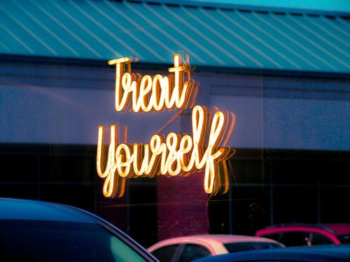
Whimsical for the colors of the vehicles, charming for the feel-good message, engaging for the puzzle of where the reflection is coming from. Love it!
-
@LindaS has written:
Whimsical for the colors of the vehicles, charming for the feel-good message, engaging for the puzzle of where the reflection is coming from. Love it!
It's actually not a reflection. It's light shining through glass.
-
A general explanation about my responses.
I try to reply to every posted image. When one person posts more than one image (unless it is a number of photos intended to be looked at as a series), I will usually only reply to the first image the person has posted for the week.
I'm interested in an image and the way people respond to it. The discussion following an image is nearly as important to me as the image. It's part of broadening my understanding of the way an image works.
Especially with flat view, I find it difficult to sort out the flow of discussions. Therefore I limit my replies for the week to the first image I come across from a participant.
When images are posted later in the week, I find that discussion generally doesn't develop around those shots. As I value the opinions, I rarely comment on anything posted later than around Sunday.
It isn't that I'm ignoring other images. Besides, it's time consuming and there are limits to how much I have available. -
@simplejoy has written:
I struggled a little bit creating a fitting image for the theme "stone"... When I tried a closer shot of a couple of very tiny (2 mm in diameter) crystals, I was reminded of one of my favorite songs by the band "Thrice" called "The weight" (www.youtube.com/watch?v=iktAVY4dcPU ). A song about love and commitment.

Double points for seeing this through! by simple.joy, on FlickrSeveral things stand out.
It's immediately obvious that this is a macro shot and we are seeing shapes, edges, surfaces that we otherwise never see.
The warm red browns dominate.
The points and edges and the gap between the two crystalline forms.
The rich firelight red at the lower front.While I don't know what I'm looking at, the forms, colours, textures and arrangements still make this interesting to study. The edges of the frames work with the edges of the crystals. It all moves to the moment where the two points appear ready to touch or part. Static objects can create tension as they do here.
The prong like shapes also give direction to the underlying lines. (What are they? They look like gemstone settings but they aren't).
The close details are enjoyable to study as is the over all composition.
I get your caption but I'm puzzled by the song connection. -
@minniev has written:@MikeFewster has written:@LindaS has written:
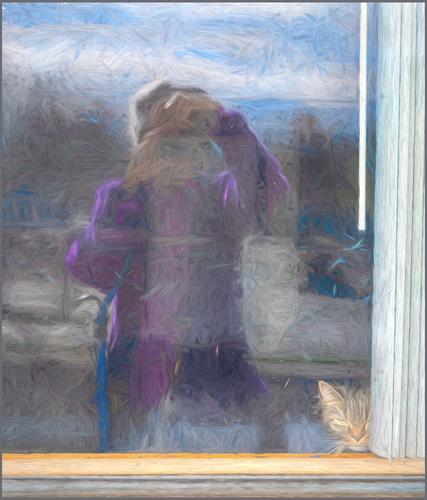
Me and Stella
Images like this tie me in knots. Don't expect a coherent response from me here because it is an area where I am unresolved within myself.
Impressionism is my favourite art style/movement. I could write an extended piece on why this is so. I'm happy for photographs to be impressionistic where the capturing of the image has created the result. For example, as a result of deliberate camera movement or maybe when reflections or fog, or other conditions have created an effect. I don't know how LindaS made the shot. If it was done by applying a filter of some sort to a photo, I get uncomfortable. That kind of manipulation seems counter to the point of impressionism. If it was done (I don't think it was) by photographing a reflection on, say, misted glass, I'm comfortable.
Without much trouble I can find holes and inconsistencies in my argument here.
Irrespective of the above, here, I like the difference between Stella and Me. Me is vague, a suggested shape with enough info to recognize a photographer at work. Me is easily the largest part of the image. Stella needs to be discovered. Relatively small and tucked in a corner. Her warmer hues and position in the corner lines ensure that we will find her. Stella is treated differently. She's sharp and detailed. Conclusion. This is a photograph of a relationship with the photographer. Stella's important in the relationship.I have a different take. For me, an image is an image, and how it ends up is far more important than how it got there. Filters are just one more tool in the toolbox, no different than any other. They can be used creatively, or plain vanilla out of the box. They can be used to create rather terrible eye-scratching images, or beautiful ones or impactful ones or just fun ones. I use filters of many kinds and have a couple of favorites in the NIK set that are part of my normal workflow. It takes skill and effort to use them well, and they usually work best for me if carefully applied in separate layers, using brushes and masks to direct the effect precisely, like any other adjustment in PS or similar. I was recently thrilled to be able to resurrect a long-discontinued Topaz filter because it creates an effect I can't exactly emulate in PS alone.
AI is going to be the same - it will have effective and worrisome uses. My entry this week has two corners that are filled in by the AI in Photoshop Beta, allowing me to finally, after years of aggravation, straighten this darned image the way I wanted. AI was not able to properly build the bottom half of the back tire though. I had to paint it in, along with the shadows. I have had my struggles with AI experiments- rabbits with 3 ears, trees with limbs sticking out the bottom instead of the top. But I know someone who's using it to make amazing backgrounds for his dramatic digital paintings of medieval knights. I love that we have a wide variety of tools to do creative stuff with the pixels we collect, and as long as I don't tell tall tales about what I'm doing, I won't feel bad about using them.
My mixed feelings aren't about filters in general. I agree with you. My particular concern is an impressionist effect. I like impressionism for the visual and also for the philosophy (for want of a better word) behind the point of making an impressionistic image. To add filter that creates the effect after the image has been captured feels like is a sort of visual oxymoron to me.
-
@Rich42 has written:@Fireplace33 has written:@Rich42 has written:
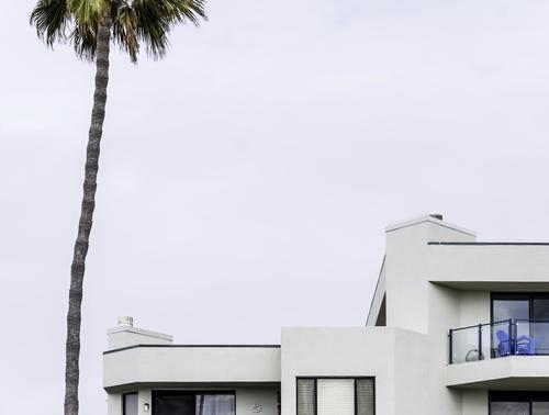
Carlsbad, CA
Rich
If you were a beginner with a point and shoot, I might glibly say , "Try aiming a bit lower next time" :-)
But the other responders have found a deeper meaning in the shot and compared it, among other things, to an artist's palette with the thumb sticking through the hole in the middle, and rejoicing in the use of negative space.
So I guess it has something, but it's not really my cup of tea :-)Fireplace,
Thank you, thank you, thank you!
Finally, a response to this image I can really sink my teeth into.
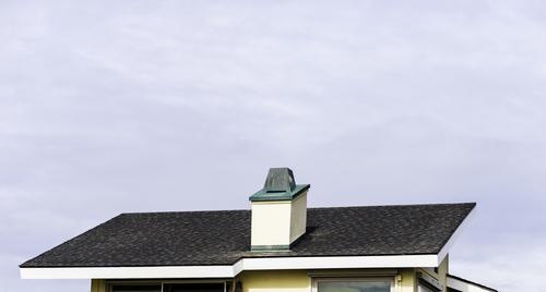
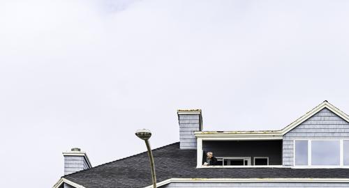
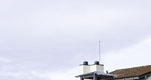
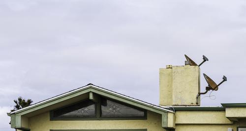
You are absolutely right! The image is too low in the frame! What's up with that? Where's the rest of the house???? What's with all that empty cloudy sky? (It's actually "Southern California Marine Layer" - just ordinary ol' fog - hanging on the coast line with momentary glimpses of sun/sky breaking through.)
I always worry how my images will look on others' monitors, compared to the way I view them. I have a 27" 5K ("Retina") iMac and an old 42" plasma screen TV.
I view the iMac from "normal" working distance (14-18") and as I'm editing an image (always in Photoshop), I frequently cycle with the "F" key, toggling into full screen mode with a completely white background, as though the image is sitting in a limitless white mat surround. Primarily because, the destination of my images is almost always as a print on matte art paper, framed in a white mat with large borders. Occasionally I glance at the 42" monitor which is across the room, just for secondary reference.
I always "worry" that others will be viewing the image in some completely different visual environment, such as at a rather small size, on a computer monitor on which there may be a myriad of competing windows and visual elements. It's just not going to look the same. And frankly, I am pleasantly surprised that I get some of the positive responses I do, knowing that there are so many visual environments in which we all ingest the Internet.
I intended the minimalist composition of this image. The rest of the building just did nothing for it. It's actually a 38" x 22" print on Canon Photo Paper Premium Matte from a Canon Large Format pigment printer. It's behind a white mat with 4" borders, so 48" x 30." No plastic or glass cover. It's a very sharp image (as I've commented earlier). At the large size, in the mat, the image is quite a bit more compelling "in person" than seen here in its JPG version. IMHO it comes across better as the graphic I hoped it to be.
But wait. There's more!
This is just one of five "companion" images. Three others are the same size, the fifth is 32" square. The other images are situated in their mats much as this one, repeating the theme of the top edge of a particular beach bungalow/condo low in the frame with expanse of sky above. The group is meant to be displayed together, though each can stand alone. The repeating graphic treatment of the group emphasizes the appearance of each individual frame. They all are buildings recognizable to "locals" of a particular SoCal beach town, presented in an unusual way.
"Repetition begets legitimacy."
"Repetition begets legitimacy."
A long time ago, in my struggles with learning to play a musical instrument, I was advised that (one) of the distinguishing characteristics of a pro vs an amateur, is that a pro never worries about making a mistake. An amateur, on playing a wrong note or chord, frequently becomes embarrassed and unnerved, tries to cover up, backtracks, and immediately tries to correct, to re-play the error, only bringing additional attention to the problem and embarrassment, increasing his/her anxiety.
A pro just goes on with the line, even holding the "wrong" note, seemingly unconcerned, then sliding into the correct one as though the sequence had been planned. Even circling back and repeating the entire "wrong sequence" one or two more times, exactly as it occurred the first time, "because no one will ever believe you could make the same mistake repeatedly. You obviously meant the piece to go that way." And, amazingly, it does sound "right" on repetition!
So maybe, making five prints, all with the same "misplacement" of the images in the frames, will convince someone that the technique is right. 😜
A gallery manager here, on seeing my large matted images thought they would be compelling on a wall devoted just to them. They have both local and wider-spread appeal (she thinks). Her partners, not so much. An entire wall devoted to one artist is a lot to ask for a small gallery. We're negotiating.
Rich
I couldn't agree more. One of the difficult things with flat view forums is that it is hard to tell the posts being referred to or whether the poster has actually seen a previous post in the discussion.
In my original response to this shot I suggested that this image could best be presented as one of a framed group. I'm delighted to see that this is in fact already underway. When the eventual display is completed, could we have a shot of what the collection looks like grouped together on the wall?. -
@MikeFewster has written:
I couldn't agree more. One of the difficult things with flat view forums is that it is hard to tell the posts being referred to or whether the poster has actually seen a previous post in the discussion.
In my original response to this shot I suggested that this image could best be presented as one of a framed group. I'm delighted to see that this is in fact already underway. When the eventual display is completed, could we have a shot of what the collection looks like grouped together on the wall?.Aw, shucks. I thought you would never ask!
I uploaded one of the images here some weeks ago -
Here are the rest -
Rich
-
@MikeFewster has written:@Bryan has written:
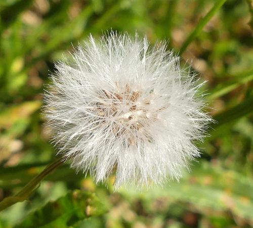
Yesterday was my first day out with my camera for two weeks - was suffering withdrawal symptoms... 😄
.
At first I thought this was a Dandylion seed head. Now I don't think it is. Here, the focus point tunnels us down into the seedhead and we have a definite centre with a warm spot and sharply focussed follicles. I'm puzzled by the rectangular white shape with what looks like punchholes in the very center? Was a flash or reflector being used here? The out of focus background sets off the halo of fine detail around the seedhead's edge. It all pop's with a satisfying 3d quality.
Hi Mike,
it is a Dandelion. The shape you see is sunlight reflecting off little band like structures at the base of the stalks that hold the filaments. I had to look at a couple of other shots to work it out...@PeteS has written:Those withdrawal symptoms are painful, and just going through the motions of looking for and composing a photo and then pressing that button are a great relief, even if the photos are only worth the delete button afterwards. Luckily not the case here with this classic shot of a seed head. The white filaments of the seeds are nice and sharp and the background, despite being quite busy with grass and leaves, is nicely blurred and does not distract. It is nicely exposed, and the white details have not been blown.
Pete
Thanks Pete. I had been seeing many older sad looking seed heads and this one was the lucky find. The light was fortunately good at the time too.
@LindaS has written:It's not healthy to go too long without taking a photo!
The main appeal for me is the bright light, with a feeling of warm breezes on a perfect summer day. However, I guess it's not summer where you live? 😁
Hi Linda, yes we are smack bang in the middle of winter here (although I am in a milder part of the country). All the flower shots I have posted the last few months have had me wondering about seasonal changes as I always associated flowers with spring. Some I researched and they may flower at various times. Turns out Dandelions bloom late autumn to early spring so nothing unusual...
@minniev has written:I know what you mean. Sometimes we get desperate and will take pictures of anything, I've photographed even a shriveled sweet potato. Fortunately you have a much better subject here than a sweet potato! It looks like our dandelions though probably not quite the same. You've captured very appealing detail even deep into the fuzzies and down to the seeds themselves. It carries the "feel" of the bright warm sun and fresh air.
For the fun of it, try converting it to monochrome and have a play. I did a quick play in the free mobile ap snapseed and it looks great that way too!
Hi Paula, I will try and remember to have a play with b&w. I had snapped a few some time ago and nothing came close to this one. I was just lucky with the light that day / time giving the filaments a silky look.
