These aren't the carefully posed studies for the official folio. These are candid moments where "the party" is as much the subject as the couple. They are shots that the group will look back at in years to come and remember what was being chatted and laughed about at the time.
They bring back personal memories to me of a different kind. Permit me to wander a little here but it's relevant to something I want to say about them technically.
Many years ago in B&W film days I did wedding photos for a while. I wasn't good at it. Lou's photos here avoid a mistake I made and never forgot. In the shots are plenty of shadows. It can be concluded that it is either sunny or close to it. The big big problem for wedding photographers is to get details in that so important white dress while not having the groom's dark suit look like a flat black shape. Control of contrast is critical. I failed badly, but that's another story. Ever since I have always gone to the contrast and those two areas in any wedding photos.
Lou's shots look a little dark and I suspect that he has added vignetting to bring attention to the central areas of the photo where he wanted us to look. It has worked. A little dark they might appear but he has the details that are important in wedding photos. I wish I could have said the same.
-
-
A beautifully selected position for the things that make up this landscape. The diamond like frame around the shoreline, the buildings, and the reflection works very well to lift the promised comforts out from the wet green stuff. The pink building is a gift here. It may be overcast but we still feel that a walk here would be worthwhile.
The cloud shapes and sizes balance up with similar forms in the foreground. Add the brighter foliage front right and check the blue patch above. The walk is too enticing to miss and we'll take a brolly. It's an optimistic image. -
Now I'm really curious Why Not. Your edit has done a lot more than a simple change of tones. It's a whole new story. I was slow in picking up on the repositioning of the bench. I can't see this any longer as a runner having a rest on a hot day. You don't wade out through the water for a rest like that. Neither can I imagine a tide coming in on a body of water like that. The inference is that the person has been there for some time. This gets sinister.
-
@Rich42 has written:@LouHolland has written:@Sagittarius has written:
Sagittarius,
Beautiful photo, really beautiful. However, it must be enlarged to properly observe all the beautiful details.
Lou
I agree. Very, very beautiful.
Rich
Add me to those in agreement.
Nothing dramatic or intrusively creative here. An appropriately calm and carefully composed image of a beautiful and quiet corner of a pond.
The single foreground leaf leads to two redder leaves which branch along the underwater stems to unite the pinks. An elegant, understated composition that is worth studying. -
@OpenCube has written:
That's a Wow!
A portrait with attitude. He's confident and direct. It isn't a formal pose, he's relaxed in his clothes and space. Cap medallion, silver pendant, watch, earring stud, purple top. The repetition of some of those elements underlines them. The golds, blacks and purple are a surprising and confident colour scheme. They are extremely effective in framing and complementing his dark skin.
In some previous posts I couldn't find reason for what you did. Not this time.
Full marks Open Cube. I'd like to see more of your portraits. -
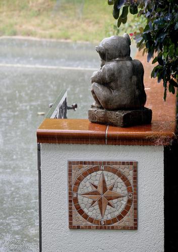
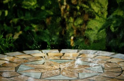
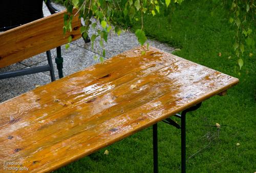
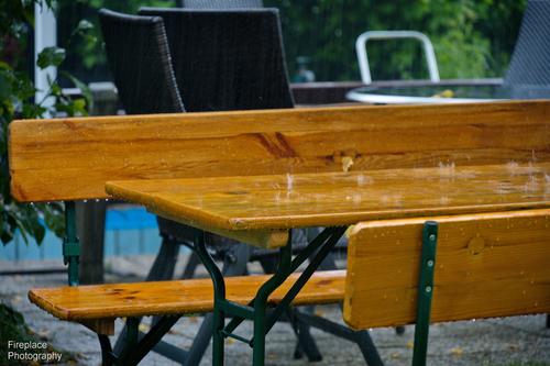
Wet, Wet, Wet
It's raining today, just a boring expanse of grey cloud and continuous light drizzle :-(
It was also raining about a week or so ago, and in between too.
But at least, on those occasions, it was a little bit more exciting than todayHere's some from around the garden.
-
@Bryan has written:
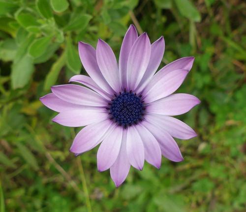
A daisy next door
.
It isn't an everyday combination but purples against greens always feel classy and right. Check Wimbledon.
As flower shots go, this is unusual. The flower floats above the background. We have no sense of the rest of the particular plant that supports the bloom. This is striking. The composition again is so symmetrical and centred that its perfection has become unusual. I have to admit though to a liking for the petal at around 10.00 that refuses to conform. The dark petal tips fade into the centre and take our eyes along at the same time. I'd guess that it does exactly the same for bees. -
@Bryan has written:@simplejoy has written:
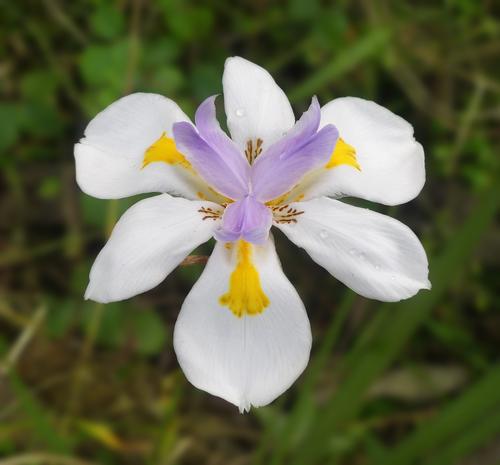
I like it - great detail and color in this beautiful color. For my personal taste the background is slightly distracting. I assume you already took this wide open (EXIF says f/2.8?), so I'd do some slight processing/color-adjustments on the background:
I like it, thanks. Did you mask and blur?
Yes f/2.8, the light was quite low and I was precariously balanced on a bank over it and was hard to be steady so I needed as much ss as possible.Yes - just a little bit of gaussian blur and a slight reduction of magenta in the reds of the background.
-
@simplejoy has written:@PeteS has written:
Inspiration
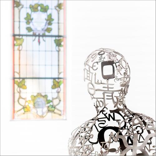
The Jakobshallen in Bad Homburg was built as a church for the French Reformed Church in 1724, but was later used by the Catholics, until their new church was completed, when it fell into disuse. It found new sporting life, and was used as a gym for over a century, before falling into disuse once more. Ten years ago, it was bought by a gallerist, who renovated and adapted it for use as a gallery, keeping elements from both its previous lives. It is now a source of inspiration.
The photo shows a sculpture by Jaume Plensa and one of the original windows.
Pete
I like it - it's a very interesting and effective composition. I also like the bright look, but feel liket he window is a little bit too bright. If the intention was to make it feel 'aetherial' it's fine, but then it would perhaps need to be slightly more blurred in my opinion... Either way, a wonderful image with lots of room for interpretations.
Oh, and speaking of 'inspiration': If you haven't added some of your sources of inspiration in the thread I created for that topic a while ago, I would be very interested to know:
dprevived.com/t/what-are-your-biggest-inspirationsmotivation-boosts/4292/
I was thinking about a response to Pete's shot while I was scrolling through to see what I might have missed and I came across Simplejoy's thoughts.
Did I agree or not that the window was too bright? It's a good question and I took a lot of time and revisiting of the shot before reaching a position.
I like it as is. The brightness gets our attention, as it does the attention of the figure. It's a little indistinct. It can't quite be read or intepreted. It attracts but needs to be studied. Our figure is composed of the forms and shapes of human knowledge. Science, maths and language. The window hints of something that operates on a dfferent level that still attracts and intrigues the humanoid.
Absolutely loaded with interpretive possibilities.
There are very few pixels at work here. A photo with far more space than content. Ethereal, as Simplejoy suggests.
Can't you see the photographer thinking about the angle here? Left or right a bit? Up a little, maybe down. He nails it with the diagonal filling corners and the shoulder/neck curve and its correlation to the lower right corner of the window. The frame is filled but it full of light and space and the relationship between the two shapes established. -
@Fireplace33 has written:
Wet, Wet, Wet
It's raining today, just a boring expanse of grey cloud and continuous light drizzle :-(
It was also raining about a week or so ago, and in between too.
But at least, on those occasions, it was a little bit more exciting than todayHere's some from around the garden.
It's the same here as well unfortunately. Hope we'll get a break from the rain soon.
I like this shot the most - great work capturing a drop like that right in the middle of the pattern and the composition is nice as well!
I'm glad you don't let the rain stop you from shooting - that's the spirit! If it's really heavy raindrops you've got, one thing I can recommend is getting into the car and shooting the splashes from inside. I once tried something like that, and it was a lot of fun and worked better than I expected:

Splashes to splashes by simple.joy, on Flickr -
@Fireplace33 has written:
Wet, Wet, Wet
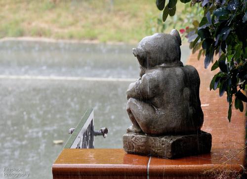
For me, this one tellsl the best story - possibly add a plate and cup to indicate an abandoned picnic? Curse that rain! I think the splash on the table is fun and interesting, but requires download and close examination to get the full effect. The "patiently waiting" is fun and unique, though that one could benefit from a closer view possibly? Risk camera damage for your art? Hmmm, maybe not. Hope you see sunshine soon!
-
@MikeFewster has written:@LindaS has written:
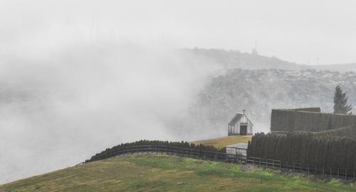
Fog rising from a small canyon in early morning
(snip)...The lines, tones and framing within the shot would be better, in my opinion, in B&W. The selenium tone feels like an unnecessary distraction from the wonderful bones of the shot.
Much the same but even more so for the colour version. It's likely that I'm biased here because that green isn't a colour I like (even if it is accurate, which it may be).Thanks very much, Mike. Even though this photo was taken in early April, I've deleted the original file, so I'm not positive about the neon green. I know when attempting to show Bryan a bit more saturation, I found there is a great deal of yellow and the editing is pretty challenging.
I have resolved to keep my raw files longer now! I had gone from being overwhelmed with unorganized and unmemorable photos to current state of too lean and spare. Will find a happy balance now that I'm active with your awesome group 😁
-
@LindaS has written:@Fireplace33 has written:
Wet, Wet, Wet
For me, this one tellsl the best story - possibly add a plate and cup to indicate an abandoned picnic? Curse that rain! I think the splash on the table is fun and interesting, but requires download and close examination to get the full effect. The "patiently waiting" is fun and unique, though that one could benefit from a closer view possibly? Risk camera damage for your art? Hmmm, maybe not. Hope you see sunshine soon!
Thanks Linda.
The closer view idea of our "patient gargoyl" works well for me with this crop, thanks for suggesting :-) -
@MikeFewster has written:@WhyNot has written:@LindaS has written:@WhyNot has written:
Summer
......
WhyNot
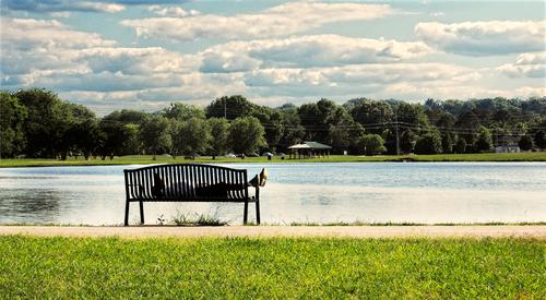
This is challenging me. I probably read too much "news" online because my first thought was this is a homeless person. I need to consider its being a jogger who decided to take a nap after a hot run, or a dad taking a break from a game of baseball with his kids. The image is displaying quite dark for me; is that your intent? I am trying to peer into the shadows of the trees for details. Also, the darker view lessens my sense of a sultry summer day.
I think you are right .. I thought its upload was a bit darker than I remembered it but even the original may have been to dark for the day .. I revisited it after your comment
Brighter, warmer , different .. but I don't think it changes the story much ... I think he is a jogger as the homeless usually have a few more of their belongings with them! and this is not a usual stopping place without a hammock -- that bench is short and uncomfortable ... I've tried it ........ Thanks for the critique ...
WhyNot
I'm talking about the colours and title first. I prefer the colours in 1 but I agree with Linda that it doesn't look like a summer's day. In 2 it looks like an overall yellow tint is a bit overdone. It could be my monitor but the whites in the clouds also seem to have a touch of yellow as do the greens. Those aren't the blues I associate with summer. Was there a touch of industrial haze?
Colour apart. The shot is full of horizontal lines. This always creates a restful impression. The picture has to be seen large enough so that the shoes can be seen to be sports shoes. Because we know they are sports shoes we make the jump to assuming someone who has been active is resting. If we saw an old battered pair of shoes or solid working boots, the subjective response would have been quite different. Similarly, it's important that the feet are up on the arm rest. If they had been flat along the bench, we might have been concerned for the owner.
As it is, we smile and feel the bench occupant is taking a well earned rest in a restful spot.. He/she isn't the subject however. The bench is the subject and the bench might have many more stories to share.Well you made me work this morning .. This picture is a year old which means that I have backed it up and thrown away the layer information. So when I did the changes to brighten and warm I used the JPEG and was finding quick solutions to get back to comment here! . So I suspect I simply used the Brighten and White Balance to make the changes but again I threw away the layer info ... I thought about your comment and went back and worked a bit longer this morning but again with the JPEG but never quite got to where I would have liked if I were going to print this at 16X20, something I never do any more! .....
I think of the "occupant" as the discovered subject ......... a compositional approach that I sometimes use ..
@MikeFewster has written:@simplejoy has written:@WhyNot has written:Brighter, warmer , different .. but I don't think it changes the story much ... I think he is a jogger as the homeless usually have a few more of their belongings with them! and this is not a usual stopping place without a hammock -- that bench is short and uncomfortable ... I've tried it ........ Thanks for the critique ...
WhyNot
It's an interesting shot. I like the composition and the image makes us question the reasons for taking a nap there... perhaps it's part of a routine: "The influencer clearly said: Run 10 miles, then rest for 3 minutes and listen to the Rocky soundtrack. Buy a supplement pack from my website, drop a like on my newest video and then run another 10 miles" or something like that. 🤔
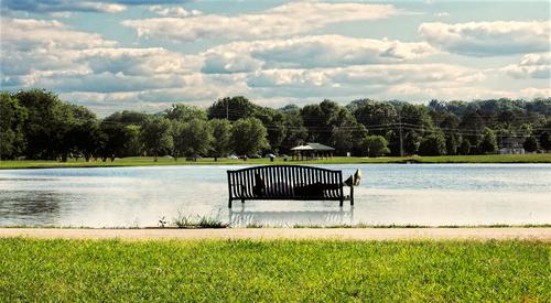
I think I succeeded in changing the story btw. but I'm afraid it's not to the benefit of anything... 😅
Your brighter edit works great btw! 👍
Now I'm really curious Why Not. Your edit has done a lot more than a simple change of tones. It's a whole new story. I was slow in picking up on the repositioning of the bench. I can't see this any longer as a runner having a rest on a hot day. You don't wade out through the water for a rest like that. Neither can I imagine a tide coming in on a body of water like that. The inference is that the person has been there for some time. This gets sinister.
I think here you are confused as the "influencer" and the new version with the repositioned bench are both from Simplejoy and his comment .... and it does change the story ...
Thanks for the detailed critique .. Much appreciated ..
WhyNot
-
@Fireplace33 has written:
Thanks Linda.
The closer view idea of our "patient gargoyl" works well for me with this crop, thanks for suggesting :-)Oh yes, it sure does! Very glad you posted the crop because, although I have shared suggested edits on other Wednesdays, this change I was seeing only in my mind 😀
-
-
@WhyNot has written:
I think here you are confused as the "influencer" and the new version with the repositioned bench are both from Simplejoy and his comment .... and it does change the story ...
Thanks for the detailed critique .. Much appreciated ..
WhyNot
Oh, yeah - sorry @MikeFewster and @WhyNot about the confusion. That edit was just my (heavy handed) attempt at 'changing the story' which was mentioned in an earlier comment. 😉 Of course it wasn‘t a serious suggestion… 😅
-
@Fireplace33 has written:
Wet, Wet, Wet
It's raining today, just a boring expanse of grey cloud and continuous light drizzle :-(
It was also raining about a week or so ago, and in between too.
But at least, on those occasions, it was a little bit more exciting than todayHere's some from around the garden.
I like the feel of these. They convey the feeling of a wet day, of a summer rain falling with some force. The garden looks deserted except for the statue huddled tightly against the precipitation. There could be some fun to be had by taking closer shots of the rain bouncing with some vigor off the various surfaces. My favorite: the stone inlaid object with rain creating big splashes. I yearn for such a day here - Heat index 120, cloudless, not a drop of rain in weeks.
