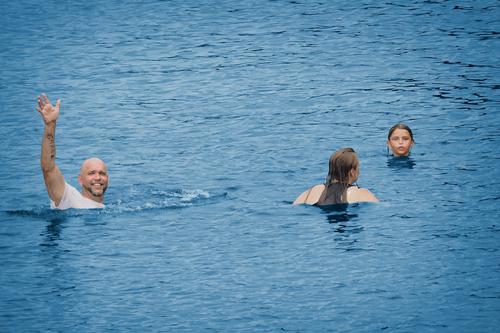
This seems like summer in the south. I'd think Tennessee or Texas. The fellow with the Grace tattoo looks like someone I know. In this summer of unrelenting scorching temperatures, the blue water may look cooler than it is. "They" say that three like objects in a photo is the preferred number for a composition, and you have that here, but I honestly think it might be a more fun without the young lady whose back is turned. The expression on the younger one is priceless, and the distance and comparison with the waving guy would be interesting that way.
-
-
Hi Lou, as always I appreciate and respect your opinion and feedback and I thank you for it.
Actually the father and his son are fairly distorted too, because proximity has played a trick on their respective proportions, making the boy seem bigger than he actually was.
All of that is a result of fisheye photography (at 7.5mm, I believe - this is with the little manual Samyang lens).
Fisheye is a strange thing. It allows to capture the maximum amount of a scene, from very close to very distant, and at its best it can result in a huge sense of immersion.
The distortions are the price to be paid. Objects in the center en on the vertical and horizontals center axes will appear fairly normal, but towards the edges there is the obvious fisheye distortion. You can be aware of those facts and work with them in the composition. The late Bill "Bootstrap" Turner (on DPR) was a master at using a fisheye without people noticing that it was a fisheye image, most often by just placing the horizon of his beachscapes dead center in the image and avoiding any verticals towards the edges.
Anyway, some people hate that typical "look" and will never like any fisheye image - and that is quite alright.
One can only hope to surprise them once in a while.Others try to "correct" the distortion with software. Sometimes I do too, if the effect is disturbing or if it helps my composition.
But most often, I embrace the distortion and make it part of the composition... and the word "embrace" is key here : in the best fisheye images (IMHO at least), the world can be made to seem to embrace the central subject.
-
@RoelHendrickx has written:
PALIO 2016
Mike's adventures in Siena last month and the fact that the August Palio will happen soon, have prompted me to take a quick look back at some of my own images from July 2016. In that year, I had the incredible good fortune to be able to spend a full week in Siena, as embedded photographer in the Contrada della Giraffa (thanks to my dear Tuscan friend Annalisa who brought me in contact with a former Capitano of the Contrada and vouched for me that I would be respectful if granted full access).
My adventure resulted primarily in a B&W documentary series (all in square format) that tells the story of "One Week in Siena", sharing the excitement of the preparations and the race. I did attend several trial races on the Campo (at various locations, including on a rooftop). But for the actual race, I opted to stay off the Campo and register reactions in various places in the city (being on the Campo on race day would have constricted my movements too much for many hours).
If you are interested, that series is here : Una Settimana a Siena
I still consider it as one of the series most representative of my style and what I aim for in photography.But we are about single images here, so here is an outtake from the series.
I did indeed also start work on a colour essay, but that work is still in the pipeline, so many years later.
This is an image from one of the trial races, and for this one, I was on the center space of the Campo itself: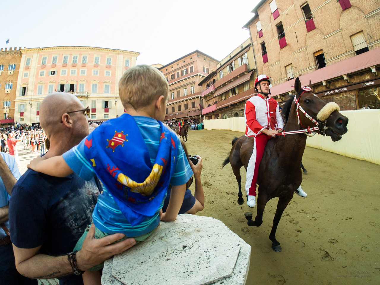 @RoelHendrickx has written:
PALIO 2016
Mike's adventures in Siena last month and the fact that the August Palio will happen soon, have prompted me to take a quick look back at some of my own images from July 2016. In that year, I had the incredible good fortune to be able to spend a full week in Siena, as embedded photographer in the Contrada della Giraffa (thanks to my dear Tuscan friend Annalisa who brought me in contact with a former Capitano of the Contrada and vouched for me that I would be respectful if granted full access).
My adventure resulted primarily in a B&W documentary series (all in square format) that tells the story of "One Week in Siena", sharing the excitement of the preparations and the race. I did attend several trial races on the Campo (at various locations, including on a rooftop). But for the actual race, I opted to stay off the Campo and register reactions in various places in the city (being on the Campo on race day would have constricted my movements too much for many hours).
If you are interested, that series is here : Una Settimana a Siena
I still consider it as one of the series most representative of my style and what I aim for in photography.But we are about single images here, so here is an outtake from the series.
I did indeed also start work on a colour essay, but that work is still in the pipeline, so many years later.
This is an image from one of the trial races, and for this one, I was on the center space of the Campo itself:
This is what I like about wa lenses. The ability to marry a foreground to a background. Father and son are locked onto the horse and rider. The arms and hands of the father and son are very prominent and establish the relationship between them. You either like it or you don't but I like the curvature added by the lens. Here, ir draws the main aspects of the image together It's appropriate. It might not feel so appropriate if this was an image about architecture.
This is where prior knowledge can be a good or not so good thing. Having experienced the atmosphere, I feel this image as a moment of generational transmission of culture. A core aspect of the mystique captured in a single image. That's an achievement.
. -
@WhyNot has written:
Summer 2
WhyNot
It's a nice summer shot! The waving man looks friendly, I wonder why he has his shirt on though... I think the composition works well, but I'd probably crop it slightly at the top and bottom unless it's important to you to show that they are a bit out in the water.
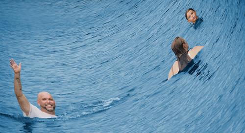
For some reason the woman looking out of the frame makes me think that something's approaching from the right side... and as my mind tends to wander into fantasy land, I came up with this:
Hope you don't mind. 😅 Just to make it clear, because there was some confusion in the last thread:
This is just my stupid interpretation, no official re-edited version by WhyNot! 😉
-
@Fireplace33 has written:
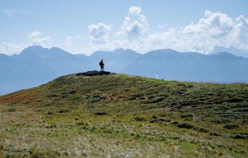
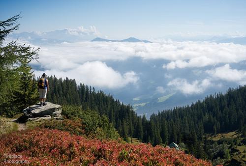
Hiker on a hilltop
My wife has this picture, as a screensaver, on her laptop, so I see it almost every day and it's growing on me :-)
I took it on an Autumn day, while on a hike to Schneeberg (which translates to "snow mountain")
A fairly simple image, but has something special for me, it's just a older hiker standing proud on a small hilltop, not too far from the summit, he's looking out and pondering the view beyond and he's contrasted nicely against that band of mounatins in the background.Being so small the person also gives the scale to the large expanse, so typical of the scenes up in the mountains.
This first one would be the single image to comment on,
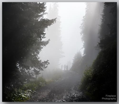
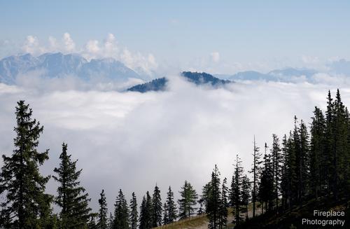
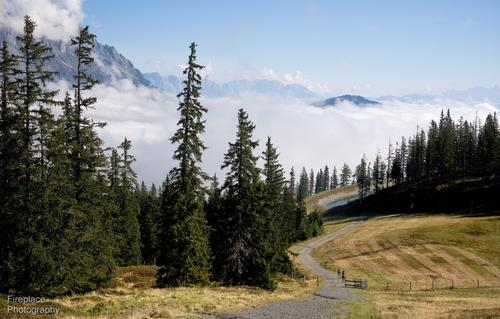
...but just to set the scene on that day, I've incuded a few more shots from that hike :-)
It started out quite foggy, but cleared as we got higher.
I'm not suprised tat your wife has 1 as a screensaver. It has quite a lot in common with the famous Microsoft scene that is claimed to be the most viewed photograph ever.
As you say,the little figure in yours adds scale and scale is completely lacking in the MS shot.
As a photo, I prefer two. The trees filling the sides of the frame from top to bottom are a strong frame, There are enough outstretche branches to point to the centre and the figures. The additional trees fading into the mist give depth and more framing. The figures may be faint and only just distinguishable against the bright background but the framing makes them unmissable.
Add the leading lines from the track. This is a shot I'd frame for my wall. -
@simplejoy has written:@WhyNot has written:
Summer 2
WhyNot
It's a nice summer shot! The waving man looks friendly, I wonder why he has his shirt on though... I think the composition works well, but I'd probably crop it slightly at the top and bottom unless it's important to you to show that they are a bit out in the water.
For some reason the woman looking out of the frame makes me think that something's approaching from the right side... and as my mind tends to wander into fantasy land, I came up with this:
Hope you don't mind. 😅 Just to make it clear, because there was some confusion in the last thread:
This is just my stupid interpretation, no official re-edited version by WhyNot! 😉
How did you make that edit warp like that? Reminds me of ES wobble.
-
@LouHolland has written:
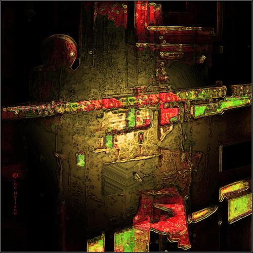
Ph-Art Abstract
enlarge: click image>click downarrowLou
This is one of those exciting images where the shapes and colours make references for me that I'm pretty sure have absolutely nothing to do with the original subject.
I look at it and I'm in Asia by night. Electric neon, fonts I don't understand, dark corners, polished brass. The two strips coming at us resemble moving advertising banners Another feature of an Asian street at night.
It is stacked with energy Lou. -
-
@Rich42 has written:
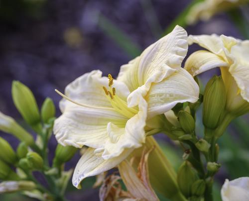
I generally don't post images of flowers. I love images of Calla Lillies, as they are so beautiful and I have said that it's impossible to take a poor picture of a Calla Lilly. But images of flowers are more about the flower than the image itself. The "creation" is already there, and for better or worse, the photographic image is just a reporting of that creation by Nature, not by me.
I'm posting this image as I had almost forgotten about it until I posted it a few days ago on another site simply as an example of the functioning of a particular adapted lens on a particular camera. It was my first ever image on my GFX 100s camera two years ago. The light was just magical that early evening in May when I took this in my garden. It was just a quick focusing exercise without any effort at composition, but the beauty of the Lilly just took my breath away when I brought it up on my monitor.
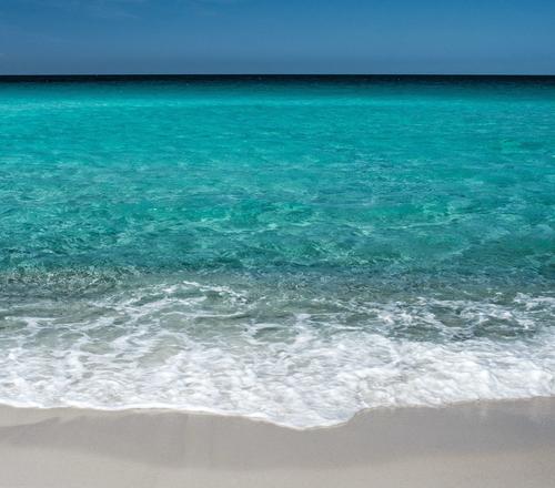
I was especially struck by the similarity of the edges of the petals and sea foam.
Rich
Rich, I am not sure why people have that opinion about flower images, but it is relatively common. I don't really see how taking an image of a breath taking landscape, a beautiful/handsome 'model', a portrait, and the list goes on, is any different. They are all creations of nature and not the photographer's. Simple Joy's photography is creative and different and is 'exempt' from this as is Lou's creative photography. I enjoy flower photograpy and it can be whatever you make it, including creative and different.
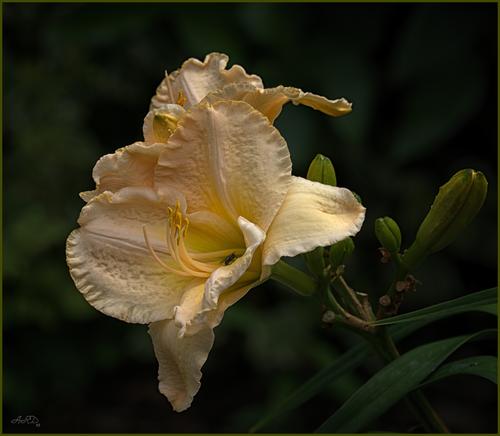
The image I have posted below is neither creative nor different but I thought I would show it here because the lily variety appears to be very close to the one you have shown that you liked so much. I have darkened the flower colour a bit so it does not appear exactly the same as yours but in reality, it was very close.Andrew
-
@PeteS has written:
No Graffiti
Taken in Brighton.
Pete
Eye catching! I like the graffiti and the inclusion of the door with the sign, "No Graffiti". I assume that means on the door and the artists have honoured the request. A very appealing image for me.
Andrew -
@LouHolland has written:
Ph-Art Abstract
enlarge: click image>click downarrowLou
Creatively different Lou. I like the use of bright colours and darkness here to create the image.
I came close to purchasing a monochrome print on canvas by Picasso yesterday but it was rather macabre so I did not. Some of your use of colour might have made it more appealing but likely not. The print was older on display in an antique shop. It was cheap and I thought about buying it even if I was not going to hang it. I would much rather hang something more on the nature of your image.
Andrew
-
@WhyNot has written:
Summer 2
WhyNot
Well balanced WN and cheerful. Either that or the guy is drowning and looking for assistance!
Andrew -
@minniev has written:
Wind From The Forest
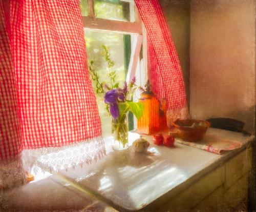
A couple of weeks ago we had a lively discussion about the use of art filters in photo editing. It wasn't my image being discussed but since I do use those kinds of things pretty often, I thought I'd share one of my own playful concoctions. This image is loosely based on my own very favorite painting, Andrew Wyeth's Wind From The Sea www.nga.gov/collection/art-object-page.143926.html which has always reminded me of this particular window in my old house.
Since none of this was done in camera other than taking the picture, I'll explain it for anyone interested. First I first softened and saturated the image in NIK color efex and PS to get an Orton type look but brighter. (I often soften my images rather than sharpen them which I know makes me weird from the start). I adjusted the colors in an ancient discontinued program called Restyle, then applied an impressionistic art filter effect variably to different areas using brushes, masks, layers and blending modes in PS. Finally, I added a texture created from old paper, also with masks and brushes. For anyone tempted to use such filters, I'd encourage you to play to your heart's content but learn the controls of the program so you are not bound by the manufacturer's presets, and use it within the confines of a host program like PS, Affinity or Elements so you can have total control of what it does where.
A lovely result Paula, which would look very nice printed on canvas and hung.
Andrew
-
@19andrew47 has written:@Rich42 has written:
I generally don't post images of flowers. I love images of Calla Lillies, as they are so beautiful and I have said that it's impossible to take a poor picture of a Calla Lilly. But images of flowers are more about the flower than the image itself. The "creation" is already there, and for better or worse, the photographic image is just a reporting of that creation by Nature, not by me.
Rich, I am not sure why people have that opinion about flower images, but it is relatively common. I don't really see how taking an image of a breath taking landscape, a beautiful/handsome 'model', a portrait, and the list goes on, is any different. They are all creations of nature and not the photographer's. Simple Joy's photography is creative and different and is 'exempt' from this as is Lou's creative photography. I enjoy flower photograpy and it can be whatever you make it, including creative and different.
The image I have posted below is neither creative nor different but I thought I would show it here because the lily variety appears to be very close to the one you have shown that you liked so much. I have darkened the flower colour a bit so it does not appear exactly the same as yours but in reality, it was very close.Andrew
Both of your flower shots are very beautiful! I love the colors of the brighter version by @Rich42 which shows a lot of detail, the mentioned sea foam shapes/texture and some context (surroundings), but also the more subdued but exceptionally elegant looking variant @19andrew47 shows, which also has a stunning amount of detail to view at full magnification due to its increased DOF and is elevated by the wonderful light.
I feel like it's a great example of how flowers can be interpreted and shown in different ways and I'd fully agree, that flower photography is as challenging, interesting and varied as any other genre. The reason why some may view it as something different might have to do with the perception that flowers look beautiful no matter what... Even if that's true (I don't think it is, but compared to many other subjects they tend to stay good looking in various different lighting conditions, which of course is in part what they were designed for...) that doesn't mean there can't be variation and a lot of different skills are needed to take an exceptional flower shot.
I can fully asure you, that I love shooting flowers and looking at well done flower photography, regardless if it's something exceptionally creative or attempting to accurately show the incredible beauty Nature created! The details, shapes and texture on them is mindblowing.

That‘s gotta be fake… by simple.joy, on FlickrI hope you don't mind the title of my leaf photography thread (dprevived.com/t/forget-flowers-long-live-leaves-show-your-leaffoliage-shots/4791/#post-58688)
I've tried to clarify at the very beginning, that it's intended as a joke and I have every intention of creating one or two threads about flower photography in the future. If you have some shots of leaves/foliage you'd perhaps want to share in the thread mentioned in the meantime, please don't hesitate to do that!
-
@minniev has written:@WhyNot has written:
Summer 2
WhyNot
This seems like summer in the south. I'd think Tennessee or Texas. The fellow with the Grace tattoo looks like someone I know. In this summer of unrelenting scorching temperatures, the blue water may look cooler than it is. "They" say that three like objects in a photo is the preferred number for a composition, and you have that here, but I honestly think it might be a more fun without the young lady whose back is turned. The expression on the younger one is priceless, and the distance and comparison with the waving guy would be interesting that way.
Thank you for stopping by ... i confess this wasn't the picture I thought I was going to take. When coming on these swimmers I thought the story was about people swimming in the large and green Tennessee River.... This location isn't set up for swimming and I've only seen a few teenagers diving off some pilings further down the river in summer ... and as I just said the story in my mind was about these swimmers and the large body of water that really isn't very accommodating .. I took several pictures and then the man turned and waved and the story changed, for me. The story became more about the joy of summer and was a bit reminiscent of early childhood trips to family on the farm where the kids had a swimming hole and the tree with a rope that swung over the water!.. Only in a Rockwell print these days .... I made the water bluer than you might experience if you visit the river and generalized the family a bit ... My part of the river is about the south most where the Tennessee flows ... not quite Tennessee ..... I think if the woman had turned around or wasn't there I wouldn't have used this composition here ...... I can only say the street photography isn't limited to the street!! ...
WhyNot
@simplejoy has written:@WhyNot has written:Summer 2
......
WhyNot
It's a nice summer shot! The waving man looks friendly, I wonder why he has his shirt on though... I think the composition works well, but I'd probably crop it slightly at the top and bottom unless it's important to you to show that they are a bit out in the water.
For some reason the woman looking out of the frame makes me think that something's approaching from the right side... and as my mind tends to wander into fantasy land, I came up with this:
Hope you don't mind. 😅 Just to make it clear, because there was some confusion in the last thread:
This is just my stupid interpretation, no official re-edited version by WhyNot! 😉
I realy don't mind and enjoy reading how others see the story here and also seeing what others like to do with the picture .. However,that said, let me critique your interpretation .as it changes the story completely from the joy of a summer day to the creativity of the person behind the camera .. al la OpenCube's comment ...
WhyNot
@OpenCube has written:@simplejoy has written:@WhyNot has written:Summer 2
[![Summer 2.jpg].....
WhyNot
.....
How did you make that edit warp like that? Reminds me of ES wobble.
Not adressed to me so ...
WhyNot
-
@OpenCube has written:
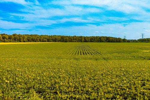
Well composed image built around the vanishing point of the rows stretched to the tree line. Interesting in that the front field appears to be rowed horizontally rather than vertically which creates a visual barrier to entering the field, and we can only get "in" by jumping over the foreground field. Have you noticed that you are drawn to compositions that impose visual blockage that a viewer has to overcome? It's an unusual compositional structure that goes against the common "rules" but you employ it often and are increasingly finding ways to make images that work this way.
-
@LindaS has written:
Not our Grandmother's Apple Trees
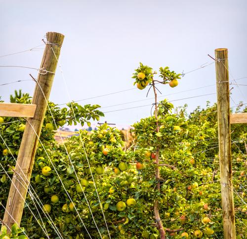
This is one of the trellis-style commercial operations that have become common in the past 10 - 20 years.
The image has such interesting design features, but they aren't the typical ones. There's an abundance of lines large and small, of different materials, and they cross and overlap each other to create a variegated frame around the one tall branch of apples. The colors are beautiful and the editing is a great artistic choice. I think I'd clone out the top of the utility pole that sits in the background near the lower thirds juncture but of course it's artist's choice.
-
@Rich42 has written:
I generally don't post images of flowers. I love images of Calla Lillies, as they are so beautiful and I have said that it's impossible to take a poor picture of a Calla Lilly. But images of flowers are more about the flower than the image itself. The "creation" is already there, and for better or worse, the photographic image is just a reporting of that creation by Nature, not by me.
I'm posting this image as I had almost forgotten about it until I posted it a few days ago on another site simply as an example of the functioning of a particular adapted lens on a particular camera. It was my first ever image on my GFX 100s camera two years ago. The light was just magical that early evening in May when I took this in my garden. It was just a quick focusing exercise without any effort at composition, but the beauty of the Lilly just took my breath away when I brought it up on my monitor.
I was especially struck by the similarity of the edges of the petals and sea foam.
Rich
Two classic summer images, Both offer visual beauty and a sense of respite from summer heat. The flower has delicate colors and construction, and the ocean shot offers enticing crystal blue water that extends forever, in a simple horizontal somewhat Gursky-ish composition. Both are undiluted nature. A nice summer pairing that invites the viewer to find things to enjoy in spite of the heat.
