Your creative puzzles are pretty challenging! I can't shake the feeling that this is a tiny wood carving but your clue about drawing leads me down another path entirely. If it is a drawing, is it a paper and pencils drawing photographed or scanned into the computer? Or is it drawn with an art tablet of some kind? I still can't escape the notion that in "real" life, whatever that is, it's very small. If it is a drawing, it's well executed with proper shading and detail and convincing texture. I hope you'll fill in the blanks in this story, because as someone who dabbles in drawing both on paper and on the computer screen, I'm curious and intrigued.
-
-
Unfortunately I don't have anything in terms of feedback besides saying that I find it perfect as it is: Excellent, well balanced composition, beautiful colors and a wonderful atmosphere. I'm not sure if it is the one @JimKasson mentioned as being his favorite, but after looking at your set once more, it certainly is mine.
-
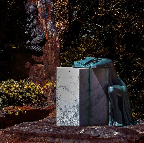
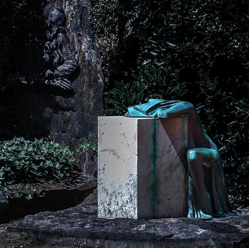
It looks like an outstandingly impactful art piece and your image does a very good job at capturing that impact. For some reason, I feel like it could be worth it to alter the colors drastically.... Perhaps it's the lush greens on the left, or perhaps it's the dark patches of shade, which gives the man on the upper left too much weight... I can't say for sure. Here are two very different interpretations, none of which gets close to what I envision unfortunately though...
Either way, an excellent capture and what a depiction of grief that is...
-
Thanks for stopping by and the critique .... I guess my world often becomes less colorful and less real the closer I look at it !!??!!
WhyNot
-
@PeteS has written:
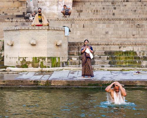
Observing Religion
The banks of the Ganges in Varanasi (aka Benares) is one of the most intensely religious sites (and sights) in the world.
Interesting and humorous observation of our world with half the participants taking pictures of the other half!!!! ....
WhyNot
.... and as someone else observed this picture along with others on this thread should be seen in the "gallery" view or whatever the enlarged view is called ...
-
@DavidMillier has written:
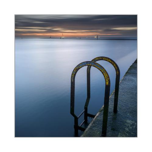
Tidal pool, Margate, UK
I'm kind of getting bored with this set now, having spent so much time editing and posting in various places over the last few days. They work better as a set than individual images IMO. I've tweaked this one a bit to fix the bent horizon and bring out the yellow paint a little. This'll be the last of this set I post on this site, I think. I'll be putting the whole set up as a gallery on my website in due course. I usually prefer making long exposures as B&W's but the smoothness of the GFX images keeps tempting me to shoot colour.
Hey, anyone noticed how the images on this site look a lot better if you click the thumbnail and view in a separate tab? Much better.
p.s.
I must be getting old. Climbing up onto the pool wall and walking along it with the pool on one side and the sea on the other in the dark made me feel quite tottery. And Not to mention stepping down off the wall at the end. I stared at that 3 foot drop for a loooonnnnggg time...
This one, too, is quite beautiful with the contrast between the pastel oranges and violets of the sky and the blues of the water. The smoothing effect is enough to render the dreamy look without being too much, turning it all to milk.The contrast of the shapes is effective here too - curves, lines, triangles. The weathered yellow paint on the rounded bar is a reminder that this structure is old, has been used by many before we walked upon it. There is a suggestion in this series of a story, but we are given only a few of the props and can make it up for ourselves. Don't get too bored with them, the story may still be evolving...
-
@LindaS has written:@Sagittarius has written:
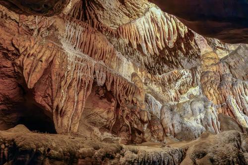
To keep rock formations theme - underground rock formations
Wow, the details and complexity of the formations are high-impact! I tried cropping out foreground and doing something with the top so it isn't cut off. That makes it more abstract perhaps, but for me also reinforces the color and natural design.
Thank you for looking and your comments.
-
@MikeFewster has written:
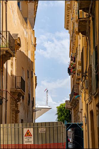
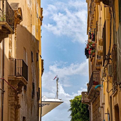
The view down the side street has architectural indications of significant age of the buildings on either side - including repairs. Peeking through the gap and set against a glorious blue sky with cotton puff clouds is what appears to be a supersize cruise ship ready to disgorge thousands of tourists onto the quiet streets with its bright flower boxes and laundry decked balconies. The colors are rich and Italian looking, and the little dollops of red - the sign, the cascading flowers, the bucket, the glimpse of a vehicle - all act like tiny design pieces guiding our eyes through the backstory upon which the intruder is intruding. Nicely caught.
-
-
@LindaS has written:
Basalt 2
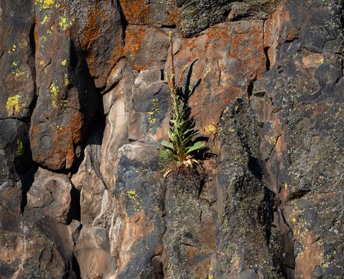
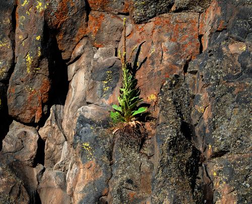
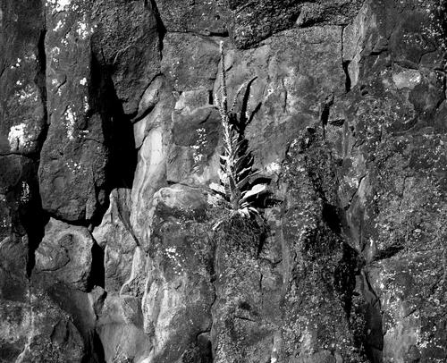
I was inspired by feedback from last week to take new photos that concentrate just on shapes and shadows, maybe for editing as monochrome. Turns out I'm too in love with the colors of the lichen to go b&w, so here are two new color shots for your appraisal.
I get it that you couldn't convince yourself to use B&W here... the varied tones are just too interesting to get rid of them. I like the first shot witht he plant in the center. If you're not too attached to the idea of capturing the colors as close to the original as possible, I'd try to experiment a bit with more intense colors, particularly on the plant. In the current edit, it just doesn't really stand out, at least in my perception...
-
@Rich42 has written:@MikeFewster has written:
I really like this image and the concept.
But it's almost too much. The incongruity of the bow of the boat intruding into the narrow street view is great. But the additional elements of the chain fence and scaffolding at the bottom, IMHO, is distracting.
Rich
I agree with @Rich42 here and also love the idea and title, while feeling too distracted to fully grasp the ingenuity of the idea behind it. I'd crop it significantly, even though we lose something of the height of the buildings, it feels more to the point to me this way:
A really excellent catch by the way - very impressive and ingenious!
-
@19andrew47 has written:
Another milestone!
Andrew
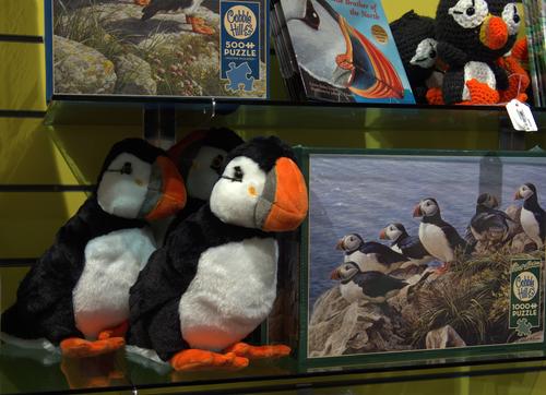
for Linda, you can buy them at The Rooms in St. John's, Newfoundland
LOL, did you just happen to have that puffin photo in your files, or did you run down to the store to take the picture for me? 😁 So cute!
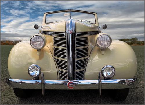
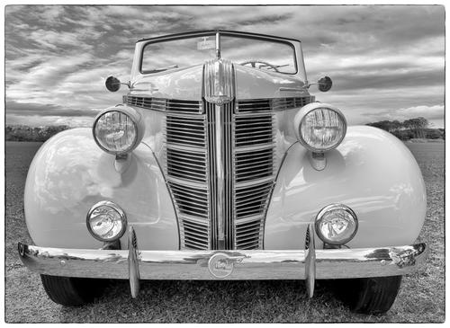
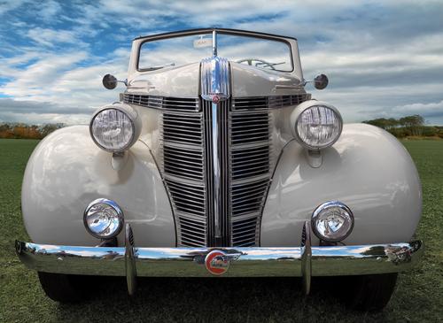
What an incredible work of art is the Pontiac's design. I don't know your title's reference; are you a collector of antique automobiles and this is your latest acquisition? The color works better for me because in the b&w I find the details of the busy sky somewhat intrusive. I also think the color reflection on the front bumper adds interest, picking up the blue and being easier to see the overall details within.
-
@19andrew47 has written:
It's a wonderful design and an excellent shot! Unfortunately I don't like that color one bit... that might have been the reason why I liked the B&W version better initially. But then I started thinking... and voilà, problem solved:
(Okay, I assume that might not be the proper way to do car shots... 😉)
-
@minniev has written:@simplejoy has written:
I really liked to draw as a child, but was discouraged over time by a number of factors including my overly self-critical nature as well as the conventional school system, which (while it worked fine for me in other areas) was quite devastating to my enjoyment of it. Therefore I unfortunately missed the opportunity to gain the motivation, experience and skill which would be necessary for me to explore and enjoy it as a hobby.
However - stubborn as I can be from time to time - I realized that photography can be an interesting avenue for me to experiment with drawing without the frustrating consequences, because it opens a way to mask and overshadow a lot of potential shortcomings in technique and it's also not as important to me to draw something unique from my mind there (I mostly draw stuff by copying images...) because I'm creating something else with it anyway.
So i can finally draw something and enjoy it in a different way:
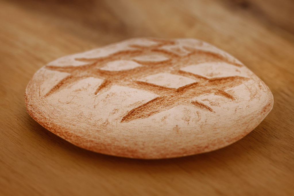
Daily bread... a mere illusion! by simple.joy, on FlickrYour creative puzzles are pretty challenging! I can't shake the feeling that this is a tiny wood carving but your clue about drawing leads me down another path entirely. If it is a drawing, is it a paper and pencils drawing photographed or scanned into the computer? Or is it drawn with an art tablet of some kind? I still can't escape the notion that in "real" life, whatever that is, it's very small. If it is a drawing, it's well executed with proper shading and detail and convincing texture. I hope you'll fill in the blanks in this story, because as someone who dabbles in drawing both on paper and on the computer screen, I'm curious and intrigued.
Yes, it's a paper and pencil drawing, but not digitized but cut out with a pair of scissors and then placed (somewhat) appropriately in terms of perspective, on a real wooden background. I also try to create a suitable lighting scenario but I'm not going for 100% accuracy there, because I've learned that our eye/brain is more easily deceived than we tend to think... and I can't create any lighting from behind (because it's paper and thus transparent). If I remember correctly, this was only done with one brown colored pencil. I also use my tilt/shift bellows to adjust the plane of focus slightly in order to get closer to what part of a real object would be in focus. As you suspected the object (cut out paper bread) was small, around 6-7 cm in size.
Here's a recent example where it might be a bit more obvious because it's so close... and specular highlights/proper reflections are very hard to draw for someone as inexperienced as me, even with a template in front of me.

May I hand you a lemon? by simple.joy, on Flickr -
@LindaS has written:
Basalt 2
I was inspired by feedback from last week to take new photos that concentrate just on shapes and shadows, maybe for editing as monochrome. Turns out I'm too in love with the colors of the lichen to go b&w, so here are two new color shots for your appraisal.
Linda,
I think the first image would do very well in monochrome.
Here's what orthochromatic film, or a deep green filter would have given me in my film days.
Rich
-
@Fireplace33 has written:
When water looks almost B&W
On holiday this week, so these are some older shots.
Congrats on 800 times !
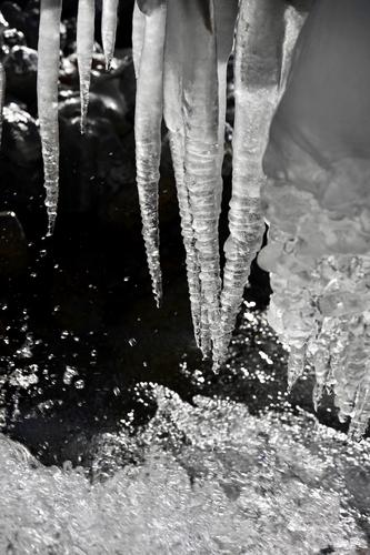
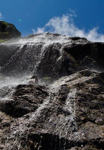
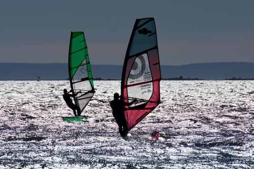
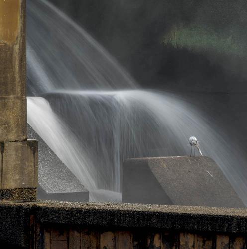
That's an interesting series, and could merits its own thread to explore other examples. Your images all seem to have been in very high contrast situations, which can wash out colors and produce the appearance of blacks and whites where they aren't present visually. Often when I find myself in such environments I shoot for monochrome. You have used these factors as pathways to creative interpretations, and it works well especially in the final one where the two windsurfers are silhouetted against bright colored sails that are just about the only color in the images.
The first might as well be shot in monochrome as the contrast has rendered it that way for you. The middle one looks like it would make a nice monochrome as well; it is my favorite scene of the 3, a beautiful well composed and dramatic shot where the cloud seems to rise up out of a waterfall that's raging above your head. Thanks for sharing a fascinating set and hopefully starting an interesting conversation here. -
@minniev has written:
A Bird's Backside
It is absolutely spectacular. The best effort so far from your special place. It has all the elements - the water, the mist, the angles, the birds etc. Fab!!! Just bottomless source of amazement...well done.
-
@RoelHendrickx has written:
MOVE OVER DARLING
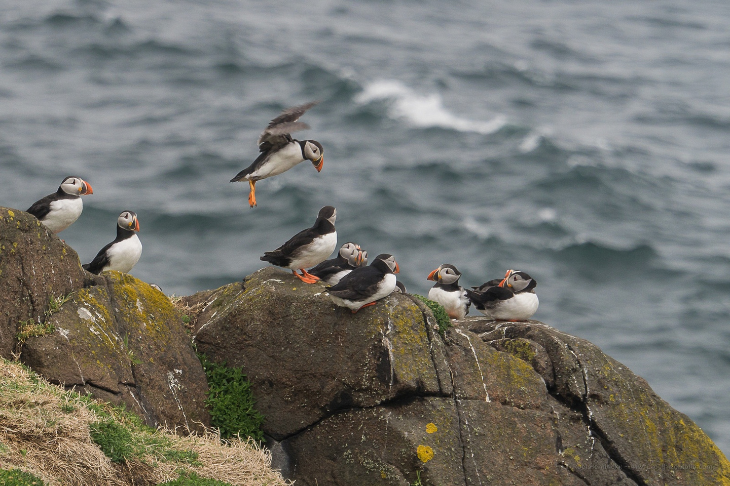
Great shot and amazing observation.
