I can't think of anything to add to minniev's comments. How to deal with the sky here would have had me scratching my head as well. To me, it isn't the sky so much as the truncated tops on the trees. Maybe, crop to just above the line at the top of the cliffs? Maybe leave it just as you did.
-
-
@Rich42 has written:@simplejoy has written:@Rich42 has written:
Absolutely gorgous - I love images like that. Such a fantastic example of effective use of color contrast and yet with enough nuance and feeling for the matter in order to be convinces that it was not only made for the purpose of being a sample shot. Excellent work!
MinnieV, LindaS and Simplejoy,
Thank you for the comments.
Cool winter storms are rare, but do happen in Hawaii. Winds blow unimpeded over two to three thousand miles of Pacific ocean, saturating with moisture before slamming up against the volcanic peaks that comprise the island chain, drenching the windward north shores of the islands and producing some of the wettest places on Earth with up to 400 inches of rain yearly. The leeward (south) sides of the islands are in a "wind shadow," are dry and often are balmy and sunny when storms are raging on the north shores.
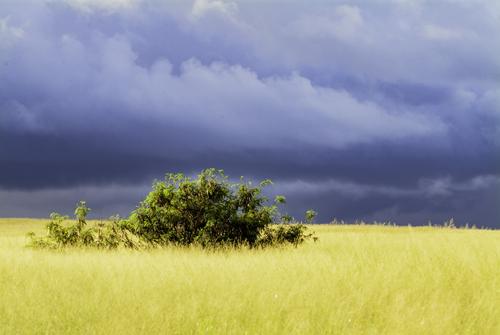
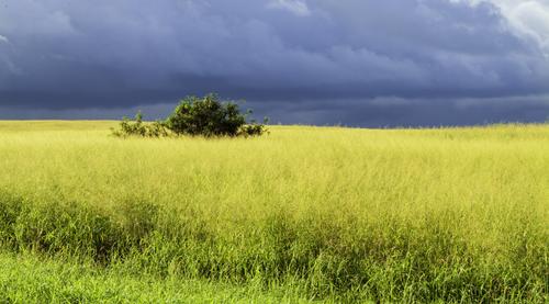
I was driving from Molokai airport, through the Central Plains region to the only town, Kaunakakai, in February, 2004. Usually a 30 minute trip. A storm was blowing in. The Plains have no protection from a mountain range.
The cloud formations were fantastic and the color and light were changing by the minute. It was raining intermittently. I got the little rental car over to the side of the two-lane road and got this first shot at 50mm with a 24-105 zoom.
I thought it had possibilities with the additional band of green at the bottom. But then I moved closer to the Kiawe and zoomed to 105mm. The second shot (the first I posted) is better as the graphic elements are simplified and more powerful.
I got pretty wet getting back to the car.
I got to Kaunakakai on the south shore a few minutes later - completely in the wind shadow of Molokai's East End mountains. There wasn't a cloud in the sky. It was beautifully calm, warm and dry. A typical day in Paradise. Perfect for tropical drinks with little umbrellas in them!
Rich
I agree with your reasoning of shot 1 over shot 2. It's the simplicity of the contrast that gives the power. Too much additional detail pulls attention away from the contrast.
You might increase the contrast by taking a little off the top so the width of the sky and the yellow foreground match. This gives a visual impact similar to the graphic of many flags and flags are all about graphic impact. -
Our Luxembourg hike (the one that disabled me to start this week’s thread).
I’ll break our rules to post three related images… (I did not carry a fullscale camera on the hike).
(oops that did not seem to work - I’ll try again later, sending the images first to my desktop computer) -
@PeteS has written:
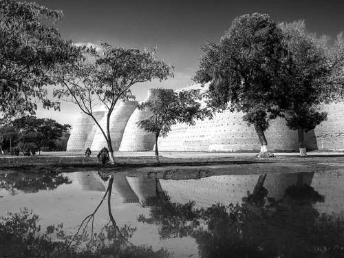
The Old City Walls
This could be from a dream about the Tales from 1001 Nights. In fact there are a lot of connections and especially with how a dream corresponds to reality.
It was taken in Bukhara, where some of those tales were set or collected.
Those impenetrable city walls are actually the only part of the wall once circling the city, although they are beautifully restored.
That lovely lake in the foreground was really a muddy puddle, close to the camera, from a recent thunderstorm.
Never believe what a photographer shows you, all too often we try to create a dream.Pete
Astonishing. I don't recall having ever seen a photo of those walls before.
The tree a little to the left of the centre is a small masterpiece. The thin trunk picks up the darker edge defining the line between curves of the bulbous shapes of the walls. Its curve and the branches above add a frame that directs out eyes. Then the reflection does it all over again and adds a centre. I'd like to know what colour the walls are but I'll forgo that for the B&W perfection making lines in the image. -
@simplejoy has written:@minniev has written:@simplejoy has written:

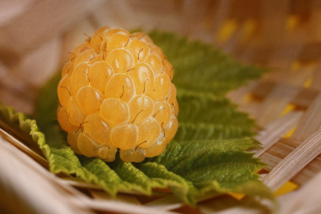
Not just one among many! by simple.joy, on FlickrIs it an unripened raspberry? Or something more exotic that I don't have here, like a salmon berry? You definitely captured its difference, and its up- close beauty in the most minute detail with its rumpled texture and tiny appendages that we probably eat without ever seeing or considering. You make us appreciate the tiny things of life, especially the tiny living things, in new ways, and I thank you for that gift.
Thanks a lot for your kind words! It is actually quite ripe and even sweeter than the red ones. They are just a different kind of raspberry.
@MikeFewster has written:I think Simplejoy has altered the color to individualize the subject? There is a very shallow dof and altering the colour might have been necessary so the chosen one emerges from the pack.
Assuming that I am correct about this, and I may not be, I feel that a bit more dof would have helped. As it is, the rest of the mob are too hard to distinguish for what they are. Therefore the subject berry doesn't emerge as one of the mob, but different.Thanks a lot for your fascinating interpretation. Indeed, an increased DOF could be interesting. I don't remember if I attempted making one... The difference in color is real though, so as you've stated emphasizing its difference in addition by making the others as blurry as they are is not necessary, just a preference of style (I'm often not too sure about those things and usually trust my gut feeling if I made multiple versions).
My images are often a bit autobiographical... for some reason even those of raspberries. 😂 Just the way my mind works, I guess. Here's another one of the yellow raspberry, empasizing that:
Sunshine in a basket case by simple.joy, on FlickrWe live and learn. I never knew there were such things as yellow raspberries.
-
@OpenCube has written:
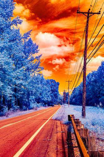
This is hard. I like it but I'm finding it difficult to say why.
After more thought, the composition is really strong. Line after line converges on the same small area. If this was in B&W or conventional colour, I think I would have felt the shot was very competent but really, a bit of a cliche. You have turned this on its head. What you have done with the colour makes it anything but a cliche. Using just two colours has strengthened the composition further, it accentuates those lines.
I like it a lot. -
@LouHolland has written:
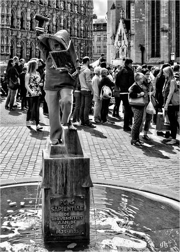
_Sapientiae > (Seat of Wisdom)
Dressed by the students of the University of Leuven.
Sometimes madness becomes a bit institutional before it leads to better "out-of-the-box thinking" 😇
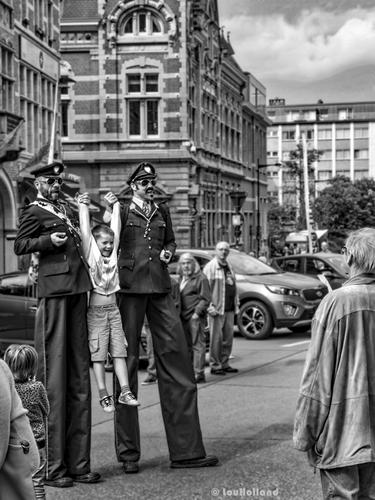
_The Police taking a young barbarian into custody. Probably drank too much Affligem beer and now the Police also want to know 😎
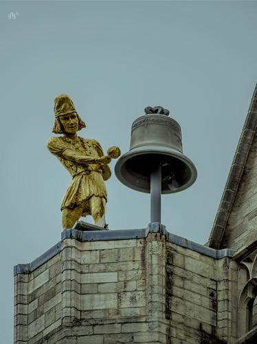
_However, keep the whistleblower in mind, because he always seems to be around the corner somewhere 😈
I have photos of my father when he was at university and involved in a similar day of uni madness. I remember similar days from my uni time. What I get from these Lou is nostalgia. These are traditions that go back centuries. Total agreement with your opening statement. There is purpose in that madness.
-
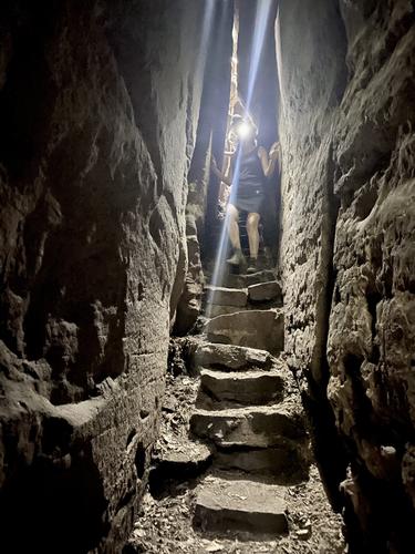
MULLERTHAL TRAIL (Luxembourg)
An image from the three days of hiking through the Luxembourg Mullerthal region (aka Little Switzerland) that was the reason why I was unable to start this week's thread (thanks again, Mike). This is an Iphone 11 image, because I decided to hike lightly packed and not take a full scale camera with lenses.
-
@MikeFewster has written:
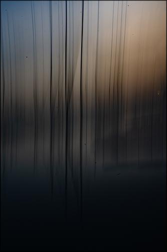
This is a prime example of how success can be achieved by exaggerating a "defect".
The first image is not bad, but also nothing really special. This dusk scene shows a motion blur that is not really beneficial to the image.
By exaggerating that motion blur in a controlled way (and with an aperture that keeps the dusky atmosphere), a little piece of magic happens for the second image. It becomes an abstract that is given context by the first image. -
@simplejoy has written:

Not just one among many! by simple.joy, on FlickrI have a feeling that this yellow raspberry is once again one of your magic tricks that makes our eyes see things that are not really there, or that at least are different from what we think we are seeing.
I can't get enough of your visual puzzles. And that is not just for the puzzle aspect of them.
More importantly, the images always look good too, in their own right, even if we don't see them as "howdidhedothems".
Your images are always well exposed, with careful focusing and DOF that enhances the image and leads the eye, and with a composition that would work well outside of the macro context. -
@Fireplace33 has written:
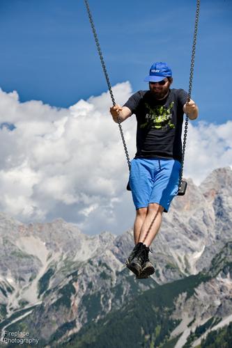
Up and over
We found a swing at the top of a mountain and my son used it to reach the top of the next summit :-)I get an enormous sense of freedom, childish joy and fun from this image.
Your framing is more than brilliant.
I did not think there was compositing involved.
I know what can be achieved by picking an exact vantage point, a specific focal length and perfect composition/framing.In this case: excluding the frame and supports of the swing is the genius touch.
Frames or pillars would ground our subject to the nearby earth surface.
Excluding them makes him airborne.
As if he is swinging from a sturdy cloud up there, ready to swing back towards the far mountain and then jump off over one that he has in his crosshairs.Just brilliant.
This was in the Hochkönig region, in Dienten, at the top station of the Gabühel cable car. 1650m
No photoshopping here! -
@DavidMillier has written:
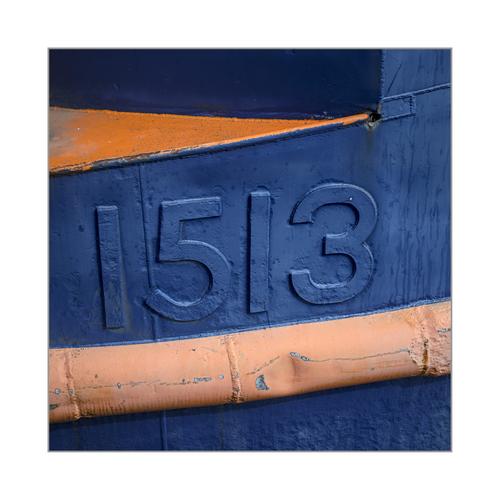
1513: Colour abstract, Royal Victoria Dock, London
(Click the thumbnail for a crisp view)Simple, but very well spotted.
Like green&red or purple&yellow, orange&blue is a killer colour combination.
You simply cannot go wrong with an image that uses these colours and adds textures. -
@WhyNot has written:
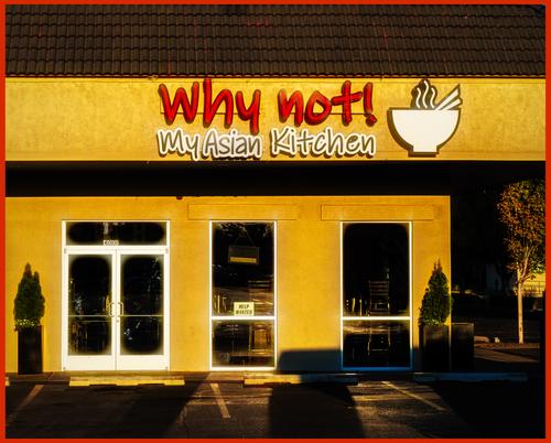
Summer 4
WhyNot
Indeed, why the hell not?
;-) -
@LindaS has written:
Cast Away
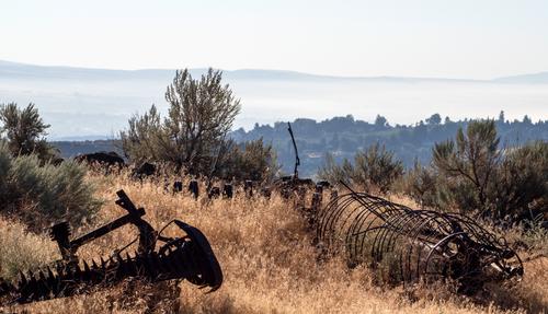
I don't figure out exactly what we are ACTUALLY looking at here.
They look like pieces of a rusted sawmill, or the frames of boats of which the planks have rotted away, or frames for little greenhouses.But that doesn't matter, really.
Because what we IMAGINE that we are looking at is so much more interesting than whatever reality may be.
These are dinosaur or dragon skeletons: a jaw line, a rib cage, a spine with vertrebrae.This is a scene of battle from Game of Thrones, years past the clash in which mere humans brought down one or two Targaryen dragons.
-
@ChrisOly has written:@LindaS has written:
Cast Away
OK.
So that is what they probably are : remnants of agricultural machinery.
A city boy like me wouldn't know.But there is exactly what I mean with the difference between reality and imagination.
Rusted harvesters are sad.
A dragon shot down from the skies is epic.Very sad, those agricultural machines were once used extensively for harvesting etc and now are just sitting idling...They are now part of the landscape and soon will be totally enveloped by vegetation. Sign of times.
-
@minniev has written:
Surprise
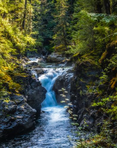
Recovering from surgery last week. Sometimes when I lack the wherewithal to take or even search the archives for a picture to post, I play Wednesday C&C Roulette, where I spin the LR catalog and wherever it lands, I re-edit/submit that one. This time it landed on a photo I'd never developed because it was so underexposed I couldn't even tell what it was. I knew from its tags that it was from a stay on Vancouver Island about 5 years ago. So I put the newest Lightroom tools to work on it and got a more respectable result than I figured I would. If you don't look too close...
I like your game of Vancouver roulette.
I should try it sometime. -
@PeteS has written:
The Old City Walls
This could be from a dream about the Tales from 1001 Nights. In fact there are a lot of connections and especially with how a dream corresponds to reality.
It was taken in Bukhara, where some of those tales were set or collected.
Those impenetrable city walls are actually the only part of the wall once circling the city, although they are beautifully restored.
That lovely lake in the foreground was really a muddy puddle, close to the camera, from a recent thunderstorm.
Never believe what a photographer shows you, all too often we try to create a dream.Pete
I like that view of the ancient city walls, starkly sun lit, through the hugely contrasting black and dark greys of the surrounding trees.
The architecture reminds me a lot of what we saw in several cities in Iran, especially in Shiraz and Yazd.
That should not be a surprise: that whole area of the middle east was once a melting pot of influences, caravan trade etc.Your lake/puddle brings the image alive with a wonderful reflection.
Getting really close and really low to a small body of water, with a wide angle lens, in order to create the illusion of a huge reflecting pool, works well.
It is a technique that I use all the time in cityscapes. Car roofs (especially well polished black roofs) can be put to similar use.Here is an echo of your reflection, showing Castello Sant'Angelo (Rome) a bit before sunrise:

The fact that I am using a puddle is a bit more obvious, but I liked the added texture of the cobblestones.
For a "reflecting pool" vibe, you just have to avoid showing the edges.
Wearing waterproof shoes and not minding to get your knees wet, is a good idea. -
@LindaS has written:
😁Indeed! 😁
I'll say it again.
Indeed : why the hell not?
😁
