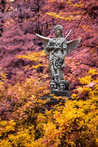
That is a very eyecatching enhancement of the already quite good image.
-
-
@minniev has written:@Sagittarius has written:
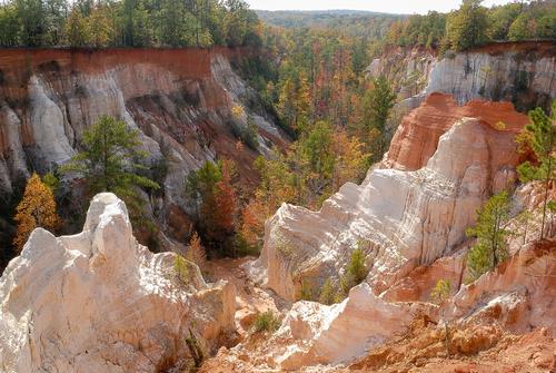
Really nice image of a place I'd never heard of, so I had to look it up. It looks like something you'd find in Colorado or Utah, not in Georgia, but we have a similar geologic anomaly here in Mississippi. The south has some very old geologic oddities that are smaller but also less visited and less known than the western ones. Love the colors and the angle that shows the canyon while also giving us a detailed closeup and a distant look at the formations.
I am always torn about whether to include a narrow strip of sky as a you have, a larger piece, or none at all. Given that the sky looks like one of those rather hazy southern skies that lacks interesting color or clouds, I'd have chosen the approach you did, or none at all. I bet you found a treasure trove of interesting compositions in this location. It looks like one of those rare geologic sites that would work out well in monochrome, too, since there's so much variation in tonality. Most such places don't have that much range.
To me it looked like Bryce Canyon.
It's a good landscape image that lets us appreciate the different parts that make up the whole.
It could be a good idea to create a series : show the whole wide view and then complement that with closeup of the earth layers, the colours in the trees, the background. -
@OpenCube has written:
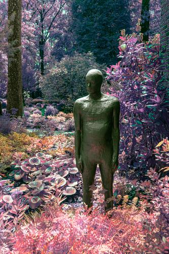
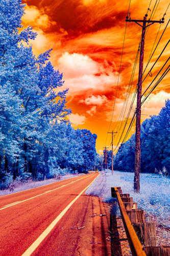
Your otherworldy colours and toning work really well here, and I was wondering why.
I do believe it is the presence of the statue that helps: he feels like an alien in a strange land. -
@LouHolland has written:
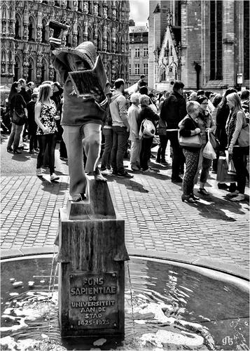
_Sapientiae > (Seat of Wisdom)
Dressed by the students of the University of Leuven.
Sometimes madness becomes a bit institutional before it leads to better "out-of-the-box thinking" 😇
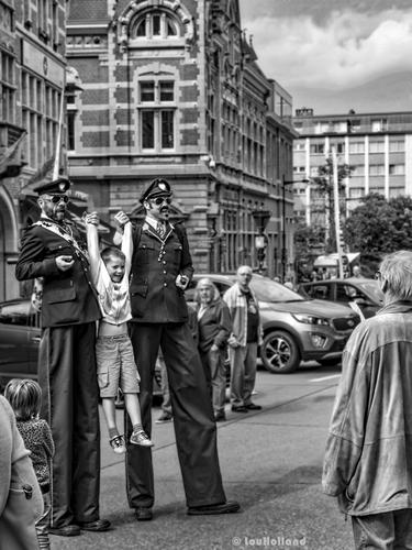
_The Police taking a young barbarian into custody. Probably drank too much Affligem beer and now the Police also want to know 😎
_However, keep the whistleblower in mind, because he always seems to be around the corner somewhere 😈
Hi Lou,
I appreciate looking at Leuven through another guy's eyes and seeing your take on two elements of Leuven culture (the first and last image) that will also feature in the book I have illustrated and that will be published next month.
Allow me to give some background and explanation.
The little statue is called "Fons Sapientiae" and that means not the Seat of Wisdom but the Fountain (or Spring) of Knowledge.
The university has that nickname, and I think the sculptor did a really good job of translating that into a visual representation with a playful twist.
Indeed, Knowledge has a habit of filling itself.
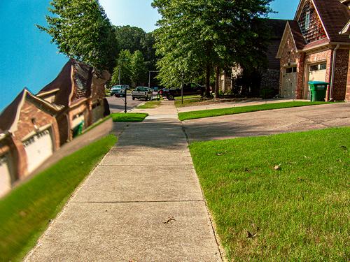
(Among students, the fountain is affectionately called "Fonske" (something like "Little Fonz".)I don't know which ritual we are looking at in the second image. Seems almost more like street theatre than something strictly city- or student related to me.
The costumes are meant to represent members of the "Rijkswacht" (they had those uniforms, and most often also a moustache).
The Rijkswacht were military in organisation and had a reputation of being more tough and prestigious than regular police. A bit like the Carabinieri in Italy.
They did get a really bad reputation with some scandals in the 80s and 90s. They have been integrated in the municipal and judicial police.
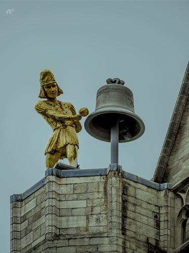
But hey, they occasionally still make an appearance in this kind of situation, where they act like "Gendarmes" (of the Louis de Funès kind).Your third image is the bell tower statue of St Pieters.
It has a specific name : Jacquemart.
Like the statues in Venice, he strikes the hour with his hammer against the bell.
The statue is really sparkling gold.
I don't know the cause but it seems a bit dull and underexposed in your image (also the wall and the sky). -
-
@OpenCube has written:
This one has a lot of shock value rolled into a well composed leading lines image. A poster for climate change, perhaps?
-
@RoelHendrickx has written:
MULLERTHAL TRAIL (Luxembourg)
An image from the three days of hiking through the Luxembourg Mullerthal region (aka Little Switzerland) that was the reason why I was unable to start this week's thread (thanks again, Mike). This is an Iphone 11 image, because I decided to hike lightly packed and not take a full scale camera with lenses.
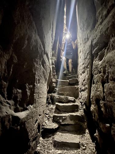
Looks like a place where a regular camera would be a hindrance! The iPhone did you a decent job, you got the lighting you needed, and a nice portrait framing that makes the most of the steps and the figure descending them. The reflection off her headlamp becomes part of the composition, lying parallel to the left side of the ancient stone steps. It doesn't look like anywhere I've ever been so I'd like to know more about it.
-
-
To Mike Fewster:
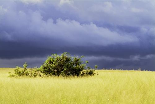
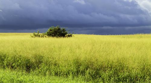
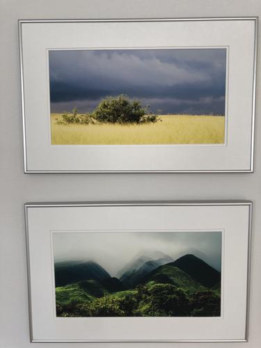
Passing Squall - Central Plains, Molokai
I agree with your reasoning of shot 1 over shot 2. It's the simplicity of the contrast that gives the power. Too much additional detail pulls attention away from the contrast.
You might increase the contrast by taking a little off the top so the width of the sky and the yellow foreground match. This gives a visual impact similar to the graphic of many flags and flags are all about graphic impact.
[/quote]Yes,
It's been hanging, framed in our family room for years, cropped, much as you suggest.
Rich
-
@minniev has written:@RoelHendrickx has written:
MULLERTHAL TRAIL (Luxembourg)
An image from the three days of hiking through the Luxembourg Mullerthal region (aka Little Switzerland) that was the reason why I was unable to start this week's thread (thanks again, Mike). This is an Iphone 11 image, because I decided to hike lightly packed and not take a full scale camera with lenses.
Looks like a place where a regular camera would be a hindrance! The iPhone did you a decent job, you got the lighting you needed, and a nice portrait framing that makes the most of the steps and the figure descending them. The reflection off her headlamp becomes part of the composition, lying parallel to the left side of the ancient stone steps. It doesn't look like anywhere I've ever been so I'd like to know more about it.
Minnie,
That area in our smallest neighbour country, the Grand-Duchy of Luxembourg (east of the small country, around Echternach in the east and Mullerthal in the west) is nicknamed Little Switzerland, and that is not a bad name : it is an area spectacular with age-old bolders, crevices, canyons etc in foresty terrain.
It is a three hour drive away from Antwerp, and the closest thing we can get to mountain hiking in our vicinity (the German Eiffel is adjacent).All information can be found here (the site is multilingual - I linked to the english version):
www.mullerthal-trail.lu/enThe trails sometimes run remarkably close (or parallel) to traffic roads, but they manage to avoid them for the most part, by staying high on ridges or deep in canyons. Berdorf is a prime spot, close to the best rock formations for hiking and climbing.
We spent three days there, doing Loop 1 (with some extensions) in two halves (on our first and third day), with two nights camping in Berdorf, and a spectacular local hike on the second day. Hiking distances 28K on day 1, 19K on day 2 and 17K on day 3. Those are my distances: the others did slightly less, because I insist on climbing every panorama and crawling through every crevice....
-
@PeteS has written:
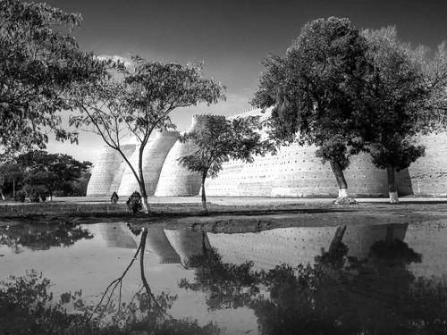
The Old City Walls
This could be from a dream about the Tales from 1001 Nights. In fact there are a lot of connections and especially with how a dream corresponds to reality.
It was taken in Bukhara, where some of those tales were set or collected.
Those impenetrable city walls are actually the only part of the wall once circling the city, although they are beautifully restored.
That lovely lake in the foreground was really a muddy puddle, close to the camera, from a recent thunderstorm.
Never believe what a photographer shows you, all too often we try to create a dream.Pete
That photo is good, it really does conjure up thoughts about 1001 Nights.
Good choice to use B&W, It works well, especially if that lake was just a muddy brown in reality
The only critic is that if you look closely at the image, in full size, there is a stange looking noise structure in the sky, like lots of little worms.
If it disurbes you,...with your favourite PP software, ...masking that error and making a noise reduction on the area would get rid of it, like in this edit below
-
@Rich42 has written:
Passing Squall - Central Plains, Molokai
Rich
A good image. I can see why it is framed and hanging on your wall.
I like such images where it is sunny, and nice and bright in the foreground but where you can see something in the distrance approaching!
Adds tension to the image! -
@OpenCube has written:
I like this one, as others have mentioned the human figure looks quite alien, and the colour changes take us to another planet !
-
@LouHolland has written:
_Sapientiae > (Seat of Wisdom)
Dressed by the students of the University of Leuven.
Sometimes madness becomes a bit institutional before it leads to better "out-of-the-box thinking" 😇_The Police taking a young barbarian into custody. Probably drank too much Affligem beer and now the Police also want to know 😎
You caught a brilliantly fun moment here !! I bet it was fun to be there and see what else those policemen were getting up to.
B&W works very well. -
@RoelHendrickx has written:
MULLERTHAL TRAIL (Luxembourg)
An image from the three days of hiking through the Luxembourg Mullerthal region (aka Little Switzerland) that was the reason why I was unable to start this week's thread (thanks again, Mike). This is an Iphone 11 image, because I decided to hike lightly packed and not take a full scale camera with lenses.
An explorer in a dark cave; presumably your wife, (as we know from the 2023 08 02 thread, she's one of the fellowship).
Seems like she has made it OK through the green and pleasent lands of the shire, and has now enetered the darker caves of Moria!
The flare line from the head light following the narrow gap up and down is a nice touch this image.
The phone has managed to get both the dark and the bright tones captured very well. Assuming a HDR mode was used.
Phones are definitely getting better -
@Fireplace33 has written:@RoelHendrickx has written:
MULLERTHAL TRAIL (Luxembourg)
An image from the three days of hiking through the Luxembourg Mullerthal region (aka Little Switzerland) that was the reason why I was unable to start this week's thread (thanks again, Mike). This is an Iphone 11 image, because I decided to hike lightly packed and not take a full scale camera with lenses.
An explorer in a dark cave; presumably your wife, (as we know from the 2023 08 02 thread, she's one of the fellowship).
Seems like she has made it OK through the green and pleasent lands of the shire, and has now enetered the darker caves of Moria!
The flare line from the head light following the narrow gap up and down is a nice touch this image.
The phone has managed to get both the dark and the bright tones captured very well. Assuming a HDR mode was used.
Phones are definitely getting betterIt's actually not my wife, but Dettie, another from our fellowship.
It's funny that you mention fellowship, because on our first Scotland hiking trip, that is what we called ourselves : "The Fellowship of the Dram".On a technical note:
I did not use HDR but I spotmetered on an area somewhere where the feet are (spotmetering by touching the screen for focus and exposure).
Later, I used the Photo App's native controls for correcting exposure (bringing up detail in the dark areas) and contrast + some desaturation. -
-
