Wirlwind created by myself
Enlarge: click image > click downarrow
-
-
-
Love the images. They say a lot on their own and I love the compositions.
The story just adds to it.
There is such a classic feel to them with the black and white, square composition, ties and jackets, curve to the image plane that highlights a center subject, it all works so well. -
Thanks for the kind comments. I'll add the image to the thread on color combinations.
Rich
-
-
@RoelHendrickx has written:
FATHER of the BRIDE
The main reason why I have been less active than usual in last week's thread, is the fact that our son has just married this weekend.
A blissful day, composed entirely of friendship, sunshine, love, gratitude, good food, deep emotions and sorely aching dancing feet.
(Truth be told : I also had one too many beers, having to toast constantly with my son's group of loyal buddies, many of whom we"ve known since elementary school. The stories we heard of what has happened over the years in our house when we were away traveling, were mindboggling. It was a good moment to come clean. But we loved all of those confessions, because deep down we had always known about the misadventures and the messes they had made - but always cleaned up...)Anyway: the marriage gave me the opportunity to follow the work of the wedding photographer that our daughter in law had chosen.
A very young lady with maturity and skill far beyond her years: discreet, always well positioned, with eye for the light, and very efficient.
I was seriously impressed by Lore Mattens. www.instagram.com/picturesbyloremattens/It reminded of the (only) time when I shot a full wedding, having been asked by the sister of the bride, an acquaintance of mine who was the wedding planner.
I acccepted that job on the strict condition that I could employ my normal, fly-on-the-wall documentary style and that I would not be asked constantly to "please come over here and make a portrait of uncle charles and aunt camilla" (the clients were not the Windsors). We agreed on that.Still, it was a gruelling job that I had sorely underestimated (also the amount of selecting and processing afterwards).
Respect for wedding photographers who can do that economically!I started my day at 6.00 AM in the house of the bride, and ended the next day at 2.00 AM on a boiling dance floor.
(I was not required to stay that long, but I thought it was a big part of the day so what the heck.)The fact that I was limping around on a foot that had a fractured small bone somewhere in its center (occurred three days before) did not help.
I did the whole wedding in the heaviest mountain boots I own: this was the orthopedist's compromise for a full foot cast.My then 15 year old daughter was the second photographer. She loved the idea and got some good additional angles.
For the opening dance, I gave her my camera with the fastest lens and she shot some of the best images of that moment.I heard afterwards that we had provided priceless memories of many moments that the family had not even really be aware of.
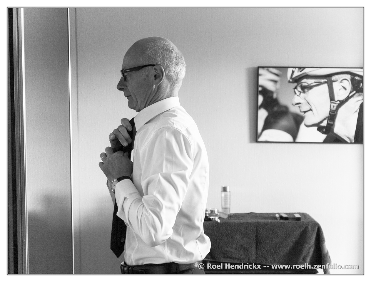
It was worth it.Here is an early shot from that long day : the father of the bride knotting his tie:
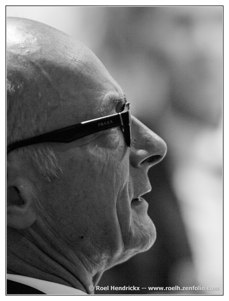
Candid portrait at dinner:
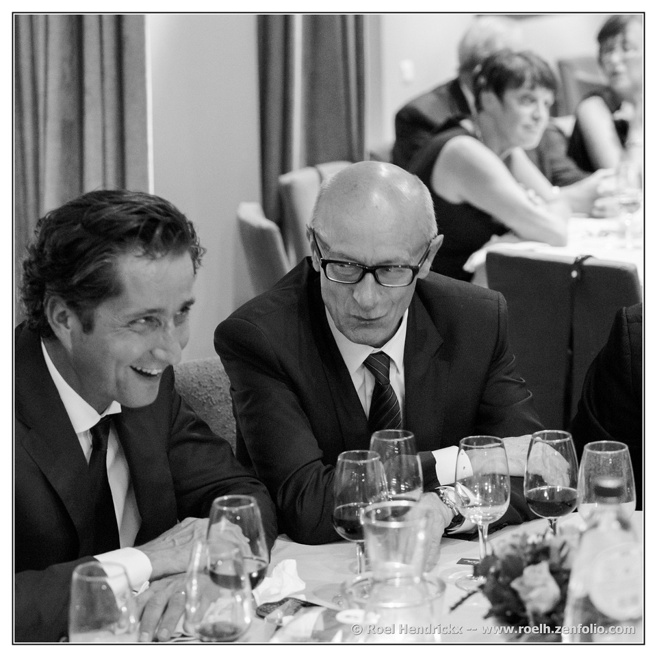
With his new son in law:
With his wife:
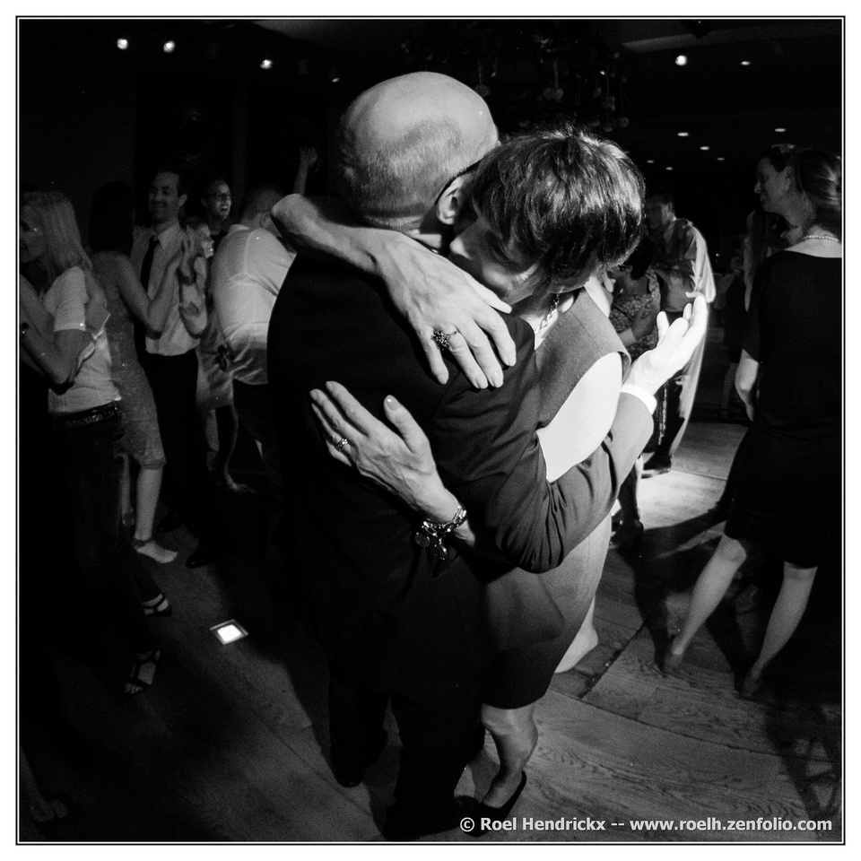
One of the later, dancing action images of the day (and the last of the whole series)
It is made with my beloved fisheye, in extremely low light and grainy as hell, but they L-O-V-E-D it: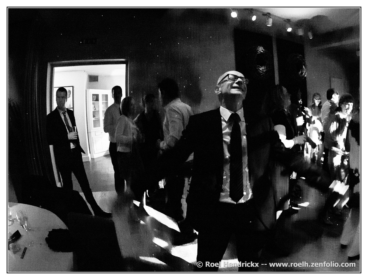
The idea of doing a wedding series on the father of the bride is outrageously different. He's usually well down the pecking order of subjects at the event.
Then you made it B&W which converts the series into graphic reportage. Now it is a study of a man on one of the great occasions in his life.
Shot 1 especially. Most photographers would have looked for the reflection in the mirror. Instead we have the man dressed for different aspects. It isn't just a portrait, it's a life. Not including the right hand edge of the photo on the wall is inspired. It helps give a right to left movement suggesting movement in time. The repeating rectangular shape with the table is equally perfect. There's lots more that might be said about this shot.
2. The father looks with pleasure at the event. Beautifully lit to highlight the profile line but also bring out further face contours. The highlight on the glasses frames accentuates that he is watching and the tilt of the head suggests pleasure in what he sees.
3. An intimate passing of the baton moment. A wonderful capture that captures carefree youth and shrewd experience. And pleasure all round.
4. It's worth thinking about what the photographer had to do to get this angle. This is planned use of the known characteristics of a lens to maximize the heads and hands. A huge moment in the shared life of two people and we feel their closeness.
5. Party time. Head tilted back, arms wide, coat unbuttoned and wide. The grin is wide.
It can stand on its own or be a fitting finale.A series to be treasured by the family and admired by lovers of phtotgraphy.
-
@Fireplace33 has written:
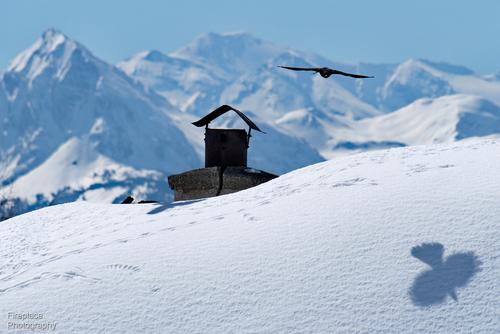
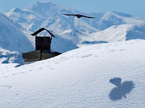
Rooftop shadow
Thinking about the upcoming winter reminded me of an old favorite photo I took while walking through the snow near Mühlbach.
I liked how this raven flew over the mountain hut, making his shadow on the rooftop.
The inverted Vs of the chimney and the peaks plus the wing spread of the bird and chimney top are excellent. Getting the shape of the bird from two angles is unusual and striking.
Having the bird's shadow in silhouette to fill in the bottom corner is even better.
A great shot. -
@minniev has written:
A Short Story About Fishing From The Shore
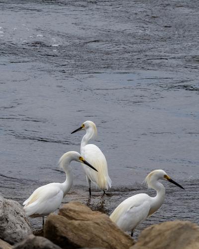
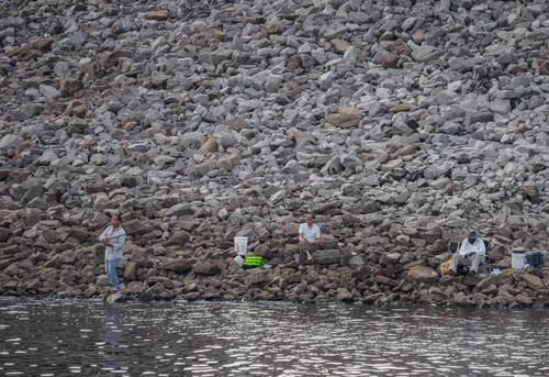
The dam birds and their human counterparts do not have enough water right now to support fishing beneath the dam (no water going in so no water coming out), so they have moved about 100 feet downriver to fish the shore of the Pearl which is still shallow and very hot but they are dedicated.
Little egrets gather in groups to fish. This bunch was having only occasional luck, and they aren't happy about it.
The diverse group across the river on the east side aren't doing much either. I see some of these guys almost every time I'm there. Even getting down there is a dangerous proposition, and they can't fly in like the birds.
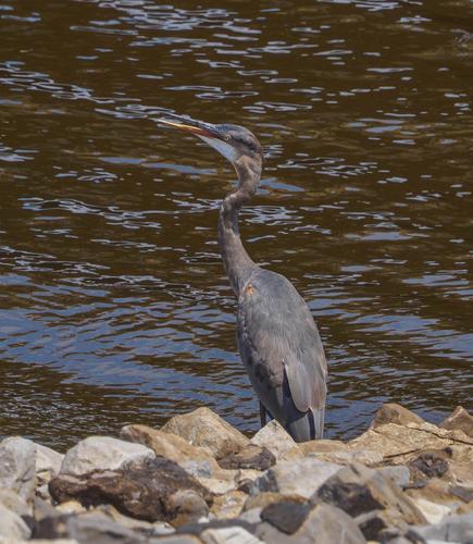
I have never caught a decent picture of this phenomenon before. This young blue heron is overheated (it's been over 100 degrees every day for 6 weeks) so he is using gular fluttering to cool himself, similar to a dog panting. The blue's throat vibrates very rapidly and it makes a unique somewhat musical sound.
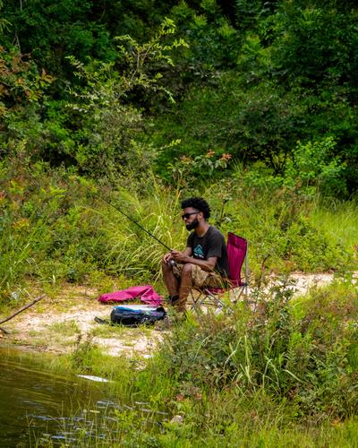
This fisherman found a green spot on the west bank that looks slightly more hospitable than the rocks but it still looks pretty hot.In this series we need the extra information you have given us. "Over 100 degrees every day for six weeks." Now I looked at these quite differently. The fishermen in 1 and 2 become related. The greys become bleak and threatening. The stillness feels oppressive.
3 shows something I wasn't aware of and I needed the explanation.
We are surrounded by clues that or wildlife is under threat but we don't always "see" what is in front of us. -
@LindaS has written:
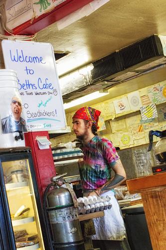
Dutch Tilt - What's That?
I'd never heard of a Dutch Angle or Dutch Tilt until I posted this photo to a forum back in 2016. I hadn't made a conscious artistic choice; I was simply trying to fit stuff into my 40mm fixed lens angle of view 😁 Here's the restaurant info (which seems to have left out the stories they used to tell abou that artwork, such as much of it was done by stoned college students): bethscafe.com/about-us/
Thanks Linda. Even though I was aware of how the deliberate tilting of an image changes the viewer's response, I had never heard it called "Dutch Tilt." Google to the rescue. We live and learn. I think this is wrong, it should be "We learn and live."
Here, the use builds attitude. It works with the cook's headscarf, tie died shirt and tattoo and the posters. All the parallel lines linking the cook, the fire extinguisher and the gent with the sun glasses, play their part as well.
-
@Rich42 has written:
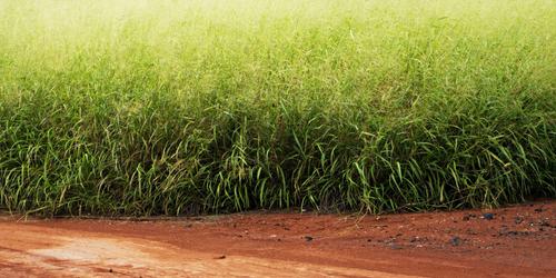
Lemon Grass and Dirt Road, MolokaiRich
There's a lot here to like- the three bands of colour are eyecatching and your xy axis proportions look just right to make the most of those bands. Those colours together feel hot and lush. It drips with tropical humidity.
-
@WhyNot has written:
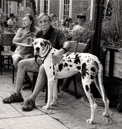
Looking at Me? #2
WhyNot
Dogs and owners grow to look like each other and these two are the proof. The photograph makes the most of the faces and the legs.
Both seem to be very aware that they are seen as a pair and further, they want to be looked at that way.
The brighter white of the dog "pops" it nicely from the background . -
[quote="@simplejoy"]
I've been thinking quite a bit about my purpose and role(s) in this world, so I guess a lot of that (partly unprocessed) thoughts are still lingering in the background whenever I create something. So today, I found 10 minutes of time (while drinking a cup of coffee, which regularly tends to get cold when I'm distracted) and decided to build up this very basic scene... I won't describe exactly what I tried to depict, but the title should provide a good hint.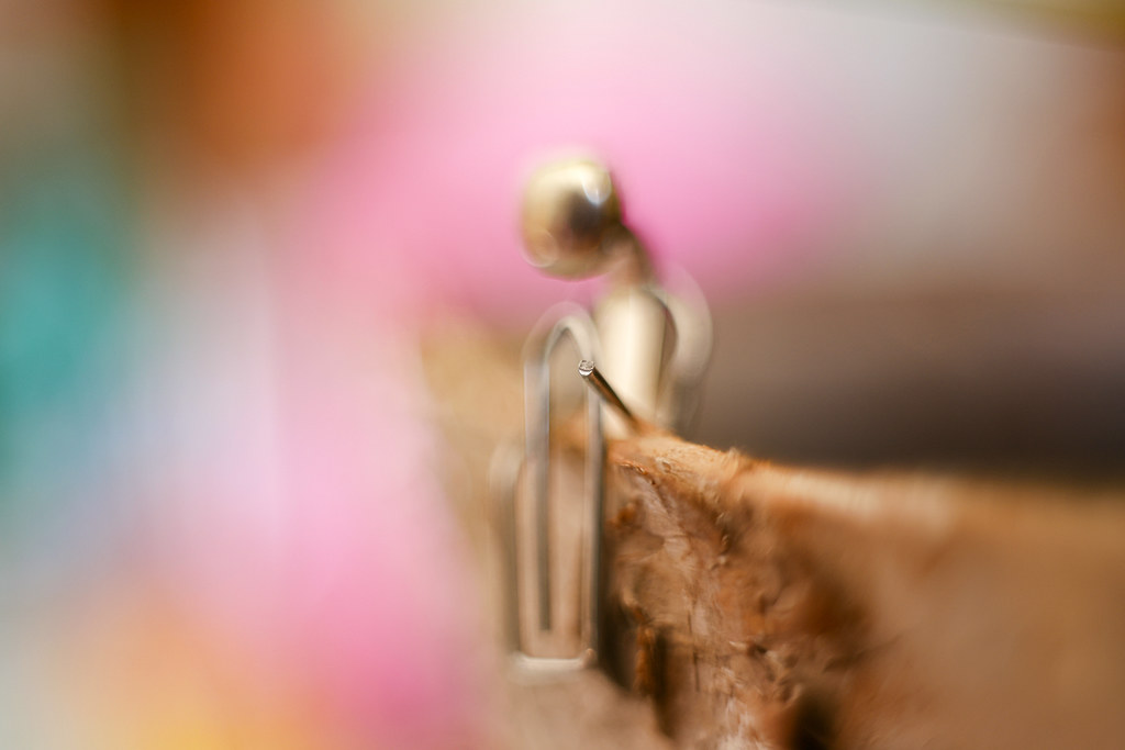
Papa-clip explaining... by simple.joy, on Flickr
[/quote
There's always the fun with these in trying to work out what you did. This is different from responding purely to the image on its own merits.
The paperclip I see but after that?
I don't see Papa explaining. The ruler or rod is too prominent as it is in focus. To me, this is a schoolmaster of the old school laying down the facts to be learned. The colours however are gentle and more easy to associate with your caption. -
@simplejoy has written:@Fireplace33 has written:
Rooftop shadow
Thinking about the upcoming winter reminded me of an old favorite photo I took while walking through the snow near Mühlbach.
I liked how this raven flew over the mountain hut, making his shadow on the rooftop.
An absolutely excellent image - really impressive work capturing that short moment so well! I love the special shadow and the wonderful blue and white tones in contrast to the dark bird and chimney. I would try to crop it differently because I feel like it would perhaps improve the overall balance, but I get it if you're hesitant, because it would probably require to get rid of some of the beautiful blue sky... (I've tried a square crop, but that didn't really work for me). So here's what I would go for:
Thanks Simplejoy, glad you like it 😀
I can see where you are going with the crop and it does work, but it loses something too.
At the moment I see a sort of "diagonal line", that I like, in the original,...
....a line made from the left mountain peak, the chimney (which sort of echos that peak) and the bird's shadow.
The bird itself is above that line and quite small and distinct, it's balanced by the much larger "free space" below the diagonal line, but perhaps I'm just thinking too much, and have been reading too many of Erez Marom's articles on composition in DPR ;-)By the way, did you notice the imprint of a birds wing on the snow on the roof on the left side?
The birds were occasionally landing on the roof and walking up and down, and taking off again. -
@Fireplace33 has written:
I can see where you are going with the crop and it does work, but it loses something too.
At the moment I see a sort of "diagonal line", that I like, in the original,...
....a line made from the left mountain peak, the chimney (which sort of echos that peak) and the bird's shadow.
The bird itself is above that line and quite small and distinct, it's balanced by the much larger "free space" below the diagonal line, but perhaps I'm just thinking too much, and have been reading too many of Erez Marom's articles on composition in DPR ;-)By the way, did you notice the imprint of a birds wing on the snow on the roof on the left side?
The birds were occasionally landing on the roof and walking up and down, and taking off again.Yeah, you‘re right - there surely is more than one way to find a working balance here.
Yes, the imprint was one of the first things I noticed and would be well worth its own shot. Looks almost like a fossil - really fascinating!
-
-
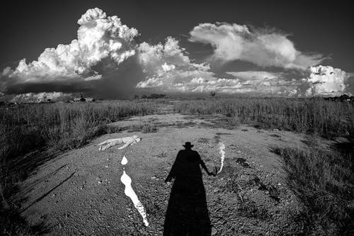
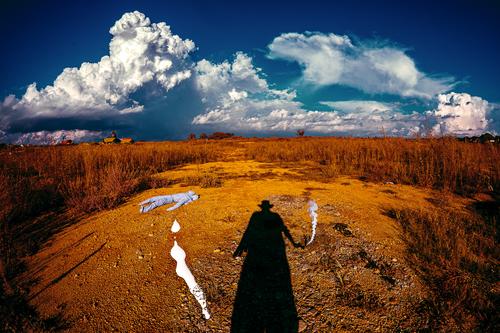
What lens did you use for this?
As I said in a recent B&W thread, the substitution of dark grey for a blue sky completely changes the feel of a photograph. As far as the rest of the scene goes, I find it interesting in either version, though actually more macabre in the colour version, which doesnt show the sun lighting up the scene quite so obviously.
David
-
@davidwien has written:
What lens did you use for this?
New toy. Brightin 10mm f5.6. Wish I had done more research. That's a fixed aperture. But, as you can see in the results...that's not a bad looking image quality.
-
Old China in New China
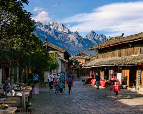
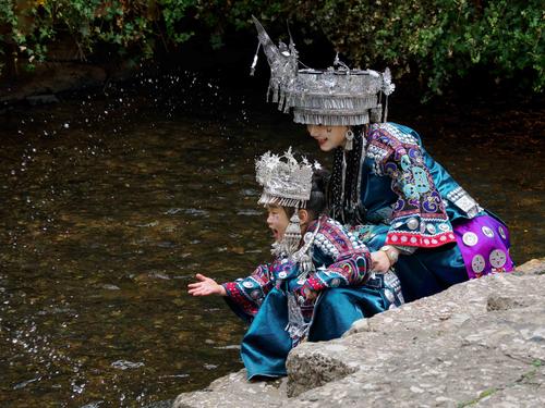
Over the last few weeks my free time became a land-fill, and one of the things dumping its demands on my time was an exhibition on Lijiang, a beautiful city in China, and with which our town in Germany has a friendship treaty. I am in an association supporting this idea to encourage contact and cooperation and throw some light in the dark corners, which can cause prejudice, and all the while trying not to be misused by interested parties. Quite fun really!
The exhibition is made up of my photos, and these are two of them. At first sight there is nothing really to connect them, but my title suggests the link. The first shows Baisha, an ancient small town, or even a village in chinese terms, on the outskirts of Lijiang, which has not yet been flattened by tourism. The stalls are there, but the produce is local and the people in the street could be local or tourists. A lot of the older women still wear their traditional costume, and it is not just for the tourists.
The buildings are old and traditional. The Jade-Dragon Snow-Mountain in the background is as beautiful as it was centuries ago, but we can sense the imminent change and tussle of trying to move with the times and at the same time preserve history and traditions.There are 56 recognised minorities in China and 15 of them are in Lijiang, in fact the Han, the majority of the Chinese, only make up 42% of the population, and the traditional costumes of the other minorities are everywhere in the city. Some, especially the older women, wear them as their everyday clothes, others just for weddings and celebrations, others are simply in the tourist trade, or hired costumes for a photo shoot, regardless of whether they have any connection to the minority or not. The two people in the second photo could be any of those, although the costumes certainly weren't the very tacky tourist photo shoot type.
It is definitely food for thought. The old buildings, clothes and style are beautiful in my eyes and I hope they don't disappear. But do I have any right to wish for that? Is it fair on the people facing the impracticalities of old, just to look cool for a Westerner? And in any case, to what extent do they still really exist and are not already just a beautiful dream for tourists?
Pete
