• Members 1662 posts
    Sept. 7, 2023, 9:51 p.m.

    A really beautiful shot, very well framed and full of interesting details, colors and textures. I love the mountains in the background and it seems like an excellent choice shooting at the focal length + f-stop you used. (I would probably botch a shot like that by using a longer lens wide open 😅) The buildings are beautiful add some really nice warm tones with the help of the sun, contrasting perfectly with the green and blue tones of the trees and mountains/sky in the background. It's a wonderful shot and an excellent reminder how much unique history there is in Chine, which is probably in quite a bit of danger of being neglected or forgotten in the near future... Thanks for that!

    Of course no one has a right to tell those people what they are supposed to do with their history, culture and rituals and tourism certainly is a bit of a double-edged sword... however I think it's usually better if some cultural aspects are kept alive mainly "for show", than to have them disappear completely.

  • Members 1416 posts
    Sept. 7, 2023, 11:06 p.m.

    As the photo is, the edge of the dumpster doesn't bother me. However, I'd want to lighten the shadow area to the left of the person's shadow. In this case the dump[ster edge would become more prominent and you might want to remove it. Another "however," I like the windows top left so I wouldn't want to just take a slice off the left to remove the dumpster, I'd use Adobe's fill replacement.
    I found my eye's going from the person's shadow to trying to work out the details in the left shadow area and really, there wasn't much there to find. Therefore the dark, left area was a distraction. So, I'd lighten the lower left area a little and selectively darken the person's shadow.

  • Members 1416 posts
    Sept. 7, 2023, 11:15 p.m.

    Beautifully composed. The positioning of the various falls starting in the top left creates movement that splits and both take us to the logical, brightest point, bottom right. Something similar happens with the greens with the foreground, bright, sharp leaves in the same area as the brightest rock/falls.
    Composition, exposure and control of dof are all outstanding here.

  • Members 1416 posts
    Sept. 7, 2023, 11:24 p.m.

    DAP? I'd never heard of it so I followed it up. A very very impressive bit of software. Scarily impressive.
    Lou's example shows what it is capable of. Of course, it needs something worthwhile to work with and Lou's original had to provide this.
    The red line of poppies against the green plus the dynamic use of the corners gave a perfect starting point. I also like the retention of detail in the nearer unopened flower buds.
    Lou, DAP creates all kinds of ethical dilemmas for me that I'm going to have to think my way through.

  • Members 1585 posts
    Sept. 8, 2023, 1:08 a.m.

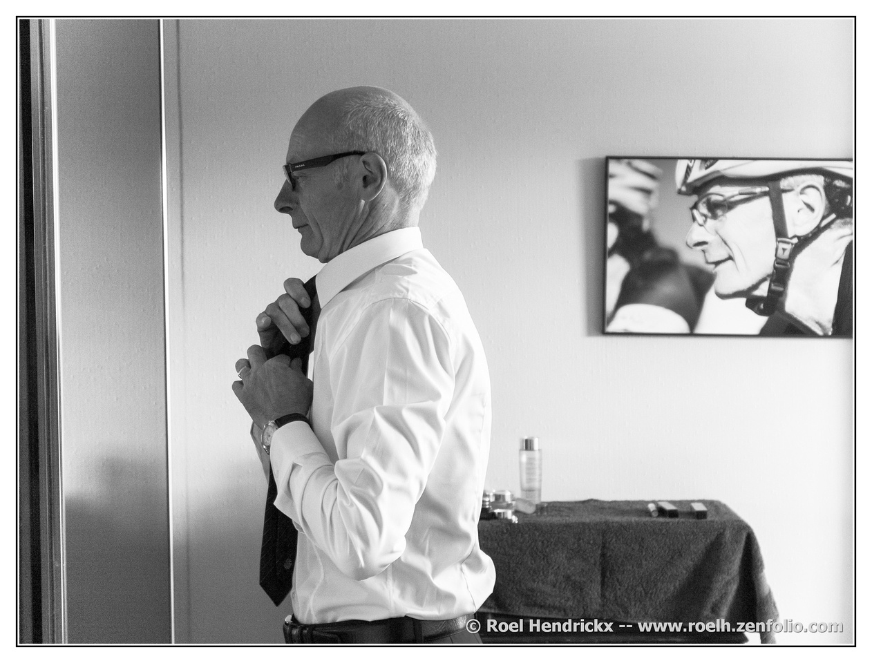
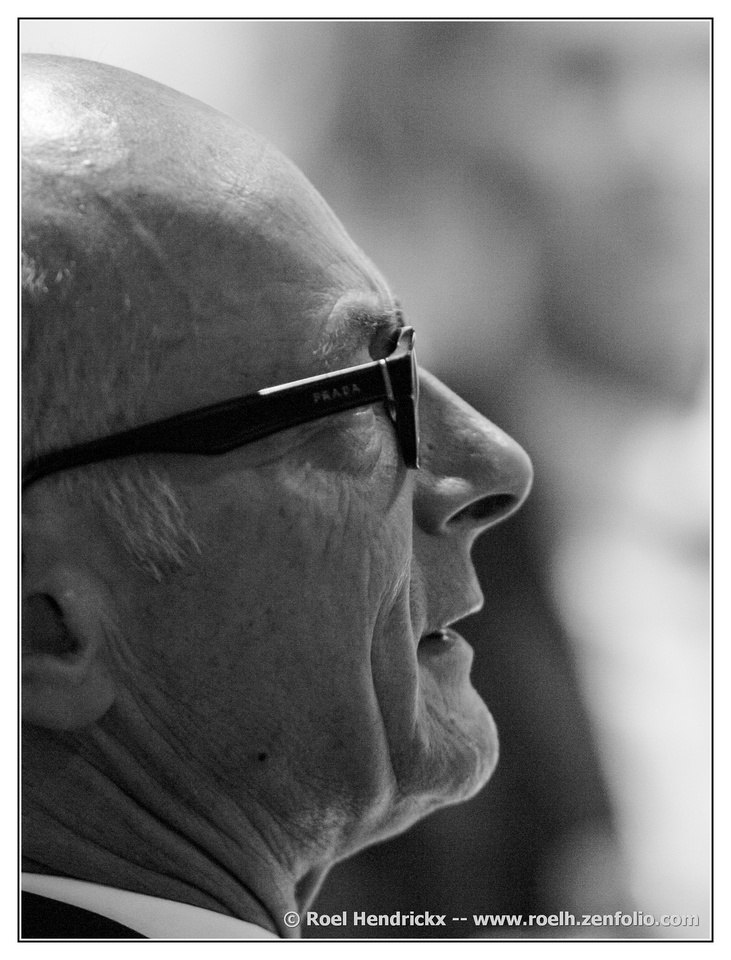
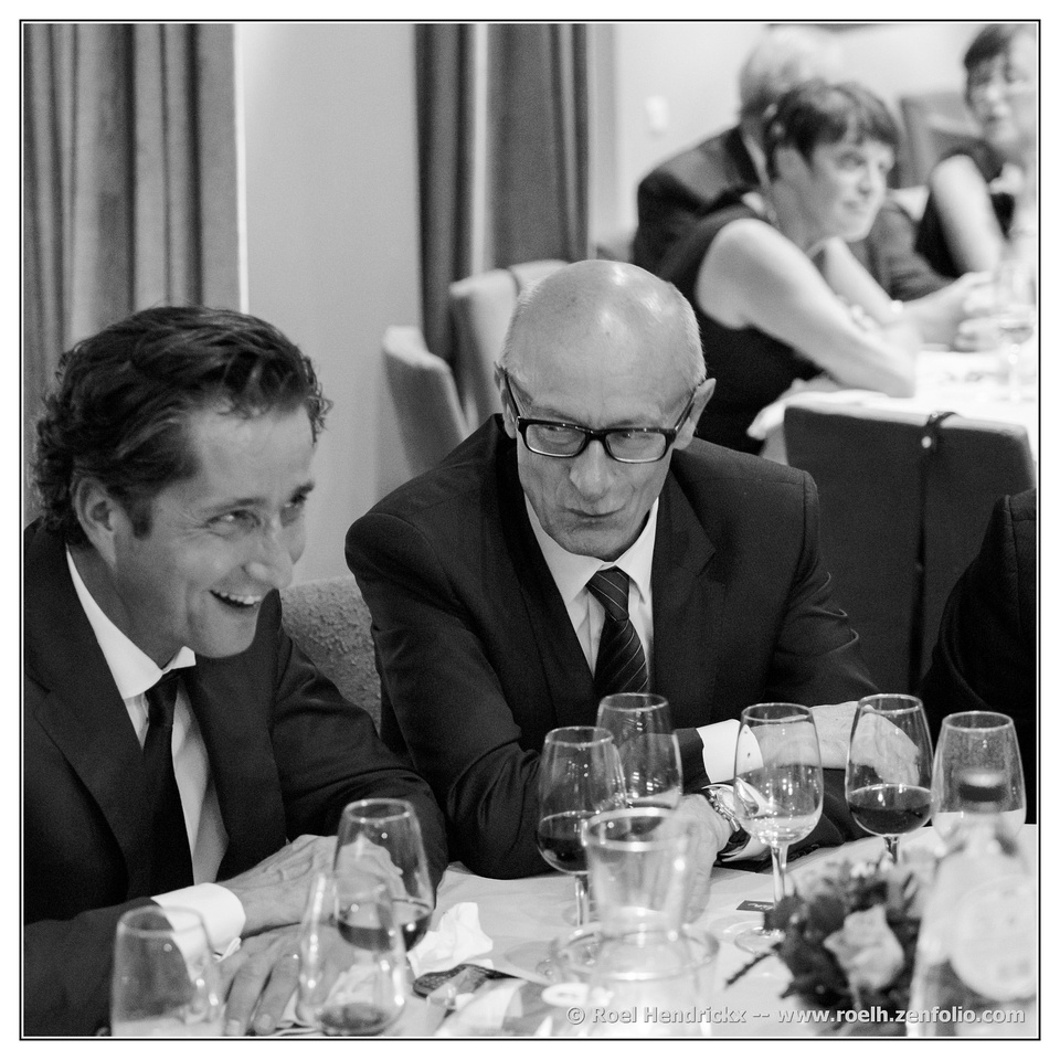
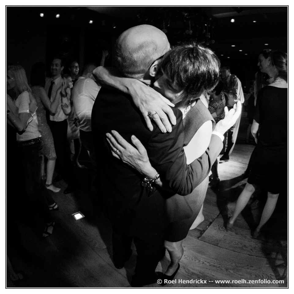
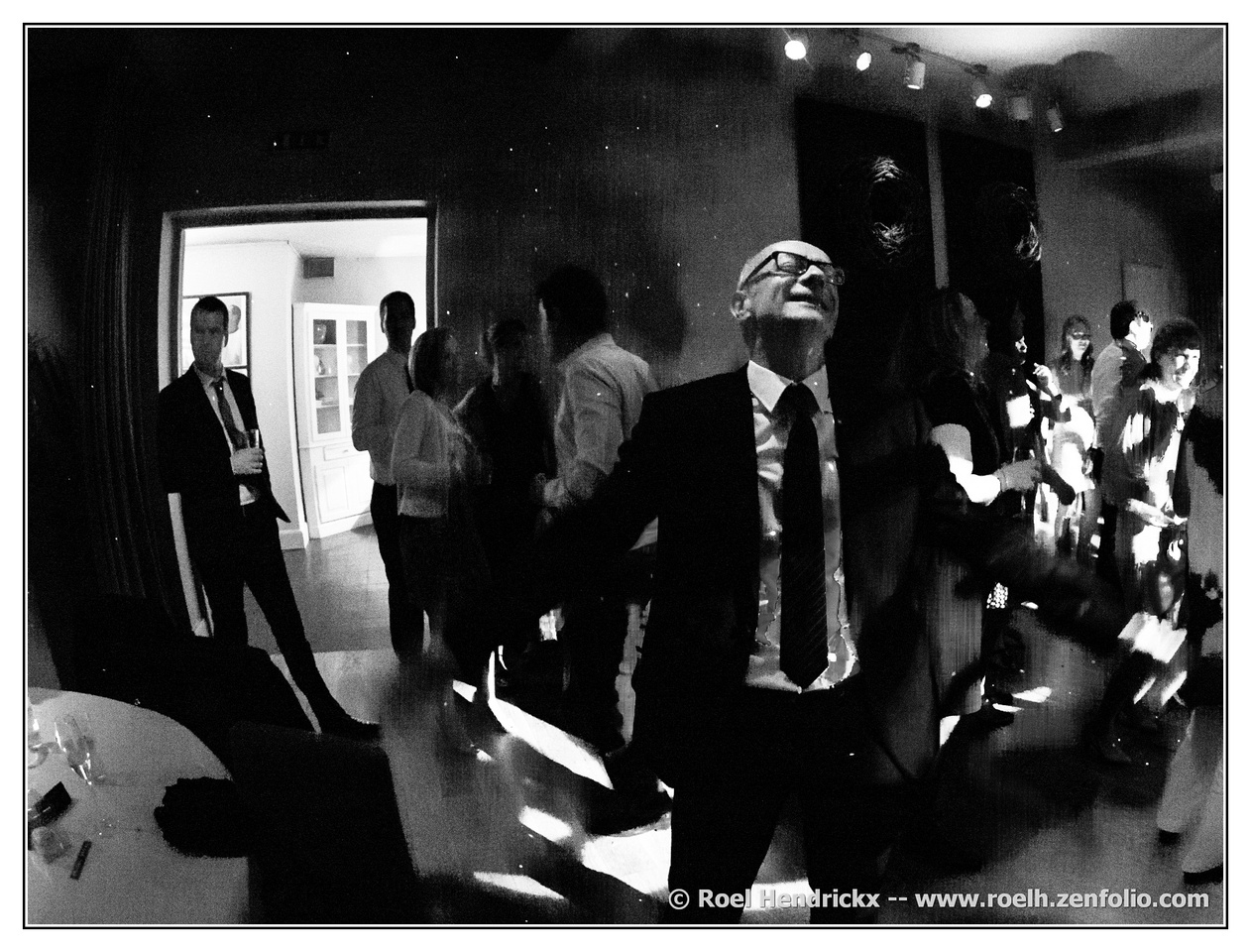
    Excellent series, and perfect in monochrome. The first is a master shot with expression, character, pose, background, simplification of elements - everything you might want in an informal portrait. The last one, with its well managed distortion, is classic as well. There is no better illustration of joy and relief than we see here - joy for the couple, for the completed closure of the circle of child rearing, relief that it all came off as they wished (weddings don't always, we know). Well done. I am sure these are treasures.

  • Members 1585 posts
    Sept. 8, 2023, 1:12 a.m.

    Beautiful image, frigid pastel blues and whites with the two contrast markers: the bird and the chimney, in a good thirds location of the frame. The triangular motif that is repeated in the mountaintops and echoed in the black chimney cap is an effective compositional structure. But the star of the show is the bird, whose shadow glides magically out of the frame lower right and left its echo in the snow lower left. Wonderful.

  • Members 1585 posts
    Sept. 8, 2023, 1:19 a.m.

    I have seen this one of your somewhere else and I still like it. This image taught me what a Dutch Angle is and it works so well here. There's a bunch of tiny detail to enjoy here, from the background art to the pie safe, the eggs to the tattoos. I want to go there and order a sea chicken. The reds hold down the center of interest and the yellows provide the frame.

    I tell my grandsons random things about photography and must have mentioned something about this because the youngest; when he borrows my camera, always takes these angled pictures. His older brother told him he needed to concentrate on holding the camera straight. The youngest replied, "Don't you know anything about Dutch Angles?"

  • Members 1585 posts
    Sept. 8, 2023, 1:23 a.m.

    A well constructed photo with the single hay bale in the open field and a forest behind with one large tree that balances the lone bale. The clouds are well defined and appealing. The colors are, I am sure, exactly as you meant them to be.. They are complementary and contrast well with each other. But I confess they hurt my eyes, and I would not choose to look often at this color rendition. There is some bleeding of color from the trees into the sky, but I have no idea what you might do about that, even if you wished to.

  • Members 1585 posts
    Sept. 8, 2023, 1:26 a.m.

    A simple three colored composition comprised of three horizontal strips alternating yellow, green and orange. The detail of the darker stems with the glowing ethereal heads of the grass gives the image a dreamy look. The texture of the dirt road offers another contrast. Simple but elegant and quite beautiful.

  • Members 1585 posts
    Sept. 8, 2023, 1:47 a.m.

    A wonderful catch. The dog, the owner, and the wife all look just alike, as family should, right down to the sagging jowls, skin spots, droopy eyes and mournful expressions. The dog is posed just perfectly with a lean-in across the owner's lap. The monochrome conversion helps with this impression of relatedness by removing any color that might not fit the story, simplifying the scene and making the key players stand out even more. I love this one!

  • Members 1585 posts
    Sept. 8, 2023, 2:03 a.m.

    I find it a very arresting image, not just because of the shadow but because of the golden light that makes the shadow stand out. A duller or bluer light, or a monochrome version, would not have the same appeal as the golden one. The gold light impacts less than 1/4 of the frame but quickly gathers up 3/4 of the interest. We have to ponder whose shadow it might be (it seems unlikely to be the photographer's because of the angles involved). Unidentified shadows often feel sinister, so we feel on our guard in what looks like an almost abandoned back street.Once we wrest our attention from the light and shadow, we find there's more of interest here. The street art is remarkable - what is that? Rocket ships? Beehives? Tombs? Missiles? The blued paint winds its way into those windows to make it even more mysterious. Then we have hundreds of electrical contrivances, razor wire at the third story (???). I think I would crop out the blue dumpster at the edge and maybe a corresponding amount from the bottom but that would be all. I don't think it adds anything (the scene is grungy, and intriguing, enough on its own).

  • Members 1585 posts
    Sept. 8, 2023, 2:11 a.m.

    Against a backdrop of pastel painted Easter eggs, I see a human figure, head bowed in concentration, steering a medium sized brown boat with a rear tiller.

    But, as always, it doesn't really matter what it is meant to be because such images let us make up the stories for them on our own. The bits and pieces of the set up are positioned well, focused enough but not too much. The colors set a mood, and there is a spot of sharp focus to tell us where to begin building our own story from the assorted parts.

    Well done.

  • Members 1585 posts
    Sept. 8, 2023, 2:16 a.m.

    What a gorgeous falls! It's huge, and you had to be creative in how to frame it to get all those different levels in the image. The water is slowed down just enough to make it pretty and not enough to make it milk, so we can gather information about the strength of the thing. The textures of the rock contrast well with the water and the lush greenery. Nicely captured, it makes me wish to visit. I love waterfalls.

  • Members 1585 posts
    Sept. 8, 2023, 2:59 a.m.

    Bright and appealing artistic rendition of the poppies, which have symbolic meaning as well as visual beauty. The colors are perfect complementary colors straight from the color wheel. The program, in your hands, rendered them just abstract enough without losing detail and especially shadow. These artistic programs can give us lovely results, but only when we take the time to learn to harness their power as you have here.

  • Members 1585 posts
    Sept. 8, 2023, 3:06 a.m.

    It looks more like a whirlpool to me, with a bouquet inside. The whirlpool features have picked up the colors from the flowers, which had already been altered and retained in some very pleasing way. Somehow this whole thing is quite lovely. Little details of the flowers are hiding inside the rounded pool as it laps smoothly back across itself. The purplish background is a good choice for the tones. I really like this one.

  • Members 1416 posts
    Sept. 8, 2023, 3:55 a.m.

    This time, I think the discussion is more interesting than the photos. Not that there is anything wrong with the photos. I love travel and I don't want a world where it all looks, sounds and tastes the same. Neither do I like what tourism can do to a country. What I really want is a world where I and a selected few others can travel. The rest of you can wait at home and be gobsmacked by the photos while all the places we visit while they continue doing photogenically quaint things. Possibly there are problems with this position but I'm working on it.

    Number 2. The implausible headdresses are shown to advantage against the dark background, The facial expressions are a delight. The curve of silver water droplets complements the curves and colours of the headdresses.
    Another name for the bucket list.

  • Members 1585 posts
    Sept. 8, 2023, 11:20 a.m.

    Italy reflected twice in a Fiat (windshield and hood)? The bright blue sky, the classic buildings in complementary yellow, with accents of teal. It is a fun puzzle image to unravel but encapsulates your summer visit with seasonal weather, distinctive architecture and vehicle, a street side creative portrait. Nice concept, well carried out.

  • Members 1585 posts
    Sept. 8, 2023, 11:39 a.m.

    This one is hard to respond to because there are so many elements to it, and the way you've put the elements together is creative but confusing. The resulting image gathers and holds our attention but it's morbid in a darkly comic way. We have an impressive rural backdrop presumably shaped with color shifts. We have a sky full of clouds that trigger our pareidolia and we see animals or demons in combat. We have this grim reaper type gunfighter figure who is either wearing a cape slung to the side or perhaps that is his folded wing, while holding the inevitable smoking gun (which might be something else altogether). We have a distorted body that is decomposing before our eyes leaving a trail of white ink dribbling down the surface of the artwork. I don't understand it, I don't want it on my wall. But I do appreciate the imagination that created it. This is one that I would love to see the creator critique, in detail - what you did, why, what you wanted to achieve, what you were happy with and what you were not, what you wanted to change. Etc.