• Members 787 posts
    Sept. 20, 2023, 7:44 a.m.

    Welcome to the Wednesday Comments and Critique (No Theme & No Brand) thread!

    We are dedicated to continuing the great tradition of this C&C thread because we are convinced that looking at, and talking about images is vital for better photography.

    Our tried and tested concept (15 years and running!) is a weekly "peer-to-peer" photo comments & critique encounter, in which you GIVE and RECEIVE.

    The idea is simple: you post an image and get critique on it, and in return give other people your opinion of their images, or vice versa.

    Any Theme, Any Camera, Any Style, Any Subject.

    We are still figuring out how to create the convenience of threaded view on this new forum. For now, let us agree that you post an image with a title and short explanation, and that all comments include the image as a quote. Replies to comments may or may not include quotes.

    THREAD GUIDELINES – THE SHORT & SWEET VERSION
    • This thread does not care about brands. It’s not about the tool, but the image.
    • Post one image that you would like to get comments on (exceptions: see below).
    • Add a clear title to your post to reflect the image’s title and distinguish your entry.
    • Look at the other images and give your comments on at least one of those.
    • For comments, try to go beyond a simple pat on the back or a short dismissal.
    • Do you like an image (or essay) ? Try to explain WHY it appeals to you.
    • Negative feedback is OK (we all want to learn), but be polite and constructive.
    Try to explain why the image (or essay) does not appeal to you and how it might be improved.

    We will start with single images.
    Re-establishing our C&C for essays will be a next step.
    Please limit any individual contribution to a single image. This avoids confusion.

    The critique you give is vital.
    What was your first impression? What catches your eye about an image? Why?
    What do you like, and what distracts you? What would you change?

    Fiddle with the image in your head - composition, perspective, color balance, exposure.
    It is understood that unless the original poster specifically states that they do not want an altered image posted that you are free to alter the posted image and repost it in a reply for C&C purposes (no use for other purposes!). That reposted image may remain permanently or you may remove it after a short period of time if you prefer. No copyright disputes here!

    Encourage - it is a scary business putting your work up for other people to judge!

    More general feedback is also welcome.

    Do you know something about taking the same sort of image that would make matters easier - share your own as an example in your reply.

    And finally, here are some useful hints for navigating and familiarizing yourself with the forum mechanics of DPRevived:
    • Unfortunately, there is no threaded view (yet). We can’t simply keep images and their related comments together like we used to. So please make clear about which image you are commenting.
    • To do that, you may make good use of the “quote” feature. This allows you to keep the image in your reply. Excess content can be deleted. The “preview” button allows you to look at what you are going to post.
    • There is a difference between the “reply” button that sits at the top of the forum, and the reply buttons under every post.
    • A few threads in this new forum with useful navigation information:
    dprevived.com/t/how-to-use-this-site/387/
    and
    dprevived.com/t/how-to-embed-photos-into-your-post-directly-from-flickr/456/
    (this applies also, with modifications, to other photo hosting websites)
    and
    dprevived.com/t/how-to-quote/1014/

    Have fun and let’s stick together!
  • Members 787 posts
    Sept. 20, 2023, 7:49 a.m.

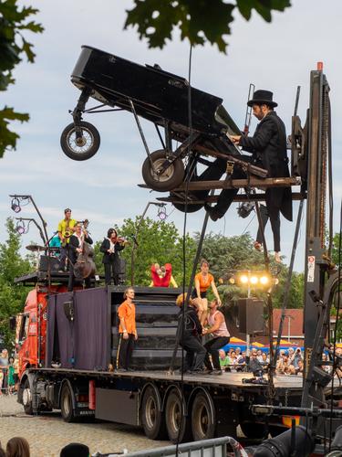
    ARRÊT d'URGENCE

    An image from the short Circus Festival "Plein de Cirque", last weekend in provincial town Turnhout, to mark the start of the cultural year of their excellent cultural center De Warande.

    French circus ensemble Akoreacro stunned and amused with a highly intoxicating performance that was a perfect cocktail of live music (gypsy jazz), acrobatics, humour, visual stunts, set design and some pyrotechnics. I loved every minute of it.

    Plein de Cirque Turnhout 2023 - Akoreacro - RH-2023096-T9174689-LRC12-sRGB.jpg

    (Yes, that was an actual functioning piano on top of that forklift...)

  • Members 1416 posts
    Sept. 20, 2023, 8:22 a.m.

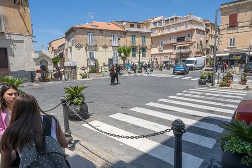
    A matter for discussion.Italy can be baffling.jpg

    Italy can be baffling.jpg

    JPG, 1.3 MB, uploaded by MikeFewster on Sept. 20, 2023.

  • Members 1091 posts
    Sept. 20, 2023, 9:14 a.m.

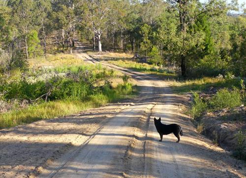
    P1050442b.JPG

    Late afternoon stroll along my new driveway

    P1050442b.JPG

    JPG, 3.3 MB, uploaded by Bryan on Sept. 20, 2023.

  • Members 787 posts
    Sept. 20, 2023, 9:40 a.m.

    What a wonderful illustration of the Italian attitude towards the priorities in life.

    Traffic safety is a nice thing, but it cannot hold a candle to the necessities of small talk.

    Fortunately, Italians are known to illustrate their speech with impressive displays of gesticulation, so there is little danger of the cars not noticing the ladies discussing world politics and domestic issues in the middle of this crossroads.
    Besides, the car drivers will be too busy honking for no apparent reason other than the joy of the sounds, and parking on the sidewalk.

  • Members 1662 posts
    Sept. 20, 2023, 10:12 a.m.

    live.staticflickr.com/65535/51536882103_ff5dd5b595_b.jpg
    Rising star
    by simple.joy, on Flickr

    You may recognize this one... 😉 It's feared all across the internet: "Oh, no... run away, if you don't want to hear about all these old lenses again!"😱

  • Members 1662 posts
    Sept. 20, 2023, 10:18 a.m.

    Really effective composition. I love that your(?) dog is looking into the curved road, ready for whatever may come! The light is beautiful as well and provides really interesting patterns and nuanced warm tones. I would perhaps consider to crop it a little bit more tightly (particularly because of the small patch of sky in the upper right corner), but not too much, as the lines work pretty much perfectly as they are. Well done!

  • Members 676 posts
    Sept. 20, 2023, 12:28 p.m.

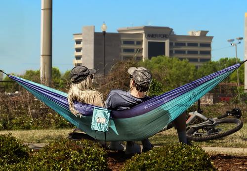
    Summer 4

    Summer 4.jpg

    WhyNot

    Summer 4.jpg

    JPG, 1.5 MB, uploaded by WhyNot on Sept. 20, 2023.

  • Members 523 posts
    Sept. 20, 2023, 12:40 p.m.
  • Members 523 posts
    Sept. 20, 2023, 12:48 p.m.

    Is David referring to this image? "Quote" reply helps keep confusion to a minimum.

    The juxtaposition of the elements is whimsical and engaging. I mean, who would place a hammock there with that view? Sort of like placing a cat in a rocker out in the sagebrush 😂

    The processing on the couple is familar - poster edges?

  • Members 523 posts
    Sept. 20, 2023, 12:52 p.m.

    Agree with simple.joy.

    It's particularly enjoyable for me, because knowing you live in Australia, I can imagine a kangaroo bounding of of the bush at any moment. And maybe that's what caught the dog's attention??

  • Members 523 posts
    Sept. 20, 2023, 12:57 p.m.

    I stumbled across someone on flickr who is also in love with old lenses and apparently has many more than he feels he "should." 😀

    I'm enjoying seeing a large version of your avatar because I never tried to find it and couldn't really make out the details. I'm interested to know how you achieved the fiery orange colors?

  • Members 787 posts
    Sept. 20, 2023, 1:48 p.m.

    Could you please explain what you are referring to?
    When commenting on a particular image it is always useful to include either the image (by using the "quote" function) or at least its title.

  • Members 787 posts
    Sept. 20, 2023, 2:10 p.m.

    Your creativity with macro subjects and use of old lenses is really limitless.
    I admire this so much.

    I think that I am looking at the tip of a specially shaped screwdriver or drill bit?
    But actually, I don't really care what it is in reality.
    The surreal alternative reality is so much more inviting.

    In this case, your lighting adds a spectacular character, because it really does look like the fiery trail of a comet flying.

    IDEA : if you turned this image 90° counterclockwise, it would look like a object entering the earth's atmosphere and trailing a blaze of flames behind it.

  • Members 676 posts
    Sept. 20, 2023, 3:46 p.m.

    IF you are referring to my picture -- then please expand ....

    WhyNot

  • Foundation 1507 posts
    Sept. 20, 2023, 5:11 p.m.

    The shot of the two people looks like it has been pasted on to a shot of the factory.

    David