Sailor apprentices

Enlarge
-
-
Both the title and photo made me smile! I think the most important aspect of the image's success is that there ae so many little sailboats, and they're all grouped closely together. The cruise ship is obscenely massive, in comparison. I had no idea!
The apprentice (or students in a classroom) theme is great! Kudos for seeing the potential for an engaging photo.
-
Minnie,
Thanks so much for commenting.
Baseball is the greatest game.
"Looks like it would be a good magazine ad."
For the majority of my graphics arts career, my job was to illustrate brochures, newspaper/magazine ads, booklets, some books.
Impossible deadlines and expectations. At a moment's notice go out and get professional-quality images to complement the ad-copy. Fill the frame. Simplify. Eliminate extraneous elements. Reduce ambiguity. Use color pleasingly. Use color dramatically. Tell the whole story at a glance. "We need the images yesterday."
That's pretty much the way I see the world and make photographs. This was early evening, during a semi-pro game on Maui. I had the contract to print brochures and schedules for one of the teams. The glove and ball belonged to one of the infielders. It was lying there between innings.
Rich
-
@Rich42 has written:@minniev has written:@Rich42 has written:
Rich
As a person who spent 30 years watching one son play baseball and am now watching a grandson start his journey in the most beautiful of sports, I enjoy a good baseball photo like this. Looks like it would be a good magazine ad. I appreciate that the ball has a few scuffs on it. The choice of focal point works well. A deceptively simple image that immediately calls up memories, sensory experience, and milieu. Nicely done.
Minnie,
Thanks so much for commenting.
Baseball is the greatest game.
"Looks like it would be a good magazine ad."
For the majority of my graphics arts career, my job was to illustrate brochures, newspaper/magazine ads, booklets, some books.
Impossible deadlines and expectations. At a moment's notice go out and get professional-quality images to complement the ad-copy. Fill the frame. Simplify. Eliminate extraneous elements. Reduce ambiguity. Use color pleasingly. Use color dramatically. Tell the whole story at a glance. "We need the images yesterday."
That's pretty much the way I see the world and make photographs. This was early evening, during a semi-pro game on Maui. I had the contract to print brochures and schedules for one of the teams. The glove and ball belonged to one of the infielders. It was lying there between innings.
Rich
It was very interesting reading about your career demands, Rich, and how they connected to your photo here. Thank you!
-
@LindaS has written:
The Light Behind
 The Light Behind by Linda Shorey, on Flickr
This is an image that is spoilt for me by interference from memories of other images. This is totally unfair to Linda's photo.
Backlighting, the otherworldly green, foliage, lots of black space where things might be lurking. They all have connotations of Halloween and I have to work hard to strip my prejudices away.
The intricate textures through the leaves, their framing by the more dominant branches plus the striking green are what make the shot. The supernatural feeling is hard to avoid as we consider the very bright area. What is it? Then we quickly change to deep blacks. I would have preferred more of the pattern and so I would have cut back the intensity of the strongest highlight area and allowed more detail in the shadows.
Of course, the suggestion of something unnerving might have been exactly what Linda wanted in which case my suggestions are way out of order. -
@JSPhotoHobby has written:
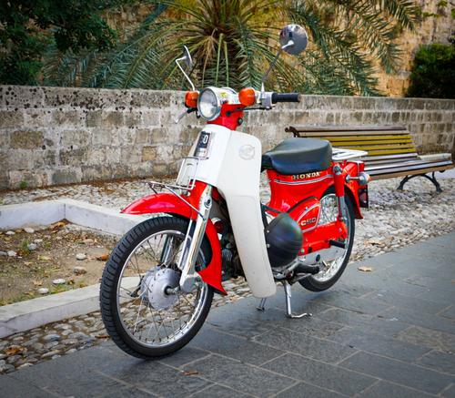
Walked passed this classic, such great condition.
Owner's daily commuter in Rhodes Greece
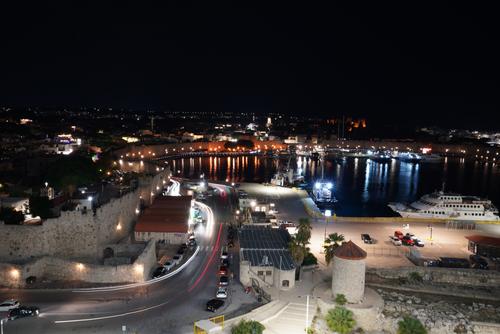
Had the opportunity to try some light trails.
Supported on the rail of a ship. IBIS paid off here I think.
What elements could have made this composition better?Shot 1. As you say, a classic in great condition. As the subject is the bike and as the background isn't adding anything to the time context, I think you might have chosen the angle a little better. The bench on the right is running into the bike when you really want the bike to stand out. Whoever built the fence did you no favours as the top edge goes right throughthe line of the handlebars. The similarity in the curbing and the concrete edging works well. If you want to try some post processing with some of the newer fangles object removal and replacement tools, try getting rid of the bench and extending the height of the wall upwards.
Shot 2. IBIS here is a tricky decision. I note that it's Sony IBIS and I have had experience with this system. It depends on how securely you had your camera positioned on the rail. If it was on a tripod, IBIS should be off. In this case, it's hard to tell whether or not IBIS would give the best result. It's a dilemma choice I've had too and I might have considered two shots, one with IBIS on and one with it off.
Re the composition, you have a choice. Either zoom in closer to make more of the trails or try to get the whole scene including the yacht, the round tower at the front and the background lights. I like what you have done. It takes in the whole scene with the light trails giving movement to an otherwise still location. The inclusion of the other bits is important to feeling this scene. Possibly take a little off the black sky. -
@Rich42 has written:@minniev has written:@Rich42 has written:
Rich
As a person who spent 30 years watching one son play baseball and am now watching a grandson start his journey in the most beautiful of sports, I enjoy a good baseball photo like this. Looks like it would be a good magazine ad. I appreciate that the ball has a few scuffs on it. The choice of focal point works well. A deceptively simple image that immediately calls up memories, sensory experience, and milieu. Nicely done.
Minnie,
Thanks so much for commenting.
Baseball is the greatest game.
"Looks like it would be a good magazine ad."
For the majority of my graphics arts career, my job was to illustrate brochures, newspaper/magazine ads, booklets, some books.
Impossible deadlines and expectations. At a moment's notice go out and get professional-quality images to complement the ad-copy. Fill the frame. Simplify. Eliminate extraneous elements. Reduce ambiguity. Use color pleasingly. Use color dramatically. Tell the whole story at a glance. "We need the images yesterday."
That's pretty much the way I see the world and make photographs. This was early evening, during a semi-pro game on Maui. I had the contract to print brochures and schedules for one of the teams. The glove and ball belonged to one of the infielders. It was lying there between innings.
Rich
minniev has covered it. The scuffing on the ball was a good pick up. I like the green, green grass that makes the summer connection and also has patterns that connect to the stitching on the ball. Defintely a shot suitable for an ad. or a titling place in a sequence. This tells us that you succeeded in getting a photo that is loaded with meaning.
Really good. -
@minniev has written:
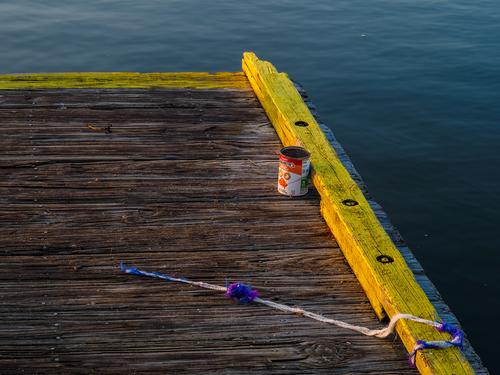
This is really exceptional in terms of colors! I love the balance and feel like it takes an incredible amount of experience and skill to get it right. A bunch of stories told in color... without any need for words, or narrators or over-the-top special effects. I like it a lot!
-
@Bryan has written:@MikeFewster has written:
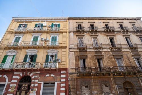
Renovator's dream or lost cause? I suspect the latter. The picture captures the contrast between maintained and dilapidated. The teal shutters do a lot for the livable. I do wonder if AC manufacturers could make slim profile units that would blend in without the square protrusion distracting from the architecture.
All over Italy we came across dilapidated old buildings being rebuilt and reborn. Many were clearly not being lived in but they weren't being demolished. I'm guessing that sooner or later they will be renovated. Tourists like the old areas and there's money to be made from renting. The Italians know very well that preserving the atmosphere of the old parts of town are critical for tourism.
I am pretty sure that not too long ago the building on the left would have looked just like the one on the right and that the one on the right will get the treatment in due course. -
@minniev has written:@LouHolland has written:
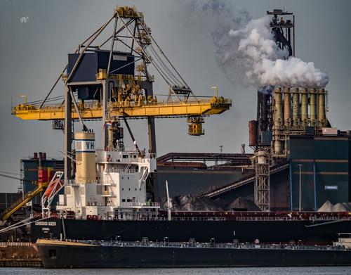
Sand dredger Charlock needed for coastal surveillance and restoration of the coastline and
on the other side of the port, the transhipment of basic materials that steel company Tata needs.
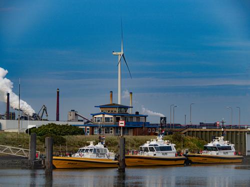
The photo also gives an idea of the width of the harbor to understand the second shot.
Photo3 some Pilots safely parked n a part of the fishing port.[![2_9260036.jpg]
Enlarge click image click downarrowThanks for looking.
LouHollandLovely trio of images of working boats at harbor. My favorite is the first because of the intricacy of the detail in the boat. We often focus on graceful pleasure boats but in reality, there are far more industrial boats and they are just as fascinating.
Once again I'm agreeing with minniev. Number one is a standout. The sky clouds/light give a dramatic framing to the upper structure of the boat. Similar lines from the mooring ropes balance the upper lines and bring the composition together. The "bow bulb" (I'm sure there is a correct nautical term) and the rope and the bow itself, beautifully frame the background docks. Then we have some perfect complementary colours.
The other shots are fine however they are more information shots that build the details about the location as part of a series. Shot one is the standout, stand alone gem. -
@Manuel has written:
I didn't so much apprentices see but a mother duck and her brood. It doesn't matter, they are both getting at the same idea.
Nice idea. -
@LindaS has written:@Manuel has written:
Both the title and photo made me smile! I think the most important aspect of the image's success is that there ae so many little sailboats, and they're all grouped closely together. The cruise ship is obscenely massive, in comparison. I had no idea!
The apprentice (or students in a classroom) theme is great! Kudos for seeing the potential for an engaging photo.
We could also say that the large cruise ship provides an appropriate silhouette to the small sail boats - if you get my gist.
-
@MikeFewster has written:@LindaS has written:
The Light Behind
 The Light Behind by Linda Shorey, on Flickr
This is an image that is spoilt for me by interference from memories of other images. This is totally unfair to Linda's photo.
Backlighting, the otherworldly green, foliage, lots of black space where things might be lurking. They all have connotations of Halloween and I have to work hard to strip my prejudices away.
The intricate textures through the leaves, their framing by the more dominant branches plus the striking green are what make the shot. The supernatural feeling is hard to avoid as we consider the very bright area. What is it? Then we quickly change to deep blacks. I would have preferred more of the pattern and so I would have cut back the intensity of the strongest highlight area and allowed more detail in the shadows.
Of course, the suggestion of something unnerving might have been exactly what Linda wanted in which case my suggestions are way out of order."Unnerving" never crossed my mind, so I am fascinated by your reaction, Mike 😁
-
@simplejoy has written:@minniev has written:
This is really exceptional in terms of colors! I love the balance and feel like it takes an incredible amount of experience and skill to get it right. A bunch of stories told in color... without any need for words, or narrators or over-the-top special effects. I like it a lot!
A photo I didn't appreciate until I read all the responses. It takes time and experience to "process" some of the images shared by this weekly group. I'm grateful for MinnieV's special eye, along with the varied comments and points of view. A great group!
-
@LouHolland has written:
[![2_9260036.jpg]
Superb colours (who needs Leica?).
Like the topic, but my fave is #1. The shape of the vessel and fabulous sky make this shot unique. Excellent! -
@MikeFewster has written:
Shot 1. As you say, a classic in great condition. As the subject is the bike and as the background isn't adding anything to the time context, I think you might have chosen the angle a little better. The bench on the right is running into the bike when you really want the bike to stand out. Whoever built the fence did you no favours as the top edge goes right throughthe line of the handlebars. The similarity in the curbing and the concrete edging works well. If you want to try some post processing with some of the newer fangles object removal and replacement tools, try getting rid of the bench and extending the height of the wall upwards.
Shot 2. IBIS here is a tricky decision. I note that it's Sony IBIS and I have had experience with this system. It depends on how securely you had your camera positioned on the rail. If it was on a tripod, IBIS should be off. In this case, it's hard to tell whether or not IBIS would give the best result. It's a dilemma choice I've had too and I might have considered two shots, one with IBIS on and one with it off.
Re the composition, you have a choice. Either zoom in closer to make more of the trails or try to get the whole scene including the yacht, the round tower at the front and the background lights. I like what you have done. It takes in the whole scene with the light trails giving movement to an otherwise still location. The inclusion of the other bits is important to feeling this scene. Possibly take a little off the black sky.
[/quote]Thank you for the feedback.
I will be more careful to consider my backgrounds, I forget to do this a lot. I was thinking afterward I should have shot it with the aperture full open to separate from the background better. The bike was on a walkway between a castles inner and outer wall in the old part of Rhodes. I could have asked the owner if he would mind moving the bike. I probably should have taken a picture of him with it..
I haven't invested in a travel tripod yet. This was a moment of opportunity. I pretty terrible at landscapes, so I thought I would try to compose one that included light trails. I wish I had a bean bag or monkey pod. Maybe I will add one to my travel kit.
-
@Manuel has written:
So symbolic, Giant and the rest...
-
@Rich42 has written:
Rich
It's all about timing. Colours are excellent and reflect the forthcoming game.

