• Members 1416 posts
    Oct. 7, 2023, 9:56 p.m.

    Thank you for the feedback.

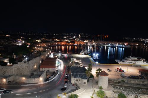
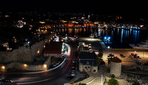
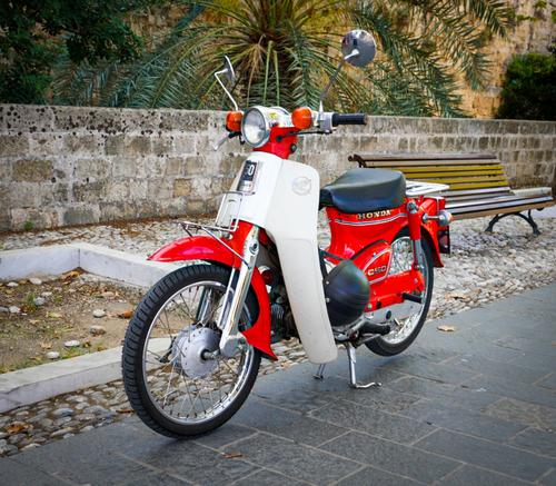
    I will be more careful to consider my backgrounds, I forget to do this a lot. I was thinking afterward I should have shot it with the aperture full open to separate from the background better. The bike was on a walkway between a castles inner and outer wall in the old part of Rhodes. I could have asked the owner if he would mind moving the bike. I probably should have taken a picture of him with it..

    I haven't invested in a travel tripod yet. This was a moment of opportunity. I pretty terrible at landscapes, so I thought I would try to compose one that included light trails. I wish I had a bean bag or monkey pod. Maybe I will add one to my travel kit.
    [/quote]
    I don't know that you need a travel tripod. Try some more experimenting first. When I'm shooting around towns, I don't bother. IBIS is good for general use and even better if you have optical stabilizer as well in the lens you are using. The question of whether to use IBIS or not when you have an opportunity to brace firmly is not clear. Sony aren't very helpful with their answers on this. My approach (unless I'm shooting stars) is to brace and handhold and use a delayed 2 second shutter release because the shutter press in these situations gives me movement. I don't hesitate to increase iso and then I use one of the new noise reduction/sharpening programs like Topaz to clean up the result. You can get a free trial of Topaz for one month to see if this works for you. There are other programs as well as Topaz, including one built into the latest versions of Lightroom.
  • Members 1416 posts
    Oct. 7, 2023, 10:17 p.m.

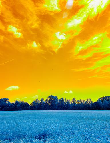
    Ice cube, I have problems in responding to shots like this and it probably says more about me than it does about your image. I'd find it easier to respond if this was a Rothko like image of three bands of colour, gold/brown, black and blue grey. Because it's a deliberate reworking of a scene I want to find reason for the reworking. But that's just me and the way I see things.
    I like the proportions of the bands. The usual pleasing gold/blue combination has been given shock value by the hues you have used. I like the cloud formation and the radiating lines that imply a convergence near the central tree. Lots of "wow." It's certainly arresting so I look closer but after that I don't find reason.

  • Members 533 posts
    Oct. 8, 2023, 7:38 p.m.

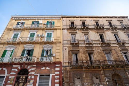
    A well observed contrast between these two buildings, one neat and tidily renovated and the other with a well-used patina, which is attractive in its own way.

    Pete

  • Members 533 posts
    Oct. 8, 2023, 7:42 p.m.

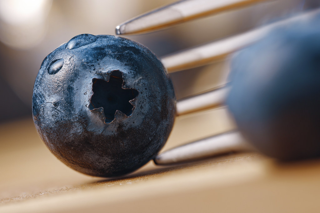
    A very creative macro, but that is a wasted comment with your photos, as it always applies.
    The fork is a good addition, as the blueberry actually looks quite metallic, and the fork leads the thoughts in the right direction of edible, and enjoyable, fruit.

    Pete

  • Members 533 posts
    Oct. 8, 2023, 7:48 p.m.

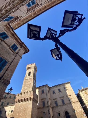
    This was a great idea and extremely well executed. The line of the rooftops is all over the place, with angles and towers and jagged shapes and then a large blue sky space, which you have filled with more jagged lines of a lamp from an extreme angle and another smaller lantern by the tower as a tie-in.

    Very enjoyable.

    Pete

  • Members 533 posts
    Oct. 8, 2023, 7:57 p.m.

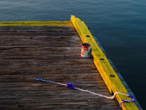
    I like the colours and composition. I like the contrast in textures between the smooth water and the fantastic texture of the wood. But most of all, I like the discovery of the happy face on the tin!

    Pete

  • Members 533 posts
    Oct. 8, 2023, 8:02 p.m.

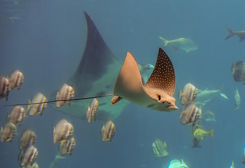
    With that crowd of fishes, this could have been a mess, but, on the contrary, it works very well. The relatively small fish frame the ray, and the maain subject is sharp and contrasty and stands out well against the other ray in the background. The lighting on the subject ray is wonderful.

    Pete

  • Members 533 posts
    Oct. 8, 2023, 8:08 p.m.

    This is very mysterious and, I am sure, could be used by psychiatrists to observe what images the subconscious can make of the shapes!
    I think the right hand side needs to be brightend a it or, alternatively, cropped a bit.
    In any case a very worthwhile image.

    Pete

  • Members 533 posts
    Oct. 8, 2023, 8:26 p.m.

    Since you asked for comments on the second, this is what I would suggest.
    DPR20231004-2.jpg

    I think the foreground is too bright, and could almost be daylight. Since you want the light trails, I would darken the image to show them off. They are cool, and sweep the viewer into the frame and lead to the background lights on the other side of the harbour in an attractive S-curve. I would crop off the black sky and the right hand side, where the reflected lights stop. The lights still lead to the yacht, and the remaining half with its bows is all you need to add interest in that area, as the eyes complete their cycle of the image.
    Others have mentioned the sharpness. With my Olympus, I have found that on a vibrating surface, such as a ship, the body is a better dampener of movement than a tripod and the IBIS does the rest.

    In retrospect, seeing the image posted, I would brighten the yacht a bit.

    Pete

    DPR20231004-2.jpg

    JPG, 448.6 KB, uploaded by PeteS on Oct. 8, 2023.

  • Members 533 posts
    Oct. 8, 2023, 8:31 p.m.

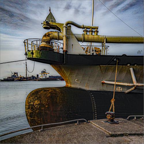
    The first is a gem, Lou. Those dramatic clouds draw the eye in to the interesting dredger and the nicely framed harbour view in the distance.
    The processing really adds another level to the image and is both creative and appropriate.

    Very cool.

    Pete

  • Members 1589 posts
    Oct. 9, 2023, 2:26 a.m.

    Replies to "Left on the dock"

    Thanks Chris. I liked the primary colors too.

    Thanks Bryan, I'm always looking for stories. I thought it was funny that the fisherman had spaghetti o's for his apparent dinner. Last time I found sardines, much more aligned with the subject matter! These docks have been through several hurricanes so there's plenty of weathering and repair.

    I was drawn to those qualities, especially the way the gold sunrise light is so different from the remaining blue hour light on the outside of the dock.

    Oh please don't make me get rid of the rope! I was so happy to find it in exactly that position so I didn't have to fight myself over whether to tinker with it or not!

    Thanks, SimpleJoy. I love finding a story just sitting there on its own, especially one with good colors and a pleasing (to me) visual design.

    I always learn from reading other folks' reactions to the pictures. It's like taking a visual design class for free.

    Thanks Pete! I love the happy face too, and that one little spaghetti O that proves the can held dinner instead of bait. I am not sure I could eat cold spaghetti Os. But somebody did.

  • Members 1589 posts
    Oct. 9, 2023, 2:33 a.m.

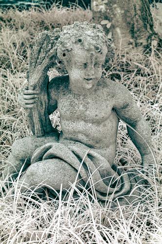
    I like the ugly little stone cherub. I like the color toning. I like the composition. I think the dry, possibly dead overgrown grass gives the little statue the appearance of something old that's been abandoned, possibly in the remnants of a garden at an abandoned mansion, or an old cemetery. Is suggests a story. I do think I'd crop off the dark line of green at the top, which is a distraction to me.

  • Members 1589 posts
    Oct. 9, 2023, 2:37 a.m.

    The flotilla of sailboats are tiny toys in comparison with the behemoth of a cruise ship. A story in contrasts. Great color and light in this image increase the visual appeal.

  • Members 118 posts
    Oct. 9, 2023, 10:44 a.m.

    I gave the title apprentice for the symbolism of the term.
    In the beginning, apprentices were young people or even children who learned a trade or art through practice, just by watching the master. It wasn't an easy life, because they were there to work for nothing or very little (usually food), and only the most talented and resilient would later become masters themselves.
    I think the concept of apprentice is both cruel and beautiful 😠😀

    Thanks for watching and commenting

  • Members 789 posts
    Oct. 10, 2023, 6:03 a.m.

    Very pleasing because the details make us see much more than we are used to when considering a blueberry: the fork provides scale, the waterdrops provide gloss and shine that makes the surprisingly textured surface of the berry stand out even more. The black hole in the center where the crown is, almost feels menacing.

  • Members 789 posts
    Oct. 10, 2023, 6:06 a.m.

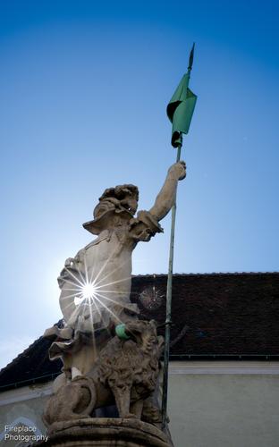
    I'm looking forward to more of your images, not necessarily because of the lens (although I always applaud people being happy with, and making the most of their gear), but more so because of your keen eye for composition. Positioning the sun exactly there is a stroke of genius that truly elevates this image.

  • Members 789 posts
    Oct. 10, 2023, 6:08 a.m.

    I usually like almost everything that you post (with the dam birds high on the totem pole, but also your rural country-house nostalgia).
    This one, however, does not result in any discernible quickening of my pulse.
    It leaves me kind of indifferent.
    To stay within your reasoning : I am not really wondering about the people who left this here.

  • Members 789 posts
    Oct. 10, 2023, 6:09 a.m.

    I like the composition, with the menacing bigger animal almost like a shadow of the one in front.

  • Members 789 posts
    Oct. 10, 2023, 6:09 a.m.

    Very simple and very effective.
    Light can turn a patch of leaves into an emerald glowing from within.

  • Members 789 posts
    Oct. 10, 2023, 6:11 a.m.

    A really nice moped there.

    About your night image: I like it as it is.
    The static elements look nice and crisp, while the light trail is situated perfectly to lead our viewer's eye straight into the heart of the image.

  • Members 196 posts
    Oct. 10, 2023, 12:32 p.m.

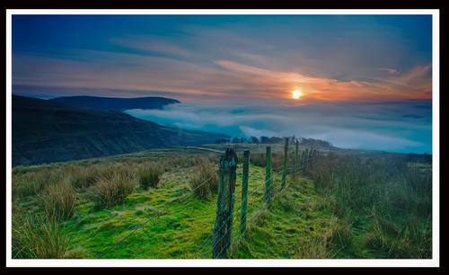
    Morning walk in the Campsie hills , sun coming up, though it was soon hidden by rainclouds

    01254.jpg

    01254.jpg

    JPG, 2.4 MB, uploaded by JimStirling on Oct. 10, 2023.

  • Members 132 posts
    Oct. 10, 2023, 3:19 p.m.
  • Members 1416 posts
    Oct. 11, 2023, 12:11 a.m.

    Beautiful lighting and composition with both working together to gives us the feel of the time and place.
    The T shaped composition suggests that we are moving along the fenceline to a destination somewhere in the intersection with the T crosslines. Most appropriate for a morning walk subject. The lighting takes us along the same fenceline with the sun highlight adding the attraction to the T intersection area. The gentle falling off in brightness to the sides of the fenceline further supports the composition lines.
    Very nice.

  • Members 1416 posts
    Oct. 11, 2023, 12:12 a.m.