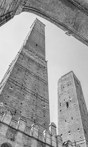
Thanks. I'm a little disappointed in the tower shot as it shows here. I wanted to bring out more of the detail in the brickwork and I used a green filter as part of the processing. On my original, seen considerably larger, the brick and mortar work becomes the point ( I just realized the brickworker's pun in the sentence. It was an accident.)
-
-
@Manuel has written:
I'm a bit clumsy with B&W, but I did my best 😀
The bright white circling the dark view down the levels makes the distance feel there's no end to the depth - a lot of impact! I like the diagonal lines on both sides of the opening very much, though I'm distracted a bit by the empty white space on upper left. The tonal range overall is excellent for the subject IMO.
-
-
@OpenCube has written:
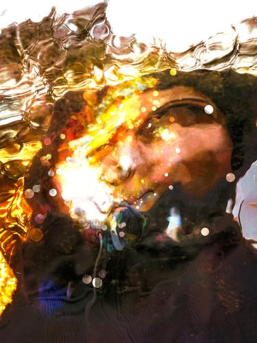
Man underwater, or looking through a fish tank, or behind a big glass of bubbling beverage! I'm obviously hung up on how it was created.
Moving along, I very much like the distortion, and the bit of white at top which gives me the sense of waves and sky. I see the reflection of someone walking past: dream or reality? If I go with man underwater, I'm reminded of an iconic scene from "The Graduate" (Dustin Hoffman in the family pool).
Intriguing work!
-
@RoelHendrickx has written:
LEAN
After our trip through India (more specifically: a large part of Tamil Nadu and a small part of Kerala) in the winter of 2016-2017, I made a few galleries of images: one with the "touristy bits" like all the usual sights of temples etc, and three dedicated to the colourful people we saw and quite often interacted with. Those galleries are divided into the themes of WORK, PLAY, and PRAY.
This is one image from the WORK gallery. A street scene in Madurai.
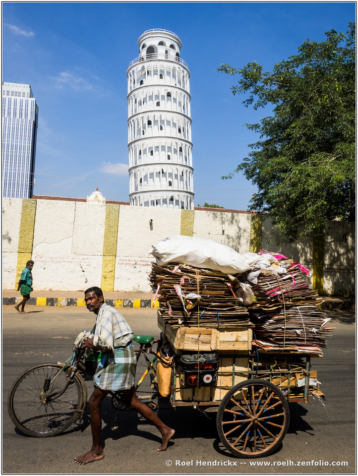
A leaning tower of cardboard traveling past a leaning tower of India under the command of a seriously hard working gentleman dressed in a fascinating combination of plaids. There is quite a contrast between the working man and his collection of card boards and the remote, pristine tower. Powerful image.
-
@simplejoy has written:
A simple image from a simple man, trying to reach out from time to time...

Contact creator by simple.joy, on FlickrYour imaginative closeup work is just as effective in monochrome/silhouette. The tiny ant-man reaches out to the giant in black (Darth Vader?), the miniscule to the enormous. Even though we do not see a single human feature in either figure, we sense the fragility and vulnerability of the Tiny One and the power of the Large One, and the tentative nature of the reaching. Well done.
-
@Bryan has written:
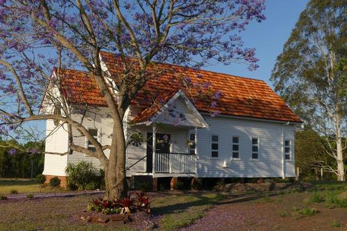
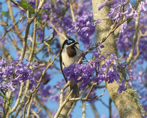
On my way home recently, I stopped to snap this little country church (now in private hands) and was pleased to find a few Blue Faced Honeyeaters enjoying the new Jacaranda blossoms.
Nice pairing, tied together by the Jacaranda blooms that appear in both frames. The church is lovely, peaceful, and well caught in the best of light. The bird is equally lovely, exotic to most of us, though he appears to be looking at you with a disapproving expression. This is a very nice nature photo with the bird in near perfect position and no barriers to get in our way. The blooms are lush, full and sharply in focus in front but pleasingly blurred in the background. The bird's unusual mask is well visualized, as are the beak and eye, the two most important features birds offer us. There's even a charming little catchlight in his eye. I love it.
-
@MikeFewster has written:
Absolutely wonderful image and framing - works really well. I'm sure the details of the brickwork will be spectacular as well, when viewed large, but it works regardless. Excellent!
-
@ChrisOly has written:
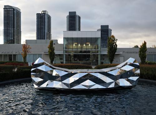
Canoe
One of the objects on the ArtWalk path in a new urban development in uptown Toronto. Public art program creates a sense of place in its parks, public landscapes, and the towers being build. The ArtWalk will provide a platform for the public to be actively engaged in the appreciation of various artwork, and to explore the vibrant neighourhoods being created.
An intriguing art object that has lots of interesting angles and prismatic effects. The development sounds very appealing, with its integration of art. The photo's appeal comes from the strong graphic design and contrasts in the canoe against an urban backdrop of buildings and towers, one row rising left to right and the one behind it rising right to left. Nice eye for composition!
-
@MikeFewster has written:
A messy post this week.
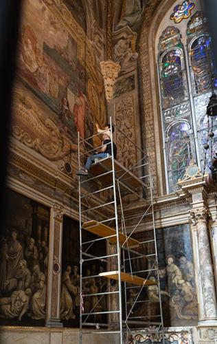
Two quite different subjects, although both are in Bologna.
I began to do a series on conservation work in a Bologna cathedral. Then I saw Roel's and had to do another of a brick tower in Bologna. The point being, we climbed this tower a few months ago and yesterday we heard that the climb has been closed for fear that the tower is now unstable. Conservation work on a major scale. This is another of Italy's incredible brick structures. It needs to be seen at max size.
[
]
(/a/KIzUWcJx3P5y22XQx1USETSJmQAyBVAvfPZTwrDj2lpcxdzwNzOg36GspnLgjjZ4/18124/?shva=1)You've held the offerings together with your theme of conservation, and your text. And we immediately agree that such as these need the kind of careful conservation that the pair in the first images are providing - full attention to detail. They understand the nature of these treasures, it's clear. I too am intrigued by the gold- blindfolded busts lined up along the front.
The final image is wonderfully composed, the two towers nestled under the protective arch at a perfect angle to allow the diagonals to lead the eye through. The intricacies in the brickwork is fascinating but I bet larger view would be great fun to study. There is so much to discover in all the little detail. Well done in all.
-
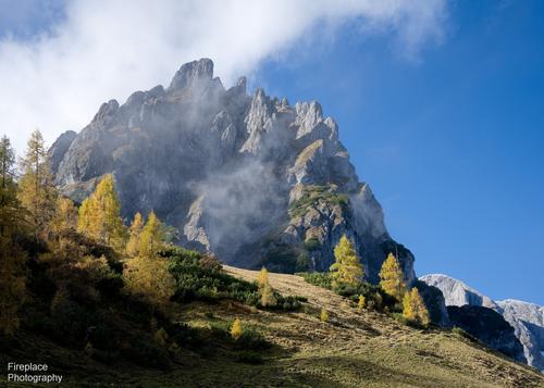
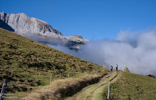
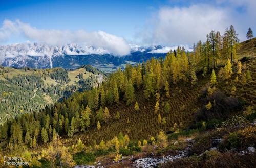
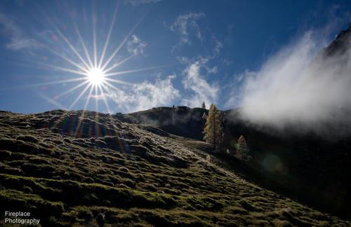
@Fireplace33 has written:
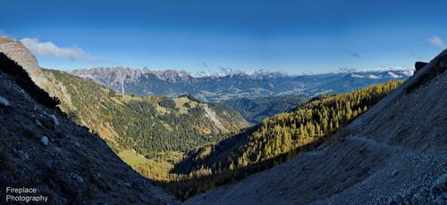
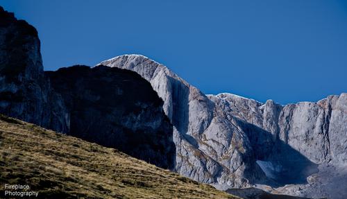
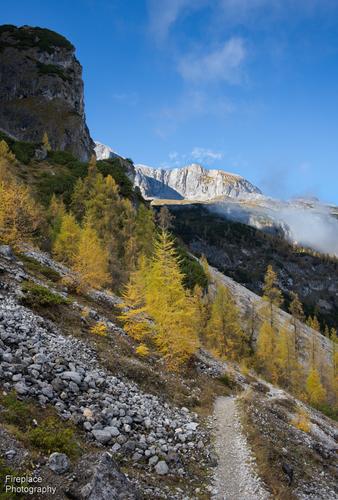
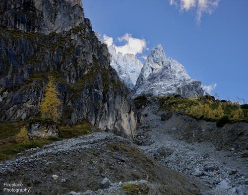
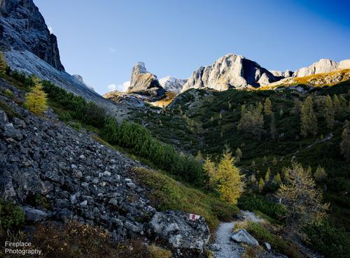
Getting a little closer to our summit goal
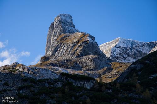
The path to the "Torsäule" is an awe-inspiring hike. Last weekend, we only managed to complete the first part, as the higher elevations were already covered in snow and to be honest, going further was beyond our current levels of fitness.The hike started with a drive from Mühlbach up to the Arthurhaus restaurant.
Hiking from there towards Mitterfeldalm, and then on and around the end of the Hochkönig range, you quickly enter into alpine terrain.The "Torsäule" stands out like a massive rocky pillar, resembling a giant sphynx, it is a gateway marker on the path leading up to the summit of Hochkönig mountain. Perhaps, one day, we will reach that summit, but currently, I have my doubts. It seems like more time in the gym is required!
When you finally reach the point where the Torsäule is visible it seems desceptively close, but as you hike on, it hardly seems to get any closer.
Here's several photos from that tour,...
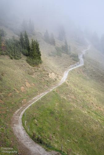
1
The path up to Mitterfeldalm was a bit foggy at times, with low hanging clouds passing by
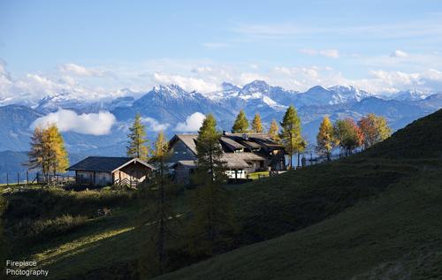
2
Looking back to the mountain hut at Mitterfeldalm. This place will make for a welcome break on the way back :-)
3
Walking around the end, and looking up towards the Hochkönig mountain
4
"Out of the cold fog" ,.... and back onto the warm and sunny path
5
The intriguing stripy pattern here is caused by rows of autumn coloured ferns
6
never miss an opportunity for a sun star :-)
7
Looking to the right, here's a stitched panorama from 9 vertical shots at 37mm.
We came along the path you can see on the right in the shadow. Quite steep and slippery on the gravel in places
8
"A thin white line" of snow atop the mountain range.
9
Now it starts to get more like true "alpine territory"
10
At first I thought this peak was the Torsäule, but soon discovered that the peak we were looking for still lays further ahead ,...
11
finally a glance at the sphynx like peak in the distance
12
A little closer, but still far away. One more shot of the Torsäule, before returning back along the same route, and for that meal at the Mitterfeldalm hut :-)
I am as in awe of your attempting such a thing as I am of the photos. These are spectacular. There's detail, color, contrast, special effects (sun star), atmosphere, leading lines, a few humans for scale - what else could we want? Since others are picking a favorite, I shall too - #3, with its massive rocky peak towering over the gold-lit trees and only partially veiled by the dramatic fog. Quite a shot. Very nice set.
-
@WhyNot has written:
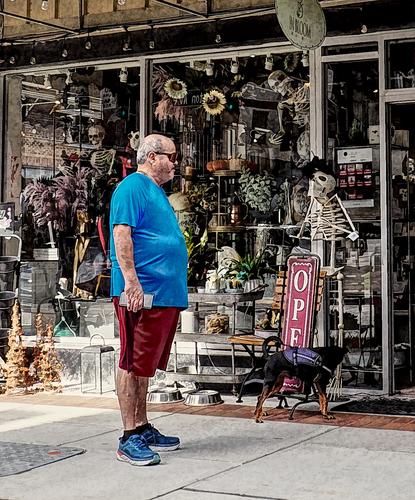
A Day Late
WhyNot
Well spotted. A portly gentleman surveys one who is nothing but bones. The dog looks quite suspicious of the bony one - his tail is curled and his back is raised as he sniffs about. But it doesn't end there, as there are so many other treasures to discover here, and the bony fellow has some several friends staring out from the store including one dangling from above. A fun urban street image.
-
@LouPhoto has written:
Vopak Energy Transition on Mount Olympus 😉
Enlarge >click image>click down arrow
Thanks for looking and comments
LouPhotoI don't know what this was, I am presuming an industrial image with perhaps a crane, some sort of segmented dome and a turbine among other things. You've spun it out into a delicately balanced clockwork of sorts. Even if we don't recognize it, we can respond to the fragile curvatures of the figure 8 and the other elements that echo the curves. Nicely created.
-
@OpenCube has written:
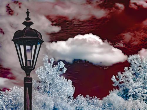
A good Halloween offering, the extinguished light looks ominous against the blood red sky. The dark spot underneath the noxious looking cloud is a distraction, I think you should clone it out.
-
@LindaS has written:
Red Delicious
 Red Delicious by Linda Shorey, on Flickr
Full Moon
 Craquelure Effect by Linda Shorey, on Flickr
.
Two intriguing creations: a beautiful silken red flower (hibiscus I think) giving birth to a golden apple just about to fall to the ground, and a soft golden moon emerging from a thicket of weeds and mist. The first has a lovely artist's texture background that makes for a more traditional presentation. The craquelure one seems etched onto sandpaper. Oddly they both work. I confess I have never found an image that craquelure works on, but you did! Fun pair.
-
-
@JSPhotoHobby has written:
Still working through last month's trip images.
Also, this one I just find funny.
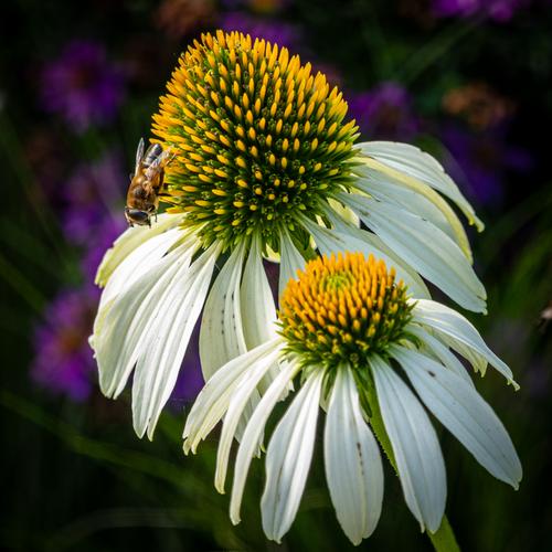
The first is a fine garden shot, with your bee in perfect profile position. The flowers are sharp and detailed, and I like that you did not try to repair their slightly tattered edges. That they have been nibbled on makes them more appealing to me. The color palette is also an interesting mix of saturated and muted.
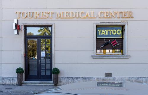
The tourist medical center with an add-on tattoo parlor is pretty funny. Perhaps while you wait to be seen for whatever ails you, you might get a tattoo. A way to while away the wait. One wonders if the same staff performs both services.
-
@Sagittarius has written:
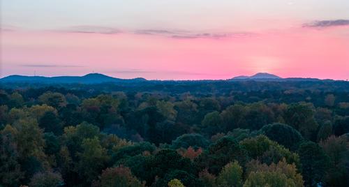
A simple image with mountains and forest, made memorable by the bright pink sunset colors. There are four horizontal bands: forest, mountains, sunset sky, normal sky. It has a Gursky-ish look because of this particular compositional choice. I like the little highlight of orange right over the tallest mountain on the right side where I assume the sun might be setting.

