stranded
-
-
It's a wonderful shot. I really like the composition and the look and balance with the dark areas above and below emphasizing the band of fog in the center. Excellent capture and processing!
-
Stranded
-
-
@LouPhoto has written:
Stranded fishing vessel The Black Jack. Very cold around freezing point, but no more heavy rain. Enlarge for better detail.
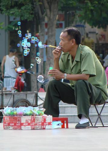
It's the right week to post this Lou. I'd like to compare it to Kumsal's bubble blower image. They both use triangles masterfully but in different ways. One has the base below and one has the base above. The base below implies stability and the base above, especially with a little bit of tilt, does the opposite. In both images, the use of the triangle reinforces the different subject matter of the photo.
The overall colour in this photo is bleak. The pink tips to the clouds however hint that all is not lost. Things are going to improve. Hang in there. -
@MikeFewster has written:
See what I mean.
Great example.
-
-
@RoelHendrickx has written:
STRUGGLE
In recent years I have taken up cycling as my main sport (apart from hiking).
Even before that, I was interested in the heroics of cycle races, and cyclocross even more than road racing.
Here is a short sequence of three images from a long time ago (2011), when I went to shoot cyclo-cross riders at work, during the professional Azencross race: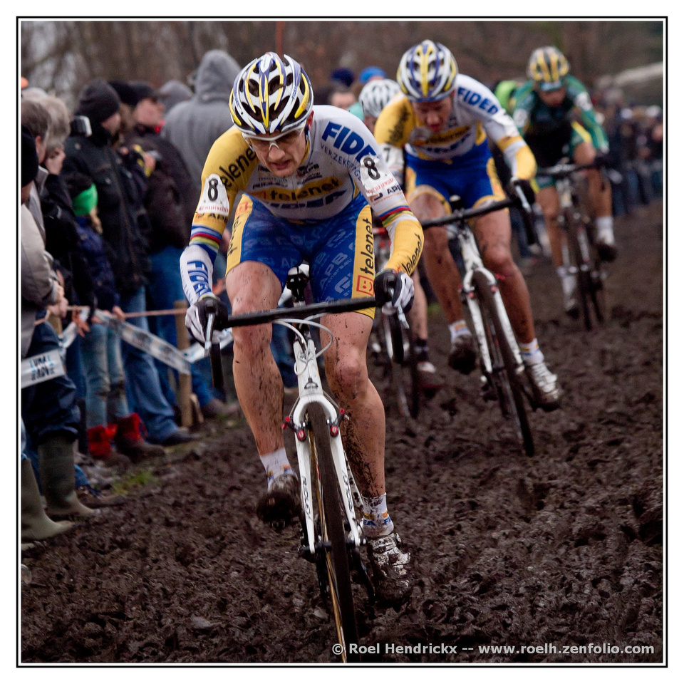
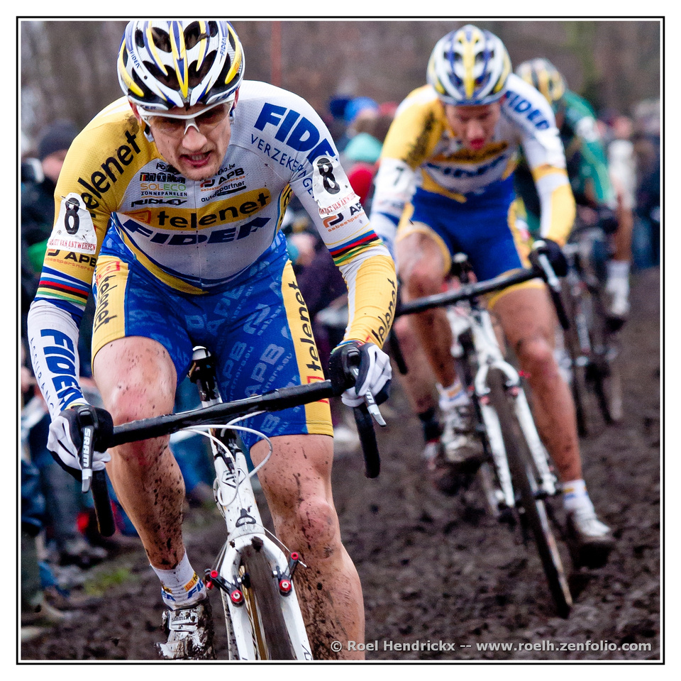
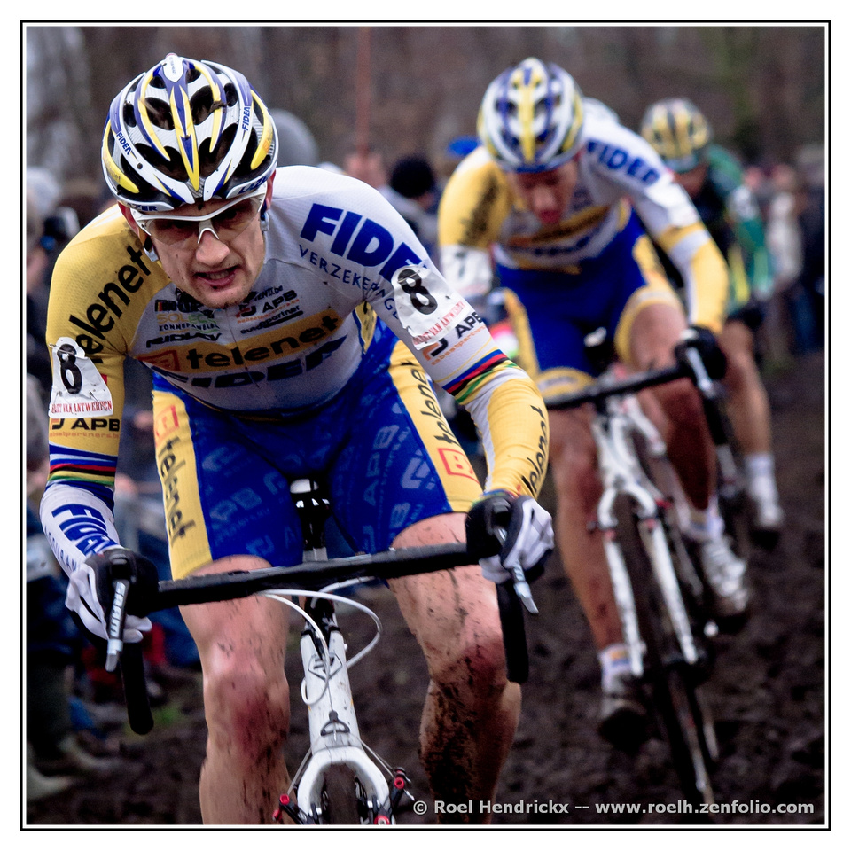
It is a coincidence that this sequence concentrates on two riders from the same team (almost making it look like a training).
The front one is former champion Bart Wellens, in his prime.Excellent action shots showing the grit, grime and determination of the riders. Even the design on the helmets implies speed and power. The shapes and forms repeat themselves for emphasis. Well done.
-
@simplejoy has written:
Water and texture

Monetary growth by simple.joy, on Flickr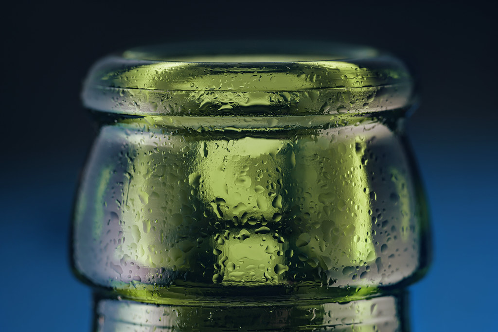
On the drink of extinction by simple.joy, on Flickr
I'm not very sharp... but at least somewhat funny! by simple.joy, on FlickrThese, as yours usually are, grab us with their imaginative design and skillful capture. The design element on the first using the water drop not just for magnification but for focal point, is brilliant. The second, while less complex, is still very effective and invokes a feeling of what that cold wet bottle would feel like against one's mouth. The third makes us smile back, then enjoy the intricate details and pleasing color gradients. Nice wet set.
-
@WhyNot has written:
Looking at Me #6
WhyNot
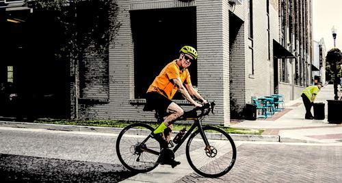
Your lone senior-seeming cyclist is an interesting contrast with Roel's highly conditioned and competitive racers. Your guy ls more like The Rest Of Us. He doesn't look entirely happy to be photographed, or as you suggested, since you're native there, perhaps he's seen you before and is saying "You again?". I like the precise positioning with the rear tire on the edge of the darkened area of the street, it gives more implied movement. I also like the guy in the background wrangling the trash can or whatever it is. Interesting street image.
-
@Fireplace33 has written:
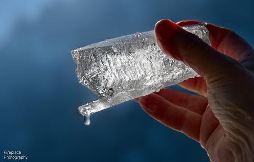
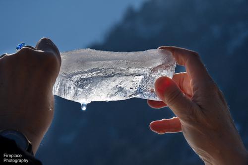
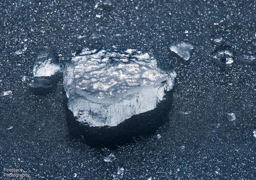
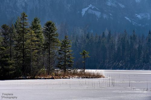
The ice melting away in our hands!
Very nice set. I absolutely love taking pictures of ice in nature, and seldom have the chance since I live in the US south.There are all kinds of environmental messages in the set, because of the danger to the remaining old ice on the earth. But there is also pure beauty, well captured in perfectly chosen light. The drip effect in the first two is pretty wonderful.
-
@OpenCube has written:
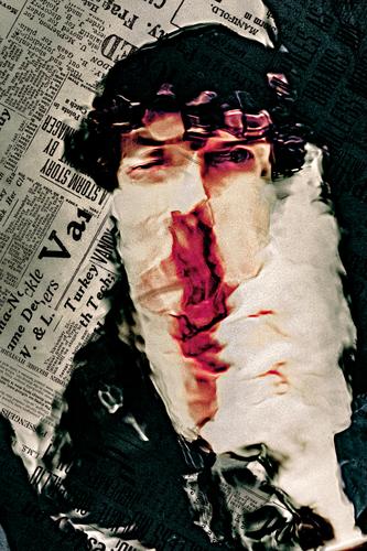
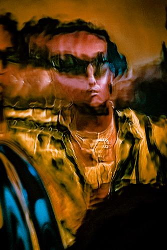
As someone else said, this image would have evoked the feel of music even if you'd left it untitled. The subject looks like a music person with his bright colors and what comes across as garish ornamentation from the necklace to the sunglasses. The pursed mouth and pinched nose created by the distortion creates a focal point just right of center, in an excellent position for an abstract portrait. Nicely done. This new effect you're using that resembled underwater distortion is very interesting.
-
@Kumsal has written:
Soap bubbles
Good street portrait. The vendor looks as if he is less than enthusiastic about his prospects, and is passing the time blowing the bubbles he's trying to peddle without a potential customer in sight. His box looks pretty full so it seems he hasn't yet had a prosperous day. But his bubbles: caught just right in the light, they are magical - electric neon colors, with unusual effects. Why is no one noticing? What an interesting image!
-
@MikeFewster has written:
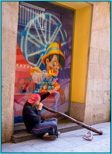
Pinocchio
Your street entertainer is as interesting and anomalous as Kumsal's vendor. Did he set this thing up in front of the Pinocchio image because of the connection between himself and Pinocchio? Surely he didn't miss the connection. Especially from this angle, the instrument does look like Pinocchio's extended nose. Love the sound of these things even if I can't spell them. Nice image with great colors. I would probably try to fiddle with the alignment but it probably would be a bad idea. The leans and distortions may well be part of the charm here.
-
@LindaS has written:
Clearing Fog
AKA "Fog is water too, you know" (photo'd for a "Water" theme on flickr)
 Clearing Fog by Linda Shorey, on Flickr
.
Just beautiful. Compositional elegance in black and white. The dark corners (upper left and lower right) hold the subject matter in gentle hands. Set against the soft light tones of the fog, the bare trees and sagging shed read left to right like a line of classical music. The sag of the shed is a poignant and necessary element of the image.
There are things you could take out: the distant light poles and lines over the rightmost end of the shed, the sign, the black thing shaped like a comma near the sign. But in some interpretations of this image, they are necessary, so I suspect you are right to leave them in. I had fun exploring these anomalous objects. My favorite is the one just left of the smaller shed that looks like an outhouse. It's probably part of a piece of farm equipment but it looks like a dancing black chicken, my favorite interpretation of course.
-
@Bryan has written:
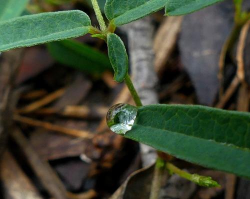
Monocular tension
Seems like we are studying the small beauty of water this week, among other things. I too am fascinated but never seem to get them quite to suit me. This is an exquisite little diamond set nicely against green. If it's big enough it could stand more cropping to focus more on the beauty of that single droplet. There's some noise there though so it may have already had as much cropping as it will allow.
-
@Rich42 has written:
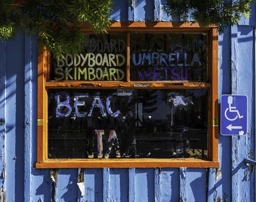
Abandoned Surf Shop, Carlsbad, CARich
Excellent study in color, texture, light and shadow. We are all keen to capture street art and graffiti, but we sometimes forget that signs can be art, too, if we treat them as such, and you did that here.
-
@LouPhoto has written:
Fishing vessel stranded off in Zandvoort yesterday in brutal weather - Name of the Ship: Black Jack, IJmuiden.
LouPhoto
Many of your shipping images have a timeless beauty that suggests to me that they could have been created a century or two ago, even when I identify modern features that prove they are current. This one is no exception. The small stranded boat, with its slight tilt, the observers huddled around the classic anchor, the stormy skies, all might have been borrowed from a JMW Turner seascape. This is an excellent image that is rich in story, mood, and compositional power. Marvelous.
