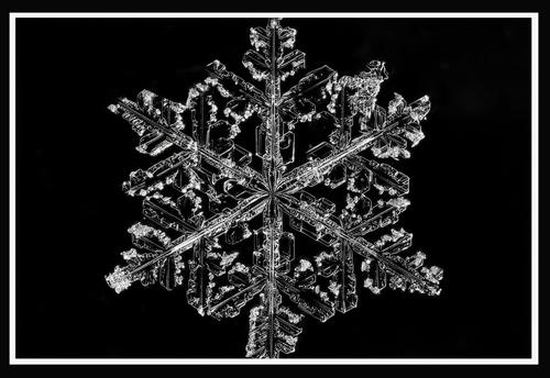
We have had a bit of snow , so here we have a single snowflake on a black Perspex sheet lighting LED , Z7II with Laowa 100mm F2.8 2X macro cropped a good bit
-
-
-
That's beautiful. I have tried this in our rare snow events but never had nearly as much success as you've had. Exquisite, magically rendered detail. You say it is cropped - does the original, before adding the digital frame, have the full snowflake with the points on the top and bottom? It's too beautiful and perfect for those two edges to be covered up. I think it would benefit from showing the whole thing and giving it a fair amount of breathing room on those edges.
-
The digital frame was a failed sneaky attempt to hide the points at the edges 😀 No matter how careful I was or what I tried out the edges of the flakes { this is the bets of many failed attempts} either broke off or melted . I would have loved to get a full one intact but alas hypothermia was kicking in
-
@JimStirling has written:@minniev has written:@JimStirling has written:
We have had a bit of snow , so here we have a single snowflake on a black Perspex sheet lighting LED , Z7II with Laowa 100mm F2.8 2X macro cropped a good bit
That's beautiful. I have tried this in our rare snow events but never had nearly as much success as you've had. Exquisite, magically rendered detail. You say it is cropped - does the original, before adding the digital frame, have the full snowflake with the points on the top and bottom? It's too beautiful and perfect for those two edges to be covered up. I think it would benefit from showing the whole thing and giving it a fair amount of breathing room on those edges.
The digital frame was a failed sneaky attempt to hide the points at the edges 😀 No matter how careful I was or what I tried out the edges of the flakes { this is the bets of many failed attempts} either broke off or melted . I would have loved to get a full one intact but alas hypothermia was kicking in
Our craft allows us to be sneaky, and hide what we don't want to show. But I am a big fan of nature's imperfections. I seek them out deliberately. Might we see the full frame with the broken/melted edges?
-
@RoelHendrickx has written:@Fireplace33 has written:@Pete has written:
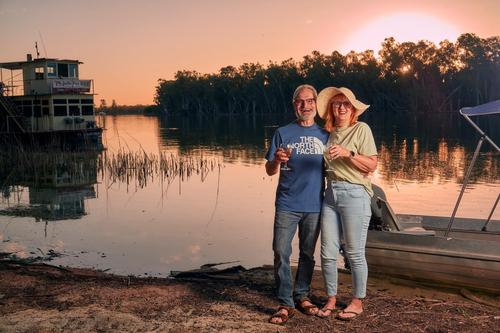
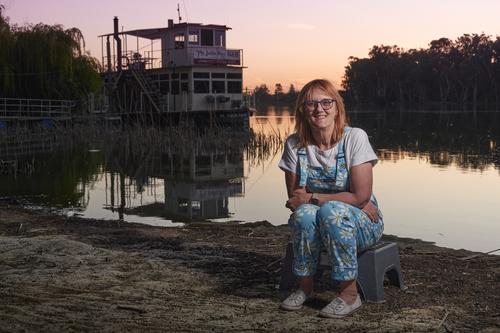
Hi, this is my first contribution to this site, after being introduced to it by fellow site member ‘Fireplace33’.
If asked, I call myself a travel photographer, and tend to like taking action or ‘fun’ shots over portraits.
Occasionally, I take set shots like these:
I used a single OCF through an umbrella to highlight the subjects, whilst trying to make use of the sunset and capture the surrounds.
As I don’t do this very often, I always feel like I am rushing before the moment disappears…
The models are myself and my wife, using a tripod and timer for the selfies.
CC is welcome. I would love to hear your thoughts…Hi Pete,
Welcome to this forum, It’s great to see new users joining us here on “THE PHOTO”.Pete is my brother, and we have a lot in common, for example, we are both UK EX-PATS and moved to countries starting with the letters “AUSTR…” while I stayed in Europe, Pete moved on much further afield :-)
And,… we both have a love of photography.It's been a bit quiet here this week on the website, maybe more comments will come soon.
I also like the 2nd photo best. Kate looks quite relaxed here, and the gentle sunset colours and the reflections in the water work well.
Using the OCF (off camera flash) was a good idea to light up "your models", without it they would have been quite dark and needed a lot of shadow pushing in pp.
The flash also helps to keep your shutter speed up and avoids any motion blur. It gives the shot more studio quality.Keep posting :-)
TrevorLet me extend another warm welcome to our little group of likeminded people.
I don't have much to add to what was already said by Fireplace and by Minnie.
The flash has been used effectively here, for the reasons stated, but also because it allowed to keep the background darker than it would have been if the whole image had been exposed for the light levels throughout : your human subject would have been darker and the background a bit brighter.Unfortunately there is little if any advice I can give in the territory of flash use.
Except for occasional use of studio lights, I have always been an available light photographer.
Sensor improvements and fast lenses have cemented those habits.I'm another who has had a full on few days and I haven't got around to my usual responses to the Weekly C&C. I did a quick flip through and discovered my backyard. I'm in Adelaide. That tree silhouette at sunset is what Ted Egan calls "Australian Lace." There isn't much of it here but it is distinctive and unmistakeably Australian and I'd guess that we are on The Murray. It's an area awash in vineyards so that fits as well.
Like Roel, I never use a flash, I wouldn't know how to set it.I'd have simply ytried to raise the shadow area in PP but if I had done that, it would have ruined the silhouette of the trees. Any way, this is a record shot of a couple thoroughly enjoying themselves at a particular place. The controlled light brings out the features that tell the story. The Zodiac is probably the tender for The Julie Fay and this hints at a bit more of the adventure.
Where are we travelling next? -
-
@simplejoy has written:@RoelHendrickx has written:
SPARRING
For lack of recent work, I once again turn to an older image, taken from a documentary series of a group of semi-pro boxers preparing for an upcoming boxing gala event.
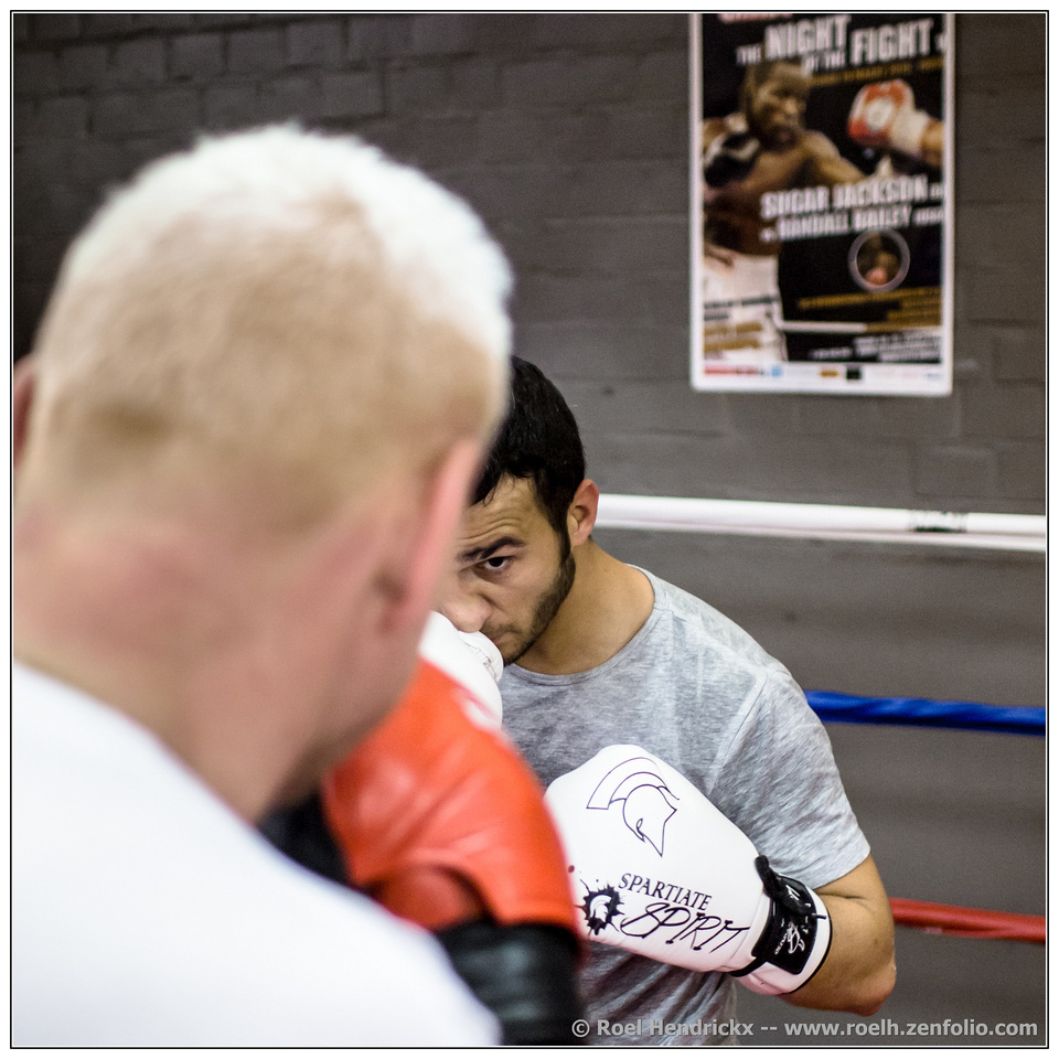
I like it - a very effective image and excellent composition! I love how you used the head in the foreground to mask part of the boxer in focus. The eye is a clear center of attention and a perfect symbol for the necessary concentration in a sport like that, but there are lots of other interesting aspects to the image. My favorite is the contrast between the idealized sport (poster of the wall) and the real sport (the two men in the foreground), where the skin on the back of the head seems to show quite a few bruises already and the nose of the opponent probably could do without the whole thing as well...
Excellent work!
We are in the ring with them and this gives the shot, cough, punch. Usually boxing photos tend to be from a lower angle with more balance between the fighters and it can't get the subjective feel that Roel has managed. The eye is fixed on the opponent and us. The black hair and beard line creates a frame for the face and eye. The white glove shows us a nose that could be in better shape. On the wall behind, the dream and the big time.
Outstanding. -
@simplejoy has written:

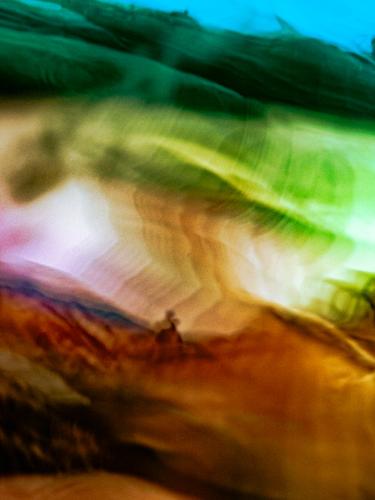
Living above your means by simple.joy, on FlickrA little masterclass in rule breaking. Three different possible subjects with almost no leading or connecting lines to guide us. It has the feel of an Asian brush and ink scroll painting and the buildings suggest Asia as well. I can't think of any examples of the style that would have attempted a composition like this
Finally, what we get is a puzzle. The missing details invite us to use our imagination to fill in the gaps. I'm hoping that Simplejoy will spill the beans and we will find that the scene has nothing whatsoever to do with Asia. -
@OpenCube has written:
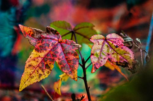
"Backyard Colors"
Fantastic capture and great use of texture and colors!
-
@LindaS has written:
Tree in a snow-covered field

Ellensburg by Linda Shorey, on FlickrThis is a fantastic composition - very effective and well balanced in every way, including the tones and subtle gradients. Excellent work!
-
@MikeFewster has written:@simplejoy has written:

Living above your means by simple.joy, on FlickrA little masterclass in rule breaking. Three different possible subjects with almost no leading or connecting lines to guide us. It has the feel of an Asian brush and ink scroll painting and the buildings suggest Asia as well. I can't think of any examples of the style that would have attempted a composition like this
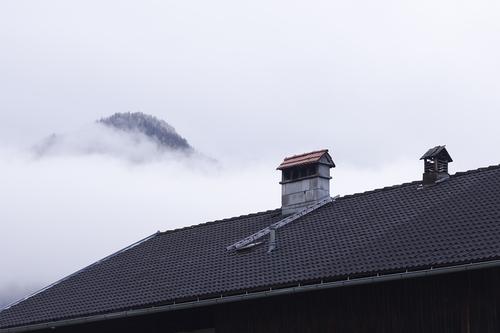
Finally, what we get is a puzzle. The missing details invite us to use our imagination to fill in the gaps. I'm hoping that Simplejoy will spill the beans and we will find that the scene has nothing whatsoever to do with Asia.@minniev has written:As usual, I have no idea what this is you have presented to us. It looks like a mountain hidden in fog and the cut off tops of birdhouses. The cut-off look is a little bit of a visual bother to me, but then I don't know what I'm looking at anyway so I'm not really entitled to complain. The monochrome treatment is very nice and lends even more mystery. At some point you're gonna have to show us the rest of the picture or tell us the rest of the story!
Thank you for the interest. Here's what's really there:
It's just some roof I shot as a quick lens test. Rule-breaking in terms of composition? Yes, certainly. It doesn't feel right for sure, but at the same time, I felt that's actually a perfect fit, because of course you're gonna notice something's off when the proportions, distances and even functions of objects are significantly different in real life from how they're presented in a photograph. So I decided to keep it that way.
I'm glad you mentioned Asia, because some sort of temple was what came to my mind as well, when I first managed to create a suitable crop of the image without the real roof in there... Great to hear it wasn't just my weird imagination (as it often is).
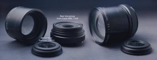
Wanna know the real rule-breaking? The lens I shot this with is a mirrored lens. No mirror-lens as we know it, but a lens which is completely closed at one side and there's a mirror. I have no idea how lenses like that are used in real life, but of course they would be unusable on a conventional camera. So I unscrewed the mirror from the back of the lens, took the rear group of another lens with similar focal length and it was almost a perfect fit:
I guess no one would have guessed that a weird combination of Japanese industrial lenses (one supposedly used in a minilab in the US, the other one in some machine or application in Germany) would take an image of a structure reminiscent of Asian houses on top of an old farm house in the Austrian alps.... 😅
-
-
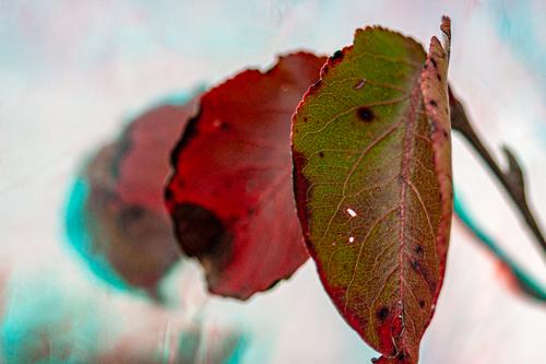
@OpenCube has written:
"Backyard Colors"
I like this a lot. Whatever you did with the colors enhanced what was already there, and really looks nice. Sweet gum leaves are my favorites!
-
@OpenCube has written:
I like this, with the graduated colors and focus, but I wish the bottom of the front leaf weren't cut off at the bottom. Very fond of the little holes in the front leaf. I always seek out the imperfect ones. They are more interesting than the ones that look like they might have come from Hobby Lobby.
-
@minniev has written:
like this, with the graduated colors and focus, but I wish the bottom of the front leaf weren't cut off at the bottom.
Makes two of us. 😂 Trying to take photos and do other things is always a struggle. Still, it's this beauty that begets the other one and there's certainly something to this process that is proving enticing. I've recently also figured out the A380 lies about its framing, so that doesn't help in avoiding situations like this where I frame one way, but the capture is different and crops the image in ways unwanted.
-
@ChrisOly has written:
Water
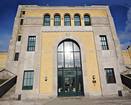
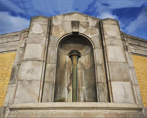
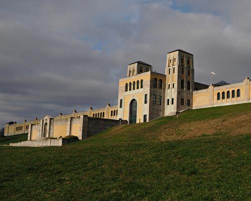
1932 Art Deco Filtration Plant still in full use.
A building designed to say "Solid." It looks weighty and authoritative and your photo angles play on this. Square shapes with plenty of strong horizontals. Nothing but The Building. A couple of suggestions. The sky looks a little fark or oversaturated. Lightening it a bit would also isolate the building a touch more. Photo one relies on symmetry and right angles. I feel that the building verticals need to be straightened and the crop refined to give perfect symmetry.
Photo three works differently but it still helps the building to impress. It dominates the slope. The extra forms at the front give forward movement that adds to the assertion of the building. Maybe strengthen this further by cropping a little off the bottom? -
@minniev has written:@Fireplace33 has written:
The thin white line!
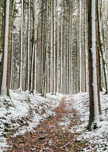
On Sunday, I took a walk through our fairly big local forest.
The light was a bit boring and quite subdued with only uniform white clouds covering the whole sky.Opting for a new route this time, the path meandered, twisted, and intersected with various junctions,
leaving me just a tad disoriented after a while ;-)
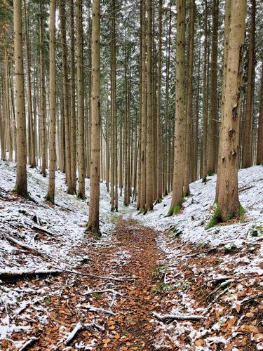
Thankfully, at the beginning of my walk, I’d noticed a thin white line of snow running vertically up each of the pine trees, albeit only on one side.Looking forward, towards the East
Now looking backwards, towards the West from the same spot on the path,
I guess that thin white line was made as the wind was blowing from the west while it was snowing? Anyway, I realised that navigating my way home would be a breeze, thanks to the natural compass provided by the distinct snow pattern on the trees 😊
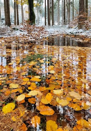
Along the path found these nice looking wet autumn leaves in a puddle
All taken with my phone this time.Nice set built on recurring vertical elements. The trees are amazingly tall and you've conveyed their majestic height. Artistically, the third is a really nice creative image that mingles the reflections fo the Tall Trees with the gold carpet of leaves afloat in the water. There's a 3D effect that is quite captivating. This is a special image that deserves a print (maybe on metal or metallic paper).
Fireplace 33 says it all. One and two together showing the difference in the snow tracks with a 180 degree change of viewpoint is very striking. The photos make us aware of a phenomenon we might have missed.
Three deserves a space all of its own. Love the warmth of colours receding back to the snowy background. Love how the refelcion fills in the details of the upper part of the trees, love the curve of leaves in the foreground that embraces the viewer. It would be a crime not to print this shot minniev.
