I see a traffic light turnt on its side but OK. 'The colors and tones are appealing, and the composition has a nice stair step effect that makes it easy to follow.
Feb. 7, 2024
95
-
-

[quote="@Manuel"]
MikeFewster,
I've looked at your photo several times and honestly, I don't know how to make a photographic comment.
I'll give you this challenge: If this photo wasn't yours, howould you comment on it photographically? composition, framing, aesthetics, meaning, etc. etc. ...
[/
Which post of mine are you referring to? The initial post for comments is of brickwork in Bologna. The wheelbarrow photo is a continuation but needs to be read alongside the original post. The wheelbarrow image wasn't intended for C&C. This is one of the problems with a flat view thread organization. It is difficult to see the development after the original post. -
Wonderful to see a culture that has managed to resist being overtaken by Western styles. This could be a photo from the 60s or even much older if it was in monochrome. It also happens to be very well composed with the foreground local human providing our implied leading line with their line of sight. And the scenery is magnificent - an incredible building snuggled between a river and the misty mountains.
-
An interesting follow to Pete's offering. The massive and complicated inner workings of those old windmills is authentic Dutch culture in action. The guy explaining it (with the wooden shoe bolo on her bandana kerchief) looks authentic Dutch too. It's fun to study all the little details in this picture. I've been in some of these things and was so fascinated by what's in there and how it all works. There's a bit of noise and softness probably because most of these things are dark as Hades inside, so it might benefit from a trip through Topaz or similar to clean it up a bit and make the details more fun.
-
Nice minimalist image in great golden light. The long fronds of what looks like some kind of pond grass are literally glowing in that light as their heads (which do look like creatures' heads) nodding in the light. I was at first put off with the crooked line in the background where the black meets the green, but I'm reconciling to it.
-
All these are quite nice. I love the two of the brown pelicans nose-diving into the water like naval attack weapons. It's amazing how fast they can move when diving, since they are on the clumsy side when upright due to their boxy construction. Well caught.
-
Japaneses lanterns? These almost look like you're shooting through fabric. Nice.
-
The angle would tell me this was a Mike Fewster image.
Congrats on your brickwork which reminds me of my 6th birthday when I wanted an outdoor hot dog cookout and my grandfather and his friend threw together a brickwork patio and barbecue pit in a day's time. I visited the old house last year and the thing was still back there.
-
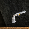
Another nice dragon with a pleasingly soft backdrop and nearly invisible wings. We feel, rather than see, the dragon's immobility as it remains suspended in space.
-
That's more guided missile than insect. Usually the transparent wings with lacy veins are a feature of dragon fly shots. You have taken them out of the reckoning. Further, you have used bokeh to remove the background and replace it with smooth screen that shows off the dragonfly and nothing but the dragonfly. The sensation of speed is emphasized by the downward trajectory.
Unusual and most effective. What were your camera settings on this shot? -

1/250s 𝑓/2.8 ISO 200 Normally I would use f/4 but because I was in P mode it drifted open - probably fortuitously. It was light to medium overcast which limits my options with the fz300.
I have to admit the composition wasn't planned. I sit on the corner of a dam because there is normally one of that species hunting around there. If he is closer to me, I get that separation. But he doesn't have to be much further away and I get all the reeds.
I wasn't going to post another dragonfly shot but the iridescent colours of this shot captivated me. Depending on the light, their eyes change colour and those two blue spots on his face and green stripes on his body are not often visible. -

An interesting little series brickwork.
The first celebrates the brickwork as a strong but unusually decorative medium. The diagonal of zig-zag walls is appealing, especially shown against the arch shape, but it is the patterns made from bricks jutting out of the wall, which really lights up the image.
The second shows the raw power of the bricks forming the tower, rising ing defiantly, helped by the low angle of view.
The third is intriguing. A slick looking Art Deco(?) frontage, with the word “Modernissimo” in contrast to the old brickwork. Below that is a word in a puzzling reverse, without any obvious reflection to cause it. Then a reflection of medieval brickwork. An image which poses riddles. Nice.Pete
-
Now this is special.
There is just enough sharpness in the water and the birds to lock onto, whilst the rest quickly disappears into the light and fog. The extreme highlights on the sharp water help to blend it into the high-key and wonderfully soft background, which barely shows the buildings hiding there. The different shades of grey in the birds neatly suggest depth.
Love it.Pete
-
The idea was good, but the execution is even better. Even knowing it is paper, the extremely shallow depth of field and the colours disguise it well. I assume it is a paper towel roll, which wasn’t thrown in, but it doesn’t matter. The photo is not about what it is , but about what it has become, and that is a fine abstract photo.
The progression of colours work well, as do the light and shadow hinting at shape.
The sharp areas are minimal, but catch the eyes’ attention and give the image some structure.
Nice one.Pete
-
Those bridges are quite something, and I am sure you can spend hours exploring different angles, and then adding in different weather conditions, different amounts of traffic, with and without blur or light-trails, the possibilities start heading off towards infinity.
I like the second, because it explores the symmetry of the structure and the third, because it ignores the symmetry and concentrates on differing lines and shapes.
The first one doesn’t really come off in my opinion. It is almost symmetrical, and the fact that it isn’t jars a bit. I think if you crop out the join in the road in the foreground, and straighten the photo so the bridge seems level, even if it wasn’t, then the arches would seem almost symmetrical and the photo would be more successful.Pete
-
Thanks Pete. From my many pictures of brickwork in Italy, these three were grouped together for exactly the reasons you saw.
Re shot 3. The Spanish fashion house Desigual plays games with their name/logo. sometimes the U is inverted to become an n. Sometimes the S is reversed. On this store, it isn't a reflection, the have reversed the whole name. I was amused by the art deco modern, the logo reversal and the reflection from a different era. -
So simple with so much! A good example from the school of thought that thinks visual art need not be set within standardized borders but can be framed within whatever proportions suit the image. A triumph in a taller, narrower frame.
It feels perfectly balanced while the components are offset. The wider black of the right has fewer strands than we have to the left but the black emphasizes them. The bent grass on the right is a foil to those on the left and the slope of the greenish rectangle. The 3 short right leaning grasses at the very base assist the bent grass on the right in giving balance to the tall grass and the left leaning grasses.
It glows.
It can be explored up close with interesting details along the stems.
A very special image. -

Fashion show. A really weird one that was set in something like a sewer and everyone had something weird and plasticy on their faces. One outfit made me remark to my wife, "Who would go to work dressed as the Scarecrow from the Wizard of Oz?" It was quite bizarre.