Fisheye turned a fairly interesting construction scene into a really engaging image. The natural curves of the bridge and the humanoid construction vehicles are echoed and accentuated in the curves created by the lens. The intrusion of the photographer's shadow is a perfect footnote to help us approach and appreciate the scene. Excellent work.
-
-
The films from which those add-on filters like Analog Effex were made! A nice simply constructed but evocative image (I love doing cemetery photography) that reminds us how cool film was (and still is for those who are keeping it alive).
-
Immersion taken to its end point! The human becomes part of an art installation. My favorite part is the extra set of shoes. Presumably that human, perhaps also a child, has become immersed totally and is now part of the art.
-
Great color and a leading line impossible to avoid following...a zipper made of light balls. Lots of depth and sinuous movement. Very engaging, and of course well done.
-
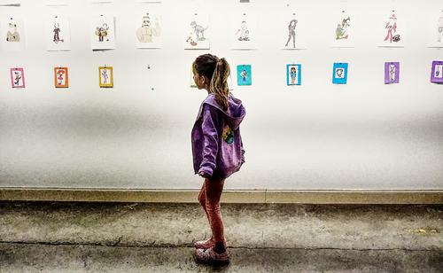
Your offering and Mike's are so similar - a child engaging with art on the child's terms. Yours has an interesting quirk: she is looking at the place where art has been but isn't any more, the single vacant spot in what look's to be an exhibit of child-made art. Maybe she's wondering, as I am, what became of that offering. I love the anticipatory pose right in the middle of the frame, the clothing, the hint of movement as she travels through the exhibit, the subtlety of the storytelling. Nicely spotted and well presented.
-
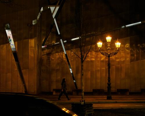
This is a visually jarring image that makes me keep coming back to it trying to decipher its meaning. A shadowy city street rendered in golden browns with a mysterious figure striding through beneath somewhat antique lighting fixtures is interesting enough. But the shafts of reflected light that seem to come from nowhere in particular are somewhat surreal. I have looked and looked and I still don't have a satisfactory explanation. All I can say is that is fascinating, confusing, and it's art. You have an uncanny ability to see things that seem otherworldly in photographic capture.
-
Like Mike, I saw a similarity to Roel's offering this week - the oval eye shaped frame within the frame, the intrusion on the lower left that anchors the composition without becoming the subject, the architectural/mechanical elements that march across the horizon line. There's visual distortion in both, but of different types. Yours has an illusion of a skew to the left, but it is quite level if you really pay attention to it. Fascinating image.
-
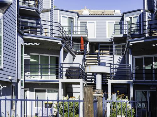
Quite a cacophony of line and shape. I would guess the red umbrella was one of the reasons you photographed it, with its position along the junctures of some of those lines and shapes.
I do not generally like selective color renditions of images, but this is one where I might have to play with such as that. A contrasty monochrome rendition with only the umbrella in its true color might be an interesting variation.
-
It looks like it's shot through a glass vessel of some type. I like the colors and the way they are integrated. I also like the tiny reaching hand just past the rabbit with the big dayglow blue eyes.
-
What a lovely mantis! The expression is one that I imagine to be inquisitive: looking for the next snack, perhaps something more nourishing than that blade of grass, maybe the head of her husband...
Great detail. A good catch for sure.
-
Interesting documentary series of a complex building project. Such craftsmen are seldom appreciated.
-
-
@minniev has written:@Rich42 has written:
Oceanfront rental complex, off-season.
The Strand, Oceanside, CAQuite a cacophony of line and shape. I would guess the red umbrella was one of the reasons you photographed it, with its position along the junctures of some of those lines and shapes.
I do not generally like selective color renditions of images, but this is one where I might have to play with such as that. A contrasty monochrome rendition with only the umbrella in its true color might be an interesting variation.
Thanks Minnie,
I didn't notice the red umbrella when capturing the image due to the visual "cacophony" at the scene and through the viewfinder which was actually much greater than it appears in the image on screen. There was actually a lot more going on that cant be seen in this angle of view that was distracting. The umbrella certainly makes itself noticeable in the processed image against the predominantly light blue and gray tones. I very much dislike "selective color" treatment and would never prepare an image that way.
Rich
-
@WhyNot has written:
Art
WhyNot
Viewing this at large size is essential. The artworks on the wall are more easily distinguished and then they can be related to the girl. The subjects resemble her in age and clothing style. It's her scene. Placing her in the middle of the images might be unexpected photographically but it now becomes appropriate. The PP treatment gives a graphic edge to the photo that again is consistent with the work on the wall and further links the subject with the art.
Lots of plusses for the shot. -
@minniev has written:
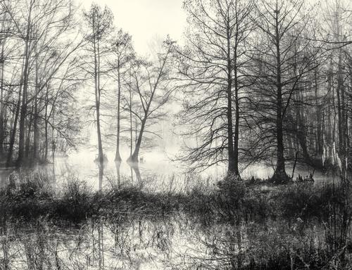
The little drainage ditch down the road in winter dress.
That's a "little drainage ditch down the end of the road"? It's no wonder that your forest and swamp shots are so awe-inspiring.
Truly beautiful. The bare branches have the texture of fine lace. The slightly off-centre tree that leans across the centre is placed to absolute prefection as well as providing a subject that differs from the other trees.
A special mention for the toning. The warm touch feels exactly right as well. It's woody and alive. -
@PeteS has written:
Light in Berlin's Darkness
A dark street in Berlin. Actually, I've just got back from Berlin, but this was taken a year ago.
Pete
I'm puzzled. The left leaning shards are confusing me. It's the different lighting and slices of scenes along them I don't get. Reflections? but if so the segments look like daylight? Reflections of screens? Windows?
I like the basic composition with the crossing and vertical lines and the curve connecting the foreground to the background. It's a magnificent old street light that contrasts with the modern straight lines. As do the warm old tones and the slashes of cool colours. It intrigues but I can't put it all together. -
@Rich42 has written:
Oceanfront rental complex, off-season.
The Strand, Oceanside, CASorry Rich, this one doesn't grab me. There are too many lines and directions that ultimately don't feel as though they go anywhere or work together. The red brolley stands out because of its colour but again, it doesn't have enough visual purpose to make it work. Possibly a tall narrow crop using the lines of the stairs and the umbrella might have been possible but I'm not sure of that either.
-
@ChrisOly has written:@MikeFewster has written:@ChrisOly has written:
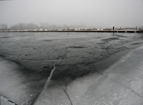
Ice crack'd...
Great White Frozen North. Silent marina waiting for Spring.
Chris, Roel says that his post this week was inspired by your post last week. Your post this week has a completely different subject matter from Roel's post, but the shots are very alike. It looks like a similar lens used similarly so that the near edge creates a cupping curve while the horizon holds a straight line.
The water melt line that runs from the bottom edge to the curve is quite perfect. As are the thinner lines that connect the bottom of the image to the curve.
The ice gives the season and byond thw wharf we feel the change to come. A special note for the touch of color along the dock edge.
Begging to be done as a print.Thank you Mike. Great comment and most appreciated .
Ps.
How is bbq station coming along?
Thanks for the question. It's all finished. Unfortunately there appears to have been a fault in the large set square I used. Maybe its batteries were flat? One wall definitely isn't exactly at right angles to my house wall. This is the sort of detail that distinguishes a true artist and hand made artisan work from that of a mere technician.
