This is at the Museum of Contemporary Art in Barcelona. The photo is not of an art installation, it's just a corridor with a glass brick floor and people walking on it.
The title refers to the sleep nightmares that all children between the ages of 3 and 6 have.
-
-
-
@Sagittarius has written:@Bryan has written:@Rich42 has written:
Never forget. Never again.
Until the victims become the perpetrators...
Over 6,000,000 were killed during WWII and now you call them a perpetrators.
Are you saying the actions of certain Europeans (not just Hitler and Germany) in and around WWII justify the way so many Israelis (not all) treat the Palestinians???
-
@Bryan has written:@Sagittarius has written:@Bryan has written:@Rich42 has written:
Never forget. Never again.
Until the victims become the perpetrators...
Over 6,000,000 were killed during WWII and now you call them a perpetrators.
Are you saying the actions of certain Europeans (not just Hitler and Germany) in and around WWII justify the way so many Israelis (not all) treat the Palestinians???
What one has to do with another. This memorial is in the memory of Jews killed in WWII.
-
Can we please not bring pointless political debates into a weekly photo thread people? You have the rest of the internet to go and argue. No one is in this thread for that.
-
@OpenCube has written:
Can we please not bring pointless political debates into a weekly photo thread people? You have the rest of the internet to go and argue. No one is in this thread for that.
I agree.
As much as I value and encourage civilized and rational debate about any subject (even geopolitics) and as much as I hate censorship (and I would seldom call a debate “pointless” BTW): this is just not the appropriate venue.
Thanks guys! -
@RoelHendrickx has written:@OpenCube has written:
Can we please not bring pointless political debates into a weekly photo thread people? You have the rest of the internet to go and argue. No one is in this thread for that.
I agree.
As much as I value and encourage civilized and rational debate about any subject (even geopolitics) and as much as I hate censorship (and I would seldom call a debate “pointless” BTW): this is just not the appropriate venue.
Thanks guys!Since the beginning of this thread, the photography has not really involved any images of strong emotional content.
It is inevitable that good photography will include a certain percent of emotional imagery. It is also inevitable that there will be verbal response to such photographic images.
So, we've apparently crossed a threshold now with such a contribution. And it happens to be of one of the strongest emotional issues in all of human history.
I believe it is at the least, naive, to expect that there will be only simple, polite, non-confrontational responses to all images here. Photography can be an intense art form. As can any artistic expression of human experience. I think it is unrealistic to expect and enforce that only genteel, non-emotional, "white bread" reactions to the posts of some contributors are acceptable here.
I think the moderation of this thread has to be in general conformity with the philosophy of the Forum in general, which is quite a bit more accepting of varied views of subjects. I think we can survive controversy.
Thoughtfully,
Rich
-
@Rich42 has written:@RoelHendrickx has written:@OpenCube has written:
Can we please not bring pointless political debates into a weekly photo thread people? You have the rest of the internet to go and argue. No one is in this thread for that.
I agree.
As much as I value and encourage civilized and rational debate about any subject (even geopolitics) and as much as I hate censorship (and I would seldom call a debate “pointless” BTW): this is just not the appropriate venue.
Thanks guys!Since the beginning of this thread, the photography has not really involved any images of strong emotional content.
It is inevitable that good photography will include a certain percent of emotional imagery. It is also inevitable that there will be verbal response to such photographic images.
So, we've apparently crossed a threshold now with such a contribution. And it happens to be of one of the strongest emotional issues in all of human history.
I believe it is at the least, naive, to expect that there will be only simple, polite, non-confrontational responses to all images here. Photography can be an intense art form. As can any artistic expression of human experience. I think it is unrealistic to expect and enforce that only genteel, non-emotional, "white bread" reactions to the posts of some contributors are acceptable here.
I think the moderation of this thread has to be in general conformity with the philosophy of the Forum in general, which is quite a bit more accepting of varied views of subjects. I think we can survive controversy.
Thoughtfully,
Rich
I agree with Opencube and RoelHendrickx.
I would like this forum to be limited to photographic C&C. -
-
A good bit of detective work Minniev. The patterns and colours of the image appealed to me but I couldn't interpret them in any way at all. Now I know what it is, I like it a lot and I also appreciate the formatting used. Anything that gets me to look at something from a different angle is a pleasure.
I'm alarmed at the idea that I should have grown out of nightmares over seventy years ago. This needs urgent discussion with my psychologists, psychiatrists, and my assorted religious advisors. I won't sleep tonight worrying about it. -
Tricky. I agree with Rich but I think the discussion here went considerably further than the image itself. I'd have no objection though to a current image from a conflict that challenged our perspectives. The discussion ought to be limited to the interpretation of the image itself, whatever it shows. Even as I write this I can imagine the difficulties in intepreting and applying what I have just written.
Should anyone be interested in pursuing this in relation to the current war situation, that's OK with me but let's do it via the personal communication channel. -
@Sagittarius has written:
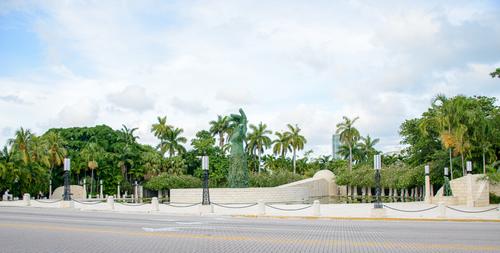
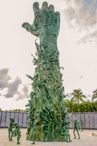
Holocaust memorial in Miami Beach, FL.
This is difficult to discuss. Should we respond to the photographs or the work of art or both? How far do we go in sharing personal responses that might be engendered?
As photos, they are simple but effective. They effectively record the sculpture and its setting. They are not trying to make a statement of their own, they simply put it before us. The first is surprising. We see the sculpture in its broader setting where its colour and form merges it into the tropical palms. The second details the sculpture itself and adds the wall of names. The angle accentuates the reaching for the sky of the hand and the suffering of the people. It's good photography that conveys the sculpture and its impact.
As far as the sculpture itself goes, I prefer the simpler statements on the same theme that PeteS has shared here from Berlin.
It is impossible though to consider such a subject in isolation from current events. Ref my response to the broader discussion raised by this image on what we can/should discuss here. -
@RoelHendrickx has written:@minniev has written:@RoelHendrickx has written:
SANTA MONICA PIER
Last week and the week before, there seem to have been some interest in my use of fisheye lenses.
So here is another -- older -- example, from a family vacation in summer 2013 to California and parts of S-W USA.
(The fisheye lens used here is not the 7.5mm Rokinon on a Micro-FT body, but the Olympus Zuiko 8mm fisheye on my big lumbering Olympus E-5 FT camera.)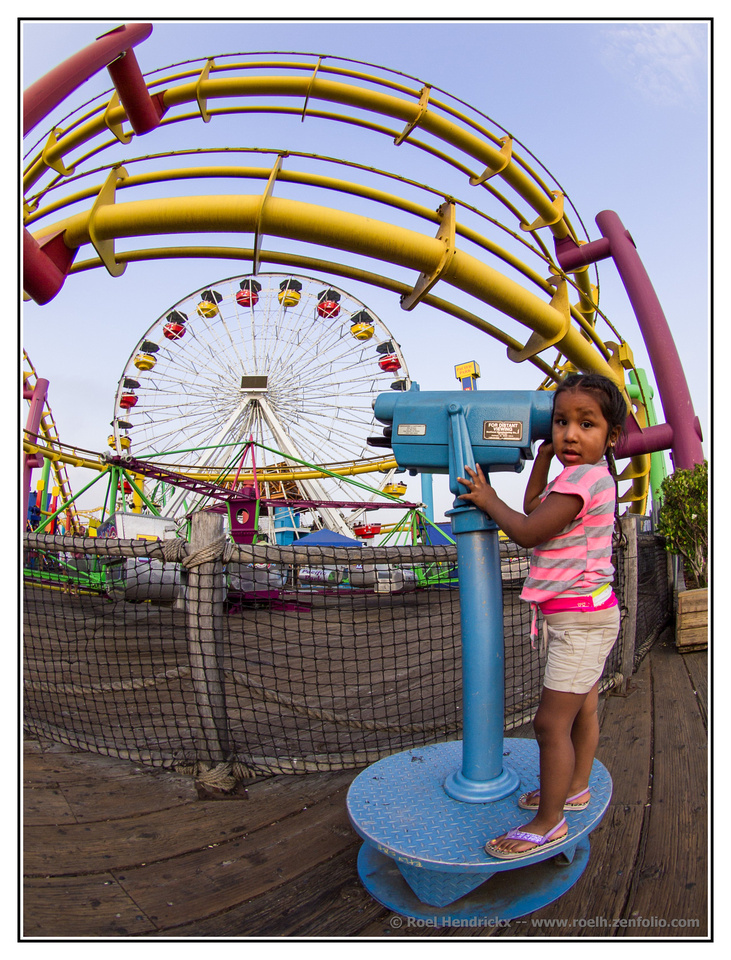
The fish eye helps you create a circle motif that then becomes the primary compositional element of the picture - the frame itself, the amusement park rides, the round thing the child is standing on, even her face. The bright primary colors have a candy-store effect, contributing to the playful mood. Only her expression contrasts with that mood; her wary look gives us a bit of disconnect, adding to the interest.
Thank you for your thoughts.
A word on fisheye street photography (because that is basically what this is).
I should probably mention that I am not a relative nor friend of that young girl in the image.
There is no posing.
Her expression of apprehension is probably due to the fact that she is thinking "what is that strange mister doing here so close to me and pointing his camera not straight at me but somewhere above and beyond me?".With a fisheye (or any extreme wide angle lens) you do get awfully close to your subject if you want to make it a main feature and connect it with the surroundings that are going to be distorted. In order to get the ferris wheel nicely under the roller coaster track, I had to get really close and quite low (and that is why I am looking up towards that child, whose head is probably just one meter above the ground). Fisheye work often includes getting on my knees in the dirt.
Thankfully, I seem to be a person who does not come across as threatening or creepy, so I tend to get away with getting really really close to people.
Also : there is no sneakiness at all (quite the contrary from sniping images of a person far away with a telephoto lens).
I am very open about what I am doing. No spy camera tricks.But I do confess that sometimes I make fisheye images of people who are blissfully unaware that they are going to be in the frame.
Standing really close and pointing not directly in their direction, has most people assuming that I am photographing some UFO in the far distance, while in fact they will be integral part of my extremely wide composition, and it relaxes them. I can get candid shots even while standing almost on somebody's toes.
It works best with people who have personal experience with cameras and can imagine (quite wrongly) what my field-of-view appears to be.
Not with this girl.
Hence the expression of "huh?".
But it was worth it for the image, and no harm was done.
She just walked over to her parents, who had watched the whole event from a few metres away.
And I walked back to my own family.Lots of eye motifs here all brought together by the fish eye lens. The "eye in the sky", the circular shapes. the telescope, the girl's eyes, the blue base. A nod to the exposure as well. It takes care to get a clear sky like that with good exposure of the foreground. The colour balance across the whole image is delicately handled. There's a muted edge to everything with repeated dusky tones. Those old Olys had beautiful colour.
A note on child photography. Taken in 2013. I'd be wary taking that photo today. It's asking for a confrontation. Kids are such wonderful subjects on their own and also because of what they add to locations. The photo I showed last week with the girl dancing was carefully Okd with the parents before and after I fired. I was particularly careful because previously I had noted that they had noted me with the camera. -
Whereas I'm enjoying, with relief, the last embers of a hot summer.In addition to minniev's thoughts.
Viewing it large brings out the edges of the frost fingers and the screen and I feel that the edges are critical here. I really like some of the horizontals here that provide solidity that offsets the delicate edges - the base of frost, the dark area topped with the light. The multi angles of the frost lines are counterpointed by the regularity of the mesh. The balance of the taller frost lines on the left with the dark area intruding up on the right is notable.
I can't see what the camera settings were but I think a little more DoF would have helped bring out more of the sharp frost edges.
Lots of stars for this shot. -
@Bryan has written:
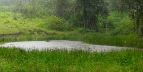
A shower at dragon lake
The bigger I viewed this, the better it got. The rain became more apparent with each enlargement. The screen of vertical lines repeats the verticals of the grasses. Your shutter speed and exposure settings get it just right. The horizontal slash of the lake breaks up the greens while giving the grass edges a background that picks them out. It also creates a gently inverted V that connects the background central dark trees to the mid ground and helps unify the picture.
A very satisfying image. -
@minniev has written:@WhyNot has written:
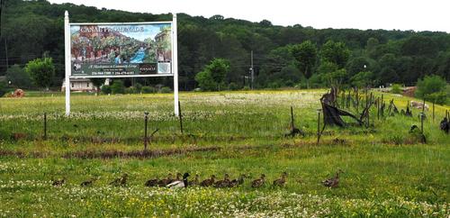
Promenade
WhyNot
What a wonderful image! Every duck in the vicinity has taken note of the sign and its invitation, they have even consulted Merriam Webster to confirm the definition, and have formed a promenade far more pleasing than anything the sign proposes as they process through the thick spring flowers towards the promised canal. I love it.
Unusually, I don't see this the same minniev although I agree that it is a wonderful image. At first I smile at the promenade, then it becomes sinister. Do we really want this development? I note the cable truck. The roll out is underway.
Lots of horizontal lines link the ducks, the sign and the landscape. Their futures are locked together. -
@PeteS has written:@OpenCube has written:
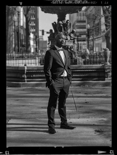
I wonder why this photo works? The subject’s head is immediately in front of the fountain, but it does not distract from him. Maybe his face is sharp enough to separate it from the background? Or maybe we are compelled by the great attitude of his expression? In any case it is a great urban portrait.
Pete
Good question Pete. I thought much the same and came to similar conclusions. I still don't like the size of the dark blob at the top and I think it ditracs a bit too much. Even so, I think the image gets away with it because the background is very symmetrical. Vertical Symmetry is provided by the large white patch on which the subject stands and so we don't mind the shape at the top too much.
After that, I got interested in the film. I used to use HP4 a lot and, if I remember correctly, I developed it in Microphen. I would have shot and developed using this combination way more than any other film I ever used. Coincidentally, I have just been working on an old B&W HP4 photo of mine I took over 55 years ago. I might post it here in a few weeks.
Then I became even more curious. It's a 35mm image, not a 2 1/4 square. I suspect that this is either a recent photo of an old photo or it is quite a recent photo. C'mon Open Cube, tell us and then I'll tell y'all why I think this. -
@ChrisOly has written:@minniev has written:
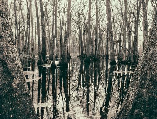
Swamp In Winter
I like the framing and pp. Nature at it's best.
Your pic ID has a lot of edit, edit... Funny?!Edit edit etc because I think minniev has done quite a lot of PP here. And it has been worth it. I'm guessing. minniev, did those foreground leaves get some extra attention? Did you have Escher's Three Worlds in mind? If not, check it
s-media-cache-ak0.pinimg.com/564x/ea/2e/de/ea2ede67edc615e6470a046cb0ee25a3.jpgIt is quite magnificent. Framing, exposure, control of dof, toning. It would be criminal not to do this as a large print.
