• Members 861 posts
    March 2, 2024, 3:36 a.m.

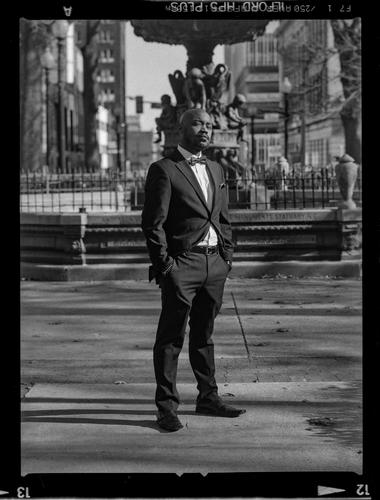
    I took the photo last year with a Hasselblad H2 with the hp film on the frame.

    I can't say anything too deep on the image as one of my biggest problems in trying to be a better photographer is having forethought into what I do. I tend to simply capture what is.

    Personality gets everyone farther than it should, and when a photo has captured some, that 1000 word quota that makes a good picture is immediately filled, which distracts from minor imperfections.

  • Members 787 posts
    March 2, 2024, 6:21 a.m.

    Hi Rich,

    I respect your thoughts.
    I really do.
    And I agree with the general principle.

    I am totally in favour of images with emotional impact and in discussions that explore, deeply, that emotional impact.

    I don’t shy away from geipolitics. I have made and shared images from Auschwitz, Oranienburg, Breendonk, China, Lybia, Lebanon, Cuba etc to name but a few. Most of those images were not “neutral”: they included an implied opinion on the subject, for the viewer to discover and to agree with or reject.

    And I have always welcomed and respected images and responses that touch (raw) nerves.

    But the question was always: what does this image say about the issue? What does the image add to the narrative?

    The photography forum is less a place for discussions about the issue or the narrative themselves.

    And as soon as a discussion devolves into yes/no or black/white about a theme without further link to the image that sparked the exchange, such discussion no longer has a place in a forum or thread focused on and dedicated to image C&C.

  • Members 1416 posts
    March 3, 2024, 2:10 a.m.

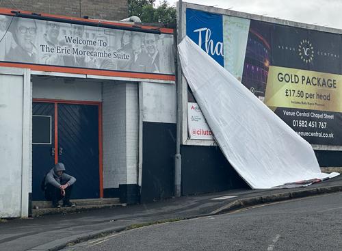
    I can see the suggested crop would work but I'd prefer to leave the "gold package" as is. It adds a marker of social division with the hooded man on the steps. The large peeling poster becomes a "slash" separating the two worlds.

  • Members 861 posts
    March 3, 2024, 5:26 p.m.

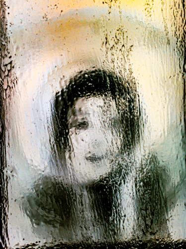
    "There Will Always Be A New King"
    therewillalwaysbeanewking.jpg

    therewillalwaysbeanewking.jpg

    JPG, 1.6 MB, uploaded by OpenCube on March 3, 2024.

  • Members 1585 posts
    March 4, 2024, 12:55 a.m.

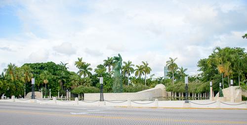
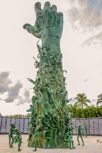
    Some photos evoke powerful feelings, and monuments are some of the most evocative. This monument delivers a heavy dose of emotion, like the art work at Whitney plantation commemorating the lives of the people who were enslaved there. It's a beautiful though troubling monument, well conceived for the place it is installed (Florida). You've presented it well. I wonder if the closeup version might be even more effective in monochrome.

  • Members 1585 posts
    March 4, 2024, 1 a.m.

    Well this is one that grabs our attention. It's well composed, well taken, and the color treatment, which features only a few areas of the surreal colors you fish out of your images, enhances interest. I am curious if it is a found or created scene. It doesn't have any bearing on my opinion of the image, it's just a function of my normal curiosity about how we find and create the things we photograph.

  • Members 1585 posts
    March 4, 2024, 1:02 a.m.

    Michael Jackson?? Interesting artistic image. Again, I'm so curious about what it really is, and whether a human face has anything to do with what you photographed, and whether you had this in mind as an end point, or simply found it during experimentation. See, I always have so many questions...

  • Members 1585 posts
    March 4, 2024, 1:36 a.m.

    Thanks Chris. I'll have to tell the "funny" part! I don't mind editing the heck out of any picture and am proud of it when I get what I want from it but this thing only has a light treatment of toning. The edit/edit/edit notations are because my favorite plugin for color adjustment is an ancient and never popular Topaz plugin named Restyle that I refuse to give up, and because it's obsolete it crashes multiple times whenever I use it, tossing an additional TIFF into LR that's the same as the original. The "edit" suffixes are how many times I loaded the darned plugin before it worked. If anyone has any ideas how I could force this old program to work better on a new mac, please share! There has never been anything else quite like it so I refuse to give it up.

    Thanks Pete for noticing the "peeping" effect which I always like in this spot on the bridge, in any season.

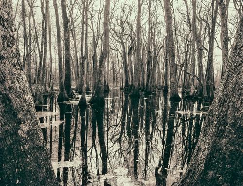
    Love your photo. It looks so much like "my" swamp. The cypress and Tupelo were about evenly split in my swamp till the wretched derecho two winters ago that killed so many trees. The cypress were the hardest hit, and the Tupelo's are becoming dominant (I think they grow faster).

    Thank you so much, Mike. See my answer to Chris for an explanation for all the "edit" notations. I cannot claim to have done any fancy editing on this one. Just toned it and straightened the verticals as much as was feasible. All those "edits" make it look like I worked a lot harder than I did! I love that image you linked, and had not seen it before. Those light colored patches are conglomerations of tiny leaves of a water plant that thrives in the swamp, and will cover it entirely during summer. Swamps are full of visual trickery, because of the utterly still reflections and the distorted shapes of the things that grow there. It is easy to get disoriented in a swamp you don't know, which is part of the reason many people feel they are too creepy to go into.

  • Members 1087 posts
    March 4, 2024, 3:08 a.m.

    To me this is a wonderful capture in many ways.

    The subject is sharp, has well defined contrast and the separation from the slightly oof background with lower contrast is spot on. The separation creates a depth we would normally only see in a 3D viewing device, where we feel we could enter the scene and move around within it. Very good composition all round.

    The subject himself has confidence and shows one comfortable with his place, within the struggles he and his fellow people have endured. A slight challenge in his eyes maybe asking, could you deal with that?

    I do wonder about the object that appears to extend above the sculptures. Was it part of the sculpture, the base of a fountain, a manicured tree behind, a mushroom cloud intended for effect? I did a google search to see if I could find the scene but came up blank. Is the location still as in the photo? I would love to see it in streetview.

  • Members 861 posts
    March 4, 2024, 3:25 a.m.

    Found.

    What gave it away?

  • Members 149 posts
    March 4, 2024, 5:18 a.m.

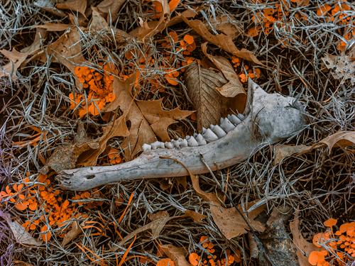
    Do you ever feel like your images are trying to show abstract, as if painted with a palette knife? Textured? I always feel like these abstracts are looking for texture.

  • Members 1416 posts
    March 4, 2024, 6:15 a.m.

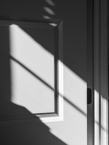
    It's very hard to explain, to myself or anyone else, why I like this so much.
    In no order.
    The audacity of the shot. Seeing something where there appears to be nothing worth seeing.
    The combination of movement and balance achieved with the mix of diagonal with vertical and horizontal lines.
    The B&W tone range.

    I can imagine this in the classic slim edge, black wooden frame of a gallery. It's the kind of relooking at the everyday that the photographers of the 1920s delighted in.
    Excellent. Plus a general note. Lots of very good images this week. Congrats everyone.

  • Members 1416 posts
    March 4, 2024, 6:19 a.m.

    I decided that this had to be a recent photo after studying the fine print embedded at the top of the photo, in reverse. I think that is the F stop and shutter speed recorded. You would need a recent camera with electronics to record that info and put it with the image on the negative.

  • Members 1416 posts
    March 4, 2024, 6:28 a.m.

    It's a toss up as to which I like best, the caption or the photo? LOL when I made the connection between the two. Fascinating detail on the cogs.
    Lots of applause for seeing the potential in the blue/bronze colour combination. More applause for the positioningh two pieces so that the diagonal gives visual movement.
    One of your very best.

  • Members 1416 posts
    March 4, 2024, 6:34 a.m.

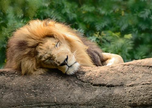
    The element of surprise. We expect a Metro Goldwyn Mayer kind of meeting. Not only is our King of the Jungle asleep, but Saggitarius has found an angle that suggests sleep. It's a very different pose to the MGM star. It's all the more striking because we have just the business end, the head.
    Very enjoyable.

  • Members 1416 posts
    March 4, 2024, 6:41 a.m.

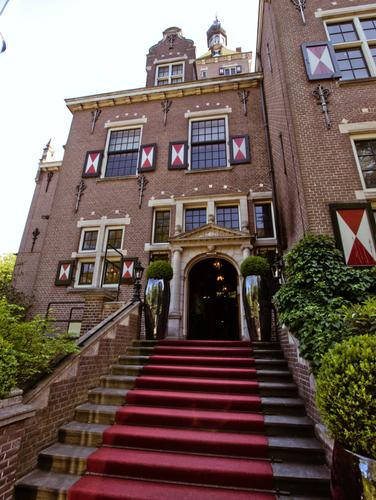
    Fascinating. Thanks Lou for showing us the steps.

  • Members 1416 posts
    March 4, 2024, 6:51 a.m.

    I like the title and the image. Combined, they are full of ambivalence that stirs up the thought processes. Is this the old king fading or the new king emerging? Is it the new king or old king looking at themselves and confronting the inevitability of change? It's equally true of Everyman.
    I can see this as a graphic for a King Lear production.

  • Members 1662 posts
    March 4, 2024, 8:07 a.m.

    Your use of color/tones is what makes this outstanding in my opinion. The (great) composition also works well of course. Really well spotted and captured.