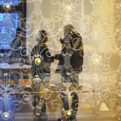
Great shot. I wish we could hear the sound.
-
-
My vote for Top Shot of the week.
Very well spotted and captured. -
Thanks for spotting this shot and the comment Chris. I had missed it completely. Permit me to sigh again about flat view.
It is indeed a great shot.
Consider the figures. We are looking at, I think, a reflection. There is just enough detail to suggest the age of the subjects and that ddas poignancy. We have hints of glasses and hairstyles and they are looking steadily at each other. The point of touching is quite exquisite - a solitary overlap at the tips of the hands. The man's jacket with the lower edge flare accentuated by the ironwork is perfect. The positioning of the ironwork relative to the figures frames them and uses lines to bring them together. How could the sharp feature with the attached awirls that is placed on the woman be bettered? The Gold browns and blues are always a good combination but here they hint at nostalgia, night and life. Having both figures in the golden rectangle with the blue close to the woman's shoulder - too perfect for words.
Absolutely not an image where the grain/noise should be cleaned up. It becomes an important part of the mood. Icing on a delicious creation..
This is a photographic masterpiece and I don't use the term lightly. -
@Sagittarius has written:
@PeteS
Thank you for looking and commenting.
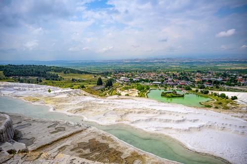
Here is a single shot versionWhat I like in the original and the single shot version is that they better convey the size of the travertine field. It's a subject made for panoramas.
Was the stitched version done with a sweep mode or did you PP stitch the images together? Generally the programs like ICE are very very good at lining up the overlaps. -
@Rich42 has written:
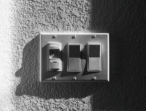
Ordinary Things - Wall SwitchesThe sun comes through the high windows in my living room twice a year for a few days, barely skimming, raking across the front wall. It moves pretty rapidly, lighting a moving swath about 2 feet wide which sweeps across and down the wall.
The wall isn't stucco but the paint texture, which ordinarily looks almost smooth stands out like it's etched an inch deep, rather than its actual depth less than a mm. The switch plate "lights up" like it's made of white frosted glass with a bright fluorescent bulb inside.
Rich
Love this photo, but I have a complaint: the bright white vertical "bar" on the left of the photo. Were it me, I'd darken that a bit to blend in with the middle section of the wall. The dark "bar" on the right works due to its size, but the light "bar" on the left is "too thin", making it a bit unbalanced. Regardless, I really like the photo!
-
@GreatBustard has written:@Rich42 has written:
Ordinary Things - Wall SwitchesThe sun comes through the high windows in my living room twice a year for a few days, barely skimming, raking across the front wall. It moves pretty rapidly, lighting a moving swath about 2 feet wide which sweeps across and down the wall.
The wall isn't stucco but the paint texture, which ordinarily looks almost smooth stands out like it's etched an inch deep, rather than its actual depth less than a mm. The switch plate "lights up" like it's made of white frosted glass with a bright fluorescent bulb inside.
Rich
Love this photo, but I have a complaint: the bright white vertical "bar" on the left of the photo. Were it me, I'd darken that a bit to blend in with the middle section of the wall. The dark "bar" on the right works due to its size, but the light "bar" on the left is "too thin", making it a bit unbalanced. Regardless, I really like the photo!
Having looked at this again, I agree with GB. It doesn't need much. The very bright highlight draws too much attention.
-
@MikeFewster has written:@Sagittarius has written:
@PeteS
Thank you for looking and commenting.
Here is a single shot versionWhat I like in the original and the single shot version is that they better convey the size of the travertine field. It's a subject made for panoramas.
Was the stitched version done with a sweep mode or did you PP stitch the images together? Generally the programs like ICE are very very good at lining up the overlaps.I agree that this shot is the most successful in showing us the sweep and scope of the travertine richness.
-
@GreatBustard has written:@Rich42 has written:
Ordinary Things - Wall SwitchesThe sun comes through the high windows in my living room twice a year for a few days, barely skimming, raking across the front wall. It moves pretty rapidly, lighting a moving swath about 2 feet wide which sweeps across and down the wall.
The wall isn't stucco but the paint texture, which ordinarily looks almost smooth stands out like it's etched an inch deep, rather than its actual depth less than a mm. The switch plate "lights up" like it's made of white frosted glass with a bright fluorescent bulb inside.
Rich
Love this photo, but I have a complaint: the bright white vertical "bar" on the left of the photo. Were it me, I'd darken that a bit to blend in with the middle section of the wall. The dark "bar" on the right works due to its size, but the light "bar" on the left is "too thin", making it a bit unbalanced. Regardless, I really like the photo!
I did not really notice, at first, the big reach between the blacks and the whites in this image, but now that my attention has been drawn to it, I cannot unsee it. Especially the stark white is a bit jarring. It also looks like your dragged a brightening mask from the left over it, with too harsh a value.
Looking back on the image with fresh eyes, I think it would lend itself quite well to a square format crop, eliminating all of that too-bright area on the left and some of the pure dark on the right. -
@RoelHendrickx has written:@GreatBustard has written:@Rich42 has written:
Ordinary Things - Wall SwitchesThe sun comes through the high windows in my living room twice a year for a few days, barely skimming, raking across the front wall. It moves pretty rapidly, lighting a moving swath about 2 feet wide which sweeps across and down the wall.
The wall isn't stucco but the paint texture, which ordinarily looks almost smooth stands out like it's etched an inch deep, rather than its actual depth less than a mm. The switch plate "lights up" like it's made of white frosted glass with a bright fluorescent bulb inside.
Rich
Love this photo, but I have a complaint: the bright white vertical "bar" on the left of the photo. Were it me, I'd darken that a bit to blend in with the middle section of the wall. The dark "bar" on the right works due to its size, but the light "bar" on the left is "too thin", making it a bit unbalanced. Regardless, I really like the photo!
I did not really notice, at first, the big reach between the blacks and the whites in this image, but now that my attention has been drawn to it, I cannot unsee it. Especially the stark white is a bit jarring. It also looks like your dragged a brightening mask from the left over it, with too harsh a value.
Looking back on the image with fresh eyes, I think it would lend itself quite well to a square format crop, eliminating all of that too-bright area on the left and some of the pure dark on the right.Mike, GB, Roel,
Thanks for the comments about the white area on the left side.
I probably could do a bit of cropping and further tone editing. The wall looks brighter on the left because there's a 45 degree angle there and the wall is coming toward the viewer and catching much more of the suns rays, which are from the right. The contrast is much greater here in the forum display of the image than in Photoshop on my monitor. Something about the way the forum's software handles JPEGs? Seeing that difference, I didn't quite know how it would display on others' monitors.
I don't convert images to B&W too much. My overall workflow is always Adobe Bridge -> ACR -> Photoshop. I can do the BW conversion in Adobe Camera Raw or Photoshop. I can't remember in which I did this conversion. I think it was ACR. Adobe updates these programs constantly and unexpectedly. Recently I've been getting a brief error message after conversion that there is a profile mismatch. Photoshop notes it, then deals with the image and all seems well. I've tried to track down the error, but it's transient and I think it's a bug generated by one of the recent program updates. Maybe that's what's going on here? Dunno.
Rich
-
@RoelHendrickx has written:
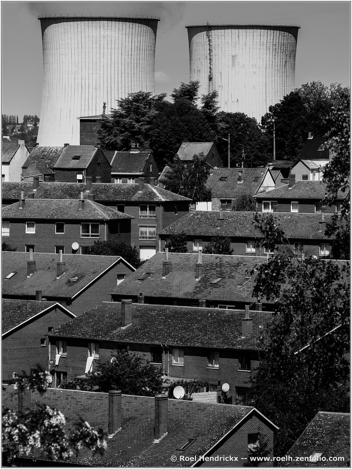
CHARLEROI - BOUCLE NOIRE
Charleroi is a city in the southern (Walloon) part of Belgium.
It is a city that has a bad reputation in Flanders: it is supposed to be old, derelict and dirty and a breeding ground for socialist laziness.
(I am just echoing some old clichés here, none of this is my own opinion).The city is indeed not the most beautiful you can find in Belgium. There are no grand medieval churches or castles here.
The city was built on a foundation of coal and steel, industries that once flourished but have mostly gone to waste in the past half century.
But there is a lot of creativity there, in the arts and in culinary endeavours.One initiative fully embraces the city's industrial heritage (and industrial archeology).
A pretty challenging walking tour is called "Boucle Noire" (Black Belt) and it leads through and around the city, visiting sites of former coal mines (and climbing the associated slag heaps - called "terrils"), walking along the canal where steel industry in now being reconverted to recycling plants, etc. On the self-guided tour you also get a pretty good idea of working and living conditions in times past, with rows of identical labourer's houses, now home to thirty-something couples with electric cargo bikes.This is one image from that walk:
A fuller gallery showing more of this highly interesting hike, can be found here : roelh.zenfolio.com/p840841149
Well developed image that covers all the tonalities. Nicely composed with shapes and lines both vertical and horizontal allowing us to read it in either direction. I wish for a bit more room at the top so I could see more of the cloud coming out of that first stack, but it's a workable fill-the-frame composition as it is. Nice work.
-
@MikeFewster has written:
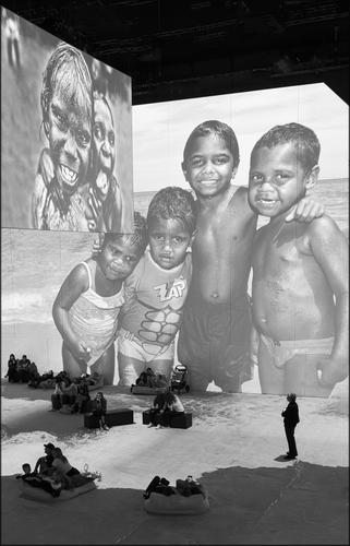
Across the divide.
The installation itself looks interesting, but it's made more so by the addition of the spectators who've become part of the scene. The set up makes them appear to be observers on the beach with the display images. This kind of immersive display is becoming quite popular. Monochrome is a nice choice for this.
-
@Rich42 has written:@RoelHendrickx has written:@GreatBustard has written:@Rich42 has written:
Ordinary Things - Wall SwitchesThe sun comes through the high windows in my living room twice a year for a few days, barely skimming, raking across the front wall. It moves pretty rapidly, lighting a moving swath about 2 feet wide which sweeps across and down the wall.
The wall isn't stucco but the paint texture, which ordinarily looks almost smooth stands out like it's etched an inch deep, rather than its actual depth less than a mm. The switch plate "lights up" like it's made of white frosted glass with a bright fluorescent bulb inside.
Rich
Love this photo, but I have a complaint: the bright white vertical "bar" on the left of the photo. Were it me, I'd darken that a bit to blend in with the middle section of the wall. The dark "bar" on the right works due to its size, but the light "bar" on the left is "too thin", making it a bit unbalanced. Regardless, I really like the photo!
I did not really notice, at first, the big reach between the blacks and the whites in this image, but now that my attention has been drawn to it, I cannot unsee it. Especially the stark white is a bit jarring. It also looks like your dragged a brightening mask from the left over it, with too harsh a value.
Looking back on the image with fresh eyes, I think it would lend itself quite well to a square format crop, eliminating all of that too-bright area on the left and some of the pure dark on the right.Mike, GB, Roel,
Thanks for the comments about the white area on the left side.
I probably could do a bit of cropping and further tone editing. The wall looks brighter on the left because there's a 45 degree angle there and the wall is coming toward the viewer and catching much more of the suns rays, which are from the right. The contrast is much greater here in the forum display of the image than in Photoshop on my monitor. Something about the way the forum's software handles JPEGs? Seeing that difference, I didn't quite know how it would display on others' monitors.
I don't convert images to B&W too much. My overall workflow is always Adobe Bridge -> ACR -> Photoshop. I can do the BW conversion in Adobe Camera Raw or Photoshop. I can't remember in which I did this conversion. I think it was ACR. Adobe updates these programs constantly and unexpectedly. Recently I've been getting a brief error message after conversion that there is a profile mismatch. Photoshop notes it, then deals with the image and all seems well. I've tried to track down the error, but it's transient and I think it's a bug generated by one of the recent program updates. Maybe that's what's going on here? Dunno.
Rich
If you wanted to adjust the tones on the left, it could be done with a graduated filter running horizontally.
-
@minniev has written:@RoelHendrickx has written:
CHARLEROI - BOUCLE NOIRE
Charleroi is a city in the southern (Walloon) part of Belgium.
It is a city that has a bad reputation in Flanders: it is supposed to be old, derelict and dirty and a breeding ground for socialist laziness.
(I am just echoing some old clichés here, none of this is my own opinion).The city is indeed not the most beautiful you can find in Belgium. There are no grand medieval churches or castles here.
The city was built on a foundation of coal and steel, industries that once flourished but have mostly gone to waste in the past half century.
But there is a lot of creativity there, in the arts and in culinary endeavours.One initiative fully embraces the city's industrial heritage (and industrial archeology).
A pretty challenging walking tour is called "Boucle Noire" (Black Belt) and it leads through and around the city, visiting sites of former coal mines (and climbing the associated slag heaps - called "terrils"), walking along the canal where steel industry in now being reconverted to recycling plants, etc. On the self-guided tour you also get a pretty good idea of working and living conditions in times past, with rows of identical labourer's houses, now home to thirty-something couples with electric cargo bikes.This is one image from that walk:

A fuller gallery showing more of this highly interesting hike, can be found here : roelh.zenfolio.com/p840841149
Well developed image that covers all the tonalities. Nicely composed with shapes and lines both vertical and horizontal allowing us to read it in either direction. I wish for a bit more room at the top so I could see more of the cloud coming out of that first stack, but it's a workable fill-the-frame composition as it is. Nice work.
You are right. I had assumed that the industries had closed down. After a further look I think the stack is smoking. If this is the case, it changes the interpretation of the image and I agree that more room is needed at the top. Maybe that isn't smoke?
-
@ChrisOly has written:
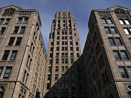
Whitney Block in Toronto - one of the Ontario provincial buildings built in 1926 in Goth/Art Deco style still in use.
That's a glorious building. I love art deco architecture and this is a wonderful example. I like the way you've framed it with the deep V shapes on the sides of the tower. The colors are muted but very pleasing, and the high contrast shows off the details nicely.
-
@Bryan has written:
I keep telling myself to find a new subject. But it hasn't stopped me visiting the area of my interest last few months and I can't stop capturing them...
So I wont say this is the last, but maybe it's the culmination...
I fully understand your fascination. I was the same way with my dam birds. It took me a year for the obsession to subside, and still today if I find an active day beneath the dam, I am mesmerized and come home with 100 images.
I like the detail you got in his eyes on this one, and the rainbow effect of the sun on those cellophane wings.
-
@Rich42 has written:
Ordinary Things - Wall SwitchesThe sun comes through the high windows in my living room twice a year for a few days, barely skimming, raking across the front wall. It moves pretty rapidly, lighting a moving swath about 2 feet wide which sweeps across and down the wall.
The wall isn't stucco but the paint texture, which ordinarily looks almost smooth stands out like it's etched an inch deep, rather than its actual depth less than a mm. The switch plate "lights up" like it's made of white frosted glass with a bright fluorescent bulb inside.
Rich
When you can make an interesting image of a light switch on a plain wall, you've got The Eye. You certainly have it.
The odd effects of glow on the top edge are interesting, the contrasts, the tonal range, the detail all help make this non interesting object become interesting. The most intriguing aspect to me is the silhouette of the old man with the big chin emerging from the box.
I'd be tempted to crop from the right to get rid of a bit of the weight on that side.
-
@WhyNot has written:
WhyNot
I love the composition and framing. He's singing his little heart out so boldly that I feel like I can hear him. The colors are rich and strong. He may not be as detailed as we all tend to like (maybe a heavy crop?) , but he's a lovely catch full of energy.
-
@PeteS has written:
Veiled Rendez-Vous
I took this in a museum where there was a glass corridor of two glass walls, a layer of wrought iron, and windows in front and behind, causing a mayhem of light and reflections to veil the actual objects in the photo, so this was all done in camera.
Getting the depth of field I wanted, I wound up with a ridiculously high ISO for m43 and got the grain I deserved. I got rid of it in Lightroom, but then, amusingly, realised I rather liked that additional layer, and decided to reintroduce a layer of artificial grain in PP!Pete
However you got it, it's a keeper. The layers - some translucent and some reflected - create an artwork fully of mysteries and puzzles presented in great complementary warm/cool colors. The wrought iron lends a feel of woven fabric to this image. And the pair touching hands has enough detail to spark our imagination but not so much that the story is defined for us. A very effective image.
