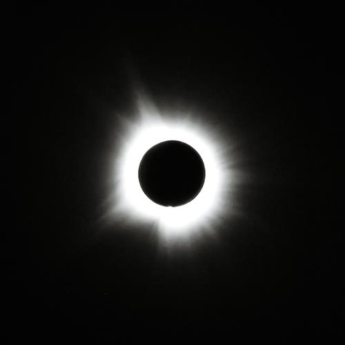
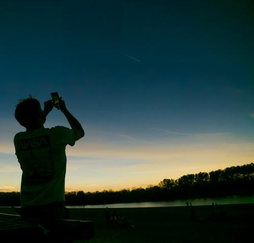
Love the images of everyone looking up, we got too distracted to stop and take those shots. In the last one you can see a contrail from an aircraft, I wonder if they were trying to see the eclipse from the air.
-
-
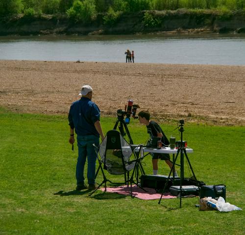
A well balanced little essay on a memorable day. Anticipation, preparation and the moment. An event that has wide impact and seen here from different perspectives. As an individual image, I like the last shot. It's always satisfying seeing the young observing the natural world.
-
And I liked this even more when I looked at it large.
There's a very delicate beauty to the whole image. The colours and background are soft but it all comes together at the perfectly focussed sharp tip at the top of the green petal (I'm sure there is a botanic name for the green sleeves that enfold the purple inner petals). The purple line that runs up the green to the opening purple centre is a joy.
All the promise of an opening bloom. -
Thanks Mike.
I'm glad you noticed that it looks good the larger it's viewed. It's actually a small lily bud. But it's one of the larger prints I've made, hanging on one of our walls. The bigger I print it, the better it looks. It's graphic design qualities improve with size.
Rich
-
@MikeFewster has written:
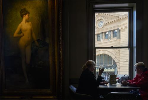
Melbourne Icon. 1.
Chloe. The most famous girl in Melbourne.
Chloe has graced the walls of the Young and Jackson's Hotel since 1909. Generations of Australians have saluted her with a drink. On ANZAC day, this bar is permitted to run the highly illegal game of Two Up. This is the traditional gambling game of Australian soldiers. All proceeds go to a charity that looks after the families of veterans that did not return.
Through the window is another Melbourne icon, the clocks of Flinders Street railway station. Couples have traditionally met under those clocks since the 1850's.The balance of indoor and outside illumination is well done. That’s hard to pull off. I like the intimacy of the scene and the contrast of the lighting.
Which is fantasy? The warm indoor painting or the cooler outdoor scene? 😉
Rich
-
@Bryan has written:
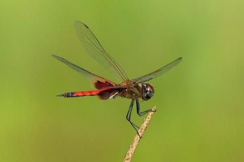
Weather hasn't been too good last couple of weeks. Reviewing a few I like this species. He is a bit larger than the other one I have been showing. I like the red in his rear wings - it is just a blur in flight but adds to his apparent size. Almost impossible to capture in flight because he darts all over the place and rarely hovers.
You need to have tried to photograph one of these to appreciate how good the shot is. I speak from long and frustrated experience.
There is a balance and elegance with these critters that you have caught. It isn't just the dragon fly itself here. The twig/grass it is perched on mimics the delicate body. The spread wings create lines to the corners while the twig anchors the image to the base but it is all acieved with delicacy. The detailing on the legs is impressive.
The background is a shade of green that isn't my favourite but it "pops" the orange and black of the star.
I'm envious of this shot. -
@Sagittarius has written:
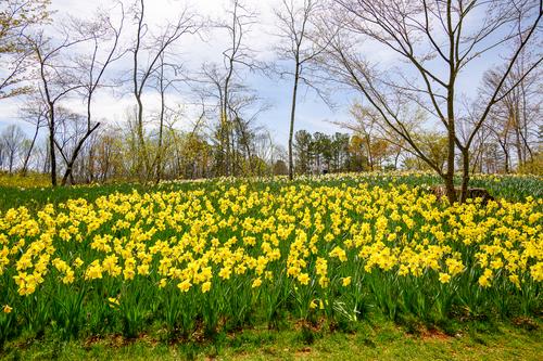
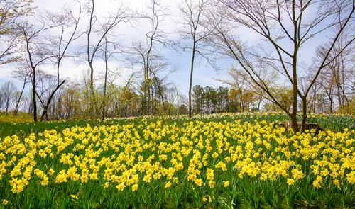
Spring has come
Essentially, what makes the image work is the four/five horizontal bands. Sky, trees on the horizon and the yellow and green strips. It is those repeating bands that give the image its impact. The taller trees tie the bands together. I feel that the very foreground strip of grass disturbs the otherwise pleasing pattern. It isn't horizontal enough and id too different in texture. Because it is at the very front, it catches the eye too much. Consider cropping off a little of the bottom. Just enough to remove all the grass but still keeping as much as possible of the green leaves.
-
@JSPhotoHobby has written:
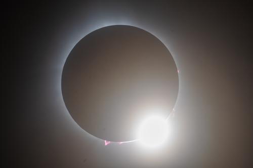
I didn't have the level of success I had hoped for, b ut I got a few keepers.
8 of us flew from NJ to VT in two planes and the weather barely held for us. I feel pretty lucky and I did learn a lot. Spain 2026, I'm looking forward to trying again!
EDIT:
I attempted to tweak it for better result in Lightroom.
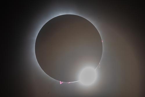
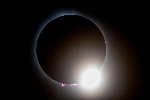
Really, if I hadn't had my shutter set to a 2 second timer I would have had 3 or 4 shots to choose from and I think a half or quarter second earlier would have been really amazing.How do you feel about it? I like the blacker blacks but I prefer the bright highlight of the "diamond in the ring" in the first shot to the greyer tones of the diamond in the second. This is one situation where I feel a little burning out of a highlight is preferable.
-
@MikeFewster has written:
Melbourne Icon. 1.
Chloe. The most famous girl in Melbourne.
Chloe has graced the walls of the Young and Jackson's Hotel since 1909. Generations of Australians have saluted her with a drink. On ANZAC day, this bar is permitted to run the highly illegal game of Two Up. This is the traditional gambling game of Australian soldiers. All proceeds go to a charity that looks after the families of veterans that did not return.
Through the window is another Melbourne icon, the clocks of Flinders Street railway station. Couples have traditionally met under those clocks since the 1850's.Mike beautiful, the background on the left has a great mystical atmosphere in which it forms a beautiful juxtaposition together with the contemporary right side wich you don't see this often.
Lou
-
@MikeFewster has written:
Essentially, what makes the image work is the four/five horizontal bands. Sky, trees on the horizon and the yellow and green strips. It is those repeating bands that give the image its impact. The taller trees tie the bands together. I feel that the very foreground strip of grass disturbs the otherwise pleasing pattern. It isn't horizontal enough and id too different in texture. Because it is at the very front, it catches the eye too much. Consider cropping off a little of the bottom. Just enough to remove all the grass but still keeping as much as possible of the green leaves.
Thank you Mike for looking and commenting. Do you envision something like this?
-
@MikeFewster has written:@JSPhotoHobby has written:
I didn't have the level of success I had hoped for, b ut I got a few keepers.
8 of us flew from NJ to VT in two planes and the weather barely held for us. I feel pretty lucky and I did learn a lot. Spain 2026, I'm looking forward to trying again!
EDIT:
I attempted to tweak it for better result in Lightroom.
Really, if I hadn't had my shutter set to a 2 second timer I would have had 3 or 4 shots to choose from and I think a half or quarter second earlier would have been really amazing.How do you feel about it? I like the blacker blacks but I prefer the bright highlight of the "diamond in the ring" in the first shot to the greyer tones of the diamond in the second. This is one situation where I feel a little burning out of a highlight is preferable.
Hum, so I like the brighter whiter of the "diamond" in the first one, I dislike the glare rings being so visible in the second. I do like the edge of the sun is more visible in the second and the dehaze of the second. You can also see the corona better in the second. Maybe I will take another crack at it and see if I can refine it more.
-
@Sagittarius has written:@MikeFewster has written:
Essentially, what makes the image work is the four/five horizontal bands. Sky, trees on the horizon and the yellow and green strips. It is those repeating bands that give the image its impact. The taller trees tie the bands together. I feel that the very foreground strip of grass disturbs the otherwise pleasing pattern. It isn't horizontal enough and id too different in texture. Because it is at the very front, it catches the eye too much. Consider cropping off a little of the bottom. Just enough to remove all the grass but still keeping as much as possible of the green leaves.
Thank you Mike for looking and commenting. Do you envision something like this?
That's exactly what I had in mind. I feel it is now a considerably stronger image with all the bands working together. The verticals of the foreground leaves are also now visually linking with the verticals of the mid range trees. What do you think about it? I like version 2 a lot.
-
@JSPhotoHobby has written:@MikeFewster has written:@JSPhotoHobby has written:
I didn't have the level of success I had hoped for, b ut I got a few keepers.
8 of us flew from NJ to VT in two planes and the weather barely held for us. I feel pretty lucky and I did learn a lot. Spain 2026, I'm looking forward to trying again!
EDIT:
I attempted to tweak it for better result in Lightroom.
Really, if I hadn't had my shutter set to a 2 second timer I would have had 3 or 4 shots to choose from and I think a half or quarter second earlier would have been really amazing.How do you feel about it? I like the blacker blacks but I prefer the bright highlight of the "diamond in the ring" in the first shot to the greyer tones of the diamond in the second. This is one situation where I feel a little burning out of a highlight is preferable.
Hum, so I like the brighter whiter of the "diamond" in the first one, I dislike the glare rings being so visible in the second. I do like the edge of the sun is more visible in the second and the dehaze of the second. You can also see the corona better in the second. Maybe I will take another crack at it and see if I can refine it more.
I see what you mean. There is an excellent image tucked away here that is worth some time trying to get right.
-
@LouHolland has written:@MikeFewster has written:
Melbourne Icon. 1.
Chloe. The most famous girl in Melbourne.
Chloe has graced the walls of the Young and Jackson's Hotel since 1909. Generations of Australians have saluted her with a drink. On ANZAC day, this bar is permitted to run the highly illegal game of Two Up. This is the traditional gambling game of Australian soldiers. All proceeds go to a charity that looks after the families of veterans that did not return.
Through the window is another Melbourne icon, the clocks of Flinders Street railway station. Couples have traditionally met under those clocks since the 1850's.Mike beautiful, the background on the left has a great mystical atmosphere in which it forms a beautiful juxtaposition together with the contemporary right side wich you don't see this often.
Lou
Thanks Lou. My wife and I were on our way home and dropped into the famous Young and Jackson's Chloe Bar. Couldn't believe my luck when I saw the couple at the table and the upraised glass.
-
@Sagittarius has written:
Thank you Mike for looking and commenting. Do you envision something like this?
That's exactly what I had in mind. I feel it is now a considerably stronger image with all the bands working together. The verticals of the foreground leaves are also now visually linking with the verticals of the mid range trees. What do you think about it? I like version 2 a lot.
[/quote]I like it. Thanks again for the suggestion.
-
@JSPhotoHobby has written:@MikeFewster has written:@JSPhotoHobby has written:
I didn't have the level of success I had hoped for, b ut I got a few keepers.
8 of us flew from NJ to VT in two planes and the weather barely held for us. I feel pretty lucky and I did learn a lot. Spain 2026, I'm looking forward to trying again!
EDIT:
I attempted to tweak it for better result in Lightroom.
Really, if I hadn't had my shutter set to a 2 second timer I would have had 3 or 4 shots to choose from and I think a half or quarter second earlier would have been really amazing.How do you feel about it? I like the blacker blacks but I prefer the bright highlight of the "diamond in the ring" in the first shot to the greyer tones of the diamond in the second. This is one situation where I feel a little burning out of a highlight is preferable.
Hum, so I like the brighter whiter of the "diamond" in the first one, I dislike the glare rings being so visible in the second. I do like the edge of the sun is more visible in the second and the dehaze of the second. You can also see the corona better in the second. Maybe I will take another crack at it and see if I can refine it more.
I had a play and learnt a little about adjusting curves. At first I was dropping the intensity of the diamond. But then I discovered one can place an anchor up high on the curve locking the most intense, and adjust the curve below that.
-
@minniev has written:
My Eclipse Adventure
My son and I took his two youngest sons (9 and 12) on a quest for eclipse totality. This quest ended up in a little village called Newport, Arkansas, population 2000, on the White River. There was a nice little state park open to all comers, and the crowd was modest and friendly, lots of dogs and children, and a couple of dedicated astronomy guys with sophisticated equipment we could mooch viewing time off of. I deliberately left my better/longer lenses behind, taking only my humble consumer short zoom and no filters, so I wouldn't be tempted to fiddle, and could focus on the experience and the kids. What I found interesting photographically was the challenge of capturing (and keeping through editing) the strangely impeded light and the color that diminished as the eclipse progressed.[
]
Mike said a well balanced little essay. You have a way with words. I wonder if you ever considered writing as a hobby?
I have a question on your eclipse shot. Is the larger halo a result of a longer exposure time?
-
@MikeFewster has written:@Bryan has written:
Weather hasn't been too good last couple of weeks. Reviewing a few I like this species. He is a bit larger than the other one I have been showing. I like the red in his rear wings - it is just a blur in flight but adds to his apparent size. Almost impossible to capture in flight because he darts all over the place and rarely hovers.
You need to have tried to photograph one of these to appreciate how good the shot is. I speak from long and frustrated experience.
There is a balance and elegance with these critters that you have caught. It isn't just the dragon fly itself here. The twig/grass it is perched on mimics the delicate body. The spread wings create lines to the corners while the twig anchors the image to the base but it is all acieved with delicacy. The detailing on the legs is impressive.
The background is a shade of green that isn't my favourite but it "pops" the orange and black of the star.
I'm envious of this shot.Mike thanks for the wonderful comments. Yes I goofed a bit on pp, wasn't paying attention and raised saturation too much. I have tweaked another one, perhaps a bit better but it was a difficult photo in that it was a bit over exposed and had to play around a bit.
