Wonderful pair of bike racing images. Both have great color, fine design elements to give the photos graphic impact, and they convey the thrust of motion that makes such events so attractive to onlookers. Well done.
-
-
Your local icon transforms what would have been a mundane image of a couple having drinks in front of an urban window into an artistic photograph with a wealth of extra story. Sounds like many generations of Australians have met Chloe and have absorbed her beauty and her story as they brought their own stories into the historic hotel, surrounded by the stories of other iconic places. I love historical places like this, with embedded stories and traditions. Well taken and especially nicely lit, with the contrasting tones of light from warm to cool. .
-
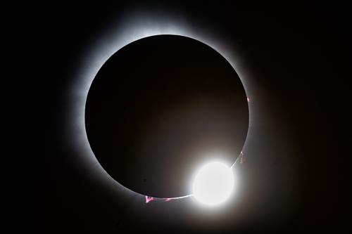
Sympathies from another eclipse viewer who didn't get photos that did it justice. (You did better than I did for sure). But we have lots of company. Even those in the Nat Geo showcase did not do it justice. We were up against Mother Nature, a formidable contest. I think you got some good ones, and Bryan is on the right track with editing them in his post a bit further down the thread, to limit the haze and secure more detail without letting the lights go gray.
-
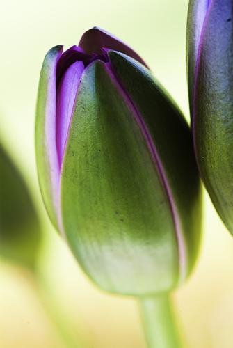
Gorgeous complementary colors. Green and magenta perform just as well as blue and orange. Love the soft gold background that fades to green in the upper edges. The sharp part is right where it must be, catching the curved edges of the bud. Well done. Lovely artistic flower image.
-
Whatever that yellow structure is, it is first and foremost an art piece, full of exquisite detail and rich color. Setting it against the gray fog, and a distant structure and its reflection gives the scene an otherworldly mythic look that lets us tell our own story about it. Well spotted and compositionally both enigmatic and lovely.
-
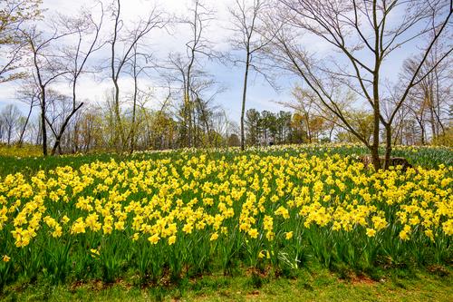
Beautiful array of daffodils, leading about as far as the eye and lens can see. Endless sea of yellow, so vivid and clear we can almost smell them. The bare trees with all their curves and bent limbs almost appear to be dancing in spring glee.
I might trim off a bit at the bottom to eliminate the glasses area at the base of the flowers, where the shadows distract us a bit from the flowers' beauty. Lovely image regardless.
-
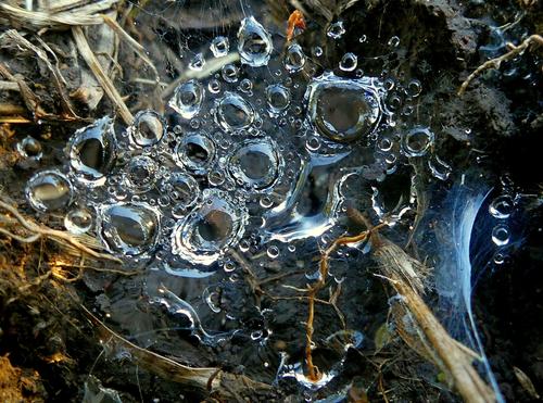
I really like this study of Small Things. The mix of webs and water drops are one of the things I always look for when out early or just after a rain. This is the second image this week that mixes cool (right side) and warm (left side) light in the same image for a splendid visual effect. (Mike's was the other). While his was a definitive scene, yours is more a nature abstract, but the concept works the same. Well found and taken.
-
Another nice nature closeup. Beautiful dragonfly in flawless focus from stem to stern and all in between, no mean feat. And for a bonus, a lovely blurred background without any distractions and a perfect perch. The ultimate dragonfly image. Print and frame it.
-
@minniev
Thank you for looking and commenting. I've already done that see my response to Mike. -
-
You can probably get closer to Bryan's version using the masking features in LR on the "diamond" to brighten/whiten that grayish tone that's always a dead giveaway of pushing sliders. Lightroom is so much better than it used to be for finishing touches like that.
-
The story is half the attraction here.
But the image is not half bad either.
The two distinct colour temperatures left and right create a division between then (nostalgia) and now.
But there are also unifying elements, notably the direction of the gaze of the persons (real and painted).
Both (groups) look out the window (or at least in that direction), linking them in activity and in target : another Icon of Melbourne's history in the form of the station.Chloe seems like a nice girl to me. Her pose is teasing and confident but still fairly modest (at least for modern eyes; she was probably scandalous at the time; painters in those times usually needed biblical themes or greek mythology as an excuse for showing human curves, but this Chloe is "just" a person).
No wonder that she is an icon for people of all walks of life. -
This little essay is economical : it shows us many different aspects of an eclipse, for an encompassing view, but with minimal number of images:
- people watching at their leisure
- people prepared for more serious watching activities
- the eclipse itself
- and a nice silhouette against great light. -
I would have no idea myself about what settings to use for a solar eclipse, so the fact in itself that you made deliberate choices is already worth praise.
I do agree that the blown highlight is a bit much. A smaller sliver of bright light (or more in the form of a starburst) would have been better.
But the eruption on the sun's surface is a nice compensation.
-
I do agree that the mist is an asset rather than a defect in this image.
Atmosphere aplenty. -
@Rich42 has written:
No Solar Eclipse images here.
Rich
I am not known to be a big fan of photos of flowers, but for some reason this one does appeal to me.
It must be the combination of colours (green and purple) and the softness of the transition between sharp and OOF areas. -
@Sagittarius has written:
Spring has come
There's just one word (or maybe two) that come to mind here : Abundance. Or : Abundant Joy.
Spring has arrived in Belgium too, but in a very hesitant way.
More rain and chilly temperatures than really nice spring weather.
Your image is a mirage to me. -
@Bryan has written:
Small and even smaller dew drops suspended in a small web close to the ground. Hidden in shadow all day, taken later afternoon.
Memo to anyone who has not yet done this : enlarge this image for better appreciation.
The dew drops look, to me, like air bubbles caught in a sheet of ice. A kind of reversal of expectation.


