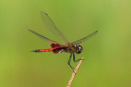
Superb detail here.
I have once in my life (on a great pre-sunrise morning in rice fields in the Po Valley in Italy) shot dragonflies.
I was kinda pleased with my results.
But I doubt that I had any image with close to this kind of sharpness in detail.
-
-
Minnie and Roel,
Thanks for commenting.
Rich
-
@RoelHendrickx has written:
WOMEN CYCLING
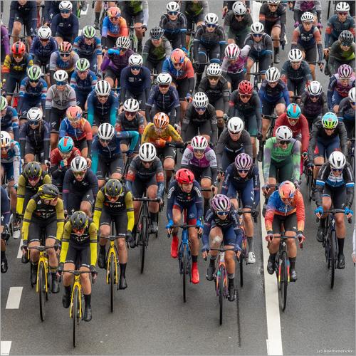
UCI Professional Cycling comes to my home town Schoten every year, with the Scheldeprijs, one of the "classic races" and widely considered to be the "informal world championship for sprinters", because it is a mostly flat race that almost invariably ends in a mass sprint.
The race takes place on the Wednesday between the Tour of Flandres (a monument race) and Paris-Roubaix (another monument). The biggest contenders for those other (somewhat bigger) races seldom participate in the Scheldeprijs, unless they use it as an intensive training without taking the risk to crash in the sprint. A champion like Van Der Poel might be someone who could indeed succeed in arriving solo, but that is exceptional.
Anyway, when I have the time, I enjoy picking a good spot on the last part of the race (three local rounds of 17 km) to see the riders pass me a few times.
I've posted my self in previous years at the finish line, on the cobblestones stretch and in various other spots.This year I went to a bridge alongside the canal and used two vantage points: one on the bridge itself, with the riders racing under me and another a bit further, where I had a straight view onto the riders making a curve into a slight elevation (where I stood perched behind a railing).
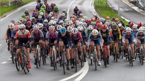
I shot a few bursts of images with manual settings of the Women race.
Here are two images, both cropped to different ratios (1:1 square and 16:9 panorama) from the original 4:3 ratio.
There are two very different feelings in these two photos, depite the subject being basically the same. I am not sure if the feeling is generated solely by the angle of view and format, but it certainly adds to it.
The first seems relaxed and this is helped by an evenly spaced group, with a bit of free air between them. The angle of the second means they seem jammed in on top of each other, which gives an edgy, adrenalin filled image. The second may really have been a more intense moment, judging by the body positions of the riders, but, as I said, I think this is enhanced by the composition.
I like them both, but, at the moment I would choose the first, not least because the higher viewpoint is more unusual and allows the viewer to see more of the individual riders. But ask me tomorrow, and it may be the second one.Pete
-
@MikeFewster has written:
Melbourne Icon. 1.
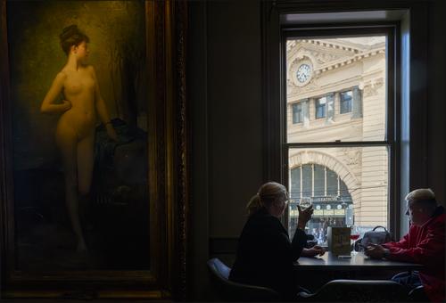
Chloe. The most famous girl in Melbourne.
Chloe has graced the walls of the Young and Jackson's Hotel since 1909. Generations of Australians have saluted her with a drink. On ANZAC day, this bar is permitted to run the highly illegal game of Two Up. This is the traditional gambling game of Australian soldiers. All proceeds go to a charity that looks after the families of veterans that did not return.
Through the window is another Melbourne icon, the clocks of Flinders Street railway station. Couples have traditionally met under those clocks since the 1850's.This is superb. There are so many things to like about it.
I am always attracted to juxtapositions, especially when an object seems to be interacting with the the people in th photo. In this case Chloe definitely seems to be doing that. Is the painting a sort of "thought bubble" for the couple? Is she a symbol for love and/or passion? Does she look at the couple with disdain for their apparent lack of passion?
There is also a nice juxtaposition between the daylight scene through the window, with the clocks(lots of them) and the station being good metaphores for punctuality and pressure, whilst in the darkened interior time passes leasurely at the speed of sipping a glass of wine.
Although the temperature of the light outside and inside is completely different, it does not clash, because the yellow stonework and Chloe's skin are a similar colour, which helps bind these two worlds together.The brightest part of the image is outside, so we are drawn to that, then to Chloe, who is almost as bright and finally to the couple. So we see Chloe first which means visually she is more powerful than the couple, which suggests a metaphore that she controls them as a sort of cupid. We can also see a triangle of Time - Perpetual Beauty of Youth, or Cupid - Aging Couple, and build our own interpretation around that.
Already there is plenty to enjoy and think about, but then comes the information given to us by Mike to add even more. Maybe the couple are looking wistfully at the clock, under which they met a while ago? Is Chloe a symbol of passion for those meeting there? Is she waiting for someone herself? Is she thinking about the meeting before getting dressed? Or is she ready for the meeting as she is?
And finally it is a photo linking two lovely icons, each with their own delighhtful story.
Pete
-
@Bryan has written:@JSPhotoHobby has written:@MikeFewster has written:@JSPhotoHobby has written:
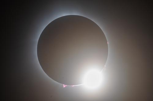
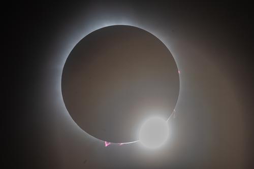
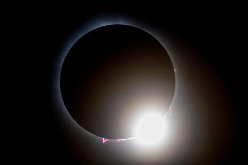
I didn't have the level of success I had hoped for, b ut I got a few keepers.
8 of us flew from NJ to VT in two planes and the weather barely held for us. I feel pretty lucky and I did learn a lot. Spain 2026, I'm looking forward to trying again!
EDIT:
I attempted to tweak it for better result in Lightroom.
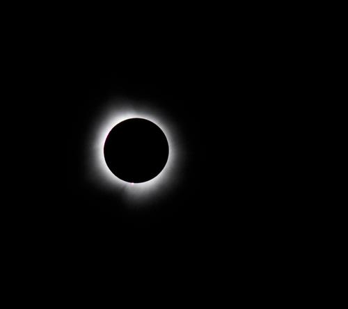
Really, if I hadn't had my shutter set to a 2 second timer I would have had 3 or 4 shots to choose from and I think a half or quarter second earlier would have been really amazing.How do you feel about it? I like the blacker blacks but I prefer the bright highlight of the "diamond in the ring" in the first shot to the greyer tones of the diamond in the second. This is one situation where I feel a little burning out of a highlight is preferable.
Hum, so I like the brighter whiter of the "diamond" in the first one, I dislike the glare rings being so visible in the second. I do like the edge of the sun is more visible in the second and the dehaze of the second. You can also see the corona better in the second. Maybe I will take another crack at it and see if I can refine it more.
I had a play and learnt a little about adjusting curves. At first I was dropping the intensity of the diamond. But then I discovered one can place an anchor up high on the curve locking the most intense, and adjust the curve below that.
You don't need to be disappointed with having so few keepers, if one of them is as good as this! It is even better viwed large. The diamond ring effect is just right, and having those flares too adds a lot of interest.
The colour is mainly black and white, but that makes the magenta in the flares and the subtle cyan glow in the ring stand out all the more.The third version, shown above, with the darker blacks, is definitely a big improvement over the others.
Pete
-
@MikeFewster has written:@minniev has written:
My Eclipse Adventure
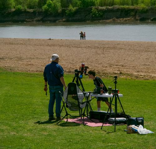
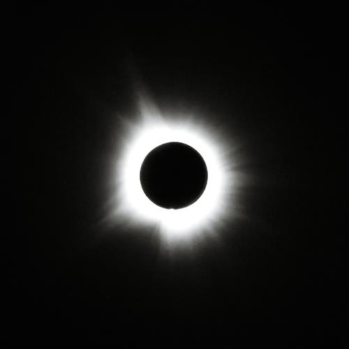
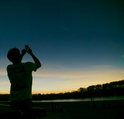
My son and I took his two youngest sons (9 and 12) on a quest for eclipse totality. This quest ended up in a little village called Newport, Arkansas, population 2000, on the White River. There was a nice little state park open to all comers, and the crowd was modest and friendly, lots of dogs and children, and a couple of dedicated astronomy guys with sophisticated equipment we could mooch viewing time off of. I deliberately left my better/longer lenses behind, taking only my humble consumer short zoom and no filters, so I wouldn't be tempted to fiddle, and could focus on the experience and the kids. What I found interesting photographically was the challenge of capturing (and keeping through editing) the strangely impeded light and the color that diminished as the eclipse progressed.[
]
A well balanced little essay on a memorable day. Anticipation, preparation and the moment. An event that has wide impact and seen here from different perspectives. As an individual image, I like the last shot. It's always satisfying seeing the young observing the natural world.
I agree with Mike.
I also like the way you posted the 3rd and 4th image without a gap, forming a diptych or even a single image, allowing the boy to be observing the Sun. NeatPete
-
@minniev has written:@Rich42 has written:
No Solar Eclipse images here.
Rich
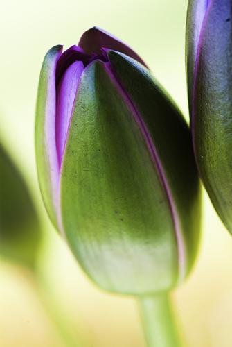
Gorgeous complementary colors. Green and magenta perform just as well as blue and orange. Love the soft gold background that fades to green in the upper edges. The sharp part is right where it must be, catching the curved edges of the bud. Well done. Lovely artistic flower image.
Agreed.
Although we can see exactly what it is, the image has certain qualities of an abstract. The transitions from sharp focus to blur and from a balanced exposure to overexposure, are severe enough to stop this from being a text book illustration, and become graphic art. The details are there, but it is up to the viewer to fill in the hidden details with imagination.Pete
-
@MikeFewster has written:@Sagittarius has written:@MikeFewster has written:
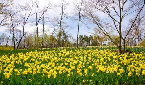
Essentially, what makes the image work is the four/five horizontal bands. Sky, trees on the horizon and the yellow and green strips. It is those repeating bands that give the image its impact. The taller trees tie the bands together. I feel that the very foreground strip of grass disturbs the otherwise pleasing pattern. It isn't horizontal enough and id too different in texture. Because it is at the very front, it catches the eye too much. Consider cropping off a little of the bottom. Just enough to remove all the grass but still keeping as much as possible of the green leaves.
Thank you Mike for looking and commenting. Do you envision something like this?
That's exactly what I had in mind. I feel it is now a considerably stronger image with all the bands working together. The verticals of the foreground leaves are also now visually linking with the verticals of the mid range trees. What do you think about it? I like version 2 a lot.
Nicely worked, both of you. The result is definitely an improvement and the process was educational.
Very satisfying.Pete
-
@Bryan has written:
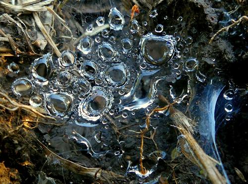
Small and even smaller dew drops suspended in a small web close to the ground. Hidden in shadow all day, taken later afternoon.
You've caught a lovely interplay between the spider's web and the water to create this stunning natural jewellery, which contrasts so well with the haphazard, dull and ordinary natural debris in the background. It is an inspiration for jewellers.
Pete
-
@MikeFewster has written:@Bryan has written:
Weather hasn't been too good last couple of weeks. Reviewing a few I like this species. He is a bit larger than the other one I have been showing. I like the red in his rear wings - it is just a blur in flight but adds to his apparent size. Almost impossible to capture in flight because he darts all over the place and rarely hovers.
Well said, Mike, and well done, Bryan.
Pete
You need to have tried to photograph one of these to appreciate how good the shot is. I speak from long and frustrated experience.
There is a balance and elegance with these critters that you have caught. It isn't just the dragon fly itself here. The twig/grass it is perched on mimics the delicate body. The spread wings create lines to the corners while the twig anchors the image to the base but it is all acieved with delicacy. The detailing on the legs is impressive.
The background is a shade of green that isn't my favourite but it "pops" the orange and black of the star.
I'm envious of this shot. -
@MikeFewster has written:@PeteS has written:
Bad Weather, Good Weather?
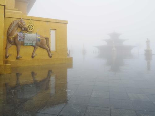
One day in Bhutan we visited a Giant Buddha overlooking the capital city of Thimphu, with a good view of the city and surrounding countryside from the platform. When we got there, it was pouring with rain and the clouds were so low, we were right in them.(To be fair to the clouds, we were at nearly 7,700 feet!) No views to be had that day. How disappointing. Then I realised that actually the fog made a really surreal atmosphere, gradually hiding features of the giant construction, then revealing them again. In fact it was rather cool.
The golden building on the left of the photo is actually the base of the statue, which incorperates a temple.Pete
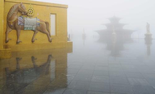
To me, the fog diffused figure on the right is very important in this shot. In trying to make out the details, we explore into the mist. A series of horizontal lines, plus the horse looking back over its shoulder, also encourage the same connection. I feel that there is something of a conflict between vertical lines and horizontal lines here. Perhaps crop a little off the top to eliminate the little piece of building that projects upwards and perhaps crop some off the bottom?
-
@PeteS has written:@MikeFewster has written:@PeteS has written:
Bad Weather, Good Weather?
One day in Bhutan we visited a Giant Buddha overlooking the capital city of Thimphu, with a good view of the city and surrounding countryside from the platform. When we got there, it was pouring with rain and the clouds were so low, we were right in them.(To be fair to the clouds, we were at nearly 7,700 feet!) No views to be had that day. How disappointing. Then I realised that actually the fog made a really surreal atmosphere, gradually hiding features of the giant construction, then revealing them again. In fact it was rather cool.
The golden building on the left of the photo is actually the base of the statue, which incorperates a temple.Pete
To me, the fog diffused figure on the right is very important in this shot. In trying to make out the details, we explore into the mist. A series of horizontal lines, plus the horse looking back over its shoulder, also encourage the same connection. I feel that there is something of a conflict between vertical lines and horizontal lines here. Perhaps crop a little off the top to eliminate the little piece of building that projects upwards and perhaps crop some off the bottom?
Agreed. That extra bit at the top was a distraction. Not so sure about the bottom. I think I prefer the extra reflection in the original.
-
@PeteS has written:@minniev has written:@Rich42 has written:
No Solar Eclipse images here.
Rich
Gorgeous complementary colors. Green and magenta perform just as well as blue and orange. Love the soft gold background that fades to green in the upper edges. The sharp part is right where it must be, catching the curved edges of the bud. Well done. Lovely artistic flower image.
Agreed.
Although we can see exactly what it is, the image has certain qualities of an abstract. The transitions from sharp focus to blur and from a balanced exposure to overexposure, are severe enough to stop this from being a text book illustration, and become graphic art. The details are there, but it is up to the viewer to fill in the hidden details with imagination.Pete
Thanks Pete,
Rich
-
@PeteS has written:@PeteS has written:@MikeFewster has written:@PeteS has written:
Bad Weather, Good Weather?
One day in Bhutan we visited a Giant Buddha overlooking the capital city of Thimphu, with a good view of the city and surrounding countryside from the platform. When we got there, it was pouring with rain and the clouds were so low, we were right in them.(To be fair to the clouds, we were at nearly 7,700 feet!) No views to be had that day. How disappointing. Then I realised that actually the fog made a really surreal atmosphere, gradually hiding features of the giant construction, then revealing them again. In fact it was rather cool.
The golden building on the left of the photo is actually the base of the statue, which incorperates a temple.Pete
To me, the fog diffused figure on the right is very important in this shot. In trying to make out the details, we explore into the mist. A series of horizontal lines, plus the horse looking back over its shoulder, also encourage the same connection. I feel that there is something of a conflict between vertical lines and horizontal lines here. Perhaps crop a little off the top to eliminate the little piece of building that projects upwards and perhaps crop some off the bottom?
Agreed. That extra bit at the top was a distraction. Not so sure about the bottom. I think I prefer the extra reflection in the original.
Now that I have looked at it with the top cropped, I'm agreeing with you about leaving the bottom as was.
-
@Bryan has written:
Mike said a well balanced little essay. You have a way with words. I wonder if you ever considered writing as a hobby?
I have a question on your eclipse shot. Is the larger halo a result of a longer exposure time?
Yes, also a minute further in than this one for instance. I can't lay claim to any particular preparation or plans for this photographically, I just got a few grab shots with my camera and walkabout lens and no special filters or tripod. So all mistakes were my own fault due to negligence!
