Chicago is my favorite city to photograph because of what you've got here: beautiful lake with water that tells the story of its glacial past, and a smorgasbord of wonderful architecture set against dramatic skies with a boundary of trees between for separation. Good exposure to hold onto the brights in the clouds and all those fine details in the buildings and even the boats. Curious about the colors, which I like a lot - wondering if this is an HDR exposure, or whether you got this with a filter or in post processing, or just lucky light.
-
-
Agree.
I've lived in Chicago for two months in the summer of 1994, but I don't have any photos from that time.
I've always wanted to go back to that city but it hasn't happened yet. Someday, for sure.To me also, the colours look HDR-like.
It works for this image, although I do not really like HDR in general.The only thing that could improve this skyline is a view that would be even slightly wider, to include the Hancock Center.
(That was my main view when looking towards the city, living just a bit north of it, near Oak Street beach.
In fact, I lived on Elm Street, and my time there was anything but a nightmare.) -
@minniev has written:@RoelHendrickx has written:
TIVOLI - VILLA ADRIANA
Any visit to Rome is a treat for all the senses.
If you are there for the first time or for a short visit, there is plenty to discover and enjoy within walking distance from the big landmarks. Don't bother spending time going anywhere else.But if your visit is a return visit or if you have more time available, it is a great idea to venture a bit outside of the city.
Taking a car into the surrounding Lazio countryside is a breath of fresh air.
A town worth spending a full day is Tivoli.You can visit Villa d'Este there, a renaissance country palazzo of one of the rich families, with magnificent gardens.
en.wikipedia.org/wiki/Villa_d%27EsteAnd you should certainly plan a stop at Villa Adriana, the sprawling estate where Roman emperor Hadrian created his private paradise.
en.wikipedia.org/wiki/Hadrian%27s_VillaAn impression (shot on an overcast and rainy day with dull light, in February 2015):
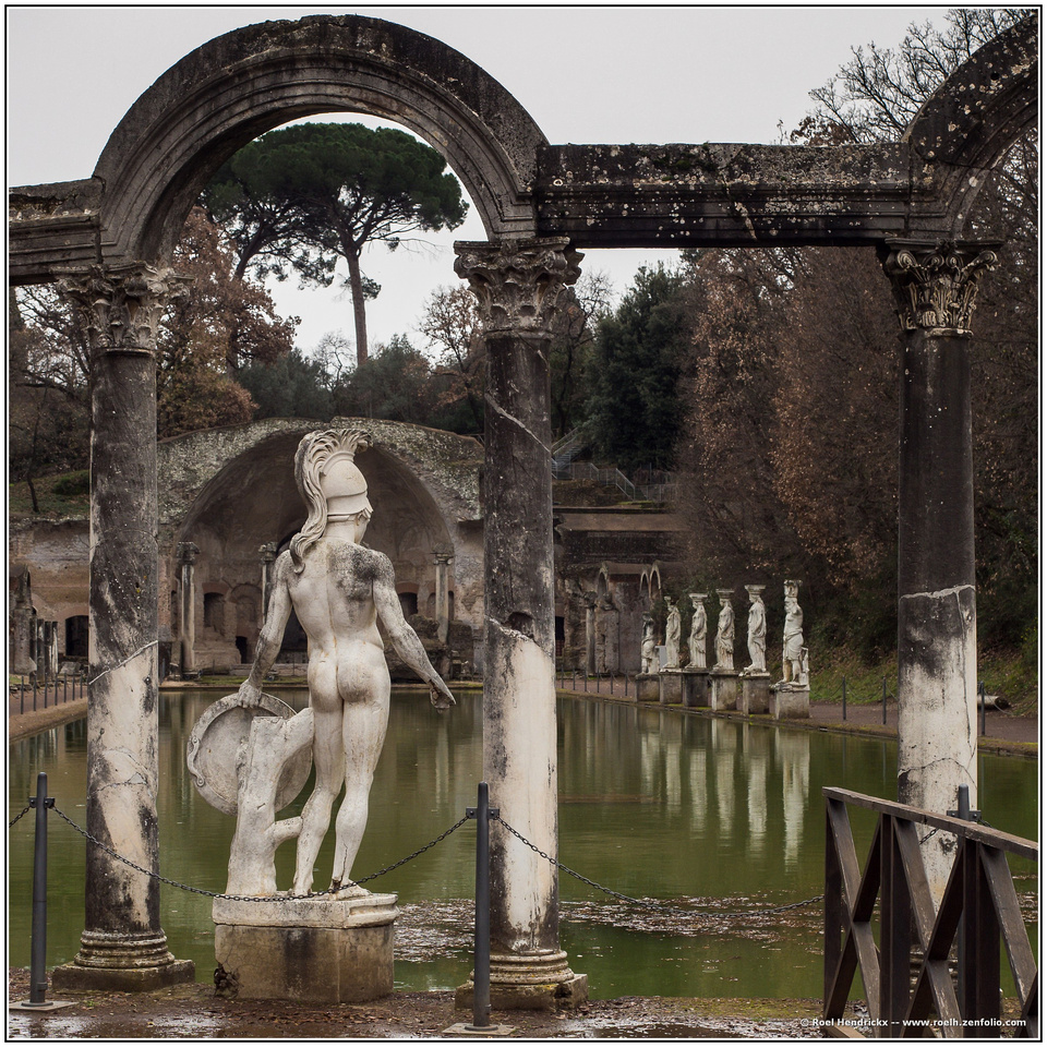
I see some suggestions about cropping but I wouldn't crop it. Of course most of you know me by now, and my proclivity to include everything in the frame, including the kitchen sink. I like the near statue where he is beneath the arched portal, and the view of the lineup of distant statues and their reflections visible through the next portal. The near statue's outstretched arm and his invisible leading line of vision aligns perfectly with the line created by the reflected heads of the other statues. I also like the way the arched shape of the tree is tucked inside the arched shape of the stonework.
The visually bothersome element is hard to remedy: I don't like the looping visitor-containing chain, its posts and the modern metal railing on the right. But these things, of course, are part and parcel of visiting sites that must protect art objects from wandering feet and hands.
I've been known to just walk up to velvet ropes in museums and remove them for a photo, and then put them back where they were, before museum guards really saw what was happening. That was not an option with this fixed chain, although there were no guards around...
-
Thank you Rich, Mike, Pete. minniev and Roel for looking and commenting. There has not been used any filter or HDR exposure. Everything is a combination of the light from the sky, reflected light from the water and processing. The body of the water was bigger in the original image. I've cropped it out.
-
@MikeFewster has written:@Rich42 has written:
When I worked with color reversal (slide/transparency) film, one of our favorite techniques to increase saturation on a rainy day or in dimly-lit situations was to very slightly underexpose. The dark, underexposed slide contained a lot of saturated color dye in the shadows which could be "dug out" with over exposure during the drum scan. It was tricky. More than 1/3 to 1/2 stop too much under-exposure and the color just went muddy and grainy. When it worked it could really "pop," with brilliant color against an otherwise grayish scene.
Digital sensors don't work in the same way. They don't like under-exposure. There's no excess of saturated dye material from a chemical reversal process in the shadows waiting to be exploited by a bright drum scanner light. Under-exposure usually just looks drab.
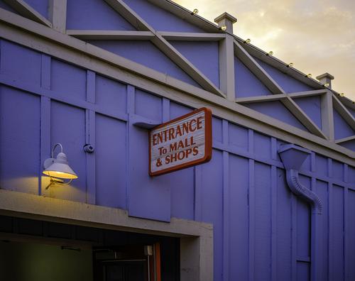
I made this exposure shortly after I had gotten my Fujifilm GFX 100S medium format camera. The lens is a Fuji GF 45/2.8 which I think is one of the greatest lenses the optical industry has ever made. I was just "test shooting."
The blue wall is in deep shadow as the sun is setting on the other side of the building and there is another building right behind my back, blocking skylight from that direction and adding gloom. The exposure is influenced a lot by the bright sky, so the shadows are really underexposed.
I'm amazed at how well I can dig color saturation and detail out of underexposure with the sensor of this camera. I like how the two spots of deeply-saturated red jump out and vibrate against the blue. And how the pool of yellow light from the overhead bulb and the sky tie together.
The "exposed construction" geometry of the wall just tops off the whole thing.
Rich
In previous lifetimes I never worked with colour. Your introduction discussing the tweaking of colour reversal film was all intriguing new ground for me. I'm going to have to spend some time looking at this image and coming back to it. My thoughts keep changing.
Decision time and I'm still fence sitting. The subject is doing nothing for me but the image still has allure. There's a moths and flame thing going on. We can't see the entrance but the red rimmed sign and the warm glow of the lamp appeal. I'm thinking about it as an abstract where colours and lines can be satisfying with no discernible subject. It isn't completely abstract, a mall and shops might offer goodies.The complementary colours are comfortable and enticing.The converging sides of the sign are acting like an arrow in combination with the lamp to pull us into the interior.
It's working but I have lots of problems in trying to explain why. -
-
@Sagittarius has written:
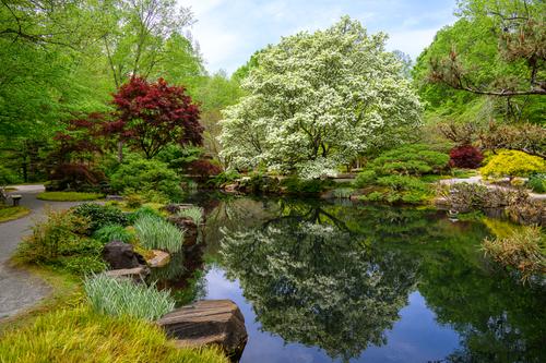
Spring
This is a busy photo, with lots of different colours and shapes of plants, but it is a well-balanced composition, so the overall impression is peaceful and not jarring. I particularly like how you dealt with the intruding branches on the right, which could have spoiled it, by cutting through shapes and colours. One branch runs along the edge of the lake and is hardly noticeable against the bank, and the one above follows the contours of the yellow and red bushes exactly, without cutting into them, so is not intrusive either.
The large tree with white blossom is the dominant subject and its reflection, contained perfectly within the lake, doubles the effect.Pete
-
@PeteS has written:
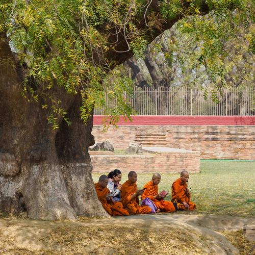
Learning Today, where Buddha once taught
Varanasi, or Benares, in India is the most holy place for Hindus, who make pilgrimages to take the water of the Ganges and to cremate their dead. It also happens to be the place of Buddha's first sermon, so it is a place of pilgrimage for buddhists too. Finally, it is a breath-taking and captivating experience for (western) tourists, who also make pilgrimages here!
Whilst in that third category, I photographed this group at the site where Buddha first preached.
Pete
Thanks for the comments.
I didn’t want to crop out the tree, because I wanted the photo to be about the tree as much as about the group of Buddhists, since Buddha’s first sermon was under the shade of a large tree. (The “Original” tree was nearby on the same site, surrounded by religious items, fences, seating etc., so this scene actually seemed more authentic). I also chose a square frame because that gives sense of stability and peacefulness, especially if the composition is based around the centre.
There is another amusing item, which nobody has mentioned, and I am not surprised, as it is tiny. The teacher on the right is wearing a microphone and has a loudspeaker at his side, which is actually rather an over-kill for the small group. It is at odds with the quiet scene, which otherwise could almost be from Buddha’s time, and this combination of seemingly being timeless, but is actually quite modern, influenced the title too.
Pete
-
@minniev has written:
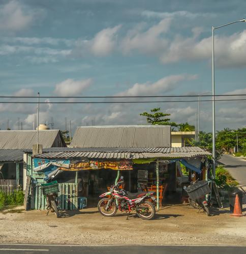
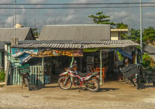
Thanks to all who replied. I always especially appreciate those who show me what they think might help the image along! Those who've known me for a long time already know that my "style" is Kitchen Sink, meaning that I include everything I can find in the frame. Cropping stuff out is hard (oh those clouds! that cute orange cone! the strip of pavement! Going all the way to the smallest crop was just too painful so I used your suggestions to arrive at a compromise, posted below, using the poles as frame brackets on either end.
-
@minniev has written:@minniev has written:
Thanks to all who replied. I always especially appreciate those who show me what they think might help the image along! Those who've known me for a long time already know that my "style" is Kitchen Sink, meaning that I include everything I can find in the frame. Cropping stuff out is hard (oh those clouds! that cute orange cone! the strip of pavement! Going all the way to the smallest crop was just too painful so I used your suggestions to arrive at a compromise, posted below, using the poles as frame brackets on either end.
A candidate for the "there is no absolutely right or wrong way to look at photographs" award.
I like the red cone on the right in 1 but prefer the crop of the road on the right in 2. I like the crop on the left in 2.
I like the crop of the bottom road in 2.
Love the sky in 1 but prefer the crop in 2. Like the section of clearer blues in 1 but don't like the murkier sky in 2.
Can't sum that up into a preference for one or the other.
