• Members 787 posts
    May 28, 2024, 11:46 a.m.

    The overriding impression here is emptiness. It is a congregation of nobody.

    Apart from that unmistakeable comment on the current state of (roman) (catholic) (christian) religion, the image has visual appeal too: the contrast between the lower and the top half could hardly be greater: a jumbled mess (but well ordened) of straight and narrow lines below, and the elegance of gothic curves and arches above it.

    It is like you are saying that we mortals, locked in our narrow and claustrophobic maze of squareness, are aspiring (or should be aspiring) to something more elevated.
  • Members 787 posts
    May 28, 2024, 11:50 a.m.

    Your image is infused with meaning and history, and I am glad that you point out the understated memorials to the Wall Crossings, because otherwise they would be easy to miss. I have walked and biked alongside the Spree in Berlin several times, and I have visited many different sections of remains of the Berlin Wall, but I was not really aware of the role that the river played in the demarcation, nor of the location of the deadly watchtowers there.
    I am trying to orient myself on this scene and I am thinking that maybe the photographer is taking the Bundestag as his backdrop?
    The Bundestag, as seen from the banks of the Spree, is particularly glorious around dawn.

  • Members 787 posts
    May 28, 2024, 11:55 a.m.

    It's a study in bold colour and I like it.
    That particular shade of blue seems like the one that Yves Klein, the french artist, used to prefer.
    If you see it in bright light it seems lighter, but it can take on the deepest hues.
    en.wikipedia.org/wiki/International_Klein_Blue

  • Members 787 posts
    May 28, 2024, 11:56 a.m.

    Reflections in landscapes are often a winning compositional tool.
    It works here too, and is further aided by the complementary qualities of green and orange, linked by blue.

  • Members 787 posts
    May 28, 2024, 11:59 a.m.

    That removal tool is really impressive.
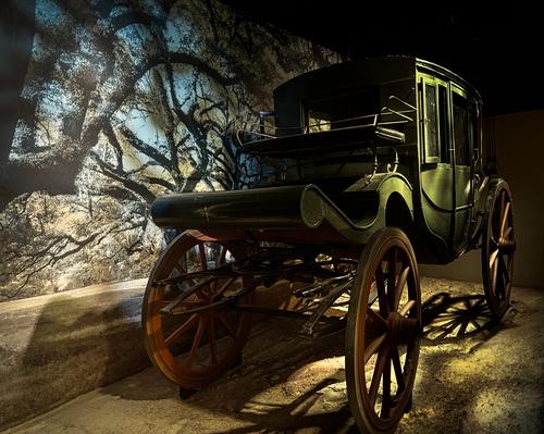
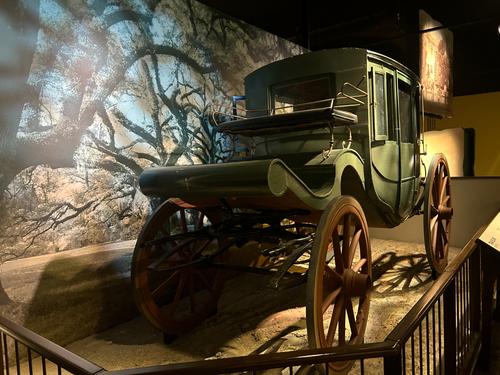
    With that, I would almost have been able to edit my own shots of "hundreds of oldtimer cars in a museum", instead of having to ship the RAWs to Andrew for his amusement. I must say that I do like the lighting on the side of the coach better in the original. It is not that I mind the darker atmosphere of the image on top, but I think that the extra visible detail in the image below is welcome. Was this darkening a side effect of the tools used, or a deliberate choice?

  • Members 711 posts
    May 28, 2024, 2:32 p.m.

    Thanks, Roel,

    Kodachrome was known for emphasizing blue skies (a lot! - early Kodachrome, ASA 10, made skies a glorious purple - we mourned its passing) and for turning neutral shadow areas blue. Additionally, it was hard to scan due to a yellow dye layer and resulted in a blue-ish image even when the slide didn't appear to contain any such color skew.

    The shadows in the original scene were not this blue, but the scanned image is accurate to the transparency itself - there's no additional blue tint in the scan. I like it "un-color-corrected."

    I assume Yves Klein was a Kodachrome fan. Lots of IKB there!

    Rich

  • Members 567 posts
    May 28, 2024, 2:35 p.m.

    Well now you have cost me money Paula! All those years I have spent honing removal skills down the drain too! 😉 Seriously though I have been considering going to Adobe for exactly the reason you have shown. I watched a few videos on the use of creative fill etc with frame expansion after Pete showed what he did recently to expand his frame in seconds. Things that took a lot of time done quickly and the examples I saw all looked very good, as does your work above. A nice result on the lighting in your image as well. For myself, I would use the frame expansion that Pete used in his effort to add a bit to the bottom of the frame. Not much, but enough to take the wheel clear of the bottom of the frame.

    Andrew

  • Members 567 posts
    May 28, 2024, 2:41 p.m.

    Well I was amused Roel, and continue to be with that set of images. I am waiting to see your work with the new tools!
    Andrew

  • Members 1578 posts
    May 28, 2024, 3:46 p.m.

    It was deliberate, not a side effect of the other edits. My grandson and I were competing with each other to see who could make our shots of the carriage the spookiest, and since I had the new removal toys I used them too. I finally have a potential photographer companion!

  • Members 787 posts
    May 28, 2024, 4:32 p.m.

    It needs a skeleton crew of driver and shotgun rider...

  • Members 787 posts
    May 28, 2024, 4:35 p.m.

    Hi Andrew,

    Nice to see you around!!

    Frankly I am still most interested in images that can use some polishing-up on white balance, levels, exposure, saturation etc, but that do not need "invasive editing" (like adding elements to the composition or or removing them). I still consider it my challenge to take the scene as it presents itself and taking care of distractions on the moment of shooting.
    But that does not mean that I do not admire extensive PP work.
    It is just not really for me.

    Roel

  • Members 567 posts
    May 28, 2024, 7:48 p.m.

    The example Pete used in a recent thread to extend the top of the frame was impressive. It is not really adding anything to the image other than space. That can be very useful at times when you frame an image thinking you have it right only to notice later that it would benefit from more space in one direction or another, or if you did not get it perfectly level when shooting and rotating it reduces the space you left. The new tools make routine fix ups easy. Not sure that removing invasive elements should be a concern. Sometimes you could walk up and remove them but at other times it is easier to take them out afterward. There is a difference between a 'photograph' as taken and a polished image. Where one draws the line when polishing I guess is a personal matter but I really don't care much about reality when making an image. If I can make a capture what I want it to be then that is my goal. Sometimes you can't get what you want with your camera no matter how hard you may try. Sometimes things are out of your control. In those instances if I can see a way to make the shot what I imagine then I take it and try. I don't always succeed!

    As to being around, I drop in frequently but the lack of a threaded view here makes participating too much work for me. Also, I am stuck with the feeling that if I reply to one or two images that I should reply to all of them. I guess that is part of hosting that is difficult to stop feeling. In any case, I admire your perseverance with this thread and especially in its new home. The group that started the site has done an admirable job and have tried to accommodate requests.

    Best wishes Roel,
    Andrew

  • Members 1578 posts
    May 29, 2024, 1:38 a.m.

    You will love it Andrew. It's the most fun $10 I spend every month. I have no qualms about subscriptions, it's an easy solution for me, more affordable this way. And I do love fiddling with pictures almost as much as taking them - some just a little, but some turn into things that exist only in my imagination. There's room in the camera world for all kinds of us.